EKZO Brand Identity Development
Katya N.
EKZO® — Brand Identity
Nicotine Pouches · European Market · 2026
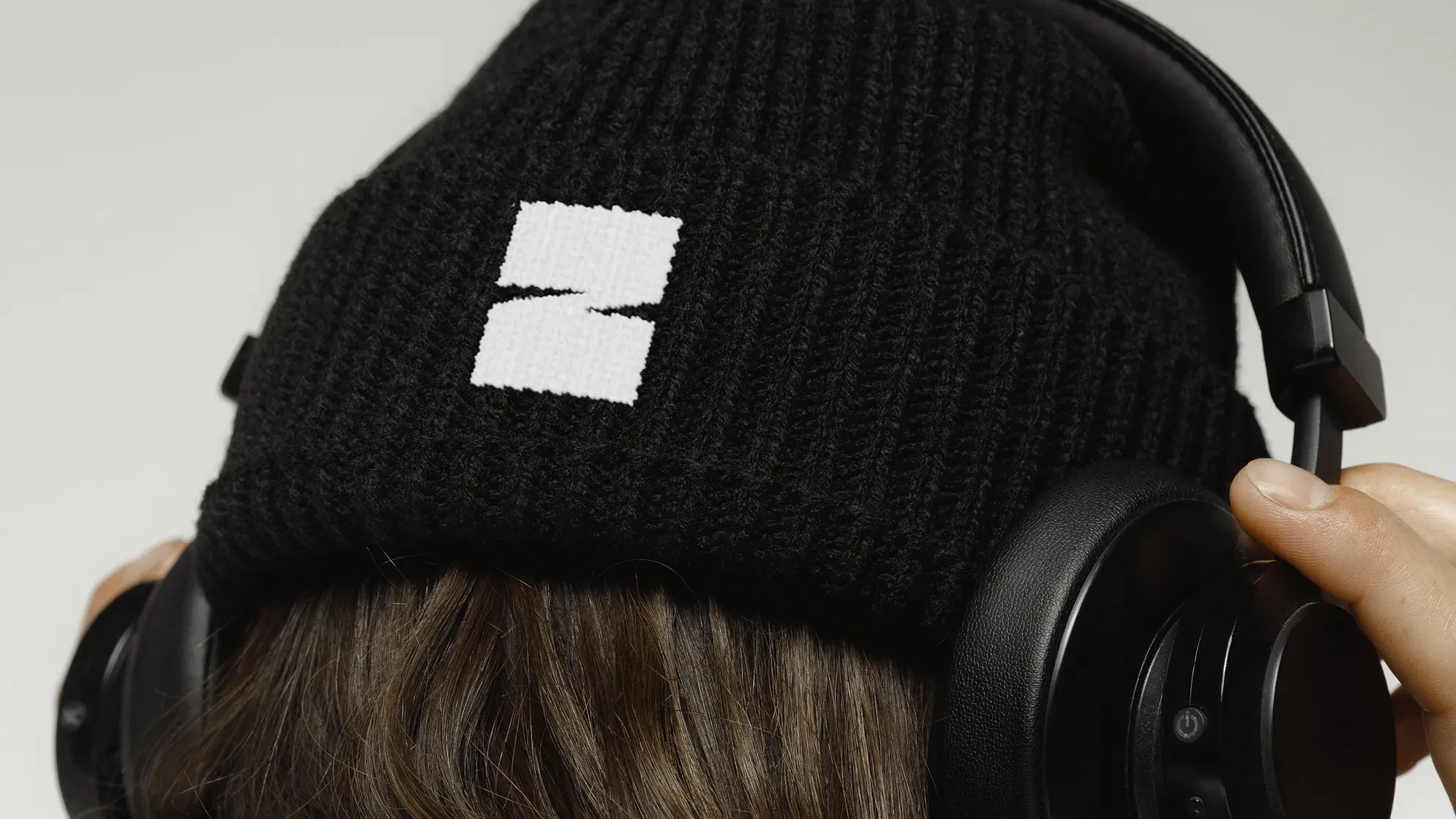
The European nicotine pouch market defaults to two extremes: pharmaceutical minimalism borrowed from Scandinavia, or aggressive streetwear aesthetics that prioritize noise over substance. EKZO chose a third position — lifestyle branding that treats the product as a sensory experience worth owning.
Your Exotic Experience.
The strategic premise and the creative brief in three words. The brand isn't selling nicotine — it's selling the moment around it. Status and sensation, simultaneously.
The System
The identity is built around a single structural idea: Flavor First. Every decision flows from it.
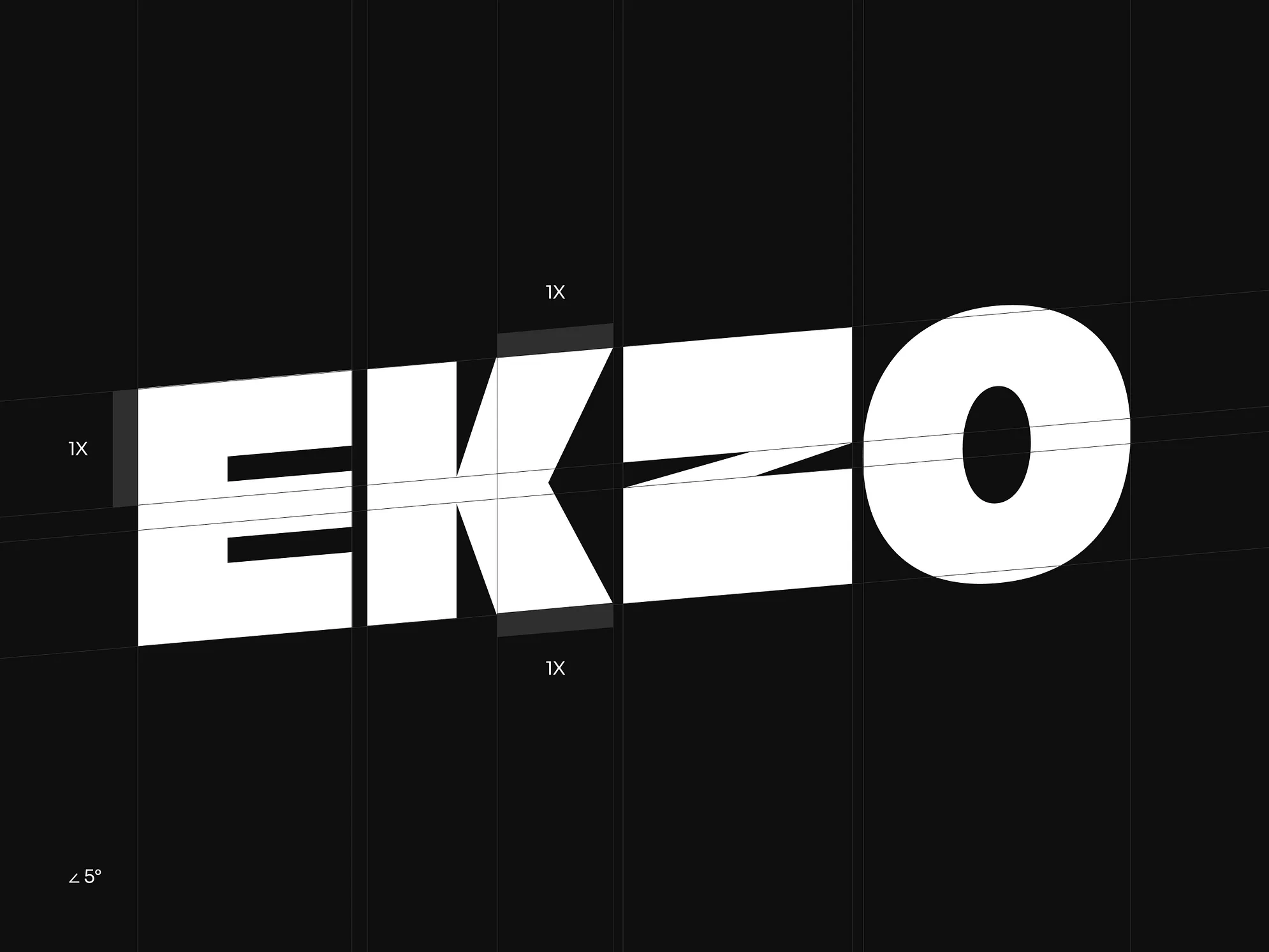
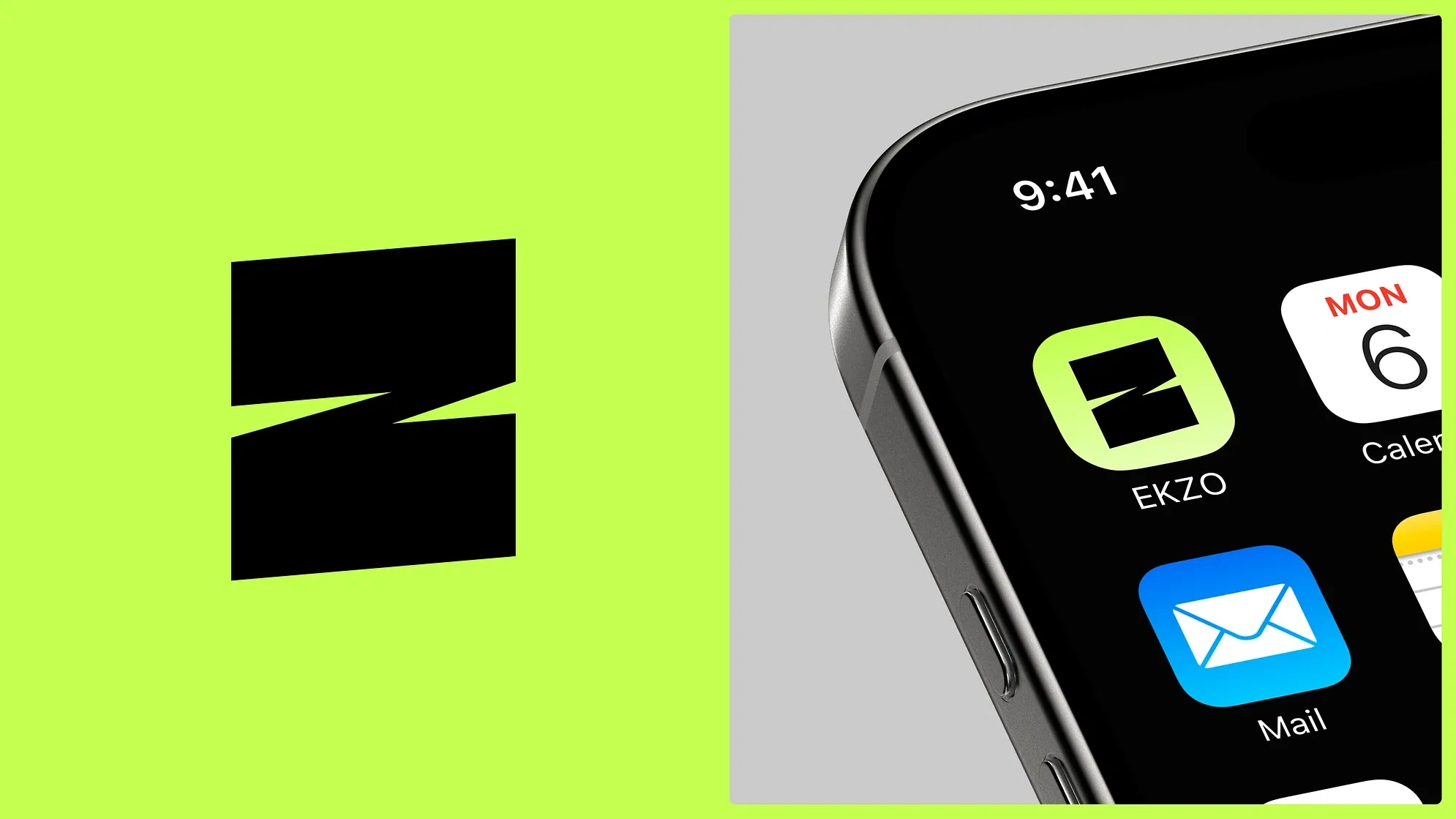
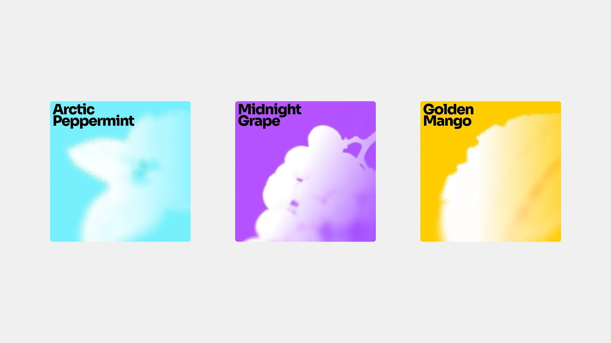
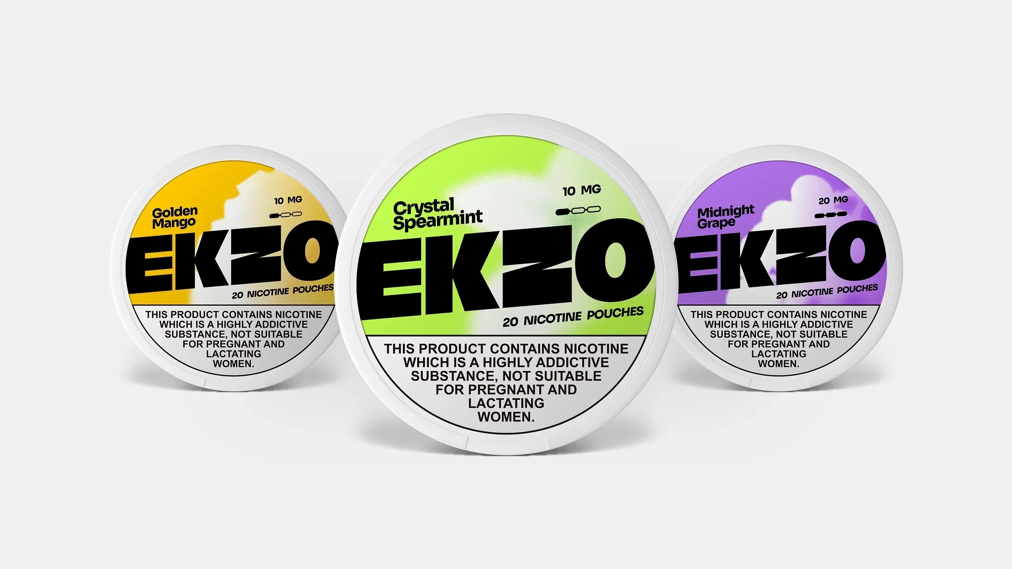
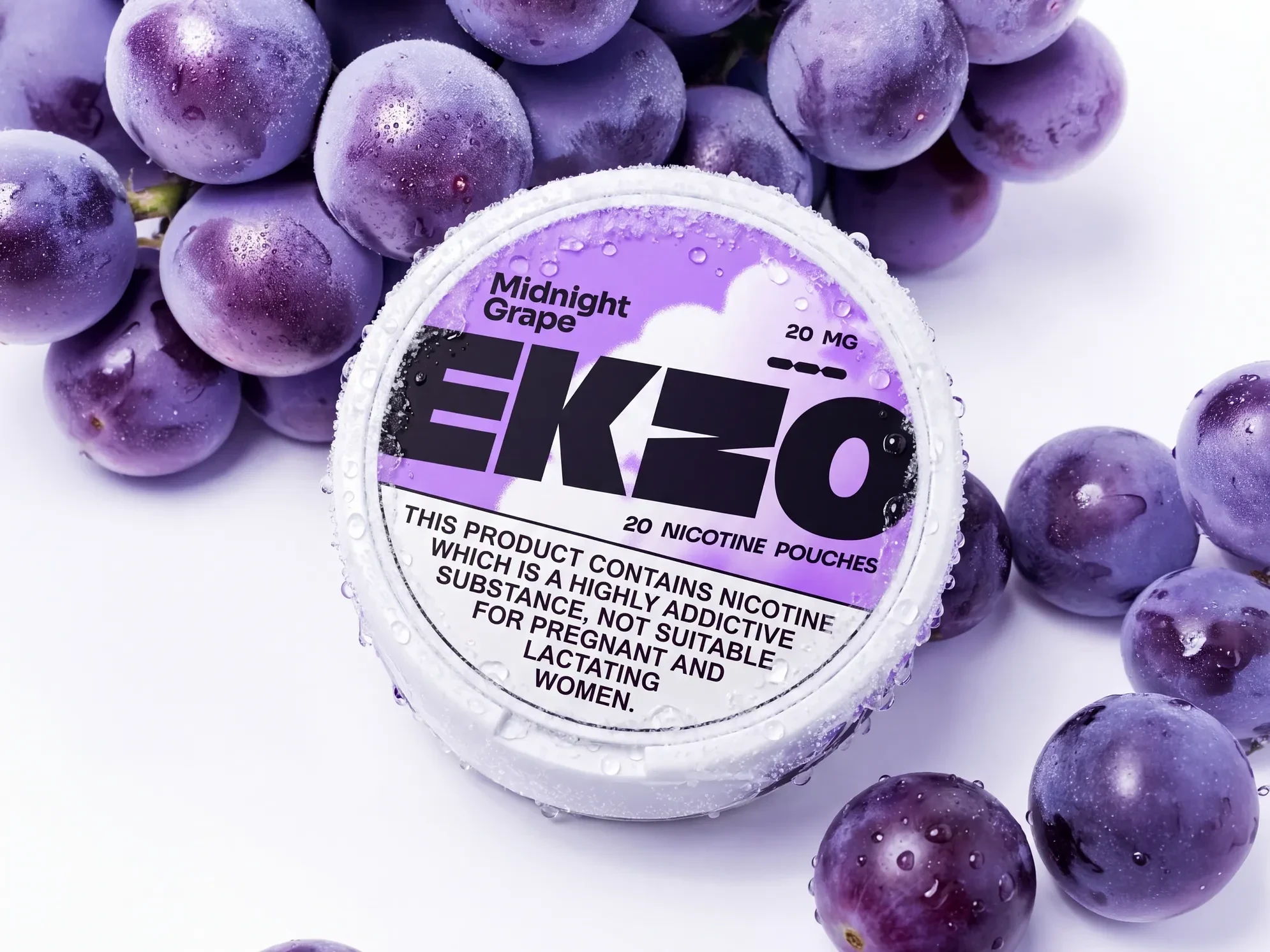
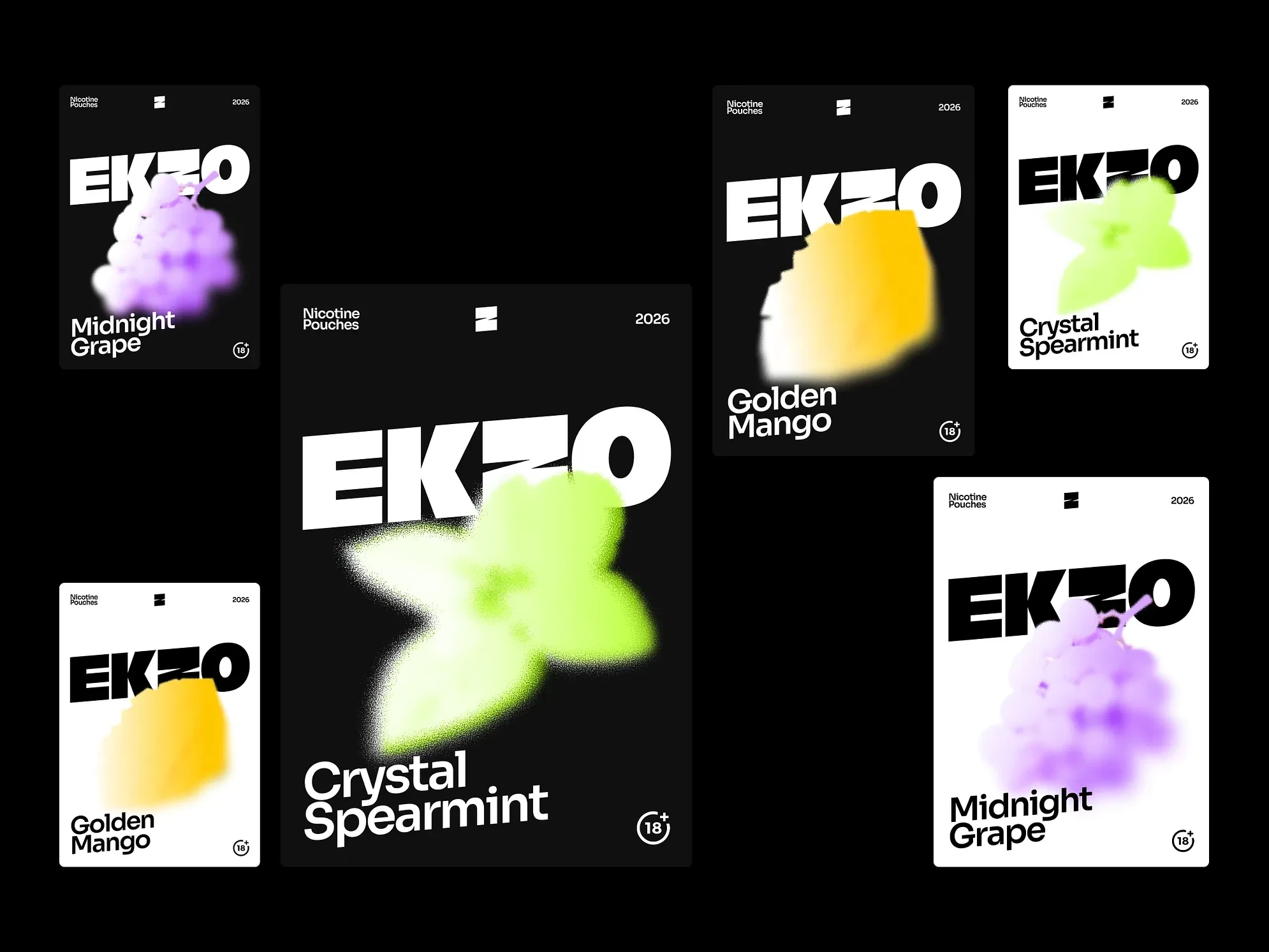
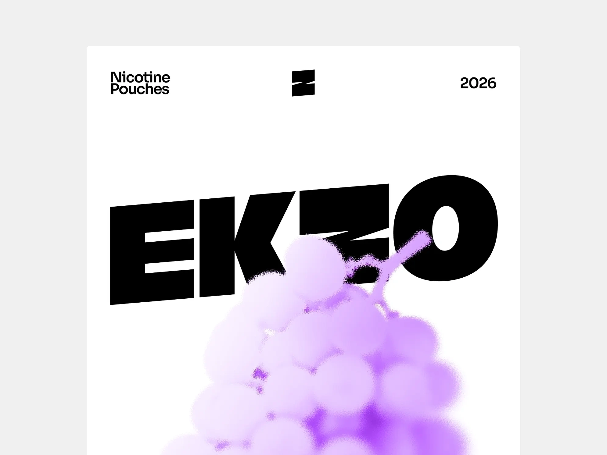
The wordmark is a custom mark. A bold, dense grotesque set at 5° — the weight alone creates a sense of juiciness, something ripe and full. The Z carries a clean diagonal cut: the visual equivalent of biting into fruit. Sharp enough to feel it on the tongue. From that cut, a container is born. Images live inside it — flavor photography, motion, lifestyle — framed by the angle that defines the entire visual language. When clarity demands it, the cut disappears and only the tilted rectangle remains. The container adapts. The logic stays.
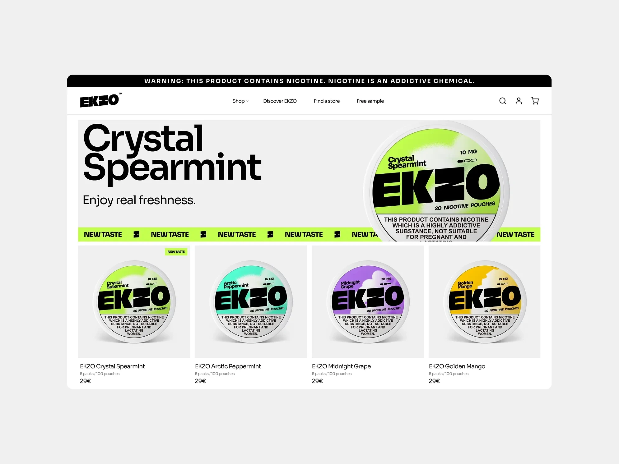
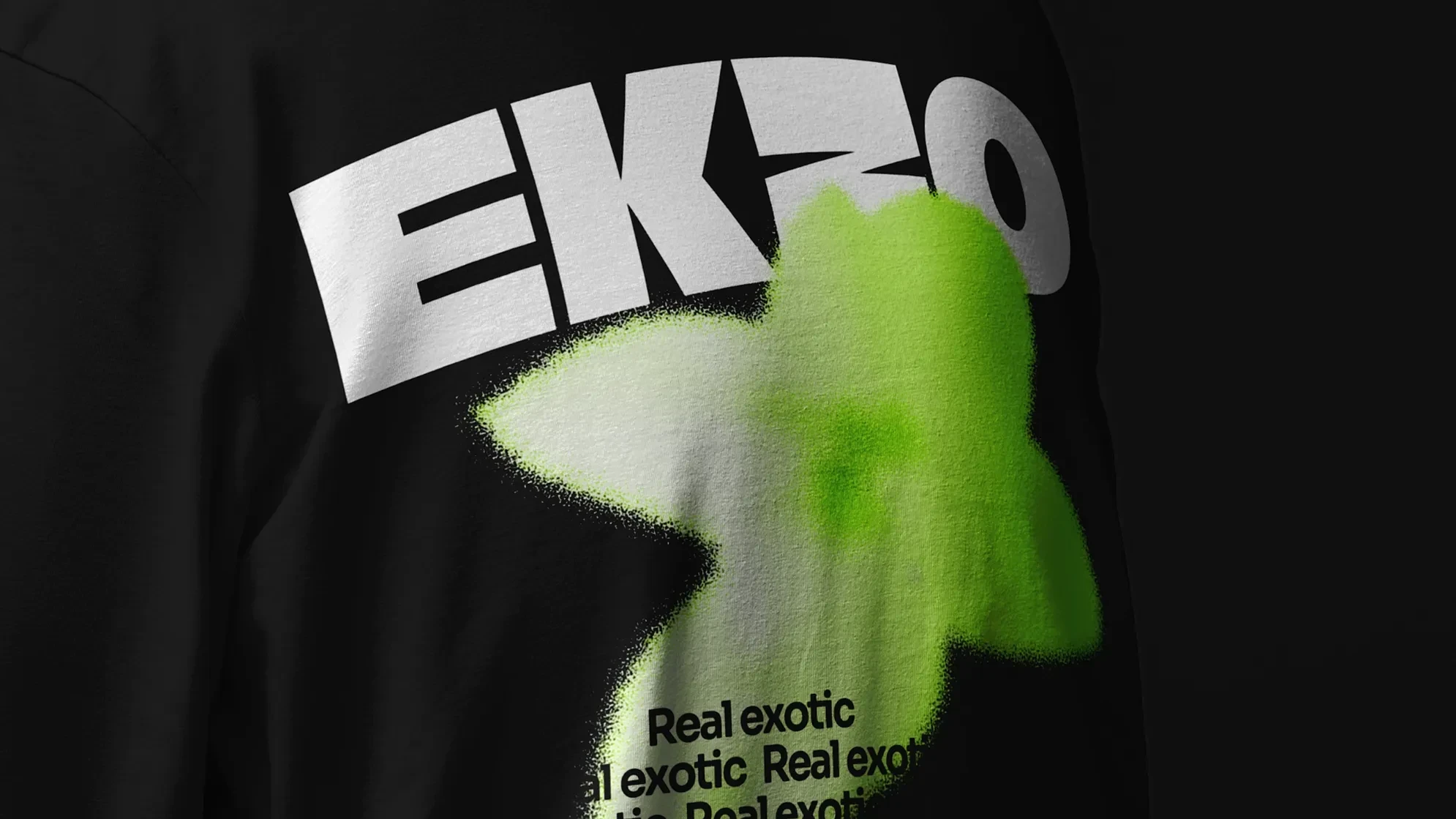
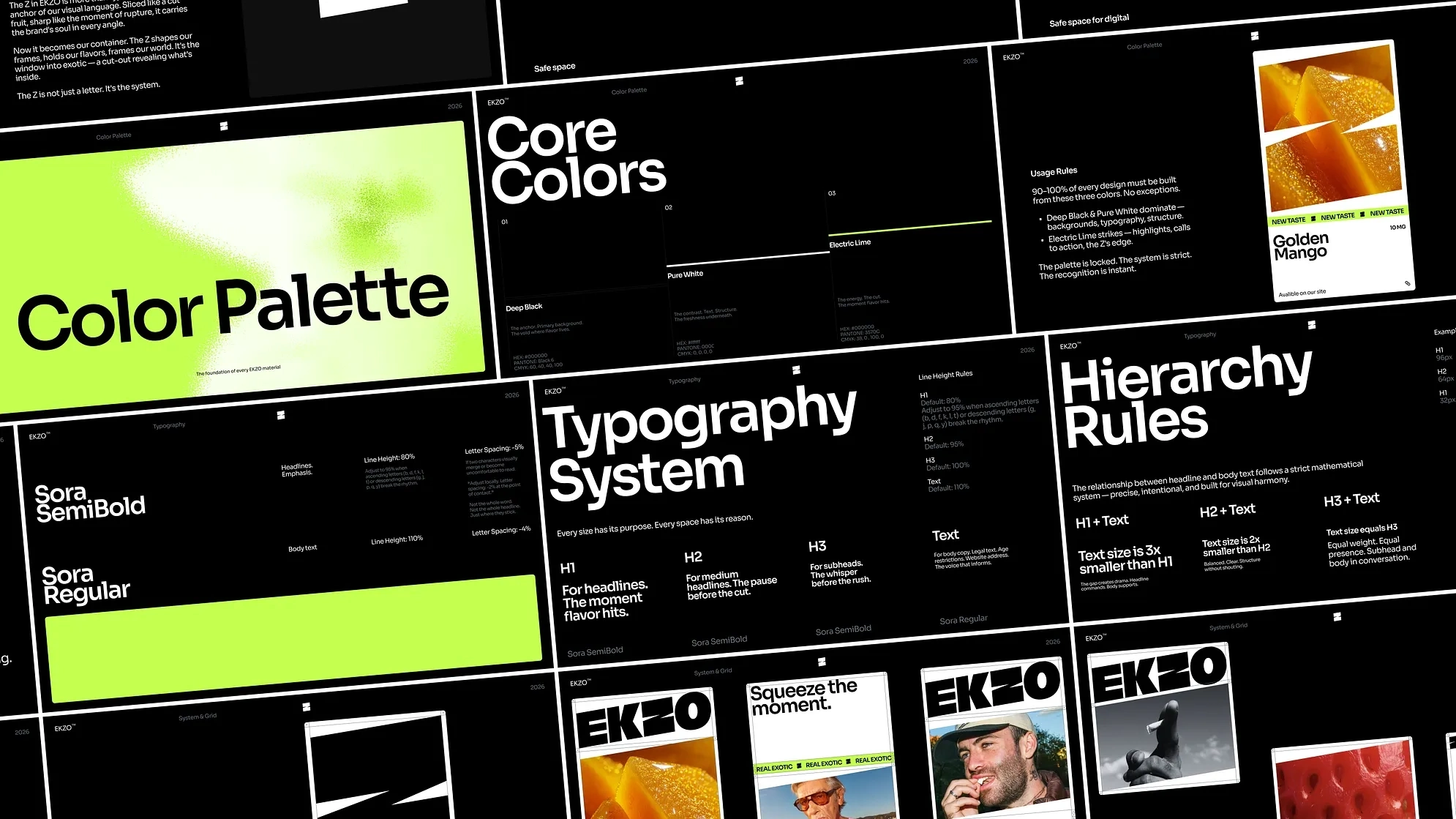
Color belongs to the flavor. Black and white provide the foundation; each flavor receives its own field — the brand's way of making taste visible before the product is even opened. Silhouetted fruit illustrations, slightly blurred as if viewed through glass, reinforce the idea without stating it directly. The sensation is implied, not explained.
The 5 Degree Rule governs every composition. The wordmark's angle is not incidental — it became the structural law for campaigns, packaging, and digital. It encodes speed: the rate at which the product works, the pace at which the brand communicates.
Typography follows a strict hierarchy. Sora SemiBold for headlines, Sora Regular for body and compliance copy. The system is functional and deliberate — legibility is non-negotiable, personality lives in weight and scale, not in deviation from the rules.
Motion extends the system without breaking it. 3D rotations, mask reveals, and animations built on the same 5° logic translate the brand into time-based media. Everything moves the way the product feels: fast, precise, intentional.
Deliverables
Logo & wordmark · Brand guidelines · Packaging system · Campaign visuals · Digital assets · Key brand touchpoints
The Result
Every element — the cut of the Z, the angled container, the flavor field, the tilt — answers one question before a word is read: is this my kind of thing? For EKZO's audience, the answer is immediate. That's the exotic experience. Designed in.
Ready to launch your brand?
Reach out to me on Contra.
Ready to launch your brand?
You can view my services here →
Like this project
Posted Apr 23, 2026
Developed EKZO's brand identity with a unique lifestyle approach for the nicotine pouch market.
Likes
1
Views
5
Timeline
Jan 19, 2026 - Feb 27, 2026