ULAR Brand Identity Redesign

Katya N.


ULAR® — Brand Identity
Motorcycle Manufacturer · Enduro Culture · 2026
The enduro motorcycle space often splits between purely technical performance brands and aggressive, over-stylized visuals. ULAR takes a different route — grounding the brand in something raw and honest: dirt, motion, and the natural emotions that come with riding off-road.
Born from the dirt
The core idea behind the identity. ULAR isn’t just about machines — it’s about the feeling of losing control just enough to feel alive. Real terrain. Real emotion. No filter.
The System
The identity is built around a single metaphor: Dirt as Origin. Everything starts there.
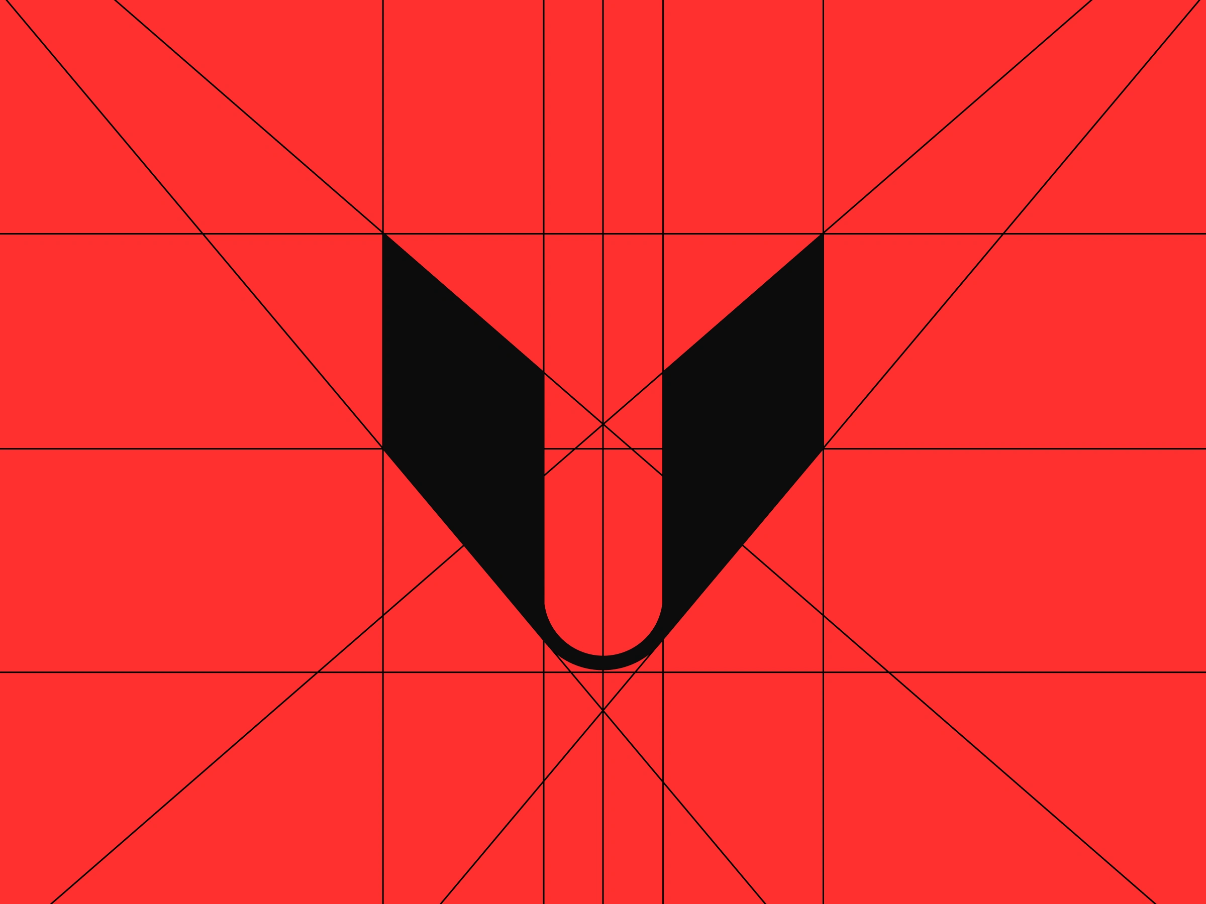
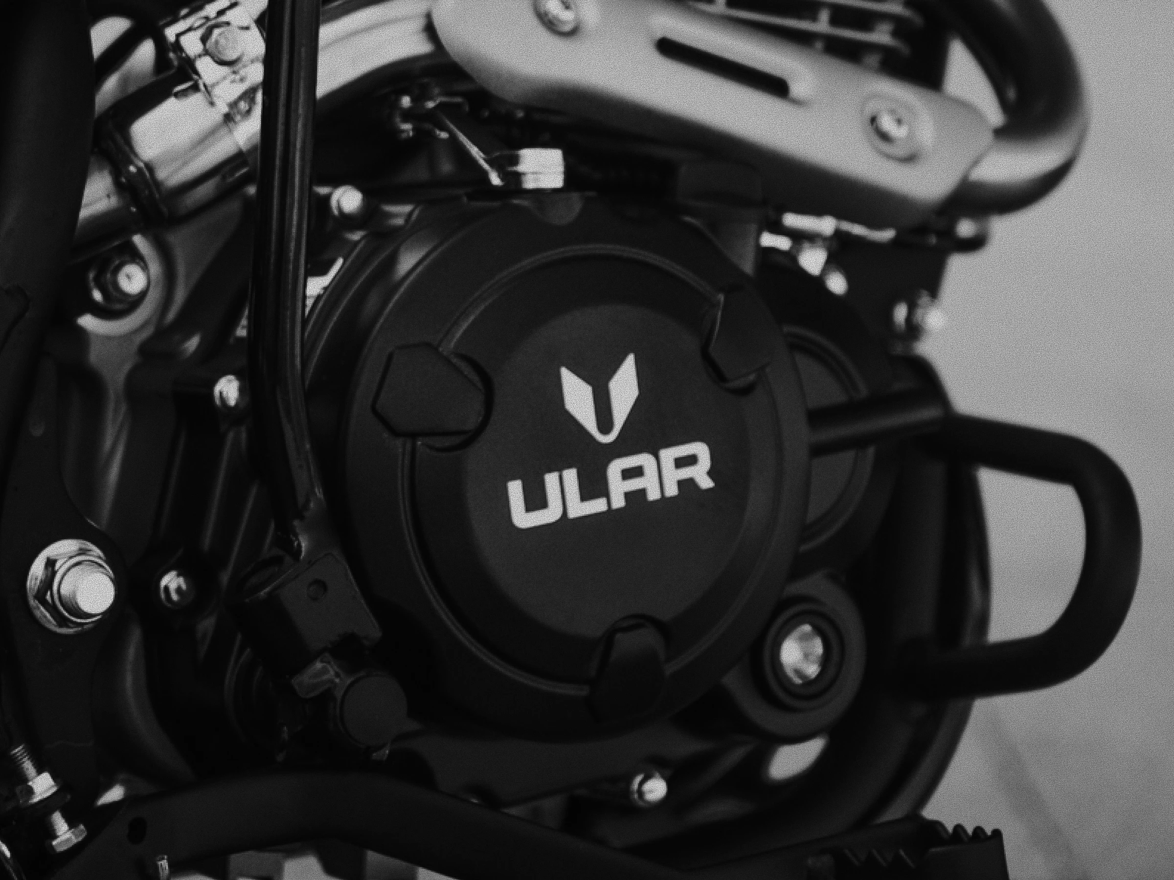
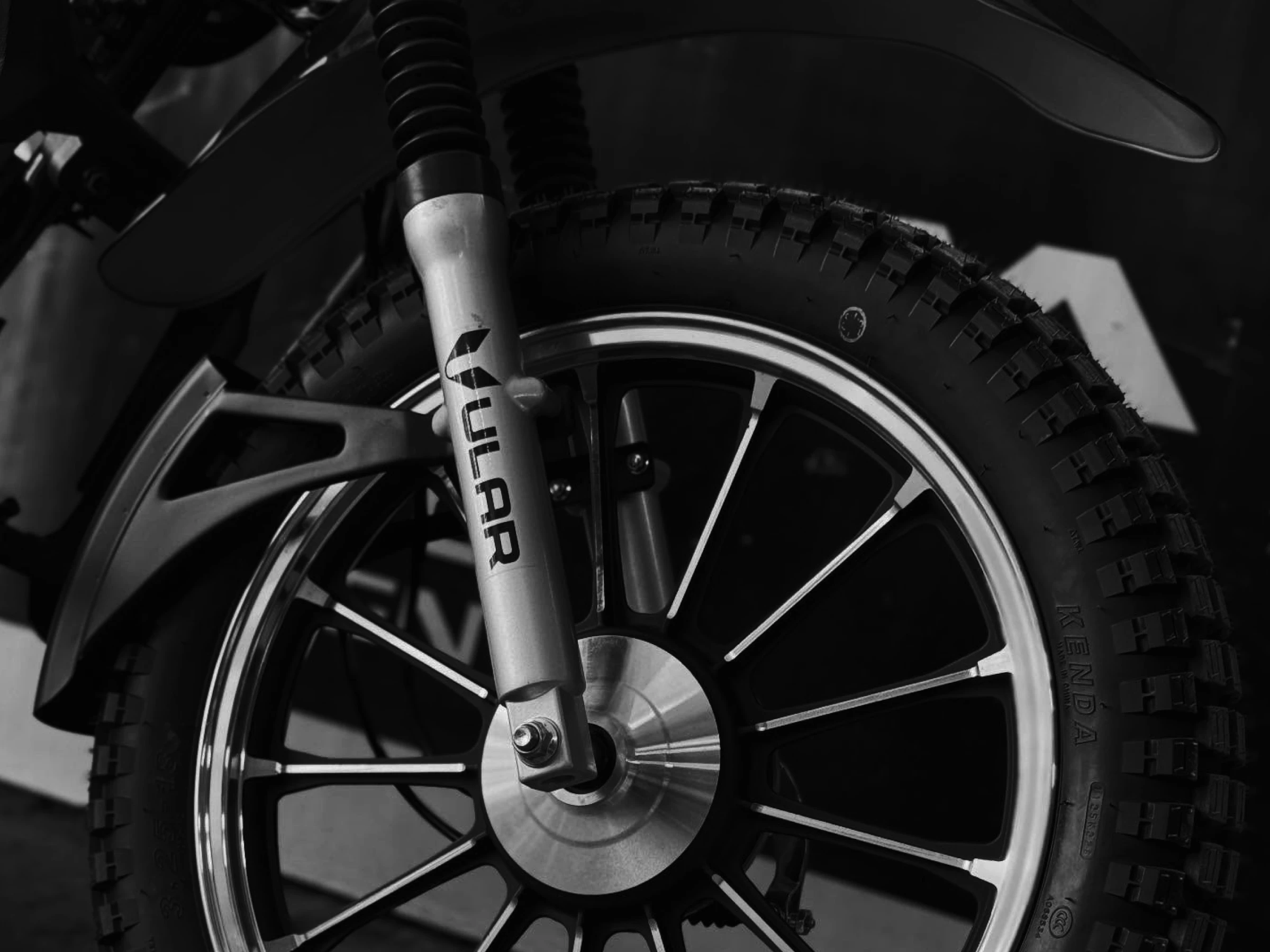
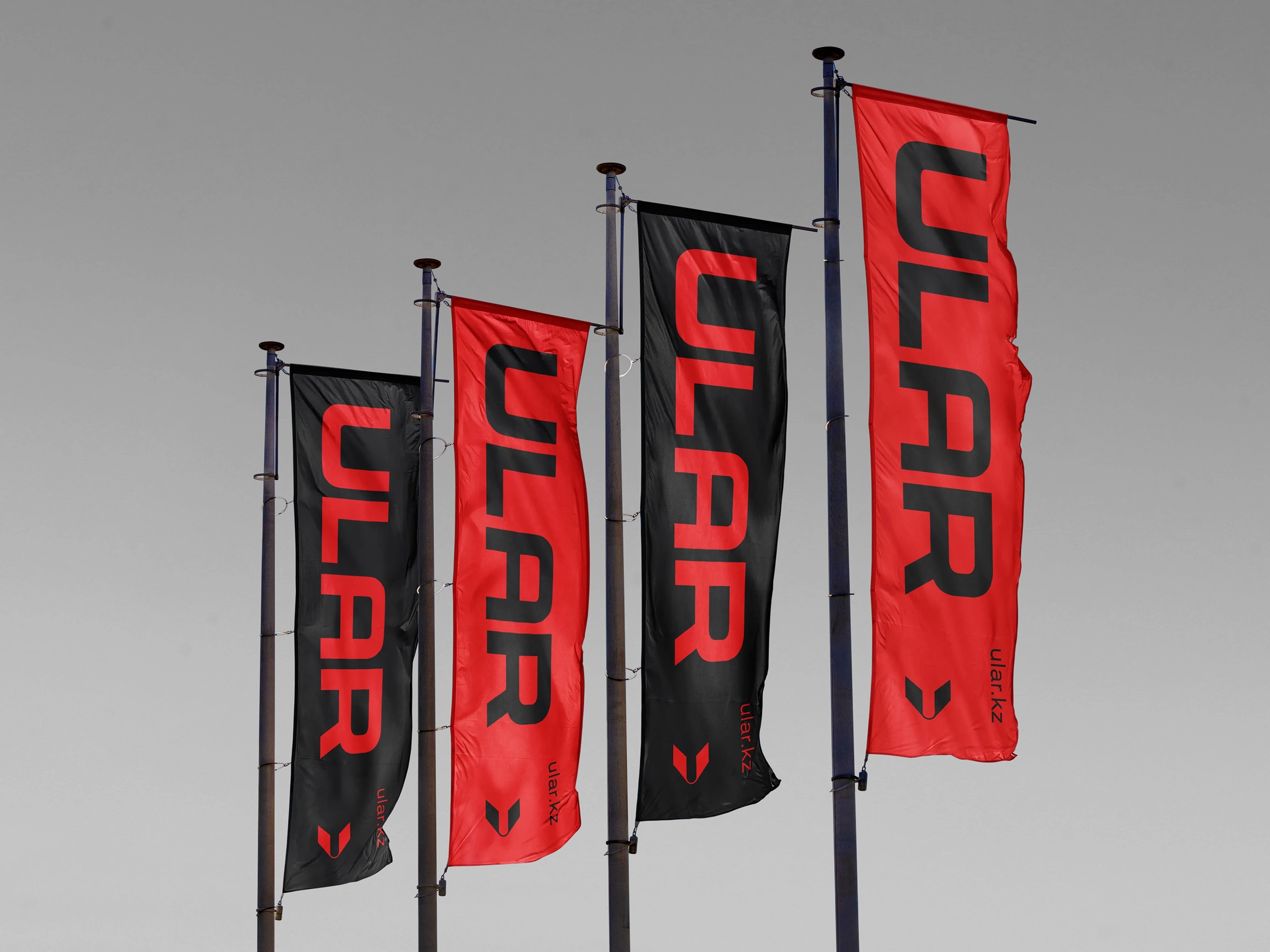
The logo is a custom mark inspired by the wings of a mountain bird — the origin of the brand’s name. It captures lift, freedom, and control in unstable conditions. Sharp, directional, and slightly aggressive — like the ride itself.
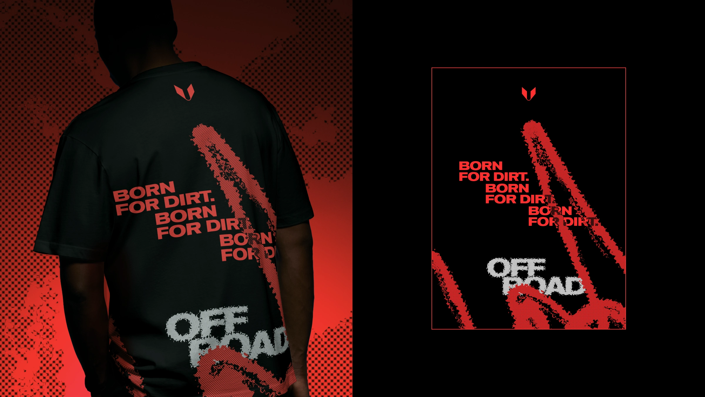
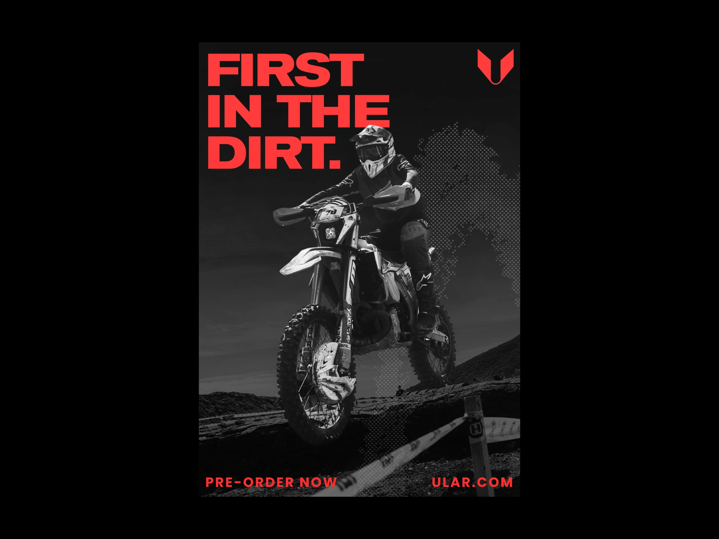
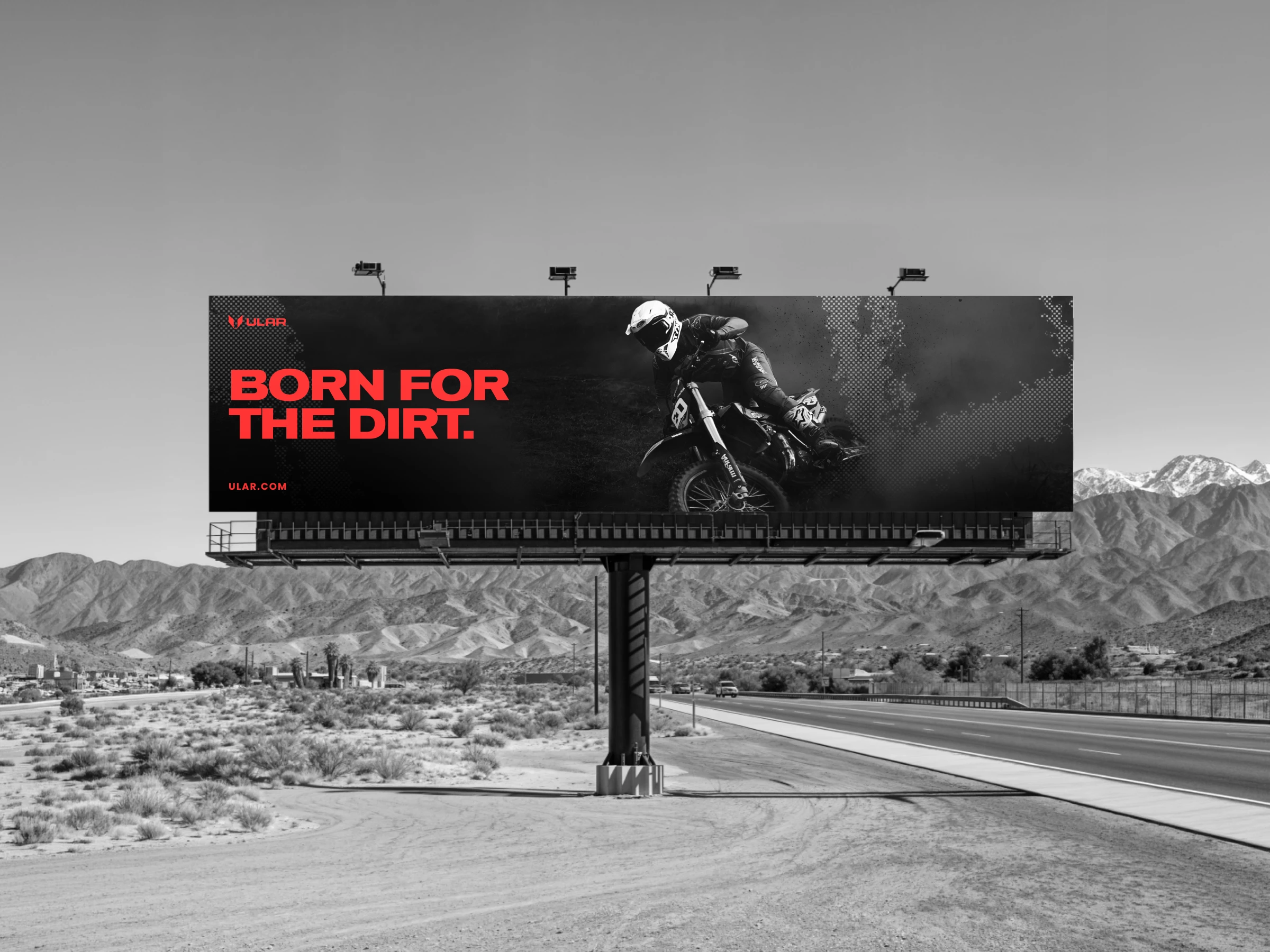
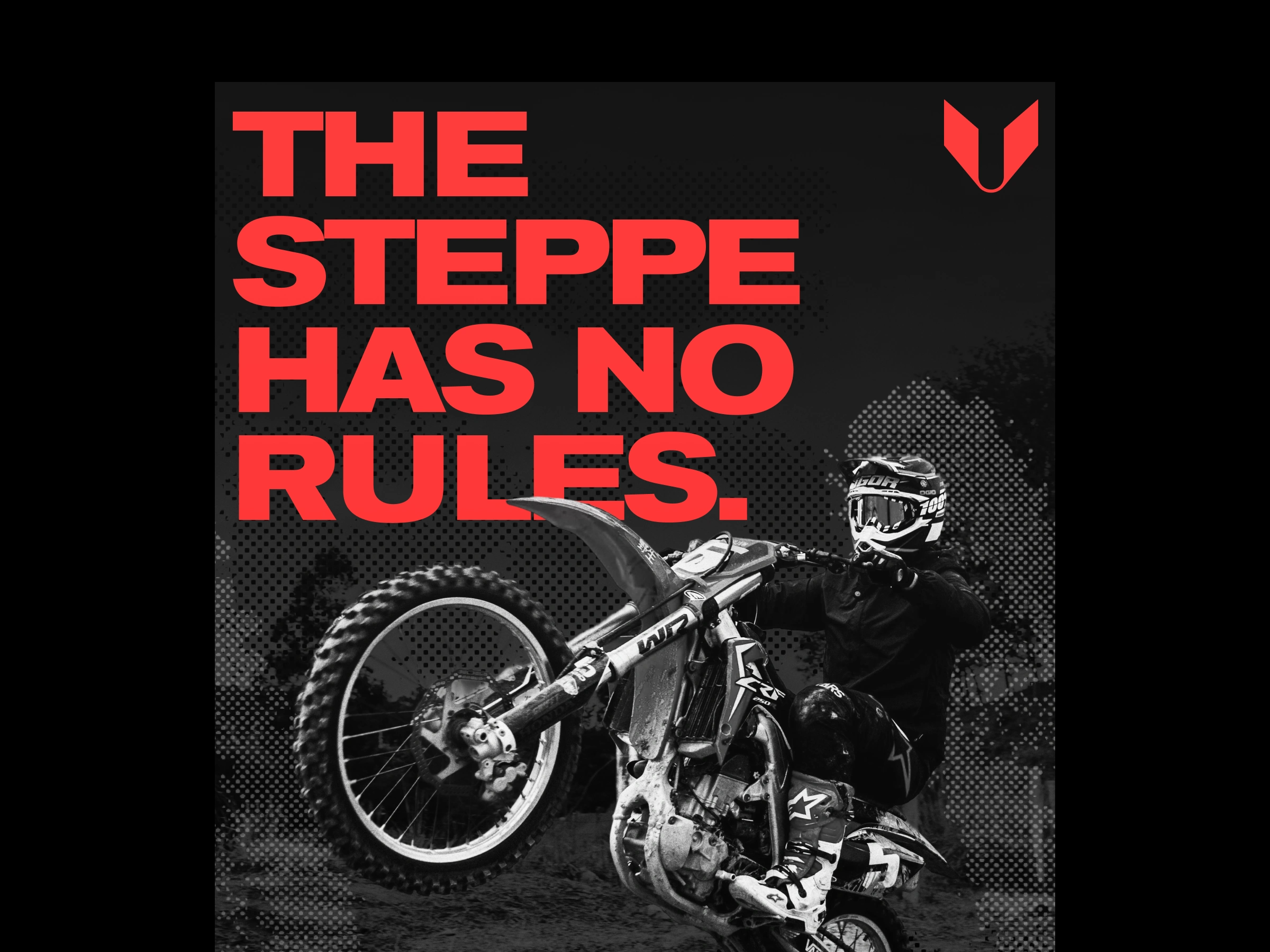
From motion comes the pattern. A dirt trail left by an enduro motorcycle becomes a repeatable visual system — raw, imperfect, and always unique. It brings texture into the identity, making every surface feel used, ridden, alive.
The visual language leans into a grunge aesthetic — worn surfaces, imperfections, and a deliberately rough execution. Nothing feels polished or artificial. The brand embraces abrasion, dirt, and the marks of real use.
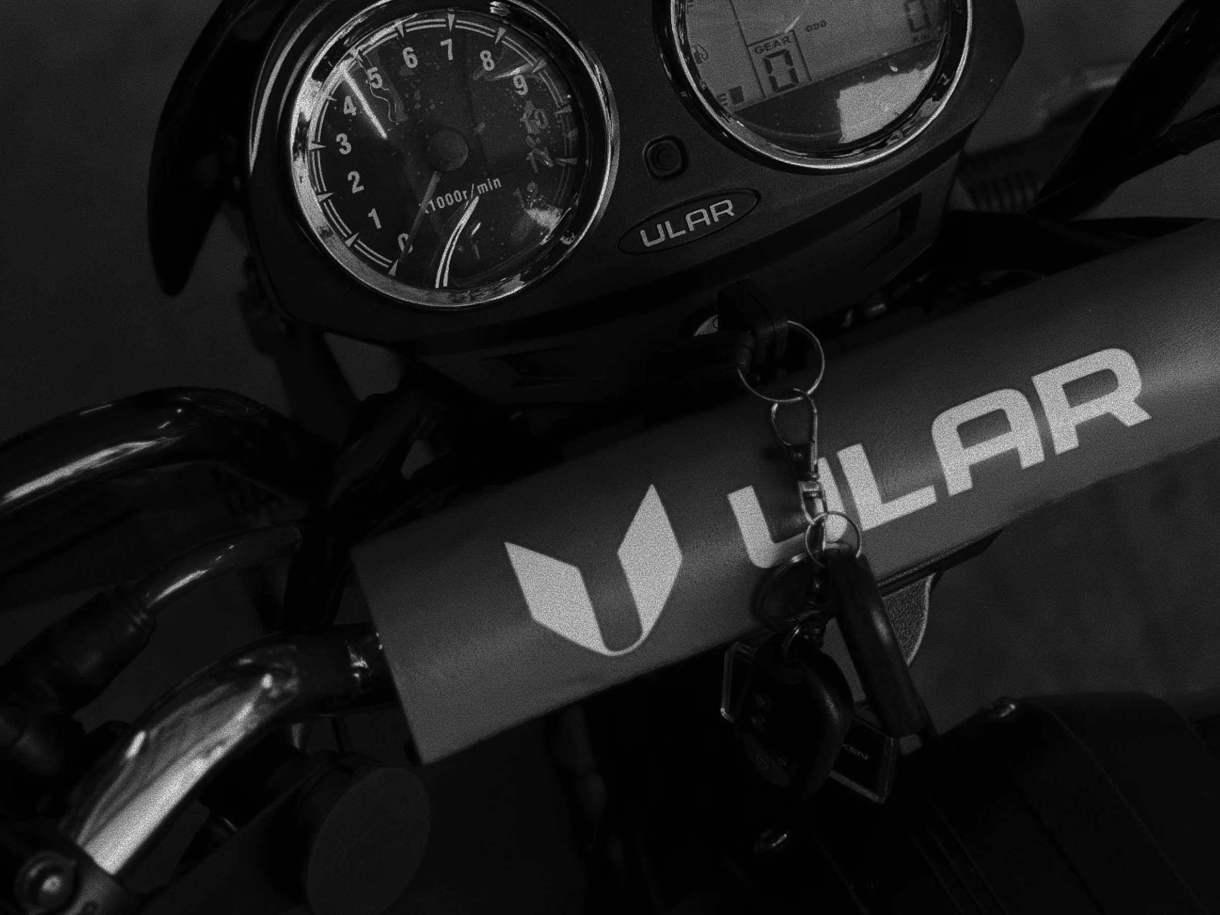
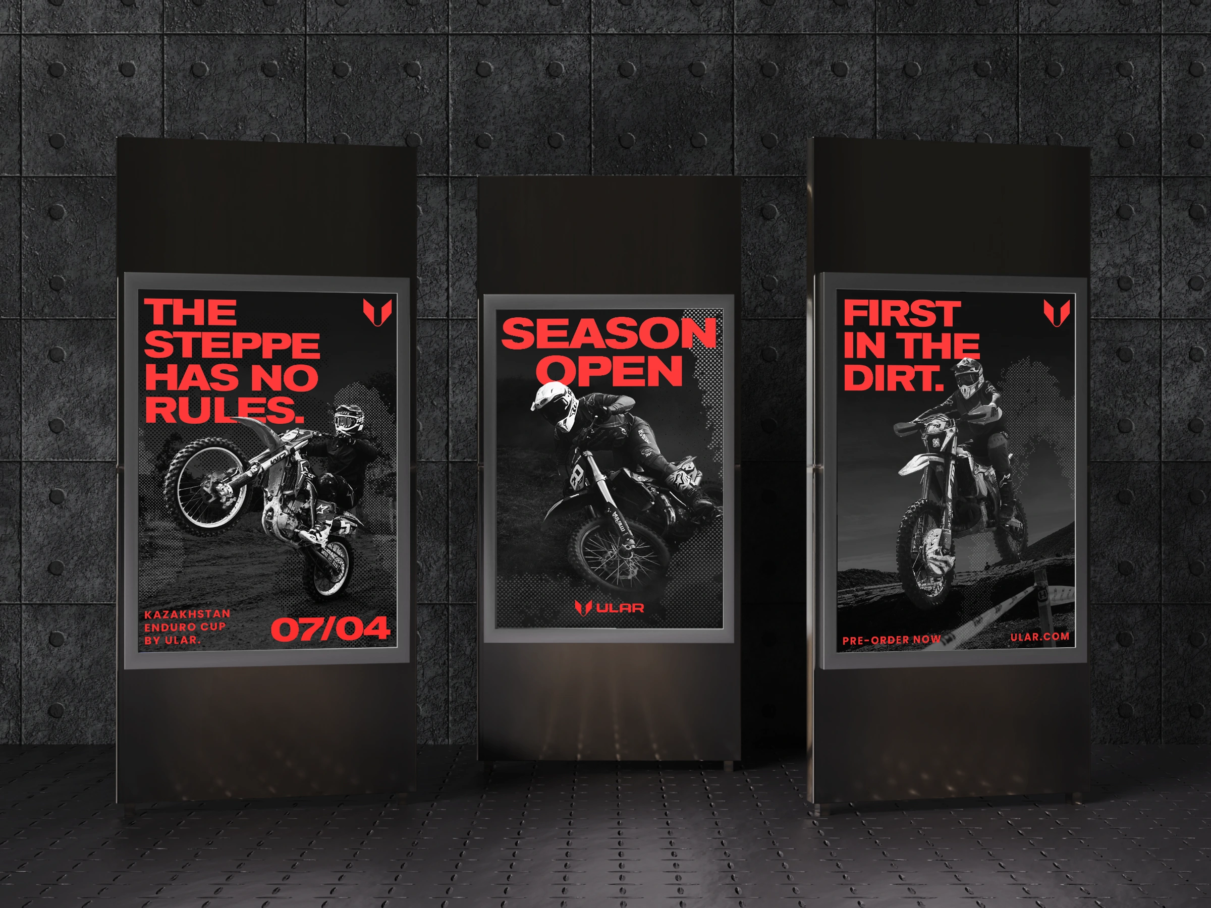
Color is reduced to the essential. Black and red form the core palette — contrast, tension, and energy. Black grounds the brand, while red carries intensity and motion. Photography is strictly black and white, stripping away distraction and focusing on form, terrain, and emotion.
Typography is a bold grotesque — heavy, confident, and unapologetic. It holds the system together, delivering clarity while reinforcing the brand’s strong, grounded attitude.
Motion follows the same raw logic. Instead of clean digital transitions, animations feel aged and tactile — grain, distortion, rough cuts, and imperfect timing. The movement reflects the same grunge attitude as the rest of the identity: used, worn, and real.
Deliverables
Logo & wordmark · Brand guidelines · Visual system · Pattern design · Campaign direction · Digital assets · Key brand touchpoints
The Result
ULAR feels like it was never designed in a studio — it feels like it was built outside. Every element reflects the same idea: where it comes from defines what it is.
The previous identity had become outdated. This one doesn’t just modernize — it redefines the brand at its core.
That’s ULAR. Born from the dirt.
Ready to launch your brand?
You can view my services here →
Like this project
Posted Apr 23, 2026
Built on the contrast of red to black, dirt and adrenaline. It captures the core emotions of riders and drives the purchase of pure emotion