The network for creativity
Join 1.25M professional creatives like you
Connect with clients, get discovered, and run your business 100% commission-free
Creatives on Contra have earned over $150M and we are just getting started
Back to feedPost

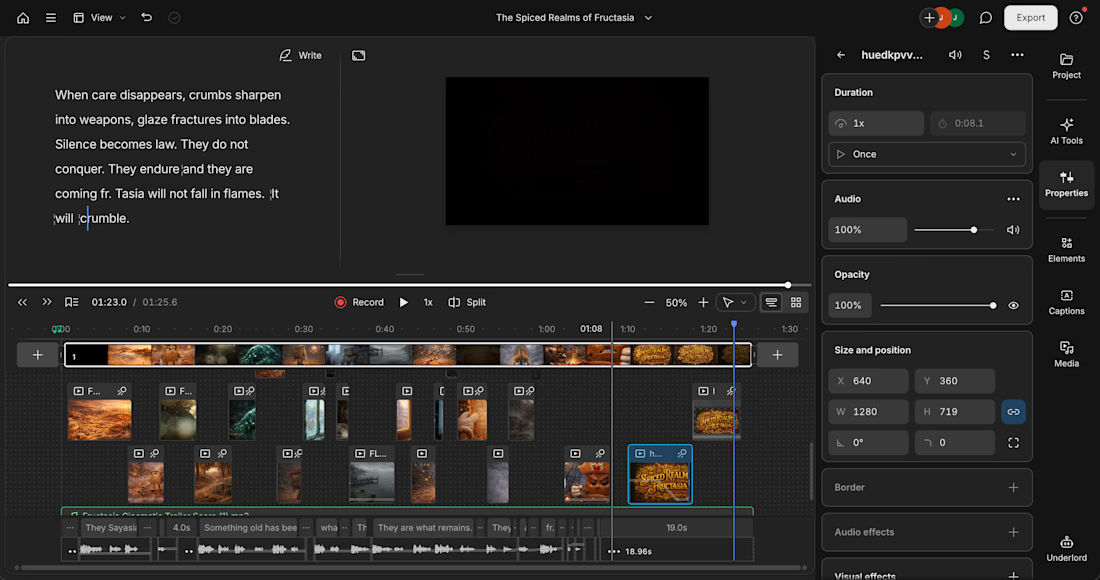
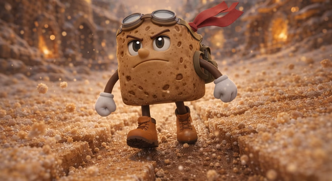
Wow, can't believe I actually got this done in time. I pushed myself to the absolute limit and have been so inspired by this community and all of the submissions. Here is my trailer concept for an original story world that I created just for this challenge! Happy New Year everyone! https://share.descript.com/view/KSLlYUb3xO1




The cinematic energy! Loving it! 🤩
The network for creativity
Join 1.25M professional creatives like you
Connect with clients, get discovered, and run your business 100% commission-free
Creatives on Contra have earned over $150M and we are just getting started

Challenges
View all


Related posts

Congratulations to the winners of the Descript Challenge!
1st place: Ruffa Sakay
2nd place: Jules Gagnon
3rd place: Ross Zeiger
Best Use of MCP: Ross Zeiger

this is really so unexpected thank you so much, Contra x Descript, for appreciating my work! it truly means a lot to me and also, congratulations to all the other winners and to everyone who participated and shared their work with us! it was amazing to see everyone’s creativity and hard work

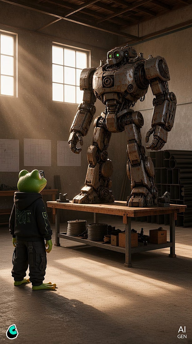
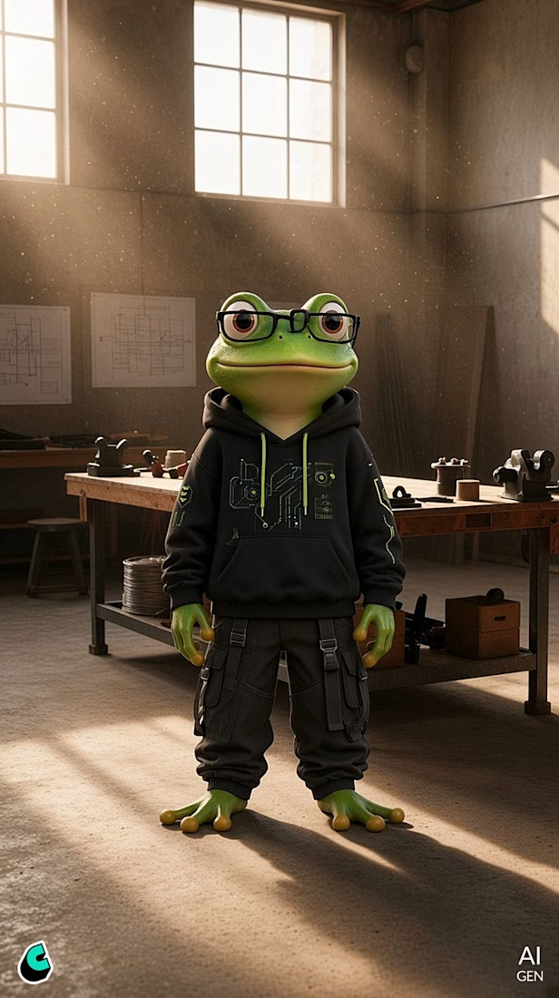
KROK — Unpredictable Scrap! 🐸🤖
Krok is a chaotic and inventive frog who lives in a hidden creative workshop inside an abandoned industrial building. He sees possibilities where everyone else sees junk.
For the Cantina Challenge, I created Krok’s pilot episode: a 60-second animated short where his improvised engineering turns a pile of discarded metal into a homemade transforming robot.
The goal was to explore how a character can be more than a visual design, giving him a recognizable personality, environment, sense of humor, and a story engine that can generate future episodes.
Krok’s creative philosophy is simple:
Build first. Figure out why later.
The episode combines character animation, visual comedy, sound-driven storytelling and a handmade scrap-metal aesthetic to introduce the character and his chaotic world.
This project was created entirely in Cantina, from character development to the final pilot.


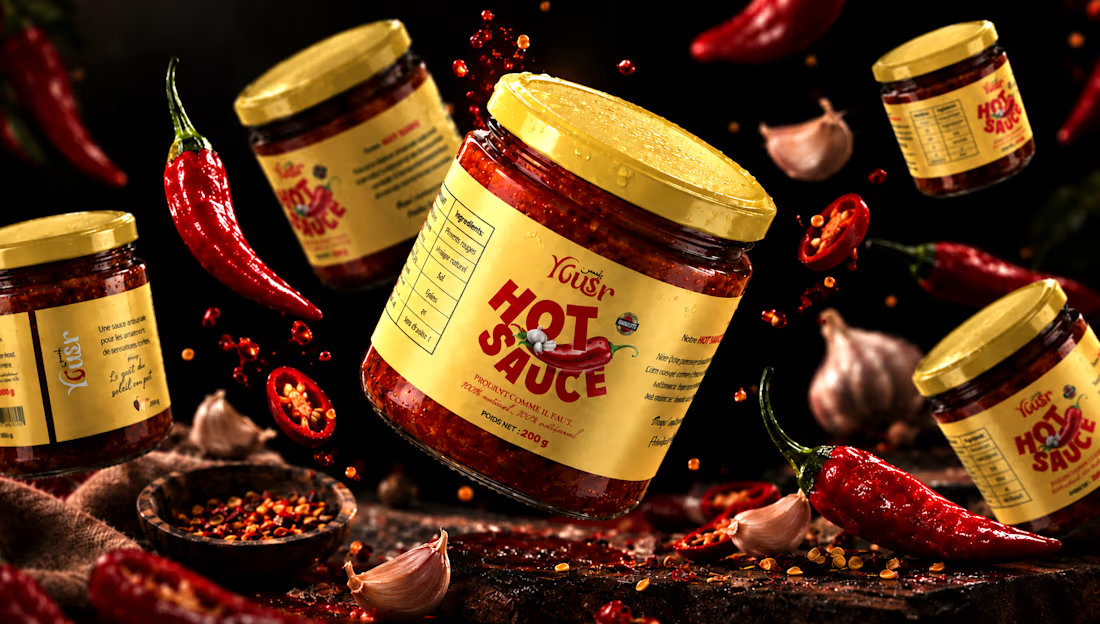
Yousr — Hot Sauce Brand Identity & Packaging Design
Turning bold flavor into a bold visual identity.
Yusr Hot Sauce is a food packaging project created to translate the intensity, heat, and character of the product into a striking visual experience.
The packaging combines a warm, distinctive color palette with bold typography and expressive graphic elements, creating an identity that immediately communicates the product's spicy and authentic character.
The visual direction was developed around the contrast between the rich red tones of the chili sauce and the warm cream of the label, creating a strong and recognizable presence across the product range.
From the label design to the final product presentation, every element was carefully considered to enhance the product's personality while maintaining clarity and brand consistency.
The final art direction brings the packaging to life through a dramatic food-focused environment, using rich textures, controlled lighting, and carefully composed ingredients to create an appetizing and memorable product experience.
A packaging identity designed to capture attention, communicate flavor, and give Yusr Hot Sauce a distinctive presence.
View the full project : https://www.behance.net/gallery/255675391/Yousr-Hot-Sauce-Brand-Identity-Packaging-Design
#PackagingDesign #FoodPackaging #HotSauce #LabelDesign #FoodBranding #ProductDesign #ArtDirection