The network for creativity
Join 1.25M professional creatives like you
Connect with clients, get discovered, and run your business 100% commission-free
Creatives on Contra have earned over $150M and we are just getting started
Back to feedPost
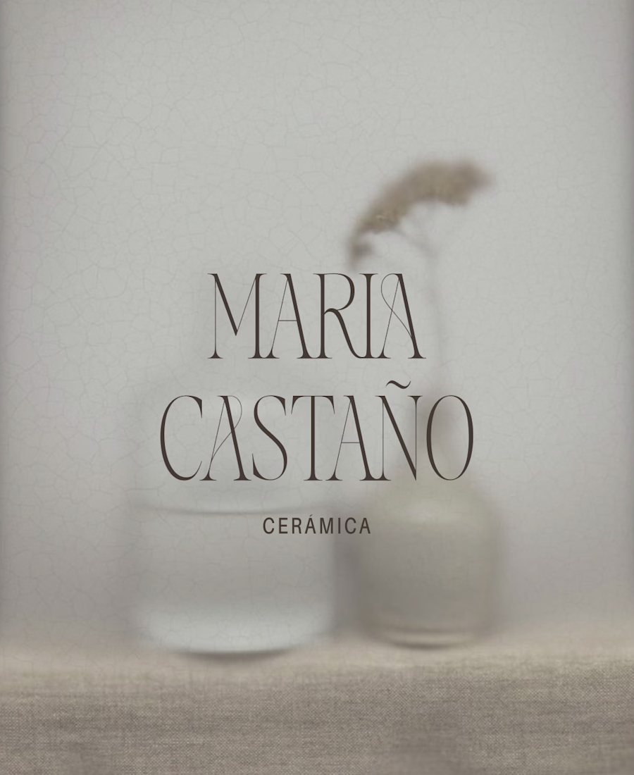
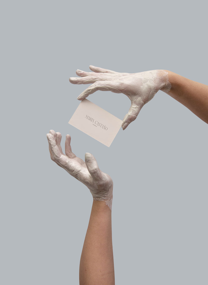
María Castañó Ceramica
Brand Identity System — Case Study
Services: Brand strategy · Visual identity · Brand book
Year: 2026
Category: Branding
The brief
María Castañó makes ceramic objects by hand — pieces that carry weight, texture, and the memory of the process that created them. Her work had found an audience, but her visual presence didn't reflect the intention behind the objects. There was a gap between the depth of her practice and how she was showing up: no consistent identity, no language to describe what made her work different from other ceramics studios.
She needed a brand that could hold that depth without flattening it.
The challenge
The ceramics market is crowded with a particular aesthetic — neutral tones, rustic textures, artisanal warmth. The risk was building a brand that looked like everything else in the category: beautiful, but generic.
María's work is not generic. Each piece is born from a personal decision. She doesn't replicate styles or follow trends — her process is a commitment, and the objects carry that responsibility. The brand needed to communicate exactly that: not craft as aesthetic, but craft as ethics.
The second challenge was tone. María doesn't sell urgency or impact. Her language is slow, material, honest. The brand had to speak that way too — no excess, no decoration that doesn't earn its place.
The approach
I started with the brand DNA: identifying the pillars that would protect the project's core objective regardless of where it showed up. Three emerged clearly:
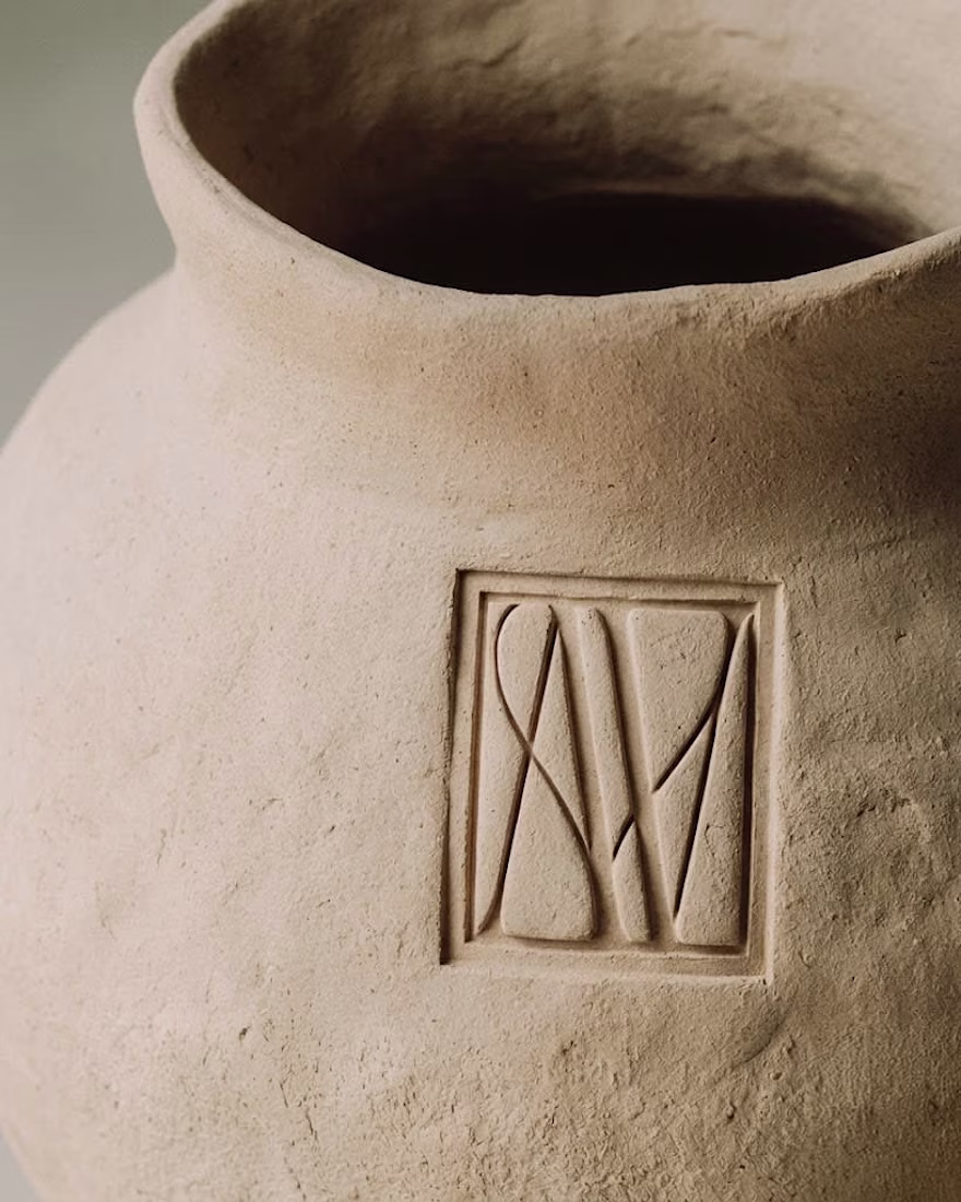
Autoría consciente — Every piece is authored, not manufactured. The maker's presence is not incidental, it's the point.
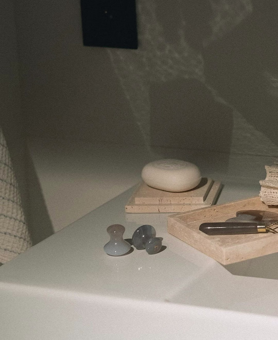
Materialidad — The material is not a neutral medium. Clay has weight, memory, limits, and possibilities. The brand needed to respect that specificity.
Intimidad compartida — The relationship between maker and user is private and ongoing. These aren't decorative objects; they integrate into daily life with discretion and purpose.
From those pillars, the positioning took shape: Dar lugar a lo que merece permanecer — making space for what deserves to last.
The identity
The visual system was built around restraint. A color palette anchored in warm earth neutrals with a CMYK base (45 / 37 / 43 / 4) that reads as neither cold nor saturated — materials, not moods. Typography that favors weight and negative space over decorative detail.
The tone of voice follows the same logic: calm, attentive, unhurried. Language that doesn't chase immediate impact or excess words. It prefers clarity, a measured pace, and leaves room for the person to find their own reading.
Taglines developed for use across social, web, and product contexts:
Belleza que se habita
Lo sencillo permanece
Donde la materia guarda memoria
Formas que construyen hogar
Tiempo, forma y sentido — donde el objeto encuentra calma
Each one works independently. None of them shout.
The deliverable
A complete brand book covering identity DNA, brand pillars, positioning statement, tone and style guidelines, color system, and storytelling framework — built to function as a living document María can hand to collaborators, photographers, or stockists without losing control of how her brand is represented.
The result
A brand that finally matches the objects it represents. María now has the language and the visual system to communicate not just what she makes, but why it matters — and who it's for.
Interested in a brand identity system for your practice?
Nice One
Beautiful work!
Thank you Bella!
This looks clean and well thought out. How long did it take you to bring everything together?
Thank you! It took about 3 to 4 weeks. A lot of that time went into getting the details right.
looks great
Thank you!
Welcome, keep up the good work.
The network for creativity
Join 1.25M professional creatives like you
Connect with clients, get discovered, and run your business 100% commission-free
Creatives on Contra have earned over $150M and we are just getting started
Related posts
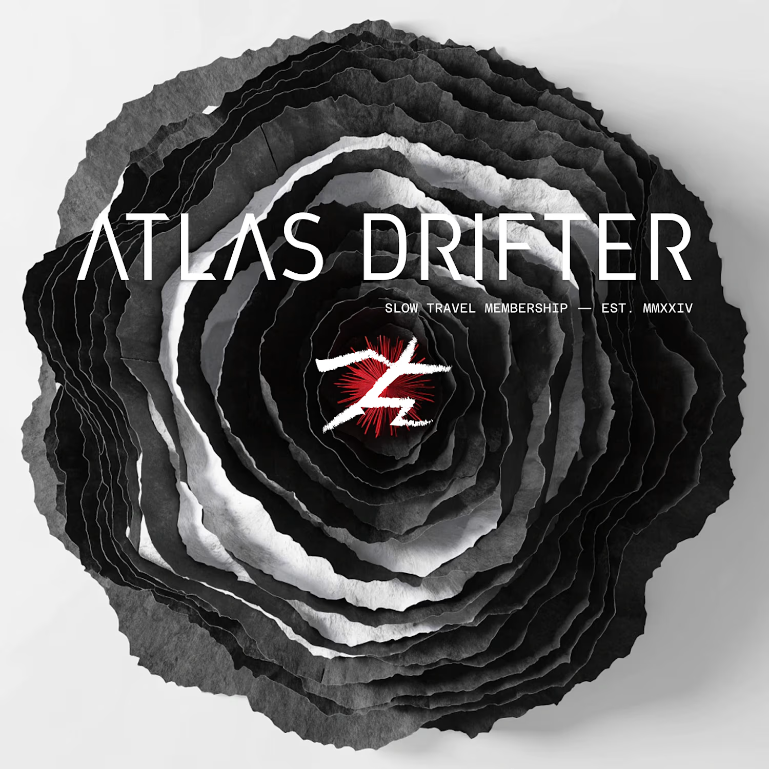
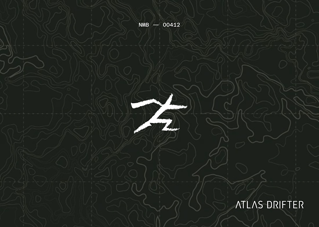
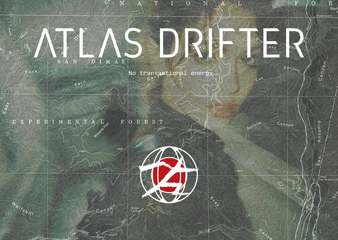
A brand for people who travel the way most people read, obsessively, slowly, over years. The whole system built from one mark that doesn't ask for permission.

Very nice work! I can see all the conceptualization you did for this project.
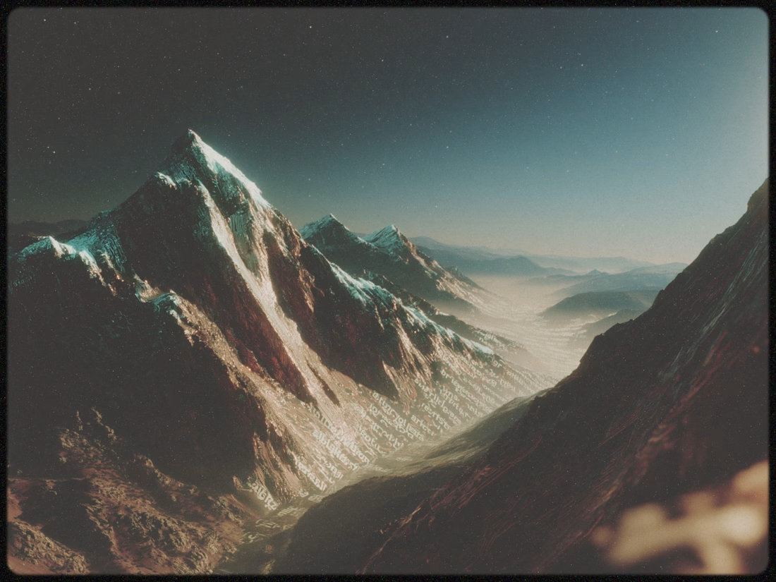
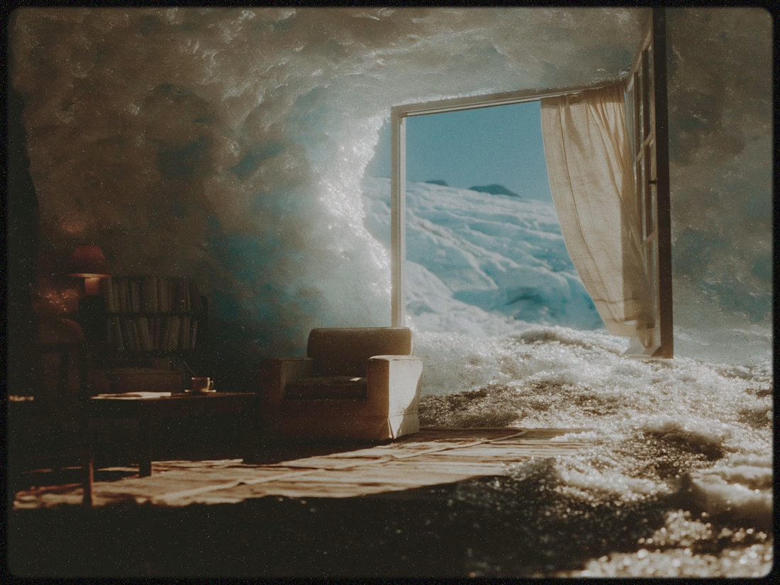
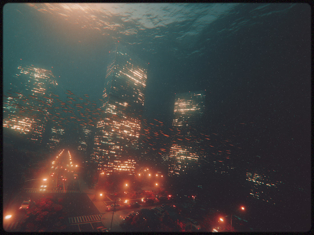
Blending surrealism with Midjourney v8.1
Nice.
Starting exploring with Claude design but ran out of credits pretty soon. Completed the design in Figma. The perks of knowing what you do in and out!
Did it turn out well? Or I should let Claude finish the incomplete task when credits are reloaded in 2 days?
great job 👌
Trending
Claude
Claude has entered the design space. How are you using Claude Design?
Contra University
Learn from expert creatives how to earn more using next-gen AI tools.
creativeaiflow
Creative AI workflows are evolving. What tools do you use, and what are their strengths and weaknesses?
portfolioreview
The best portfolios tell a story, not just show a grid. Share yours for feedback.
freelancerlife
Freelancer life is wins, pivots, and everything in between. What’s yours right now?