The network for creativity
Join 1.25M professional creatives like you
Connect with clients, get discovered, and run your business 100% commission-free
Creatives on Contra have earned over $150M and we are just getting started
Back to feedPost
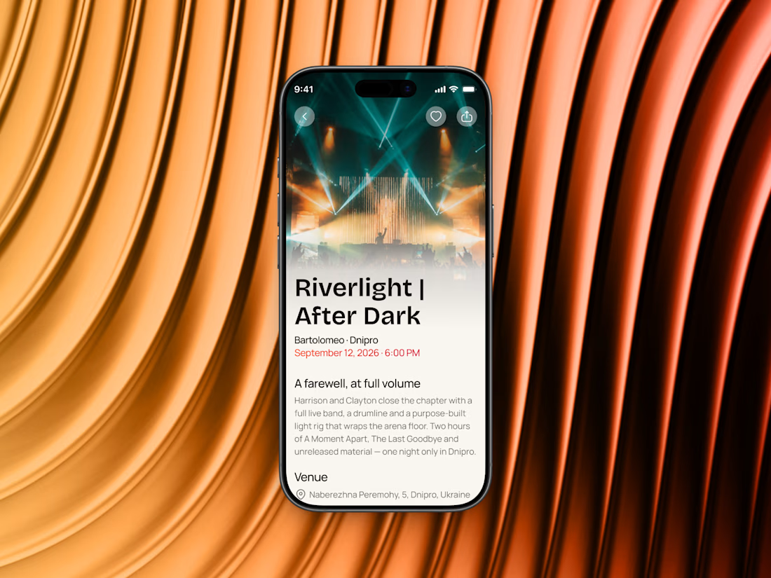
Exploring a simple and engaging experience for discovering live events and booking tickets — from event details to seat selection and checkout.


I would use this app with the great pleasure! I really love it ✨✨✨

Thanks a lot😊


Amazing😍
The network for creativity
Join 1.25M professional creatives like you
Connect with clients, get discovered, and run your business 100% commission-free
Creatives on Contra have earned over $150M and we are just getting started












Related posts

Pulse Athletics... Branding & App design✨
Check it out
#app #sport #productdesign #uiuxdesign #uidesigner #uxdesigner #pulse #branding #brandidentity #brandstrategy #brandguidelines #logo #homepage


That's really stunning app design🔥🔥🔥
Great job Ziva🎉🎉🎉

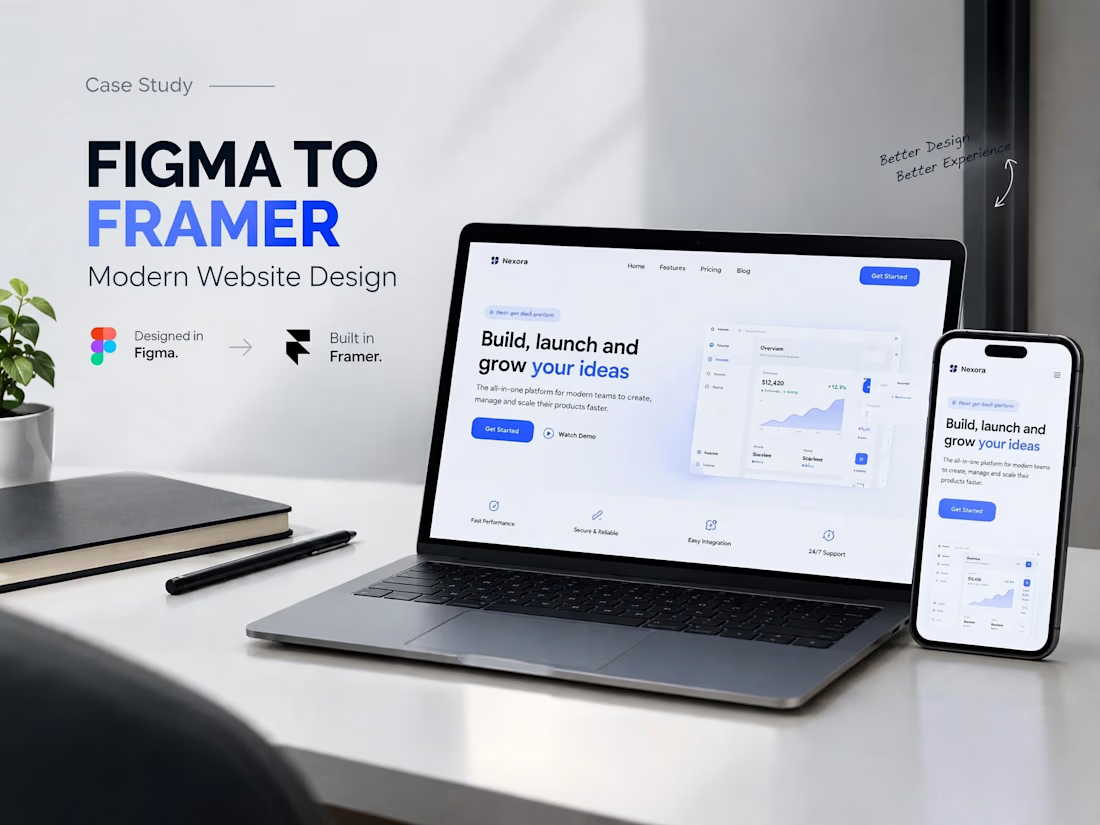
A modern SaaS website concept designed in Figma, featuring clean layouts, intuitive navigation, consistent visuals, and a user-friendly experience across different screen sizes.


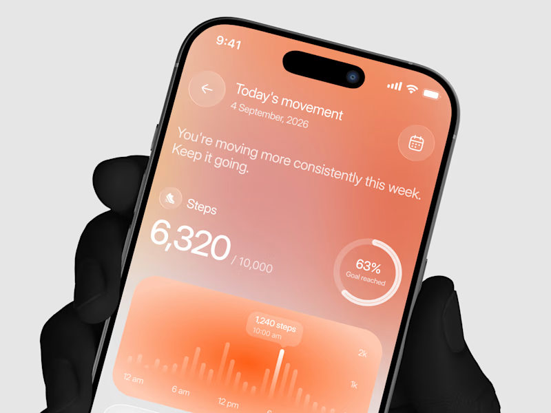
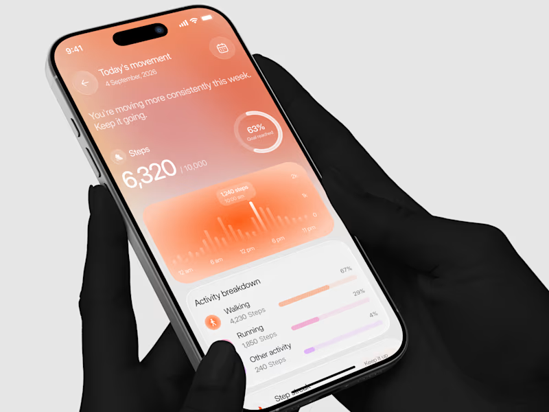
Designed a step tracking screen where you can see your daily progress and weekly trend in one glance.
Same screen, two shots. Which one would stop your scroll? 👀

11 voted
73%
4 voted
27%
15 votes
Closed