Mobile Ticket-Booking Experience Concept

Olena Andreieva


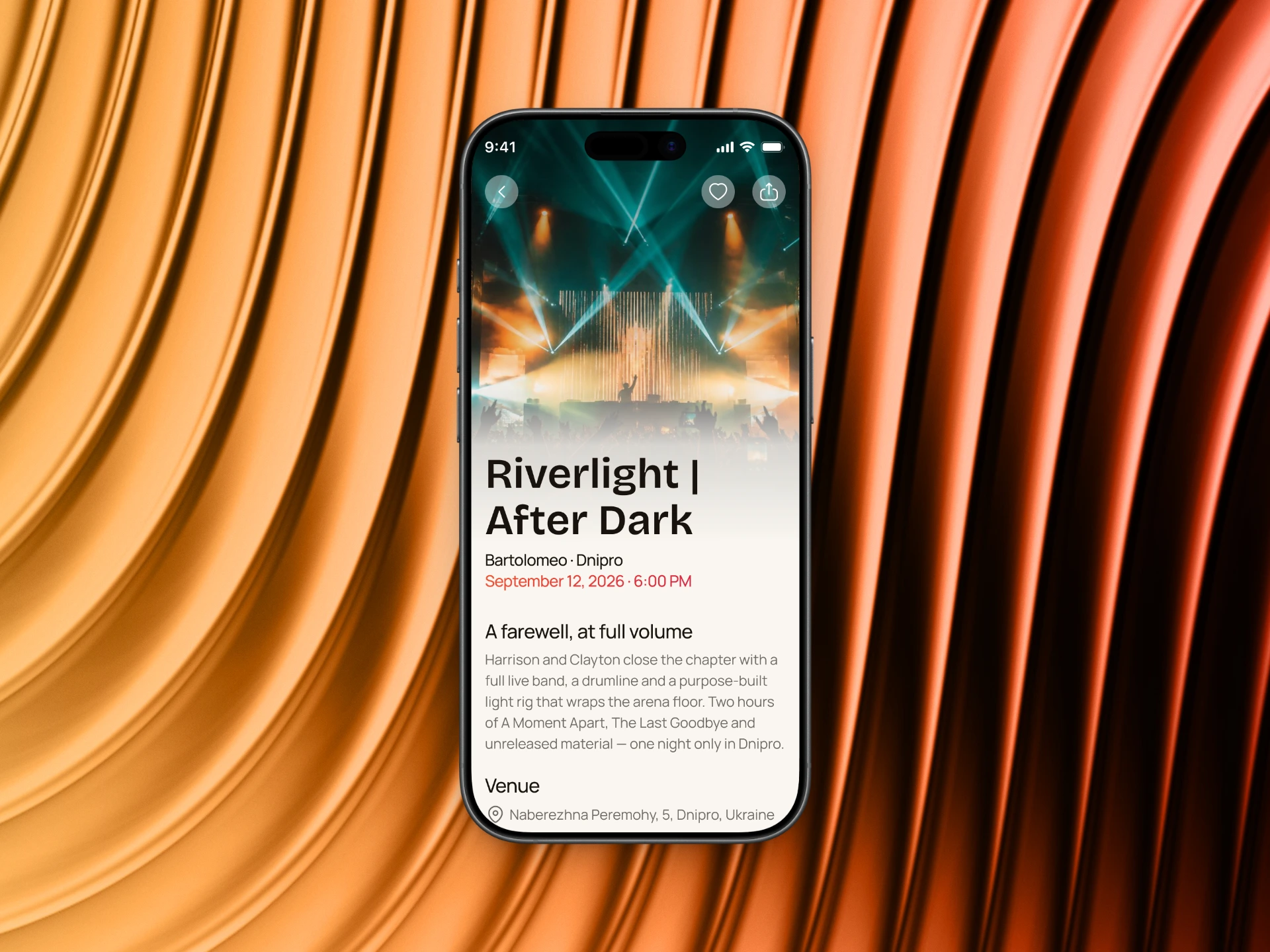
This concept explores how a mobile ticket-booking experience can make going to an event feel exciting from the very first tap.
The journey starts with discovering events that match the user’s interests and continues through event details, ticket options, and an interactive seat map where users can choose exactly where they want to be.
I focused on making each step feel simple and intentional — from building a strong visual hierarchy to using color to distinguish ticket categories and providing clear feedback during seat selection.
Designed in Figma, the concept combines bold event visuals with a clean mobile-first interface to turn what can often feel like a complicated booking process into a smooth and engaging experience.
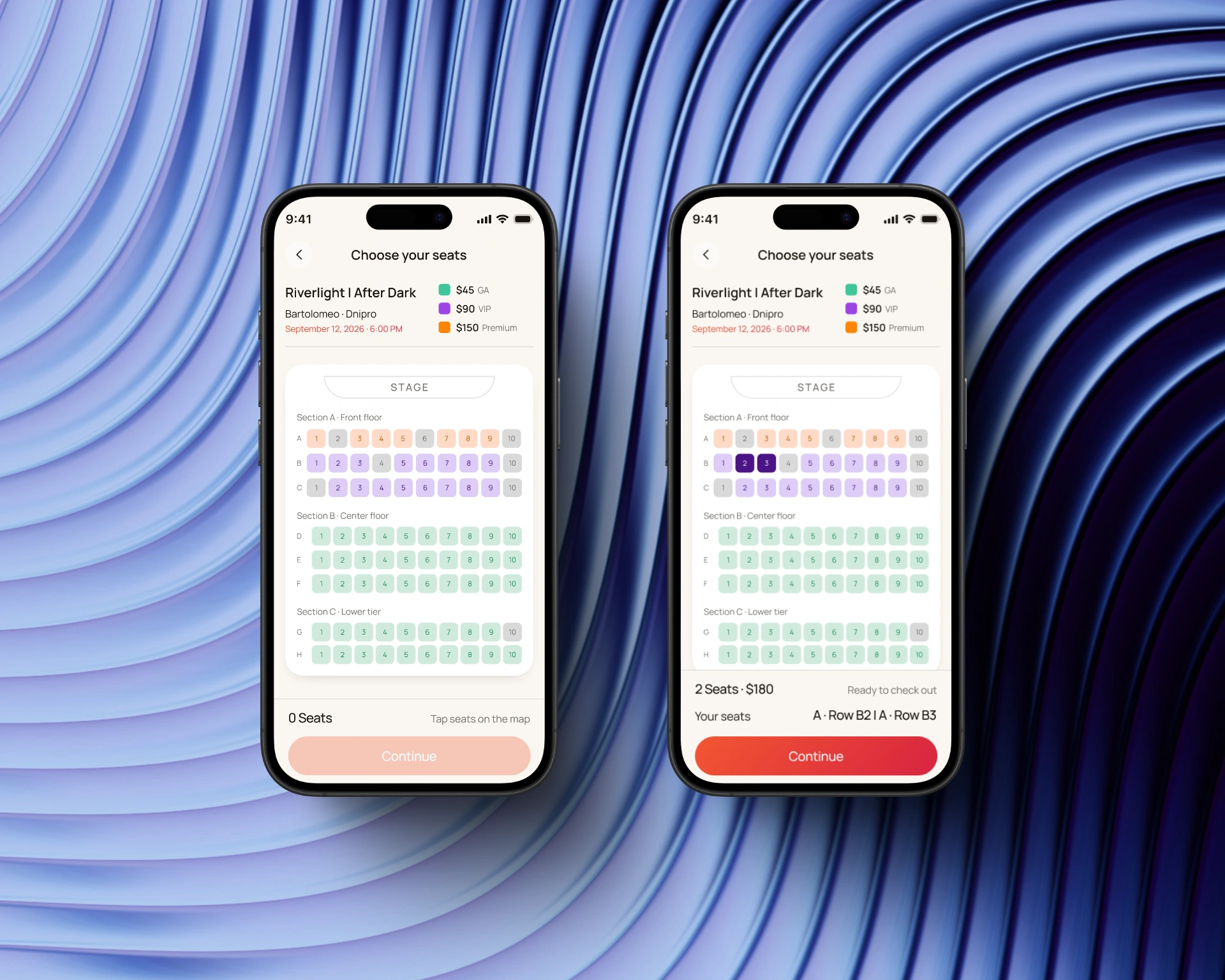
Before & after seat selection
The seat selection screen gives users a visual overview of the venue and available tickets, making it easier to compare options and find the right spot.
Once a seat is selected, the interface provides immediate visual feedback and updates the ticket information, helping users keep track of their choices before moving to checkout.
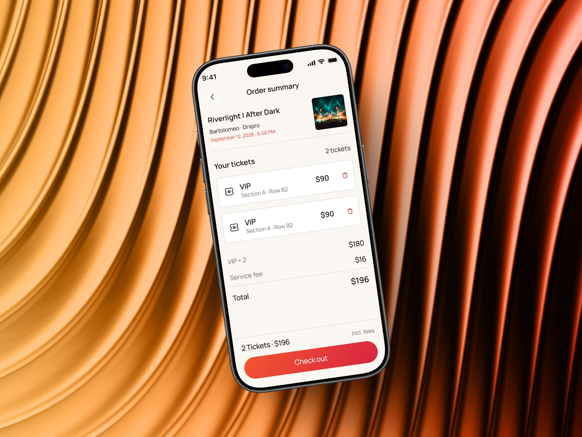
Final order review
The order summary brings the booking details together in one place. Users can review their selected seats, ticket quantity, and total price before completing the purchase.
The layout keeps the most important information visible and makes the final step of the booking process clear and straightforward.
Like this project
Posted Aug 31, 2026
Created a concept for an exciting mobile ticket-booking experience.
Likes
8
Views
33