The network for creativity
Join 1.25M professional creatives like you
Connect with clients, get discovered, and run your business 100% commission-free
Creatives on Contra have earned over $150M and we are just getting started
Back to feedPost
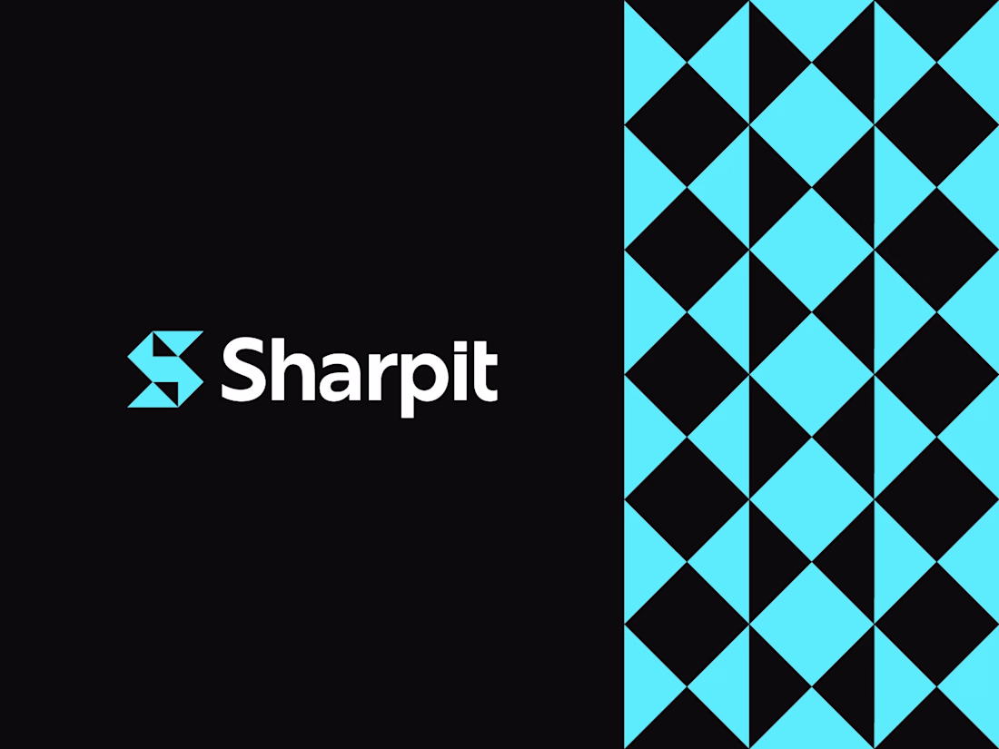
Minimalist at its core, designed to stay strong and sharp without losing its character.
Logo design for Sharpit, with a logomark built from the letter S using sharp, geometric forms.
Curious to hear your thoughts.
I really liked that usage of geometric shapes, nice job🙌
Thank you Mehmet, appreciate it😊
The network for creativity
Join 1.25M professional creatives like you
Connect with clients, get discovered, and run your business 100% commission-free
Creatives on Contra have earned over $150M and we are just getting started
Related posts
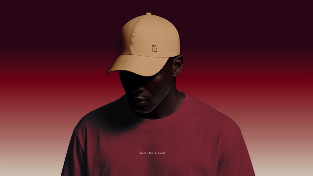
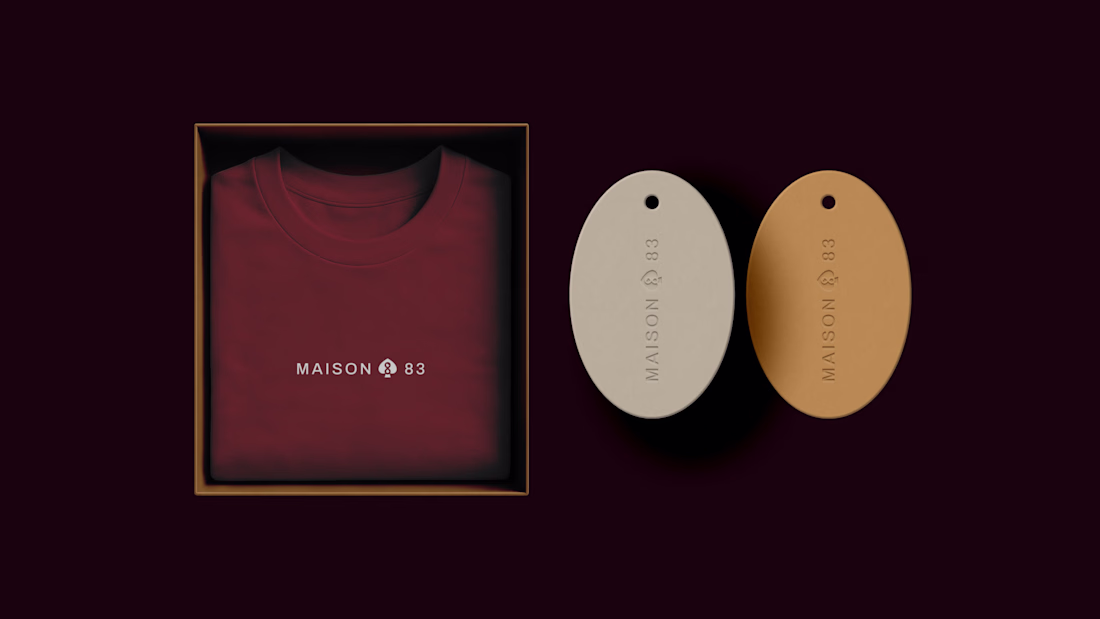
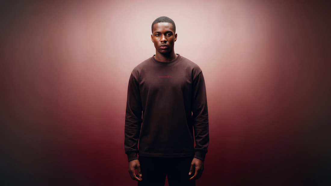
Maison 83 is a fashion and cultural brand built around ownership as identity.
The direction moves away from trends and into something more intentional, with a focus on symbolism, texture, and pieces that feel considered and lasting.
Great choice of colours...
This project started as a website request.
It quickly became a full rebrand.
Antique Woods had years of craftsmanship behind it, but the brand didn’t reflect the level they were operating at.
So we rebuilt it from the ground up.
Also, a quick thank you to @Can Girgin for helping bring my ideas to life in Framer 💫
Nice
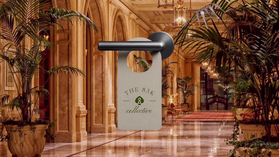
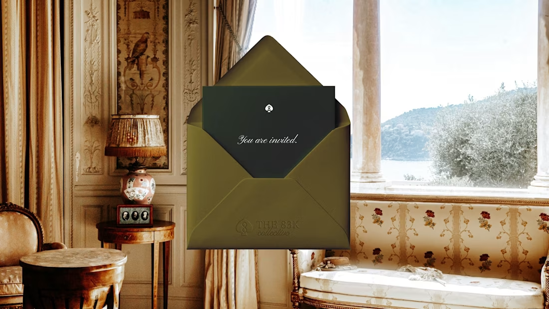
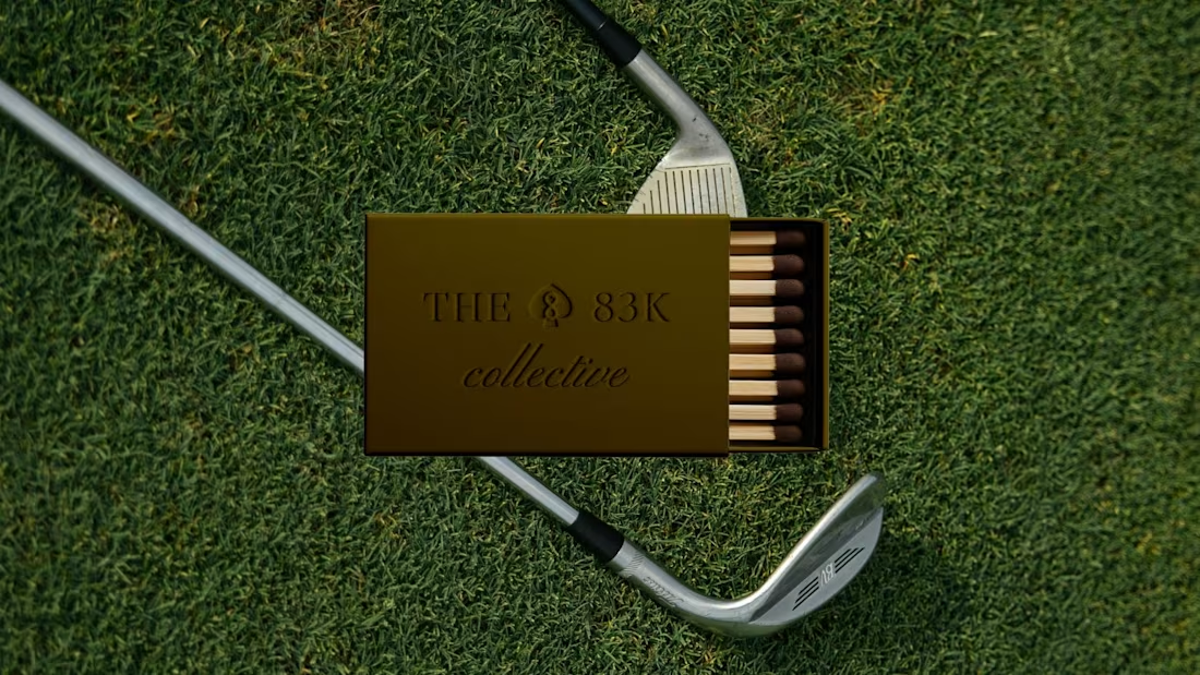
The 83K Collective is a membership-based community connecting operators, investors, and aspiring owners. The identity was designed to feel structured but welcoming, capturing a sense of belonging while maintaining a level of selectivity.
Check out the full case study here
The designs is luxury! Love your work
Trending
Claude
Claude has entered the design space. How are you using Claude Design?
Contra University
Learn from expert creatives how to earn more using next-gen AI tools.
creativeaiflow
Creative AI workflows are evolving. What tools do you use, and what are their strengths and weaknesses?
portfolioreview
The best portfolios tell a story, not just show a grid. Share yours for feedback.
freelancerlife
Freelancer life is wins, pivots, and everything in between. What’s yours right now?
