The network for creativity
Join 1.25M professional creatives like you
Connect with clients, get discovered, and run your business 100% commission-free
Creatives on Contra have earned over $150M and we are just getting started
Back to feedPost

There is a massive gap between "generating" a video and directing one. In my recent work for my client, AI was only the engine. The intelligence and sensitivity were 100% human.
For this project, every decision was guided by the "Precision Culture" and the brand’s new 2026 standard. Here is the strategic intent behind the imagery:
1) Cinematographic Intent: Every camera angle and lens choice was planned and intentional; nothing was left to AI chance. By leveraging 3D, I was able to execute the exact camera angles I had envisioned with surgical precision, ensuring there was true direction in every frame. There was true direction in this video.
2) Beyond the Product: The story isn't about selling shears; it's about the trust placed in the tool.
3) The Ritual of Succession: We constructed a narrative of legacy. When the Katana Master presents his blade and the "Hanzo Artist" presents his shears, we are witnessing the transfer of authority from heritage to hyper-modernity.
4) The Hanzo Code: The choice of silence and paused dialogue reflects the core philosophy: strength is calm under pressure.
This required five days of refinement and a lot of cinematographic decisions to ensure the video wasn't just "generated," but directed properly.
Note: This film was created as a creative spec piece for conceptual exploration. It is a narrative interpretation and does not represent Hanzo’s actual manufacturing facilities or locations.
If your brand’s visual narrative needs more than just “generation”, and it needs a directed vision, send me a message and let’s discuss how to elevate your standards for 2026.


The network for creativity
Join 1.25M professional creatives like you
Connect with clients, get discovered, and run your business 100% commission-free
Creatives on Contra have earned over $150M and we are just getting started

Challenges
View all


Related posts


New cover, new visual taste test.
As a visual director, the hardest choice is choosing between your own creations.
Two covers. Two directions. One choice.
Which one gets your vote?

34 voted
79%
9 voted
21%
43 votes
Closed


the blue background makes the orange shapes pop

What's your one-rule brand? Tell me.
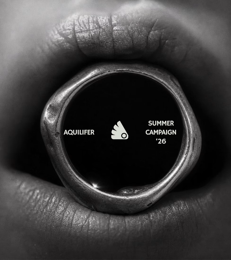
Most jewelry brands photograph the object. This one photographs the grip.
AQUILIFER — a brand I built around one idea: jewelry as something carried, not worn.
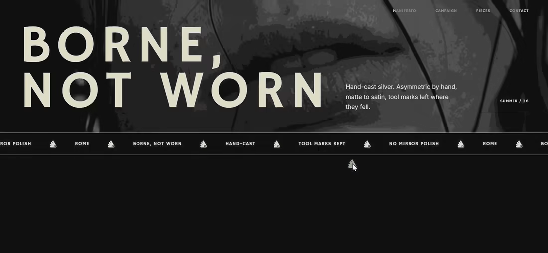
Case study + full site now live.
The name comes from Roman military rank. The aquilifer carried the standard — the one thing the legion couldn't afford to drop.
That single word killed my first direction before I'd finished it.
No polish. No faceted stones.
Hand-cast, asymmetric pieces, tool marks left visible.
Photography went extreme macro, unretouched skin, hands gripping the face instead of posing near it.
Color system: two darks instead of one dark + accent.
#1E1E1E and #27331A let the brand shift register — campaign world to product world — without ever going light.
#D9DED4 stays structural only. Never a fill.
Motion rule on the site: diagonal masks only. No rotation, anywhere.
A spinning object reads as being shown off. This brand is about weight, not display.
Same angle, same easing, top to bottom.
One idea, held all the way through — name, object, photography, palette, motion.
That's the whole pitch for how I work.

Absolutely love your works!

Crafted a few surreal frames with GPT 2.5 Sunburst, then brought them to life using Seedance's multiframes feature.
