The network for creativity
Join 1.25M professional creatives like you
Connect with clients, get discovered, and run your business 100% commission-free
Creatives on Contra have earned over $150M and we are just getting started
Back to feedPost
Taste Test


Normal text is better
The network for creativity
Join 1.25M professional creatives like you
Connect with clients, get discovered, and run your business 100% commission-free
Creatives on Contra have earned over $150M and we are just getting started



Related posts


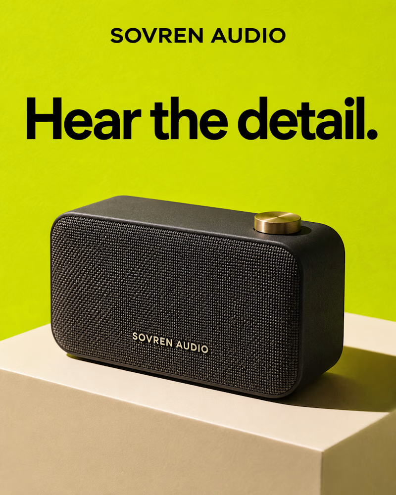
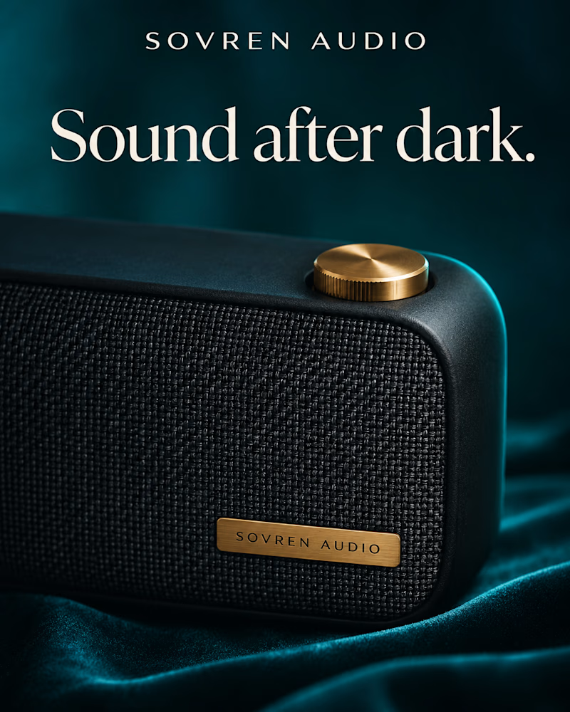
Which one would you launch it with?
The first is a black woven speaker with a brass dial, set on a cream block against acid green, flat daylight, the wordmark printed small on the grille, a heavy black sans headline across the top.
The second is the same speaker shot close and low on teal velvet, the weave filling the frame, a brass plate on the grille and the dial catching the only warm light, the headline in cream serif.
One sells clarity. The other sells mood.
👇 #productdesign #brandconcept #productphotography
3 voted
50%
3 voted
50%
6 votes
Closed

B for me. It feels more distinctive and gives the speaker a stronger premium identity.

I can't pick. You can
I love both, which is exactly the problem. Drop an A or B below — I'll pretend I'd already decided
0 voted
0%
2 voted
100%
2 votes
Closed

Both animation looks great and beautiful(i loved both) but for me the first one works better because it take no extra long time to unveil the name while the second one takes a little longer time to reveal the company name.

From the StarlightIQ promo. Hundreds of dots, one shape, no hard cuts anywhere. Can you see the difference?
12 voted
57%
9 voted
43%
21 votes
Closed

So smooth, I really can't spot a single cut. Going with 2 on this one.