The network for creativity
Join 1.25M professional creatives like you
Connect with clients, get discovered, and run your business 100% commission-free
Creatives on Contra have earned over $150M and we are just getting started
Back to feedPost
Taste Test

I can't pick. You can
I love both, which is exactly the problem. Drop an A or B below — I'll pretend I'd already decided
2 votes
Ends in 1d


Both animation looks great and beautiful(i loved both) but for me the first one works better because it take no extra long time to unveil the name while the second one takes a little longer time to reveal the company name.

The network for creativity
Join 1.25M professional creatives like you
Connect with clients, get discovered, and run your business 100% commission-free
Creatives on Contra have earned over $150M and we are just getting started



Related posts

Which one do you think i should put as a FEATURED SECTION cover on linkedin? Help me decide!
1 voted
33%

2 voted
67%

3 votes
Closed


which one matches your headline better? thats usually the tiebreaker for featured covers

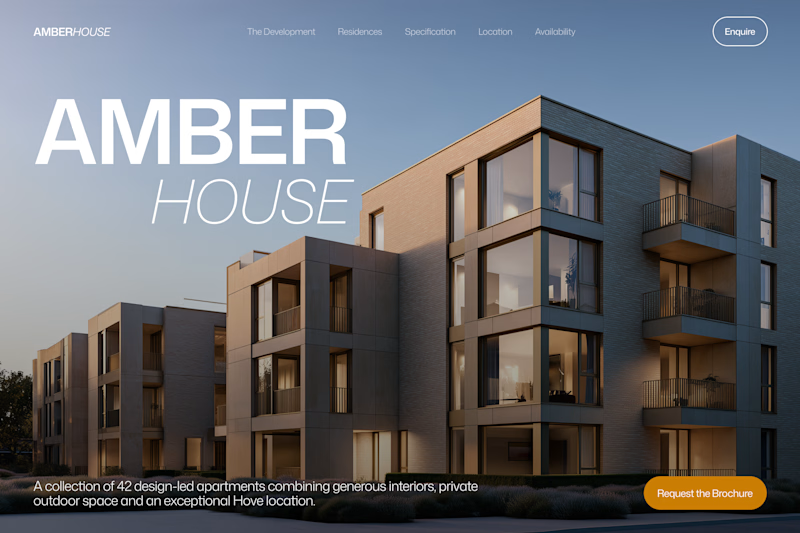
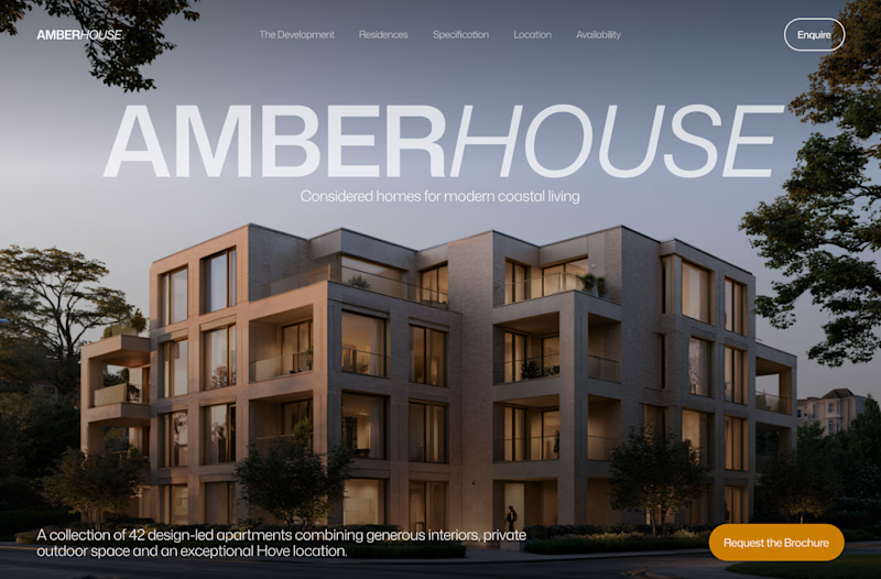
Which hero would you choose — 1 or 2?
Two directions for Amber House, my real estate website template. The first pairs a closer architectural crop with an asymmetric layout. The second gives the building more breathing room, with a wide view and a centered headline.
Same template, two different first impressions. Which feels stronger to you, and why?
24 voted
59%
17 voted
41%
41 votes
Closed

I will go with Bold & Asymmetric!

Exploring the listening state for an AI voice interface.
Which direction would you ship, A or B?
10 voted
29%
25 voted
71%
35 votes
Closed
The particle field looks more polished and beautiful🔥