The network for creativity
Join 1.25M professional creatives like you
Connect with clients, get discovered, and run your business 100% commission-free
Creatives on Contra have earned over $150M and we are just getting started
Back to feedPost

YouTube Thumbnail Redesign — CTR Focused (Real vs Fake Concept)
This project was a redesign of a money-earning app video thumbnail.
The original thumbnail had too much text and multiple visual elements, which weakens instant readability on mobile screens.
Goal was to make viewers immediately understand the video question: Is the app real or fake?
So I simplified the design and focused on:
• Clear visual hierarchy
• Strong emotion reaction
• High contrast colors
• 2-second readability
The redesign communicates the core curiosity faster, which helps improve click-through rate.
Before
Too much information
Weak focal point
No immediate question hook
Hard to read on mobile
After
One clear message: REAL OR FAKE
Strong pointing reaction
Focus on phone (subject)
Cleaner composition for higher CTR


The network for creativity
Join 1.25M professional creatives like you
Connect with clients, get discovered, and run your business 100% commission-free
Creatives on Contra have earned over $150M and we are just getting started






Related posts

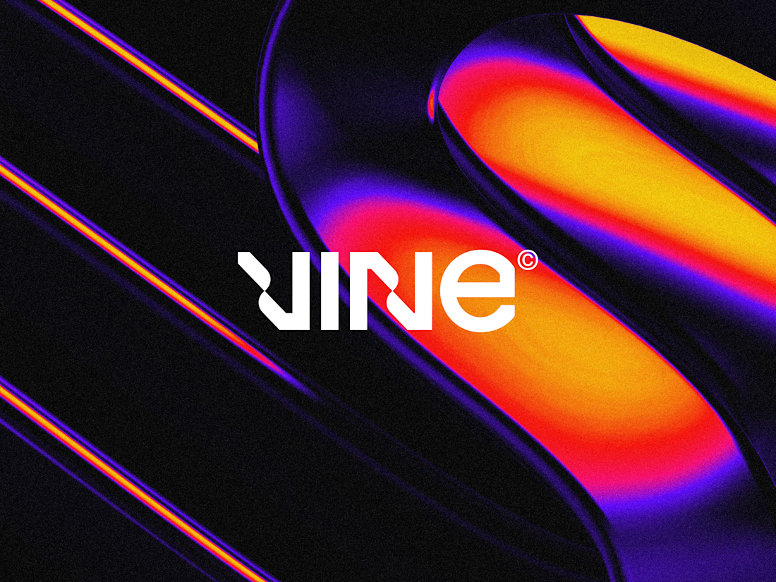

The sharp V pops against that vivid gradient.


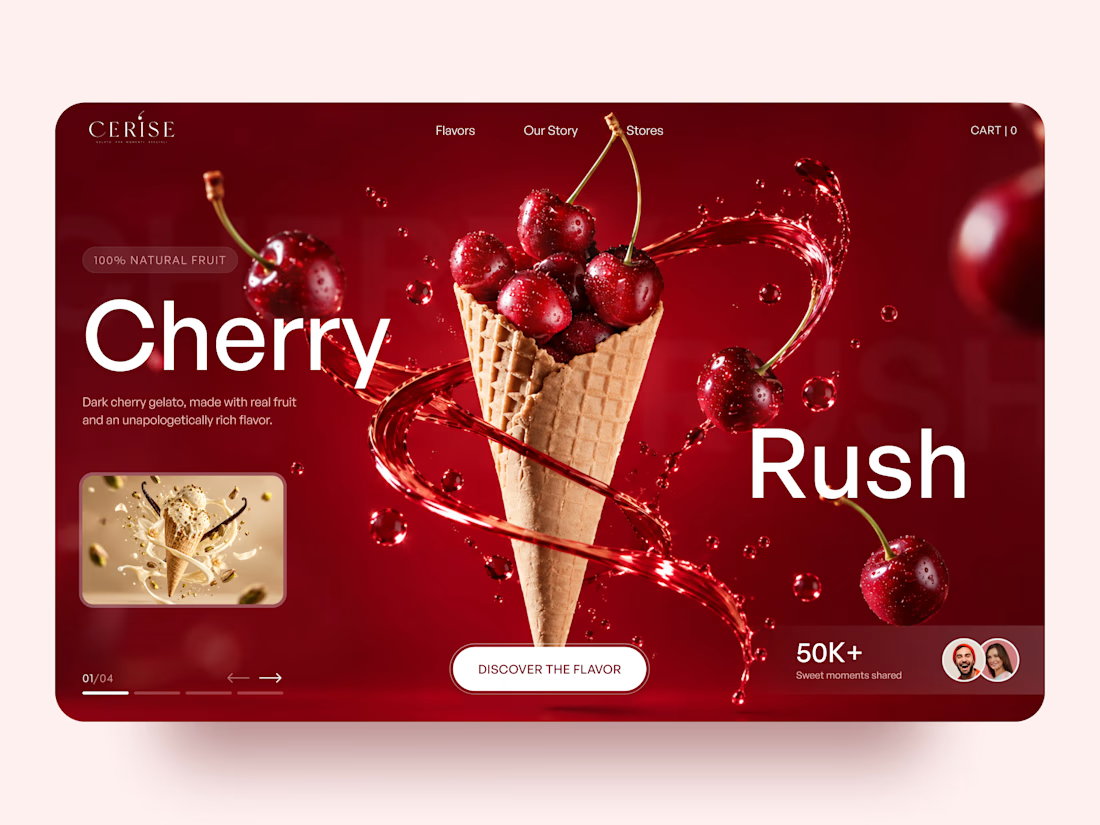
Very juicy. Didn't you feel like having some berries while working?

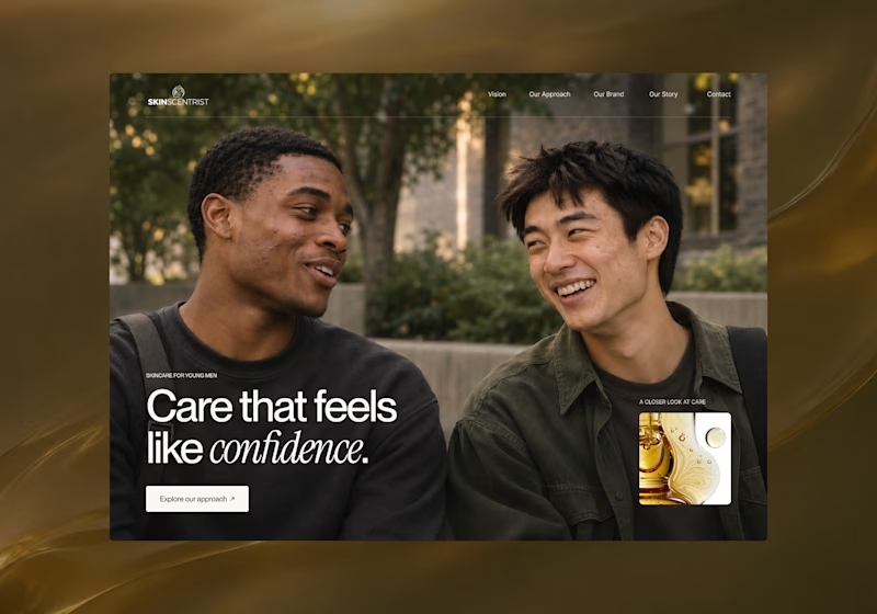
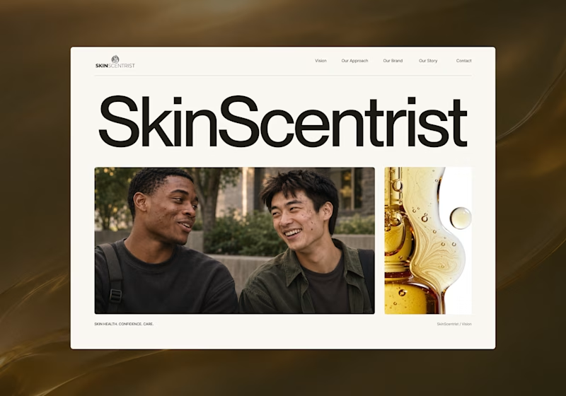
I’m exploring two homepage hero directions for SkinScentrist, a skincare brand focused on helping young men feel more confident in their skin.
Both concepts use the same imagery but take very different approaches to storytelling and visual hierarchy.
Direction 1 feels more emotional, immersive, and lifestyle-driven. The full-screen photography and bold messaging create a stronger connection to confidence and self-care.
Direction 2 feels more minimal, editorial, and brand-focused. The oversized typography, clean layout, and product imagery give it a more refined, contemporary skincare feel.
Direction 1: immersive, personal, emotional
Direction 2: minimal, editorial, premium
Which direction feels stronger for a modern skincare brand?
14 voted
93%
1 voted
7%
15 votes
Closed
Direction one — the full-screen photo feels warmer.