The network for creativity
Join 1.25M professional creatives like you
Connect with clients, get discovered, and run your business 100% commission-free
Creatives on Contra have earned over $150M and we are just getting started
Back to feedPost

I chose water because it’s the most basic thing we all need. It felt like the most honest product to work with.
Everyone needs it, everywhere — no matter the context.
FIJI Water felt like the right choice because the brand is already tied to origin and place. It carries a sense of distance and purity.
Where it comes from matters more than what it says.
So instead of explaining that, I pushed it visually.
When the setting is absurd and the behavior stays normal, the product feels confident.
That’s the direction behind this piece.
Made with AI using Morphic.
#MorphicChallenge

Yooo this is insane! 🤯
Thank you so much!🙌

Woah! So cool
Thank youu!


Wow this is insane that this was created with Morphic! We are living in a cool time!
Such a good time to be alive right! Thanks Zoe 🙌


This is amazing! Really really loved this. Great work.
As written in the guidelines, it would be amazing if you could share your final submission on at least one social platform tagging Morphic!
Instagram: @morphicstudios
X/Twitter: @morphic
LinkedIn: @morphic
Thank you so much! i did share it on LinkedIn 😍
Amazing! Possible to share the link?

Creative Ideation!
Thanks a lot!

Unique and minimal as always from my colleague, love it bro!
Thank you bro!


this is insanely good!!🤯
Thank youuu <3

as the former SMM for charity: water, the mission for the need for water is near to my heart. i love this 🥹 great job, Alec!
Thank you Maia.

Wow! This is so good.

WOW!!!
Thanks man!

Whaaat, this is soo good! First #MorphicChallenge post I'm seeing and it sets a bar! 🤍
Thank youu! means a lot <3

Really strong creative direction here. I like how you anchored the concept in “origin + place” — it’s a smart way to reinforce FIJI’s existing brand equity without over-explaining. The visual-first approach works.
100% agree! Thanks man!

this is amazing, really great work
Thank you!

good choice!
Thanks! 😍

This is so cool
Thank you! 🙌

Winner!
😍 damnnn thanks!

Yooo, this is insane! What frame rate is the video?
Thank you! its 60 i think.


This is sooo good uhuuu 👏👏🔥
Thanks man!

loved it
thanks man!

This is amazing!!
Thank you man🙌 !

🙌

Wait this is awesome
🙌

wow this is insane!!!!
Thank you so much!

Good storyline buddy, only thing I would add is an instrumental cinematic music. 💯
Thank you, i agree!

this is so cool!!!

nice work

insane!


Wooow, amazing! 🔥
Thank youu!

Really crazy
its crazy that is all AI! 🚀

Feels super authentic!
Thank youu!

Amazing! 🥳🥳
Thank youuu🎉
The network for creativity
Join 1.25M professional creatives like you
Connect with clients, get discovered, and run your business 100% commission-free
Creatives on Contra have earned over $150M and we are just getting started






Related posts

I came across this product post here on Contra and thought, “What would this look like recreated on a beach?” So I decided to give it a try.
The idea was to recreate the iki Matcha Latte can entirely in sand, keeping the original branding and details while giving it a natural, beach-inspired feel.
Here’s how it turned out.
Sometimes, all it takes is a product you like and a little creative curiosity to explore a new direction.
What do you think of the final result?

more visuals from iki, a matcha shop i’ve been working on 🍵
the project is getting close to its final stage, and it’s been really interesting to see how the...

Thats such a cool concept 🔥

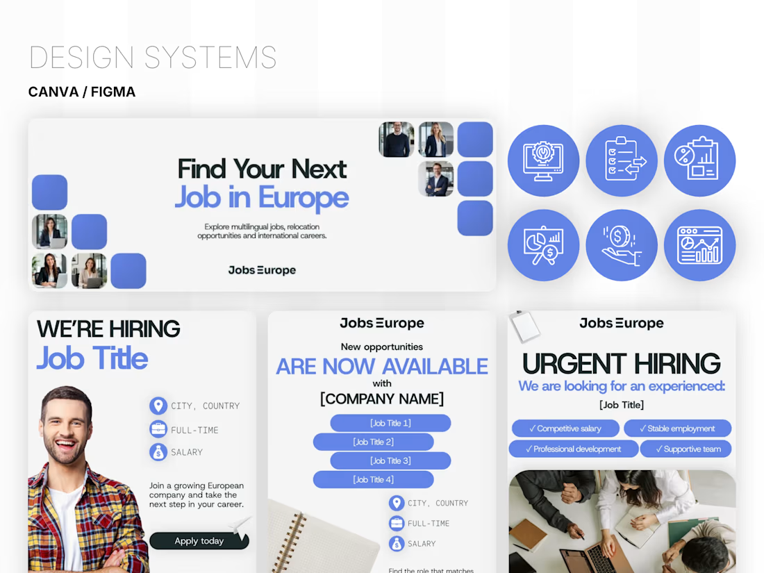
Canva Brand Design System & AI Assistant
I create a complete brand design system in Canva, with a clear visual style, custom brand elements, and reusable templates for your everyday content.
Everything is organized and easy to edit, so you and your team can create new materials while keeping your brand consistent.
The system also includes a custom AI assistant set up with your brand guidelines, visual style, and tone of voice to help you generate images and write content that fits your brand🚀




Today I’m sharing something a bit different from packaging. This is the brand identity I designed for ALVA Industries, a Norwegian company developing electric motor technology.
I wanted it to feel modern and clear, but not too cold or impersonal. It’s a technical field, of course, but I think there’s still room for some character.
What do you think?

Incredible branding kit 🔥🔥🔥🔥
Great job Roberto❤️❤️