The network for creativity
Join 1.25M professional creatives like you
Connect with clients, get discovered, and run your business 100% commission-free
Creatives on Contra have earned over $150M and we are just getting started
Back to feedPost
A beautiful website that doesn’t explain the product is still a bad website.
Visuals can earn attention.
They can make a company feel more credible, distinctive, and valuable.
But once you have someone’s attention, the product still needs to make sense.
What is it?
Who is it for?
Why should I care?
Why should I trust it?
What should I do next?
If the website makes people work to answer those questions, strong visuals won’t solve the underlying problem.
I care a lot about how things look.
But the best visual direction is the one that makes the message stronger, not harder to find.


Absolutely! Especially for small businesses where a phone call is often the main conversion goal. Making contact information easy to find on mobile should be a priority, not something visitors have to search for. Great addition!
The network for creativity
Join 1.25M professional creatives like you
Connect with clients, get discovered, and run your business 100% commission-free
Creatives on Contra have earned over $150M and we are just getting started











Related posts


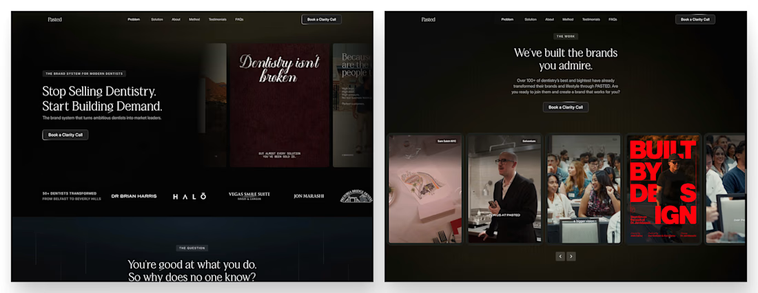
Three weeks into building the Pasted website, after the design was approved, an 11-page document arrived with a whole new vision.
It was beautiful work, and it described a different project at the agreed price.
I asked them to decide: keep the approved scope, or pause and price the new idea separately. On day six, they chose the original. We shipped two weeks later.

Offering to price the new vision as its own phase also lets the client see what the idea costs without it feeling like a no. Was a change-order process already written into your contract, or did you build that path on the spot?

Why does every restaurant group fix inconsistency with a bigger logo?
I tried a smaller one with a better schedule
Norr & Co.

This is very nice 👌


EarthHub – A Platform for Nature Expeditions ⛰️
Stumbled upon this project in my hard drive, had to publish!


Top to bottom nice work