The network for creativity
Join 1.25M professional creatives like you
Connect with clients, get discovered, and run your business 100% commission-free
Creatives on Contra have earned over $150M and we are just getting started
Back to feedPost

Every tap should move your visitors forward.
Simple navigation, consistent content, and fast-loading pages help people explore your website comfortably on mobile.
Swipe through 3 essentials to check before your next website launch. →
Can visitors find what they need and take action easily on your site?

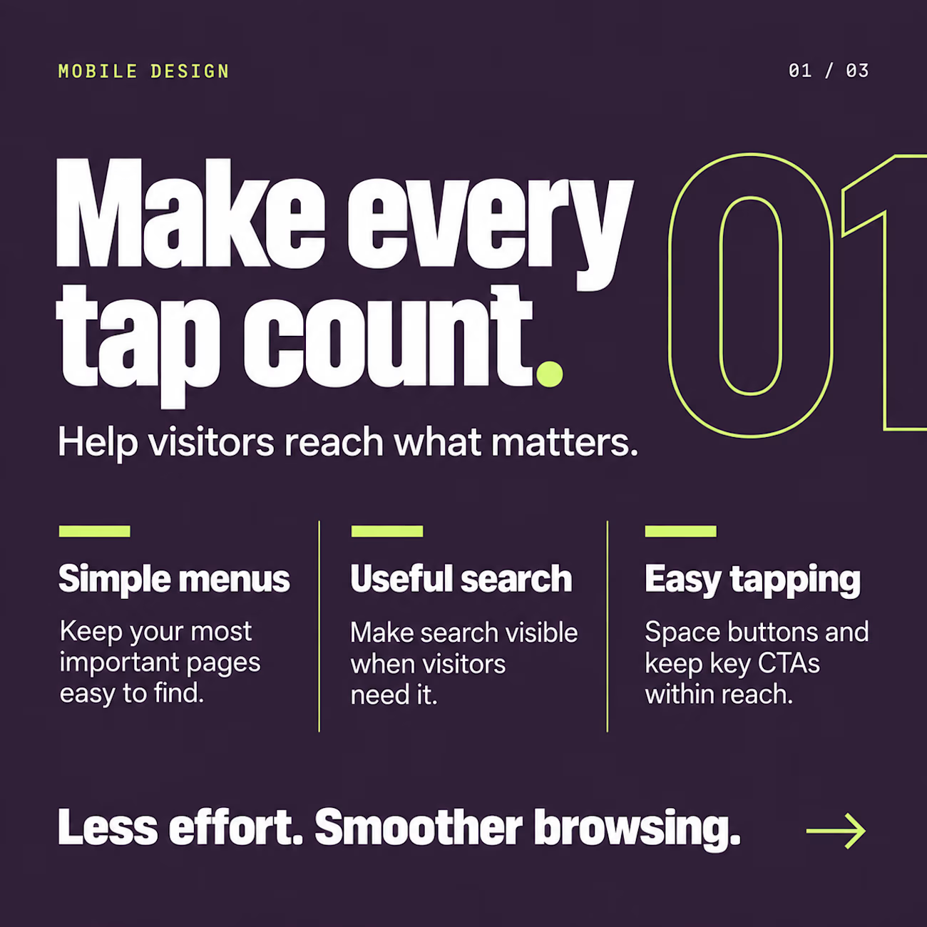
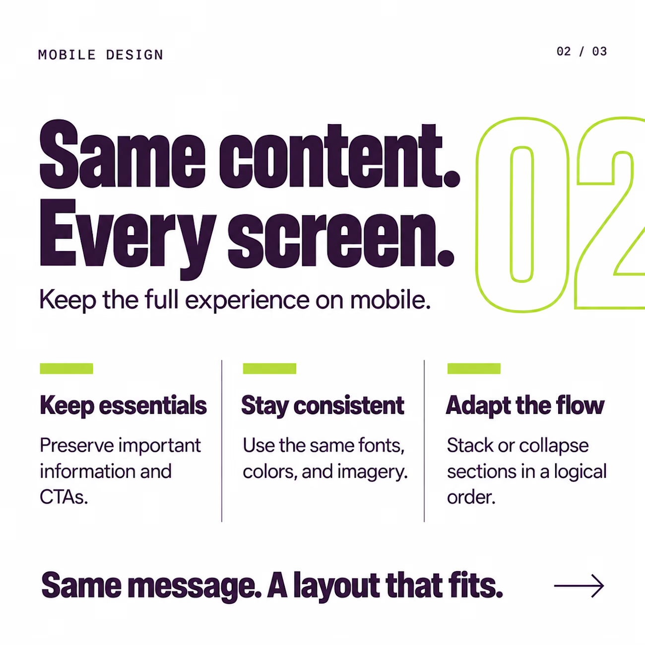
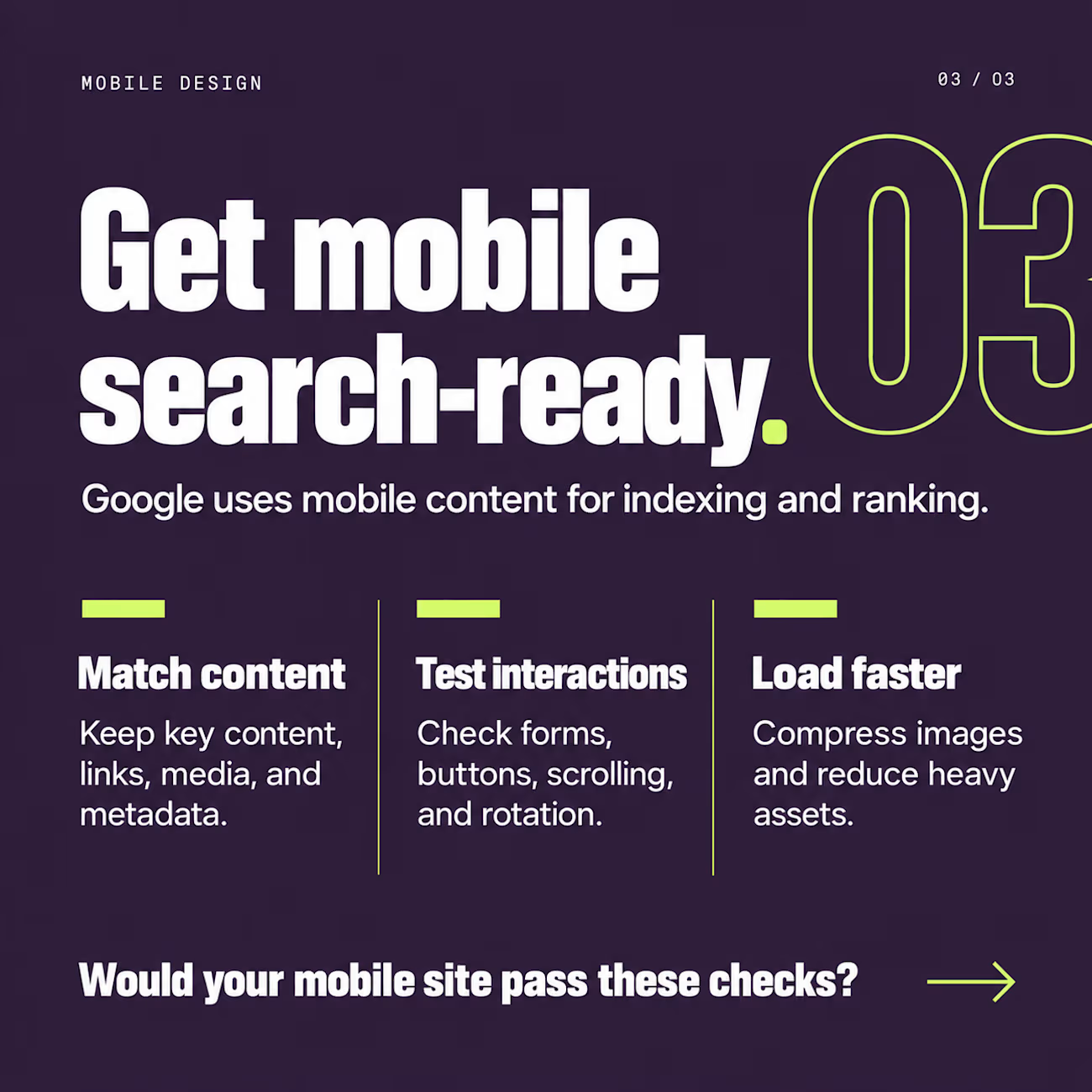

Fast-loading is the essential most teams underinvest in. I've found compressing the hero and lazy-loading below-the-fold assets does more for mobile flow than any nav tweak.
Absolutely. Performance starts with the assets, optimizing the hero and delaying everything below the fold can make a noticeable difference in the overall mobile experience.

This is such a practical reminder—mobile speed is part of interaction design, not just a technical metric. Compressing the first visual while protecting the content hierarchy can make the whole flow feel lighter.
The network for creativity
Join 1.25M professional creatives like you
Connect with clients, get discovered, and run your business 100% commission-free
Creatives on Contra have earned over $150M and we are just getting started

Challenges
View all


Related posts


Would you keep scrolling? I would.
There’s something really appealing about an agency website that feels this comfortable having fun.
That comes through in both the design and the writing.


the CRAFTING CHAOS headline is fun. what made you pick that type?

Crafting the Visual Identity for Elichi Coffee | Case Study
For Elichi, the goal was to build a brand identity that captures the ritual of craft coffee. The visual direction balances modern simplicity with a warm, sensory feel—creating a clean yet inviting identity across every touchpoint.
Design Highlights:
Custom Typography: Paired clean, modern letterforms with subtle editorial accents to establish an elevated, boutique feel.
Packaging & Collateral: Used generous white space and structured layout grids so the physical packaging feels premium in hand.
Palette & Materials: Blended deep, roasted tones with soft, muted neutrals to reflect the warmth of the space and the richness of the brew.
I’d love to get your feedback on this direction:
How does the balance between modern typography and warm tones feel to you?
Does the packaging strike the right balance between minimal and welcoming?


Cool work 🙌

This happens to me pretty often…
A client asks for a more modern website.
At first, it sounds like a visual problem. But once I look beneath the interface, I may find that:
→ The offer is difficult to understand.
→ The strongest proof is buried.
→ The navigation reflects the company, not the user.
→ The CTA appears before enough confidence has been built.
At that point, changing the layout won’t solve the actual problem.
The work becomes defining what users need to understand, what will make them trust the business, and what should help them take the next step.
The brief says redesign.
The project says strategy.
Fellow designers: what’s the most common problem you discover hiding behind a redesign request?


Always bad positioning disguised as a visual problem. Clients think they need new UI when they really need clear messaging and proof.