The network for creativity
Join 1.25M professional creatives like you
Connect with clients, get discovered, and run your business 100% commission-free
Creatives on Contra have earned over $150M and we are just getting started
Back to feedPost
Taste Test

Netherlands or Spain?
Both are warm, bold palettes, but they behave very differently.
I keep changing my mind about which one I prefer.
If you were building a brand with one of these, which would you choose?
A · Netherlands
B · Spain
And I’m curious why. Is it the color relationships, the mood, or simply the palette you’d find easier to use?
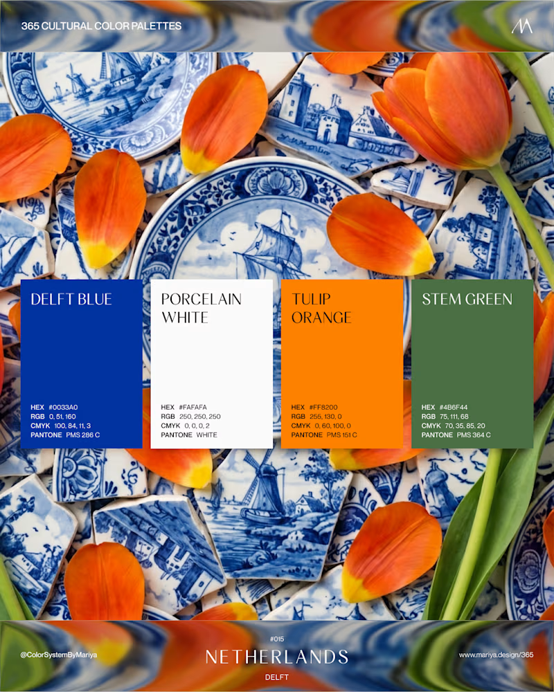
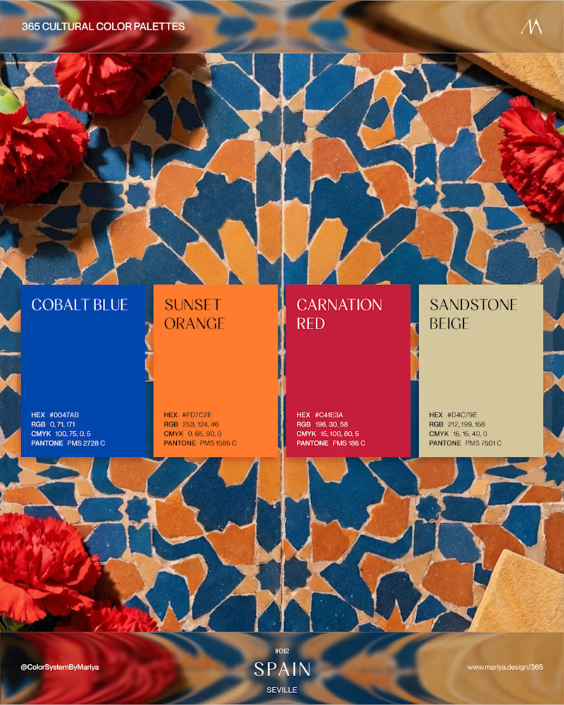
5 votes
Ends in 1d


Netherlands
That one got half a million views on Pinterest 😊

The network for creativity
Join 1.25M professional creatives like you
Connect with clients, get discovered, and run your business 100% commission-free
Creatives on Contra have earned over $150M and we are just getting started

Challenges
View all


Related posts

If your dashboard has to be beautiful OR instantly understandable, which one wins?
I designed two visual directions for the same AI Sales Agent dashboard.
Same product. Same data. Same core UX.
Only the visual language changed.
Poll options:
A — Clarity First
B — Energy First


30 voted
53%

27 voted
47%

57 votes
Closed

A clarity outstanding

Which cover for a new case study do you like more?
19 voted
40%

29 voted
60%

48 votes
Closed

Really inspiring work!


Which pack would you grab at the till?
One is cool and precise: brushed steel tin on a blue plinth, a lit circle behind it, white pellets suspended in a slow arc under one hard beam.
The other is loud and playful: translucent pink case shaped like the fruit, lime green set with an arched recess, seeded cubes tumbling around it in flat bright light.
One sells control. The other sells fun. 👇
#brandconcept #packagingdesign #artdirection
11 voted
39%

17 voted
61%

28 votes
Closed

Would have preferred frost having the melts casing