The network for creativity
Join 1.25M professional creatives like you
Connect with clients, get discovered, and run your business 100% commission-free
Creatives on Contra have earned over $150M and we are just getting started
Back to feedPost

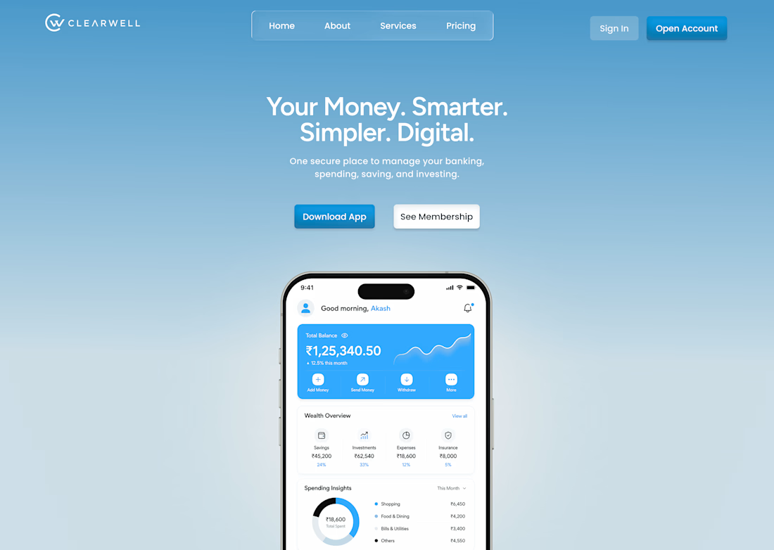
Designed a landing page concept for Clearwell, a digital banking app — focused on making finance feel simple, modern, and trustworthy.
The Challenge
Most fintech interfaces feel either too corporate or too cluttered. I wanted to design something calm and premium, where users feel confident managing their money without visual overload.
What I Focused On
→ A soft blue gradient to build trust without feeling cold
→ The balance card as the primary visual anchor — everything else supports it
→ Generous spacing, since financial data is already dense
→ Clear CTA hierarchy — primary action (Download App) stands out, secondary (See Membership) stays subtle
Tools: Figma
This is an evolving project — currently working on v2 with refined spacing, color consistency, and micro-interactions.
Open to freelance UI/UX and frontend work — let's build something together.

The network for creativity
Join 1.25M professional creatives like you
Connect with clients, get discovered, and run your business 100% commission-free
Creatives on Contra have earned over $150M and we are just getting started
Trending
retrofuturism
Share your favorite designs from the past exploring the distant future. Or your own take on the aesthetic 🚀
halftone
Dots. Texture. Grain. Let's see your designs using the halftone technique.

Midjourney
Creatives are showing off what they're making with Midjourney.
colorgrade
Video editors sound off: How do you enhance the mood of your video in color grading?
Related posts

Pixelcore — AI & Technology Landing Page 🤖⚡
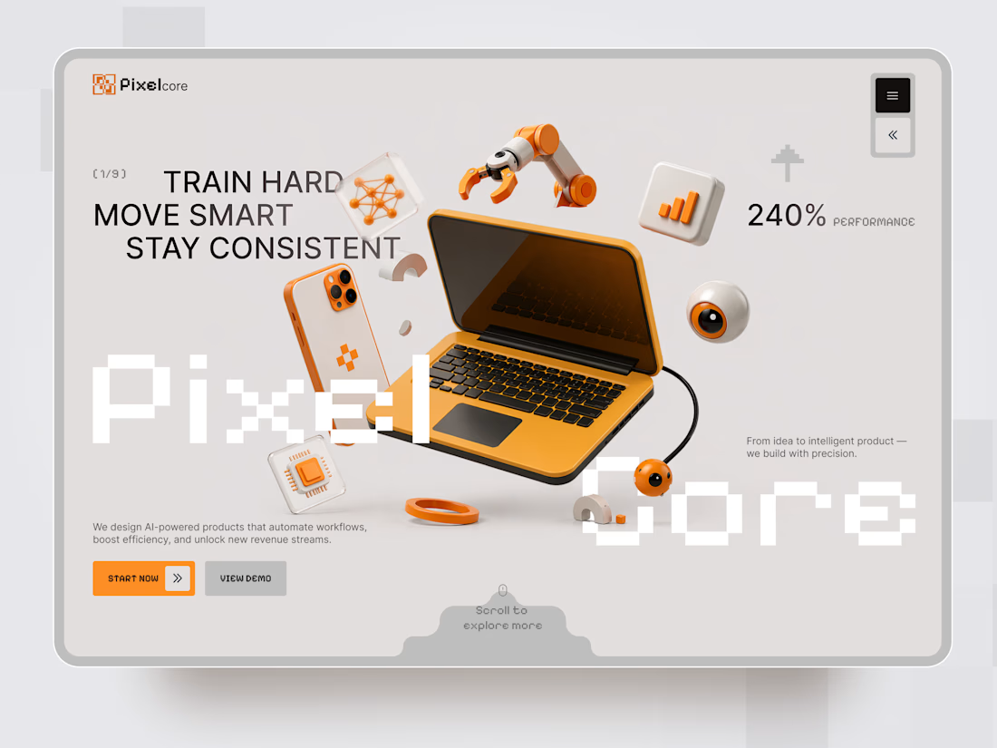
Pixelcore is a futuristic landing page concept for an AI-powered technology company focused on automation, data, integrations, and digital product development.
The goal was to communicate innovation and technical expertise without falling into the typical dark, overly complex AI aesthetic. The visual direction combines a clean monochrome interface with bold orange accents, pixel-inspired typography, and playful 3D technology objects.
Special attention was given to:
• a dynamic hero composition built around 3D tech visuals and strong typography;
• a distinctive orange accent system that guides attention toward key actions 🟠;
• pixel-inspired typography that reinforces the digital and technological character of the brand;
• 3D objects representing AI, automation, analytics, hardware, and connected technology;
• clear CTAs that make the next step immediately visible;
• service cards for AI Automation, Data Insights, Integrations, and Product Design;
• trust elements and performance metrics that support the company’s positioning;
• responsive mobile layouts that simplify the composition while keeping the same visual identity 📱;
• a modular visual system that could easily scale across services, case studies, and additional landing pages.
The result is a clean but expressive digital experience that makes an AI company feel innovative, approachable, and visually memorable — without sacrificing clarity or usability.
Looking to create a distinctive website for your AI, SaaS, or technology product?
Let’s turn complex technology into a digital experience people instantly understand ⚡



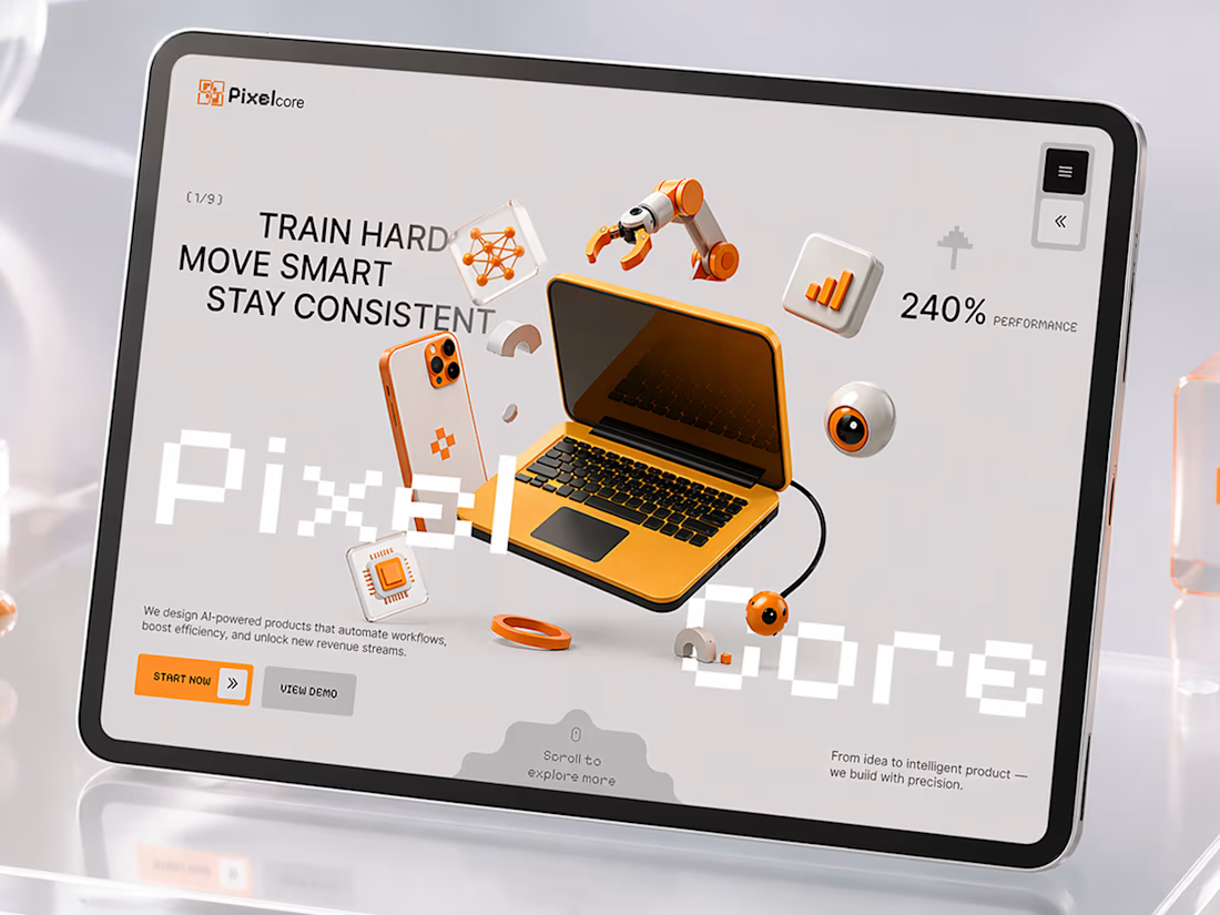

Wow! How did you approach balancing all the 3D elements without making the hero feel too busy?

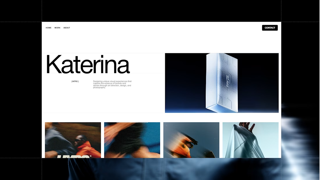
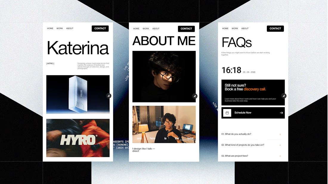
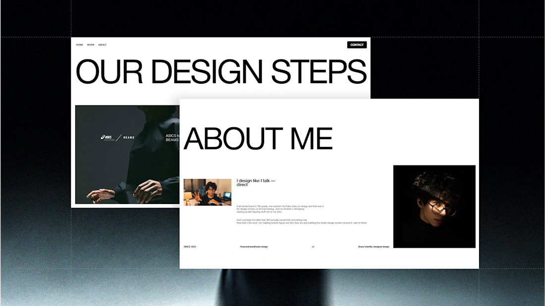
Been working on my portfolio for the past 10 days.
From designing everything in Figma to bringing it all to life in Framer it’s taken a lot of time, but seeing it come together has been worth it.
Still a work in progress, but I’m getting very close to wrapping it up.
Here’s a look at some of the pages so far. 👀


Great work but I have a question that designing everything in figma and then going to framer works better or just do all together in the framer from the start. I learning framer do let me know if thats hard or easy?


outstanding🔥