The network for creativity
Join 1.25M professional creatives like you
Connect with clients, get discovered, and run your business 100% commission-free
Creatives on Contra have earned over $150M and we are just getting started
Back to feedPost


i love this

Clean work🔥

Really fresh concept :) Lovely!

Good work

Looks good!

Nice work as usual! Choosing the soft, organic visual direction brings such a refreshing human touch to modern branding.

Looks great

outstanding🔥


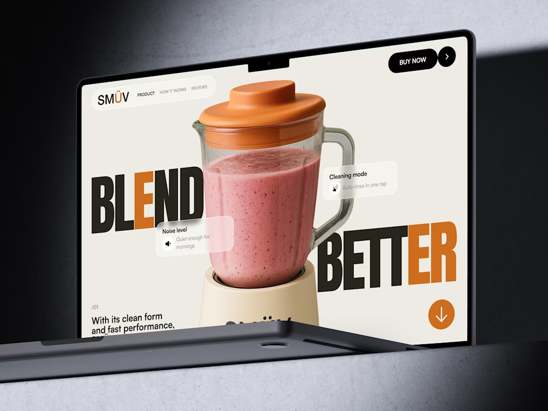
blend better is such a good line

"Blend Better" cutting right through the product shot is a bold move, most kitchen tech pages keep the headline safely above the fold. Was that overlap intentional from the start, or something that came out of iterating on the layout?

So cool ❤️🔥❤️🔥❤️🔥

Awesome 🔥

Wow!

Good design


Nice design !


absolutely insane, deserves a goat

😍 Nice

Looks good👏

this is really cool

Great! Do you use a 3D model or a .png?

Beautiful!


Wonderful

Intuitive and Premium 👌!

Nice!!!
The network for creativity
Join 1.25M professional creatives like you
Connect with clients, get discovered, and run your business 100% commission-free
Creatives on Contra have earned over $150M and we are just getting started













Related posts

A little peek at the brand work we did for Elio Mortgage.
A warm, approachable identity full of warm vibrant colors paired with soft sun rising inspired gradients, inner glows and custom illustrations & more. Loved this direction!
Full case study coming soon, from process to final identity.
Plenty of logo explorations to share too!


That color palette takes the whole identity to a different level!! I loove it.

FOCUS — Creative Portfolio & Digital Art Website 🌸✨
A visually expressive website concept for a creative portfolio, built around digital art, bold imagery, and visual storytelling
The design combines vibrant pink tones, soft gradients, experimental typography, and immersive photography to create a distinctive editorial experience
Special attention was given to:
• Bold editorial hero composition
• Vibrant pink and dark color palette
• Experimental typography and visual details
• Immersive photography and digital artwork
• Creative project gallery and navigation
• Responsive mobile experience
• Clean layouts with a strong visual identity
The result is an expressive digital experience that puts creativity, emotion, and visual storytelling at the center of every screen 💗
Looking to create a standout portfolio or website for a creative brand? Let’s connect 🚀





The vibrant pink against the dark palette gives this such a bold editorial feel. The experimental typography is the star here.

Figma Football
An unofficial football concept inspired by Figma and its visual language.
The ball was created using a custom 3D generator I built in ChatGPT, with animated interface icons and graphics developed with Claude.
Part design experiment, part exploration of how custom AI-powered tools can become part of the creative process.

The interface icons translate surprisingly well into a football identity.