The network for creativity
Join 1.25M professional creatives like you
Connect with clients, get discovered, and run your business 100% commission-free
Creatives on Contra have earned over $150M and we are just getting started
Back to feedPost


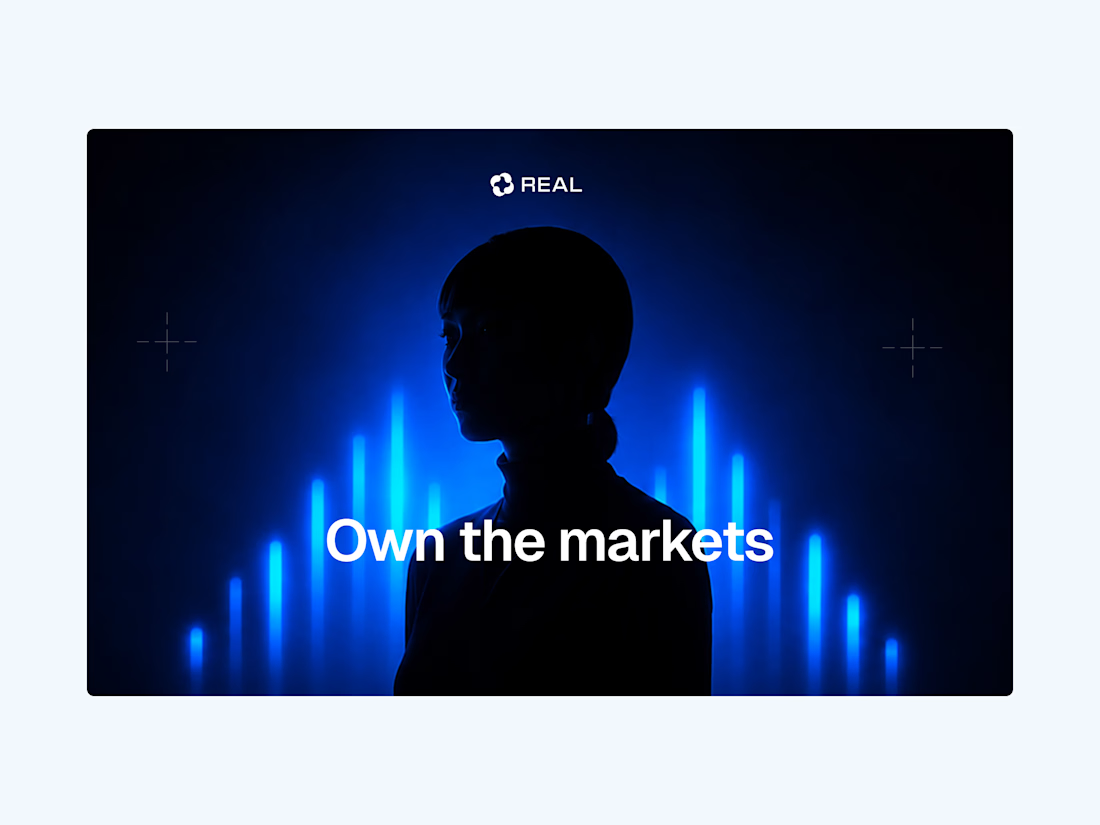
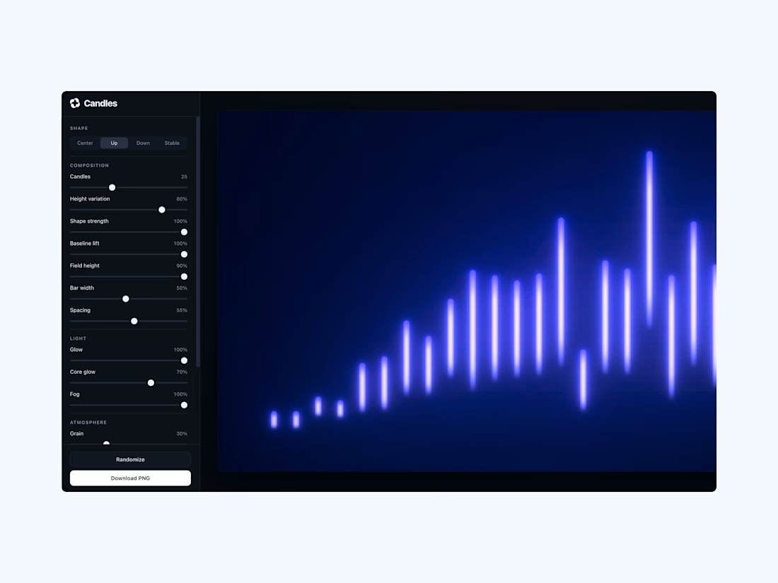
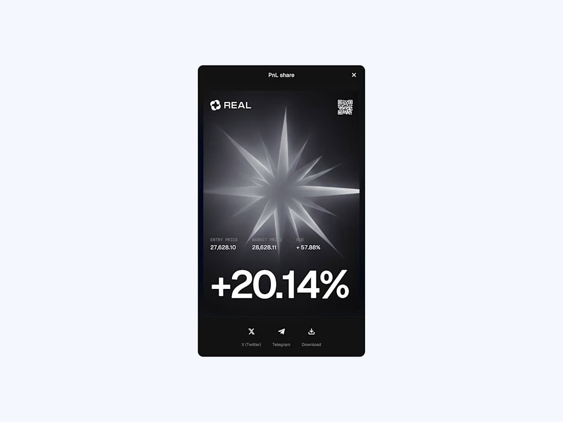
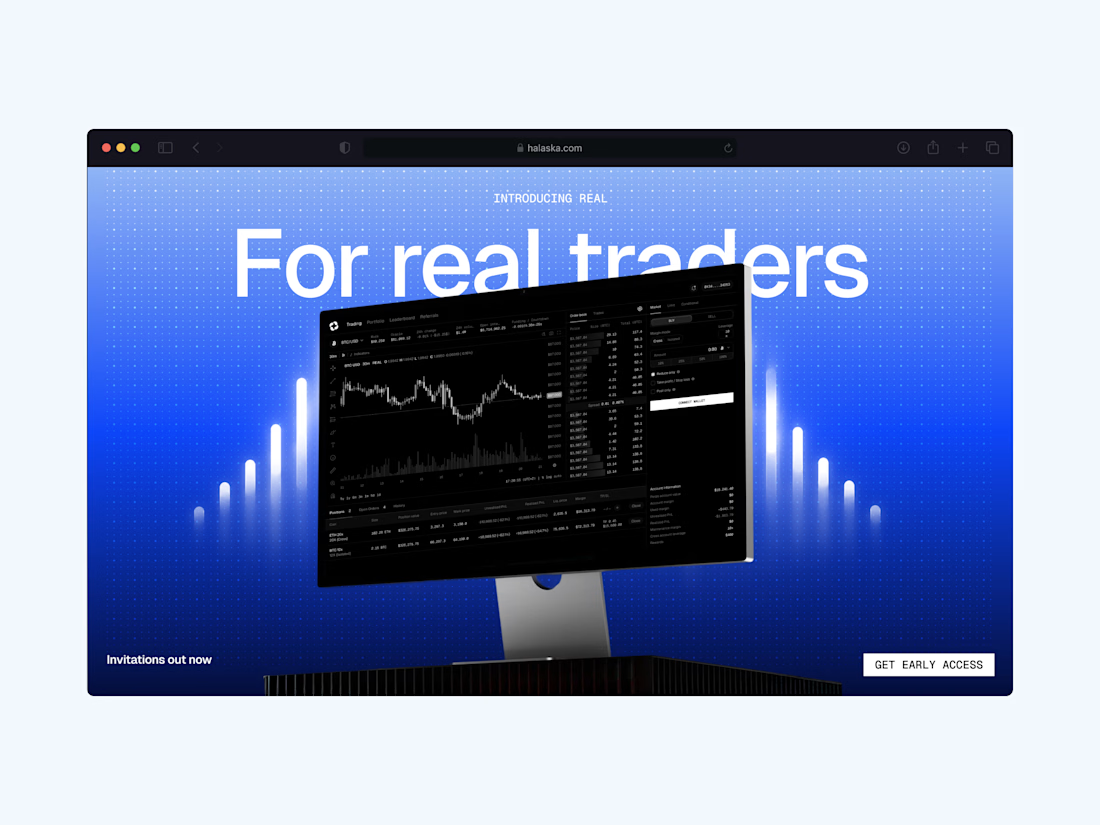
Brand and product work for one of our ongoing crypto clients

Wow

Great work

Great job bro your branding images feels energetic and unique great job 🎉🎉🔥🔥

Amazing work

Great

Really strong work👏

Own the markets over a silhouette lit by a blue volume spike is a strong visual, the whole identity feels like a trading floor at night. Crypto branding often goes neon and cheap, this one stays electric but controlled. The luminous 20.14 percent app card is a nice proof point too.


incredible work

Love the card here man

Great work!


I love these colours. 😍


Halaska never miss with the direction🙌


Love the direction here. Crypto branding that actually feels fresh is rare.

The glowing bar waves feel right for a trading product. Nice restraint with the blue palette.

The blue volume-spike lighting on the silhouette nails the trading-floor-at-night mood without sliding into cheap neon crypto. That luminous app card with the big percentage read is the real product test — glow and hierarchy still need to scan on OLED dark. Did you spec a reduced-effects mode for accessibility?


Just woww

Fantastic visuals! 😃
The network for creativity
Join 1.25M professional creatives like you
Connect with clients, get discovered, and run your business 100% commission-free
Creatives on Contra have earned over $150M and we are just getting started






Related posts

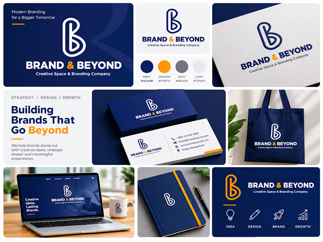
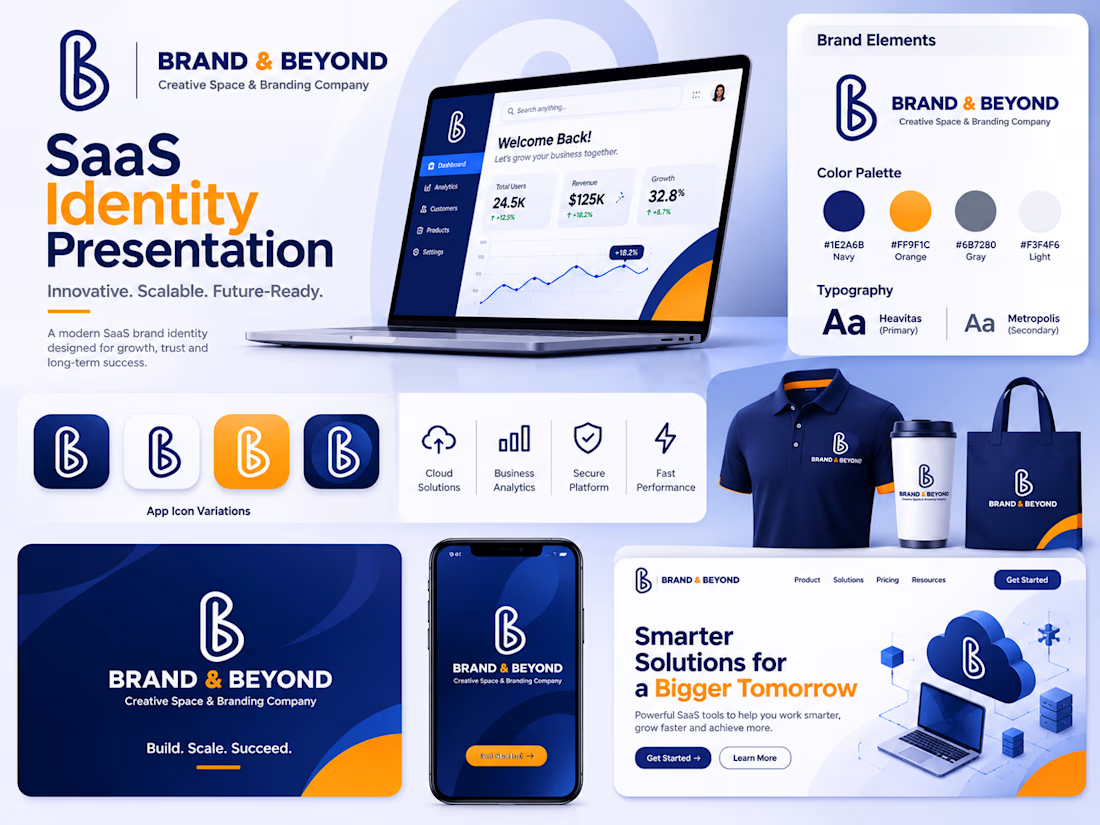
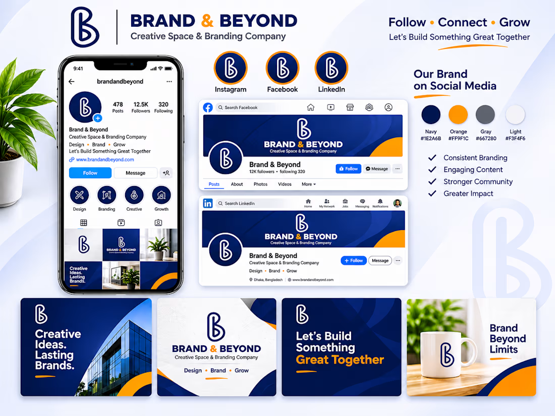
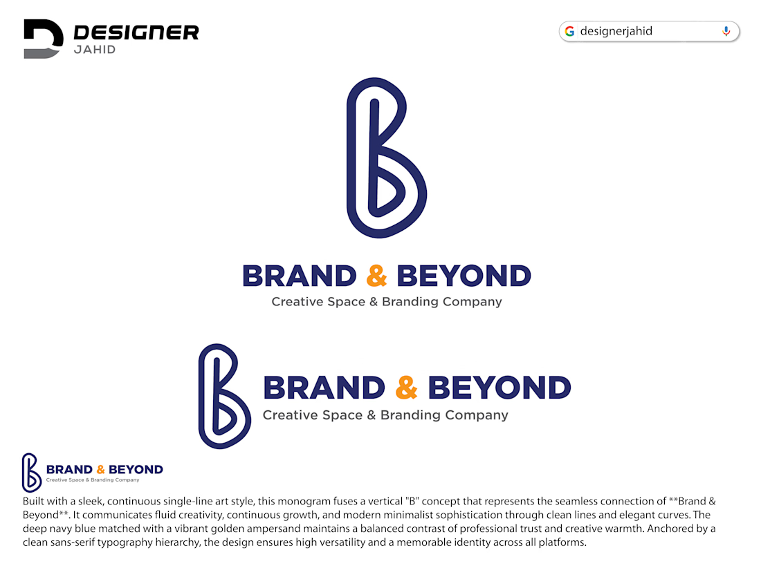
BRAND & BEYOND | Complete Brand Identity & Logo Design
A complete branding concept developed from initial creative ideas to a polished visual identity.
This project includes custom logo development, sketch exploration, vector refinement, brand colors, typography, stationery, social media assets, website visuals, and premium mockup presentations.
The goal was to build a modern, recognizable, and versatile identity with a consistent visual presence across digital and physical platforms.
Services showcased:
• Logo Design
• Brand Identity
• Visual Branding
• Typography & Color System
• Social Media Branding
• Brand Mockups & Presentation
Creative direction and design by Designer Jahid.
Need a distinctive identity for your business? Let's connect and bring your brand vision to life.
#BrandIdentity #LogoDesign #Branding #GraphicDesign #Designerjahid



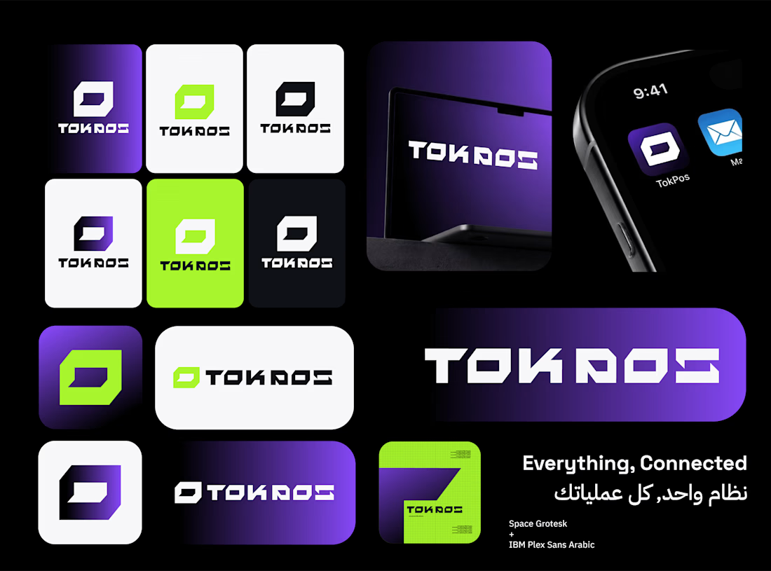
Just wrapped up a new branding project for TOK POS.
TOK POS is a software provider offering Point of Sale solutions for Retail and F&B businesses.
The goal was to build a brand identity that feels modern, professional, and tech-driven, while communicating simplicity, reliability, and efficiency.
I worked on developing the brand strategy, positioning, visual direction, and logo concepts, making sure every element serves a clear purpose.
From strategy to visuals, the idea was to create a brand that doesn't just look like another POS software company, but has its own recognizable identity
Let me know what you think in the comments🙌

Looks great!