The network for creativity
Join 1.25M professional creatives like you
Connect with clients, get discovered, and run your business 100% commission-free
Creatives on Contra have earned over $150M and we are just getting started
Back to feedPost
Taste Test


HOW MUCH DOES A FOOTER REALLY NEED?
For this online learning platform, the header is already fixed and always accessible while scrolling.
So I explored two different footer approaches:
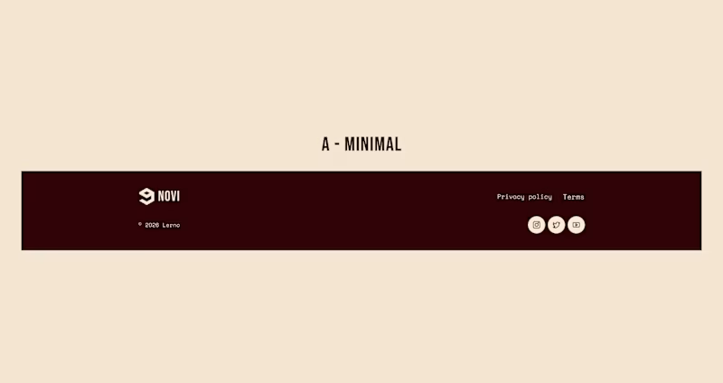
A - Minimal. Just the essentials: copyright, legal links & social media.
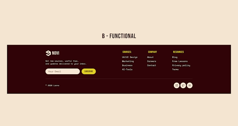
B - Functional. Course navigation, resources, newsletter & a final CTA.
Which approach would you choose - A or B?
7 voted
15%
41 voted
85%
48 votes
Closed

Functional all the way.

Personal choice, it depends on the client goals. I like to keep it Minimal and use CTA elsewhere!

Functional💯

Functional🔥


the minimal footer feels right. what would you add to the functional one?

SOMETIMES MINIMAL COOL DEPENDS ON THE BRAND

had to go with functional here! sometimes, viewers need a little more clarity, & i think darker tones in the background do help bring a little more appreciation to delineating where certain clicks'll take a viewer.

Nice work as usual! When headers are fixed, Option A minimal footers keep the lower canvas feeling ultra-clean.

I would go with the minimal approach because, in my opinion, the trend of putting everything in the footer is kind of outdated now. I think we can move some of the footer links to the upper section or navigation bar instead. That would give us more room to play around with the...

I like the Functional

Always first one

Functional..

functional! who doesnt mind the little seo boost


gotta be B for a learning platform

if minimal then I would add the brand name in background of the footer with faded bold Text

I’d go with B; the functional footer adds real value without feeling overloaded, especially for an e-learning platform.

Minimal looks good

This project is full of creativity and passion!


Functional design
The network for creativity
Join 1.25M professional creatives like you
Connect with clients, get discovered, and run your business 100% commission-free
Creatives on Contra have earned over $150M and we are just getting started





Related posts

I think this could be my favorite Framer code component I’ve created. Meet Page Transition Studio, you can add animated transitions between pages across 10 styles. My favorites are vertical strips and centre split. What’s yours? Check the live preview here


Good work, like the interaction


I’m exploring different concepts for a project. Which proposal did you like the most?
5 voted
42%

7 voted
58%

12 votes
Closed

Geometric one looks better good job🎉🎉❤️❤️

Two logo concepts for Formosa1 Exotic Car Rentals. Which one wins?
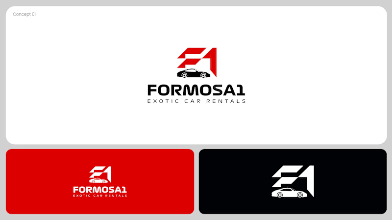
A: bold geometric F1 monogram, car tucked inside the mark. Strong and iconic.
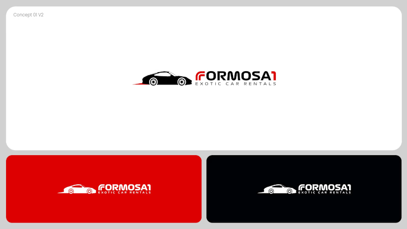
B: car silhouette leads, red wordmark with a speed streak. Fast and clean.
Drop your vote 👇
17 voted
53%
15 voted
47%
32 votes
Closed
Both are great but I feel that was something special in the bottom one that's why I choose it❤️❤️