The network for creativity
Join 1.25M professional creatives like you
Connect with clients, get discovered, and run your business 100% commission-free
Creatives on Contra have earned over $150M and we are just getting started
Back to feedPost

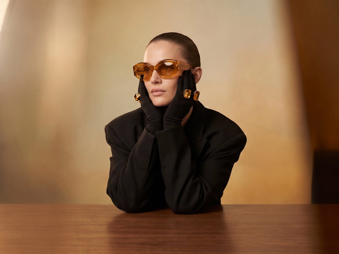
What if eyewear wasn't an accessory—but the identity of the campaign?




Nice!
The network for creativity
Join 1.25M professional creatives like you
Connect with clients, get discovered, and run your business 100% commission-free
Creatives on Contra have earned over $150M and we are just getting started

Challenges
View all


Related posts


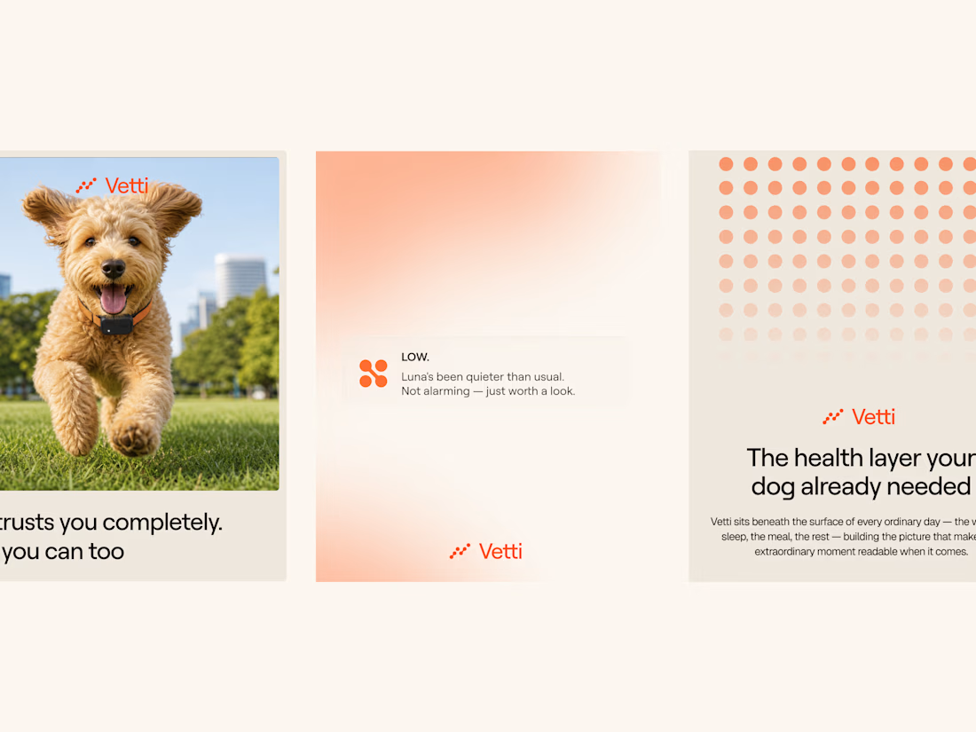
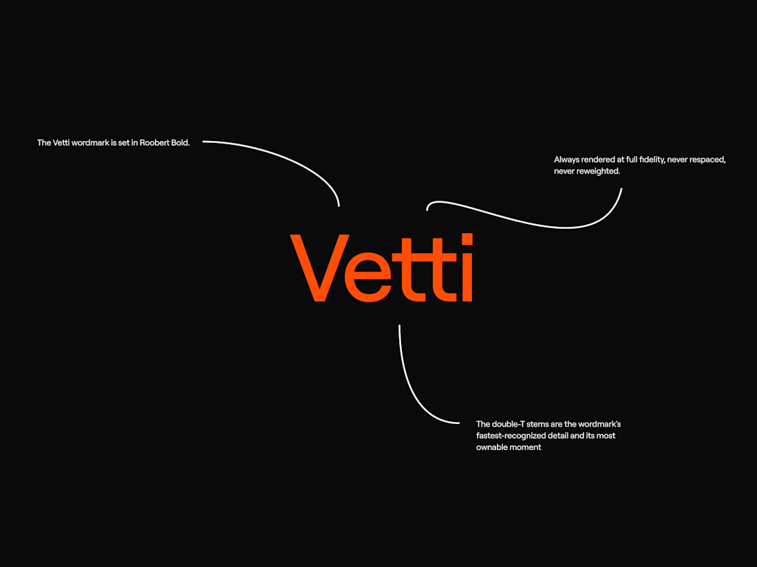
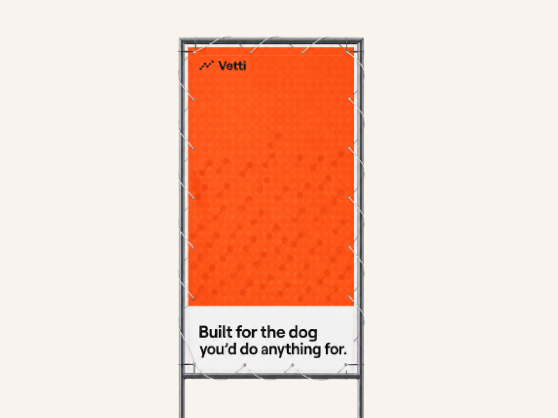
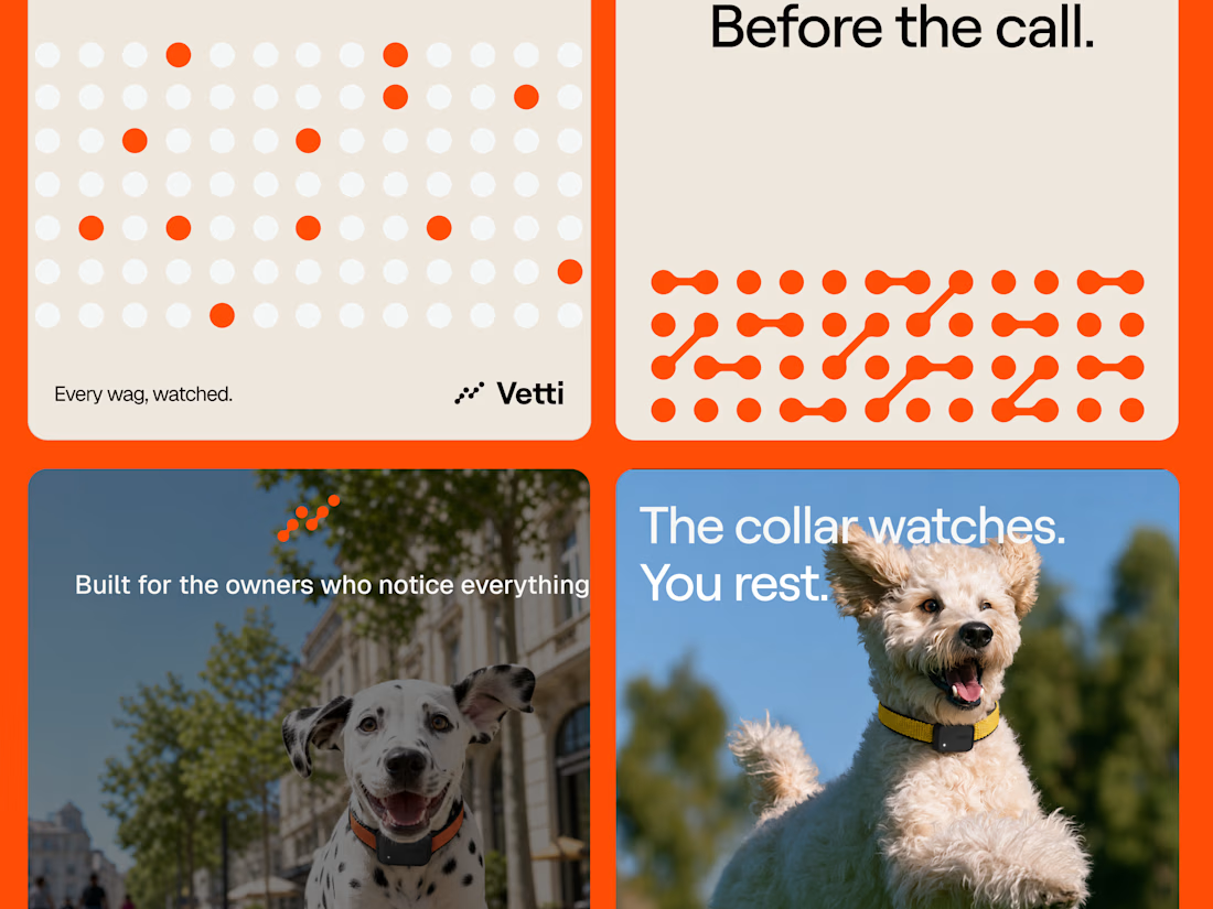
A fuller look at the brand identity work we for Vetti, a dog health monitoring brand.
The connected dots carry through the whole identity. They form the mark, expand into patterns and give the campaign a recognisable language of its own. Sometimes they fill the layout.
Paired with warm orange and cream the system has room for both the technology and the dogs it’s there for.


Looks very nice welldone


The latest Apple keynote sent me down a bit of a rabbit hole.
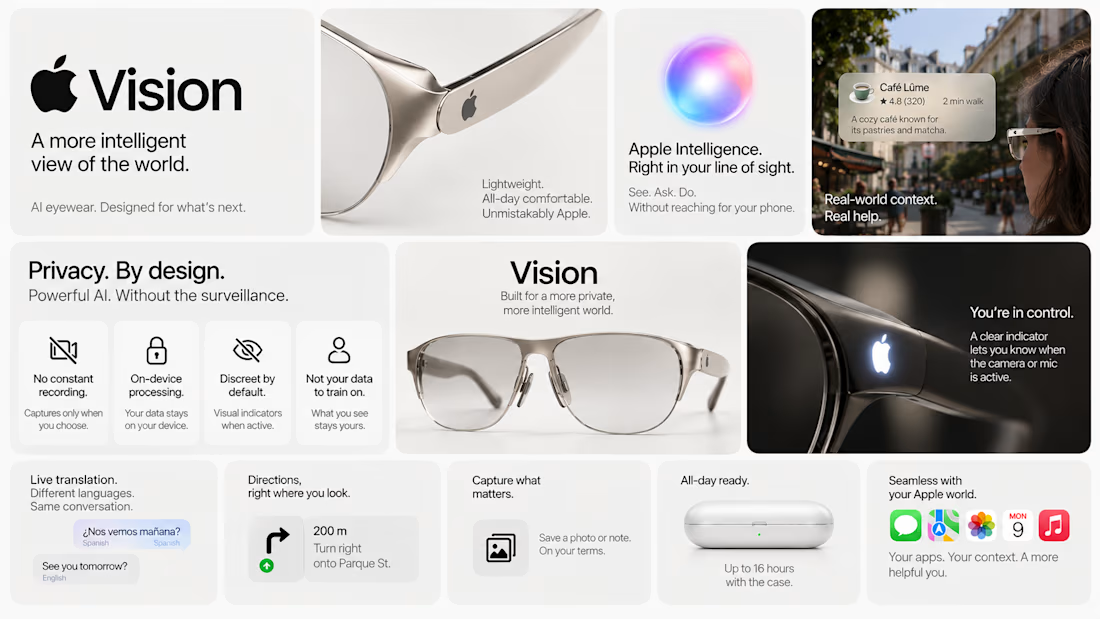
What if Apple made AI glasses?
Not another pair of glasses that happen to have AI in them.
What if they approached the whole thing the Apple way?
Beautiful. Context-aware. Ridiculously intuitive.
And ideally, not quietly documenting my entire existence. 🙃
So I designed my take on Apple Vision: privacy-first AI eyewear, with a few features I’d genuinely want to use.
Here’s the concept.



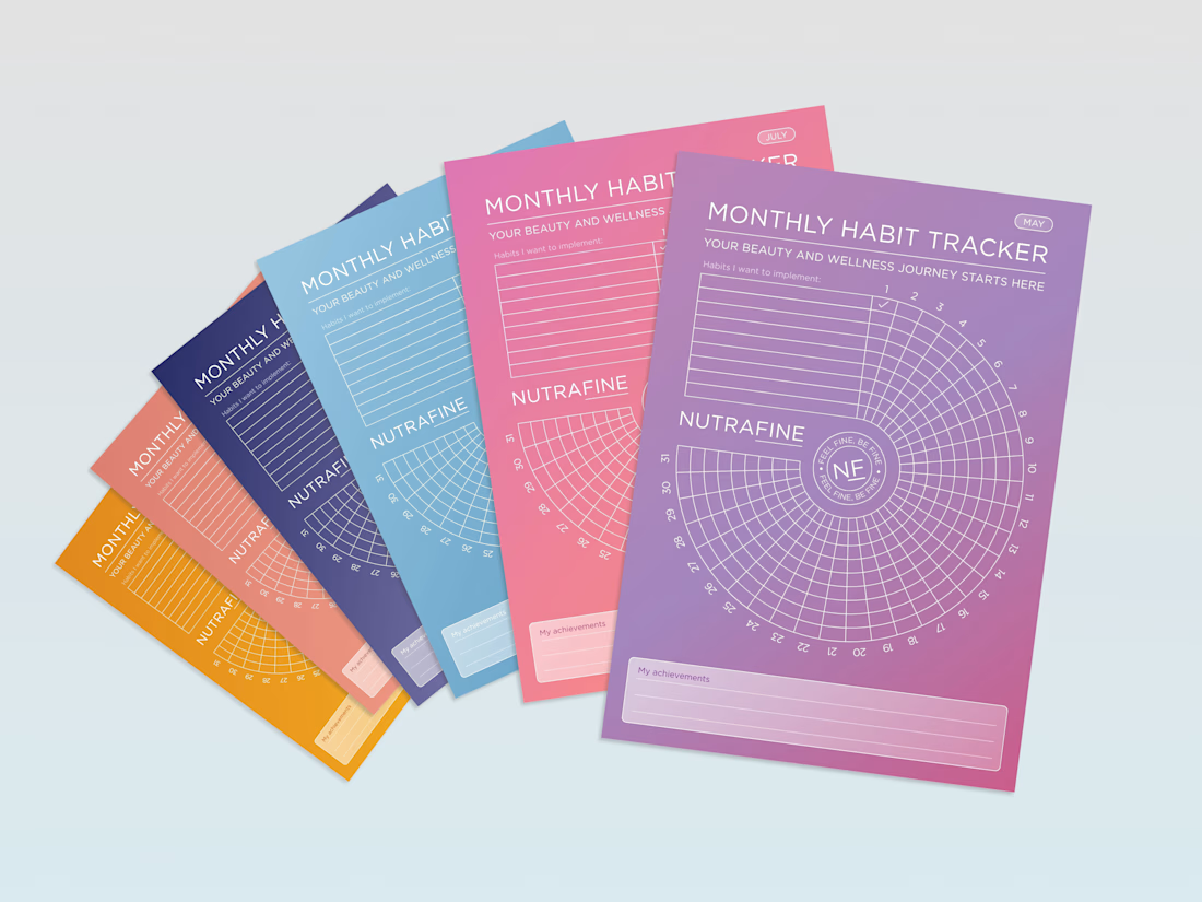
Can a habit tracker feel like a brand experience, not just a table?
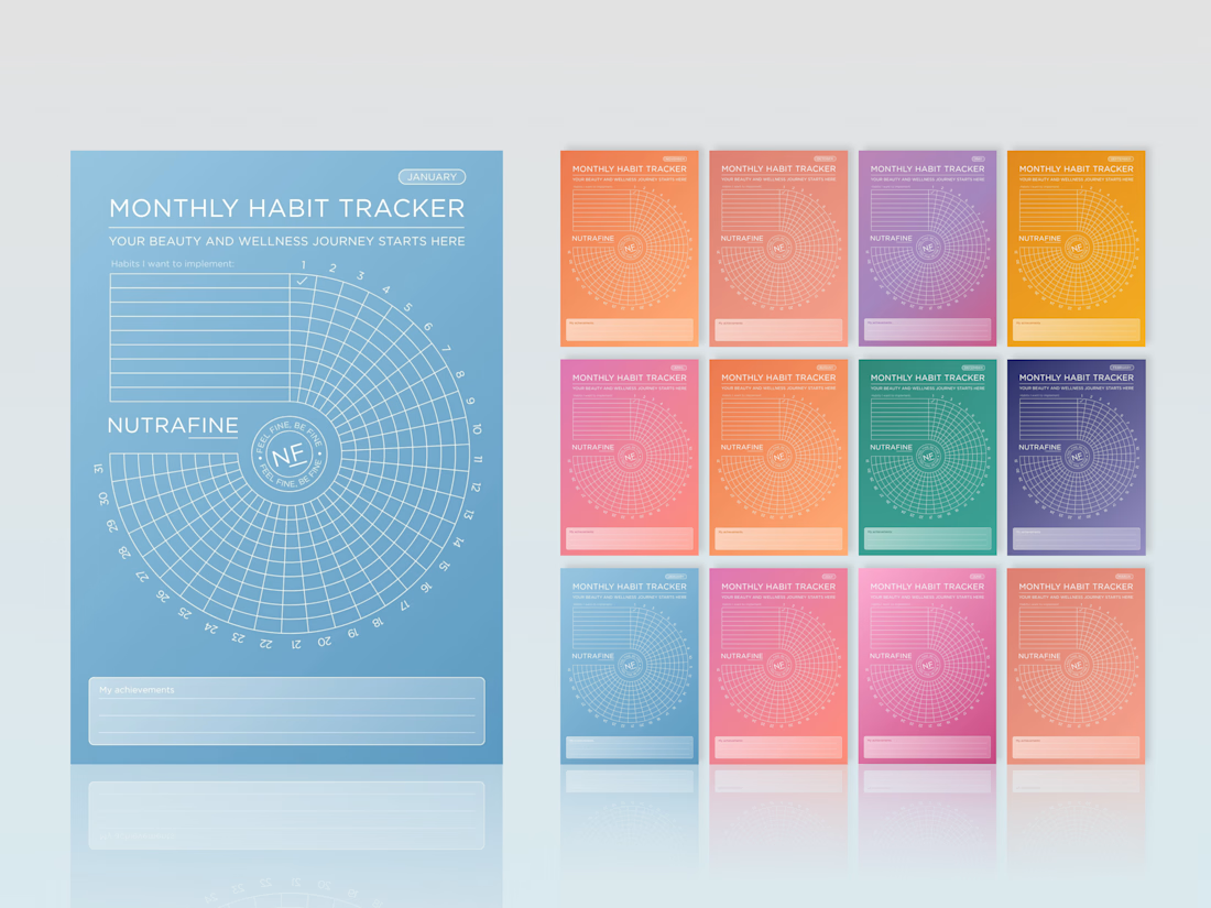
For Nutrafine’s corporate gifting, each month is tied to one SKU, using the same colour as its packaging. It’s more colour than I would usually choose, but the depth of the palette, white linework and typography make the system hold together.
The bigger idea was to make the tracker itself feel less expected. Instead of a grid, we built a spiral, turning a practical tool into something more playful, memorable and distinctly Nutrafine.
#BrandDesign #CorporateGift #WellnessBranding #BrandExperience #CreativeDirection



Love these!