The network for creativity
Join 1.25M professional creatives like you
Connect with clients, get discovered, and run your business 100% commission-free
Creatives on Contra have earned over $150M and we are just getting started
Back to feedPost

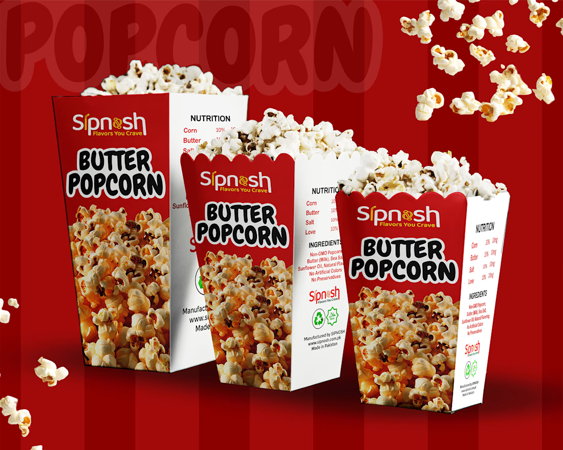
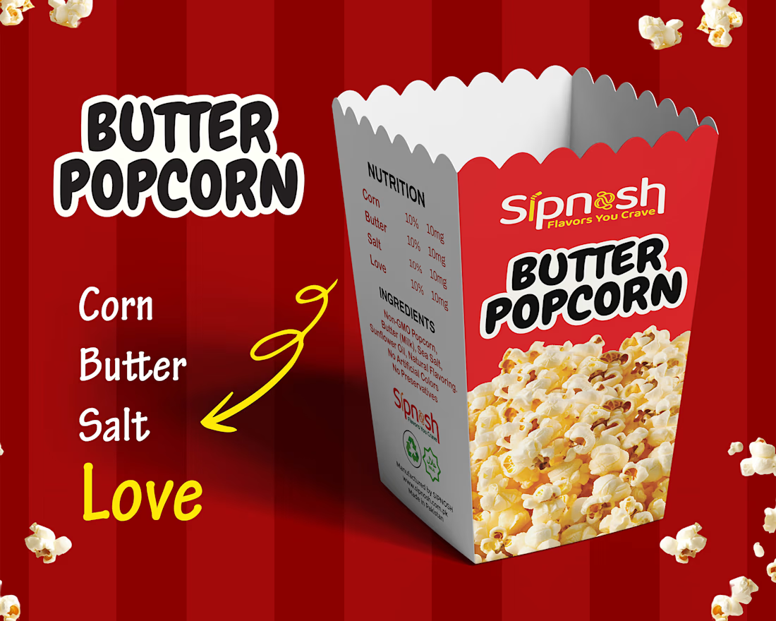
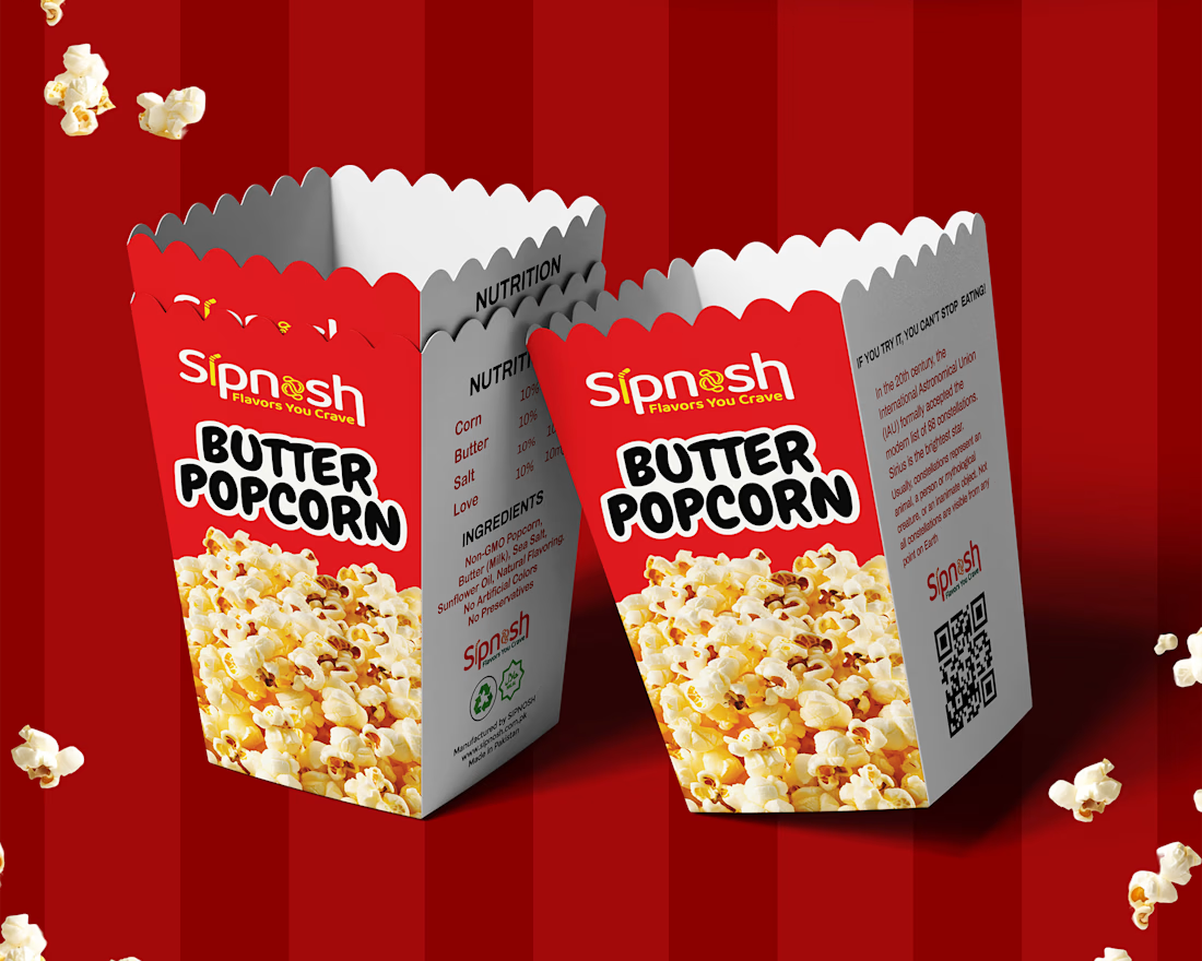
Some designs are not just about packaging, they’re about creating a craving before the product is even opened 🍿
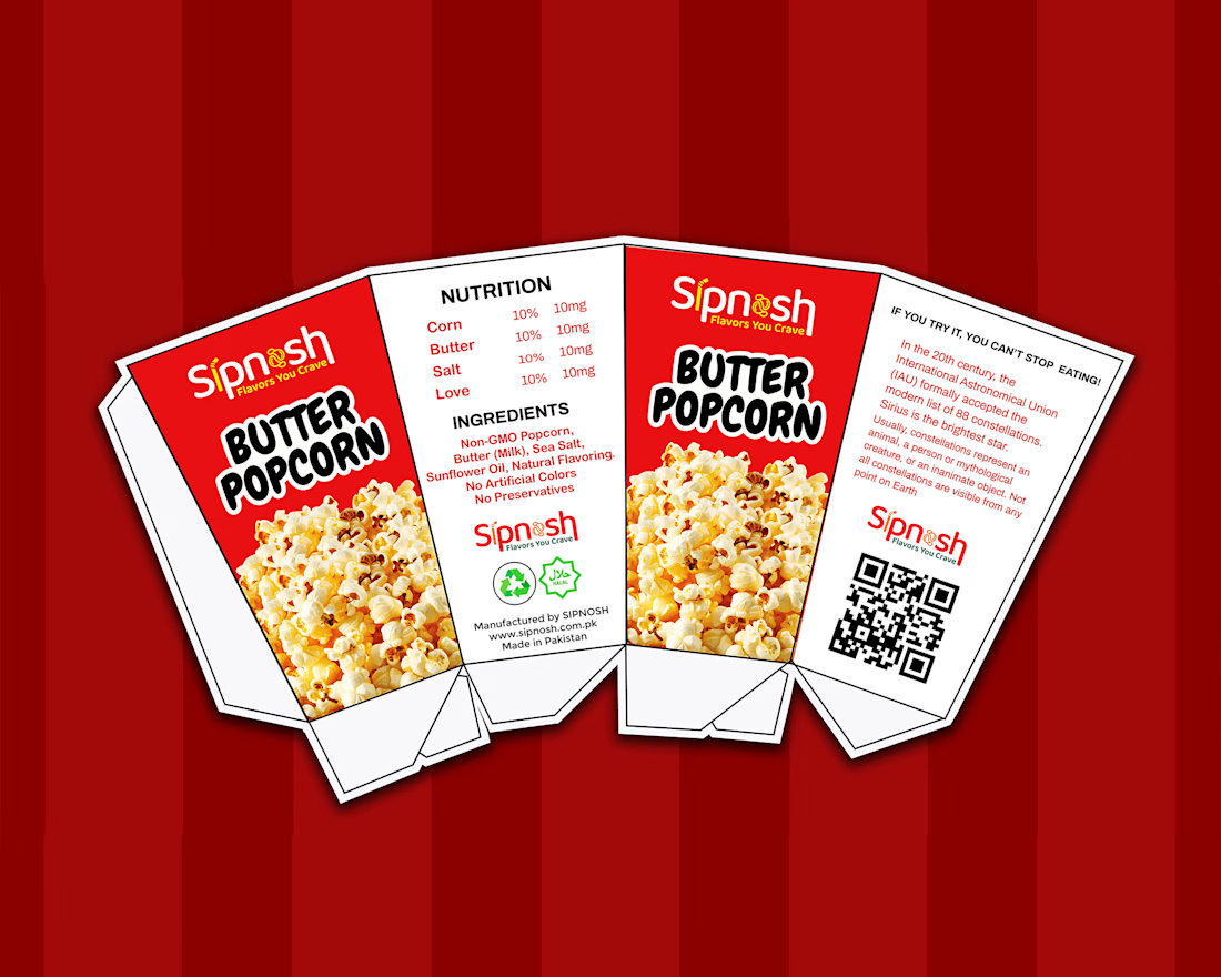
This “Spinash Butter Popcorn” packaging concept was designed with that exact idea in mind. I focused on building a bold, fun, and appetite-driven visual identity that instantly communicates flavor, freshness, and enjoyment.
From vibrant colors to expressive typography, every element is crafted to stand out on the shelf and connect with snack lovers at first glance. The goal was to balance playful energy with a clean, structured layout so the brand feels both exciting and recognizable.
Design like this always reminds me how powerful visuals are in influencing emotion and taste perception.
Would love to hear your thoughts on this concept.
Packaging DesignGraphic DesignLogo DesignAdobe IllustratorAdobe Photoshoppackagepackagingdesignexpertsgraphicsdesigner


The network for creativity
Join 1.25M professional creatives like you
Connect with clients, get discovered, and run your business 100% commission-free
Creatives on Contra have earned over $150M and we are just getting started





Related posts




Great work!

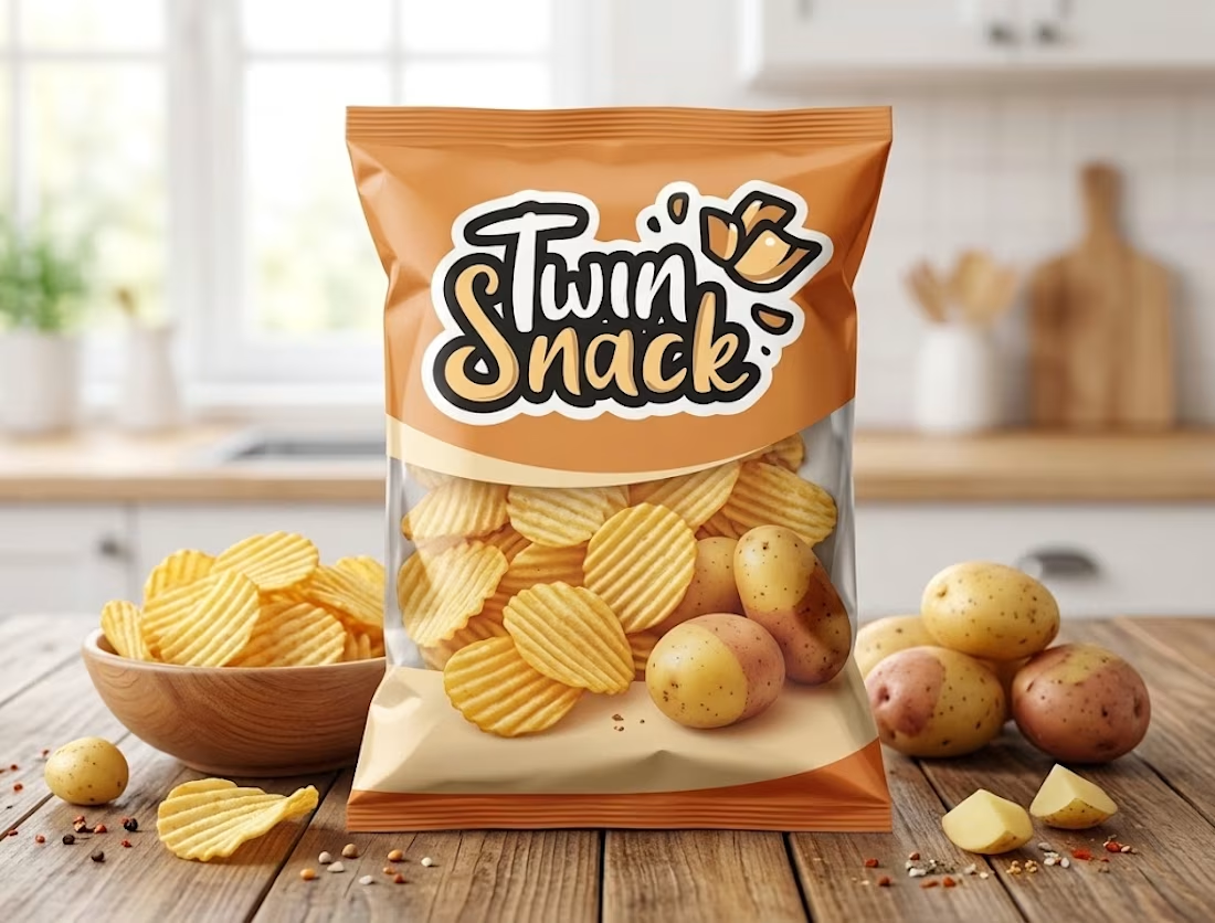
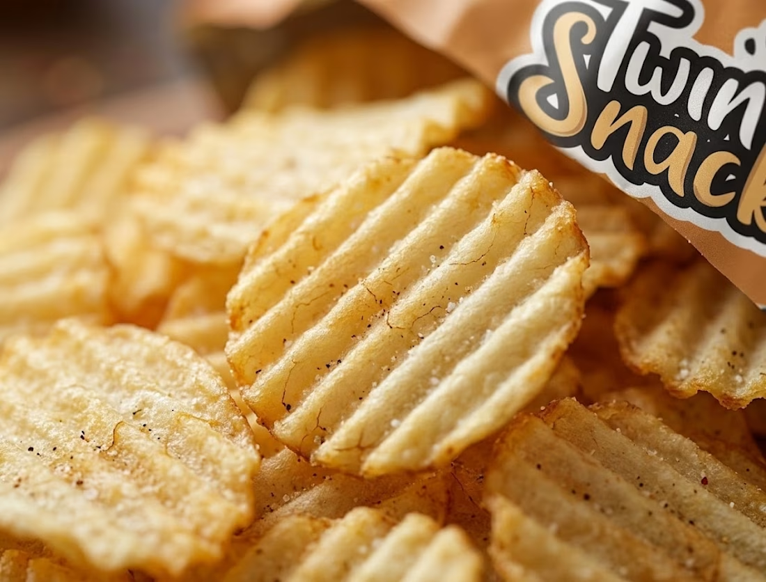
🥔 Twin Snack | FMCG Packaging & Macro Product Visual Design
A vibrant product packaging design and high-detail macro close-up concept created for Twin Snack, a premium crinkle-cut potato chips brand targeting Gen-Z and snack enthusiasts.
Key Design Highlights:
Custom Packaging Design: Dynamic warm orange & cream color scheme paired with bold custom logo typography (Twin Snack), crisp ridges, and fresh ingredient visuals.
Macro Texture Close-Up: Ultra-detailed macro product shot emphasizing the signature crinkle ridges, golden crispy texture, and fine seasoning to highlight product crunch & quality.
Branded Consistency: Seamless brand integration across product packaging and promotional visual assets.
Market-Ready Visuals: Designed specifically for social media ad campaigns, FMCG retail branding, and e-commerce product listings.
Ideal For: FMCG Branding, Product Packaging Showcase, Food & Beverage Marketing, and Portfolio Showcase.
Hashtags:
#GraphicDesign #PackagingDesign #FMCGBranding #TwinSnack #ProductDesign #FoodPackaging #BrandIdentity #VisualDesign #ContraDesigner #FreelanceDesigner #PortfolioShowcase

Saved this for inspiration! Beautiful work.