
Mir Mashhad
Graphic Designer for Brands, Packaging & Social
New to Contra
Mir is ready for their next project!
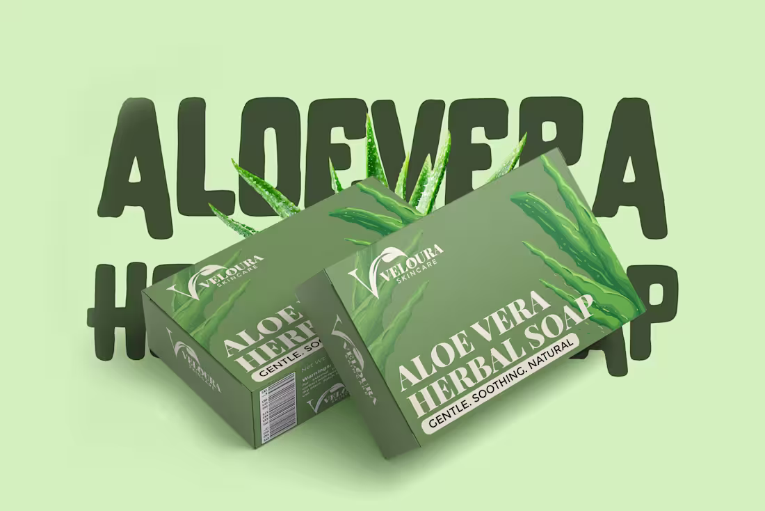
Recent Packaging Project ✨
What catches your eye first when you see a skincare product?
For me, great packaging should instantly tell the product's story.
Designed a complete packaging concept for Veloura Skincare's Aloe Vera Herbal Soap, including:
✔️ Box Packaging Design
✔️ Product Branding
✔️ Soap Logo Placement
✔️ Product Mockup Presentation
✔️ Visual Identity Direction
The objective was to create a natural, premium, and trustworthy look that aligns with the skincare market while maintaining strong brand recognition.
Feedback is always welcome. 🌿
0
5
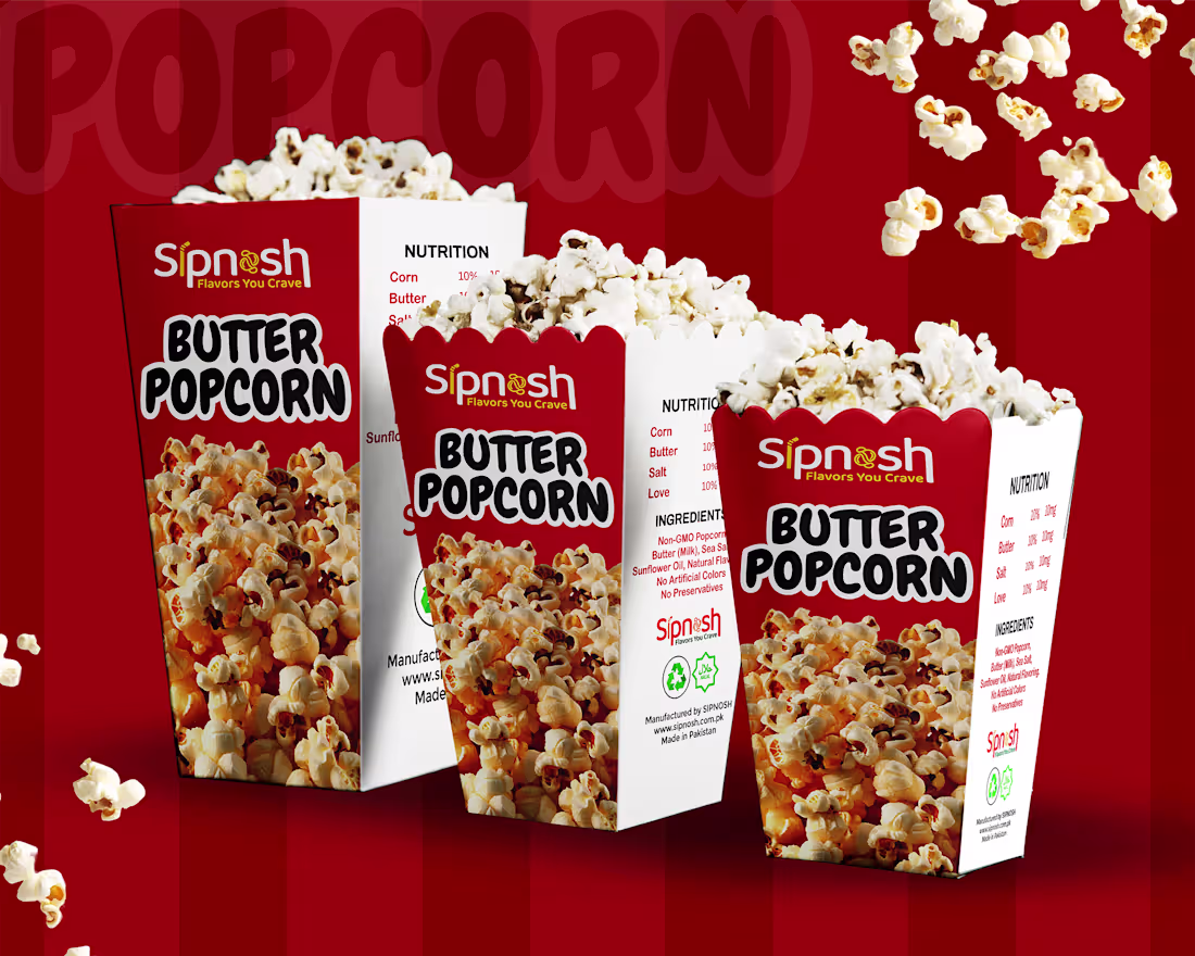
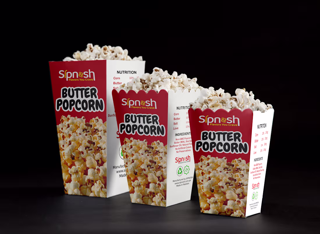
Some designs are not just about packaging, they’re about creating a craving before the product is even opened 🍿
This “Spinash Butter Popcorn” packaging concept was designed with that exact idea in mind. I focused on building a bold, fun, and appetite-driven visual identity that instantly communicates flavor, freshness, and enjoyment.
From vibrant colors to expressive typography, every element is crafted to stand out on the shelf and connect with snack lovers at first glance. The goal was to balance playful energy with a clean, structured layout so the brand feels both exciting and recognizable.
Design like this always reminds me how powerful visuals are in influencing emotion and taste perception.
Would love to hear your thoughts on this concept.
1
28
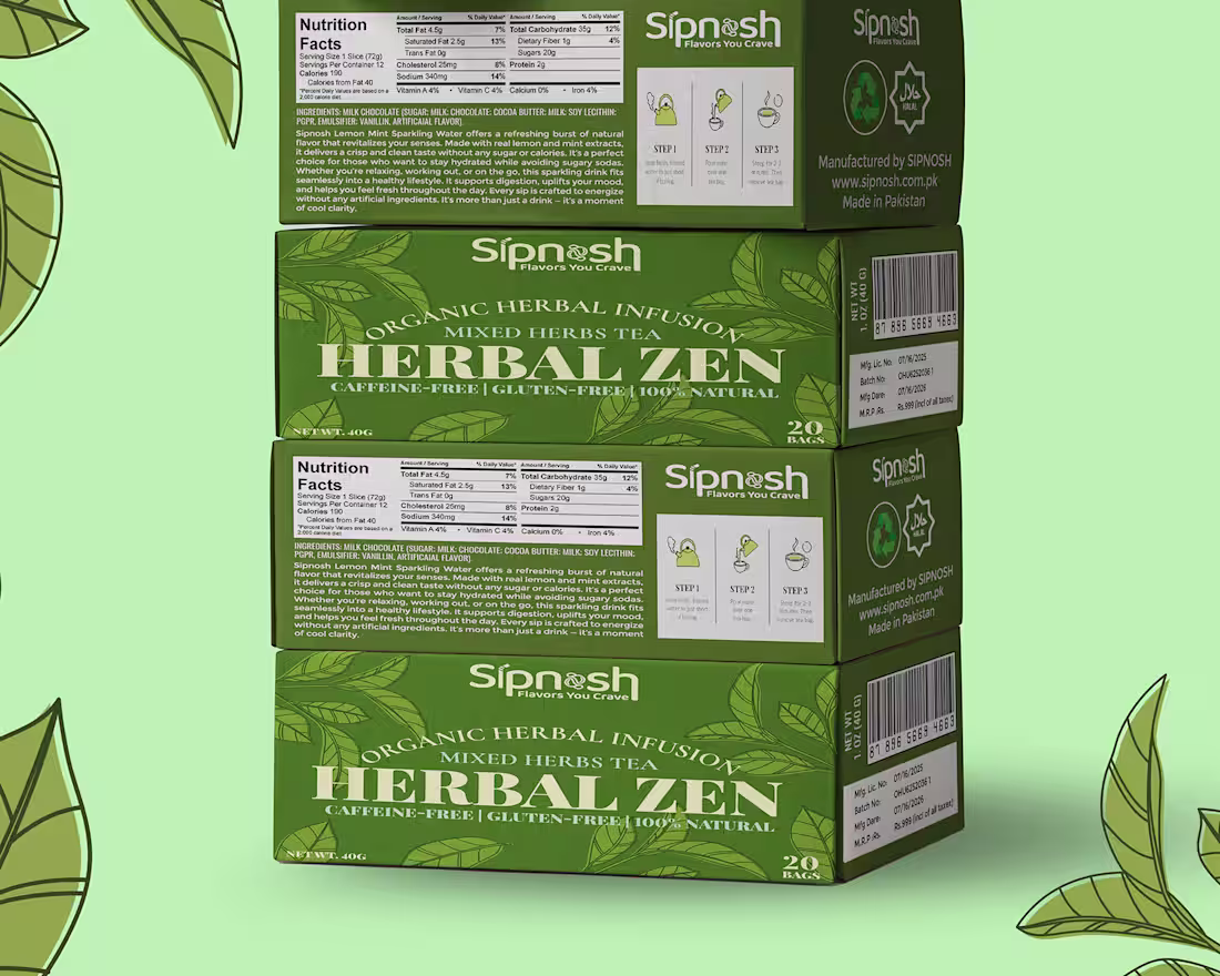
Packaging Design Spotlight 🍃
Good packaging doesn’t just protect a product. it tells its story before the first sip.
For this Herbal Zen Tea packaging, the goal was to create a visual experience that reflects calmness, nature, and wellness. The rich green palette, botanical illustrations, and clean typography were carefully chosen to communicate the product’s organic and refreshing character while maintaining a premium shelf presence.
Every detail was designed to make the product feel as natural and soothing as the tea inside.
What do you think about this packaging concept? 👇
🔗 Full project available on Behance: https://www.behance.net/gallery/242916769/Herbal-Zen-Organic-Herbal-Tea-Packaging-Design
6
6
313
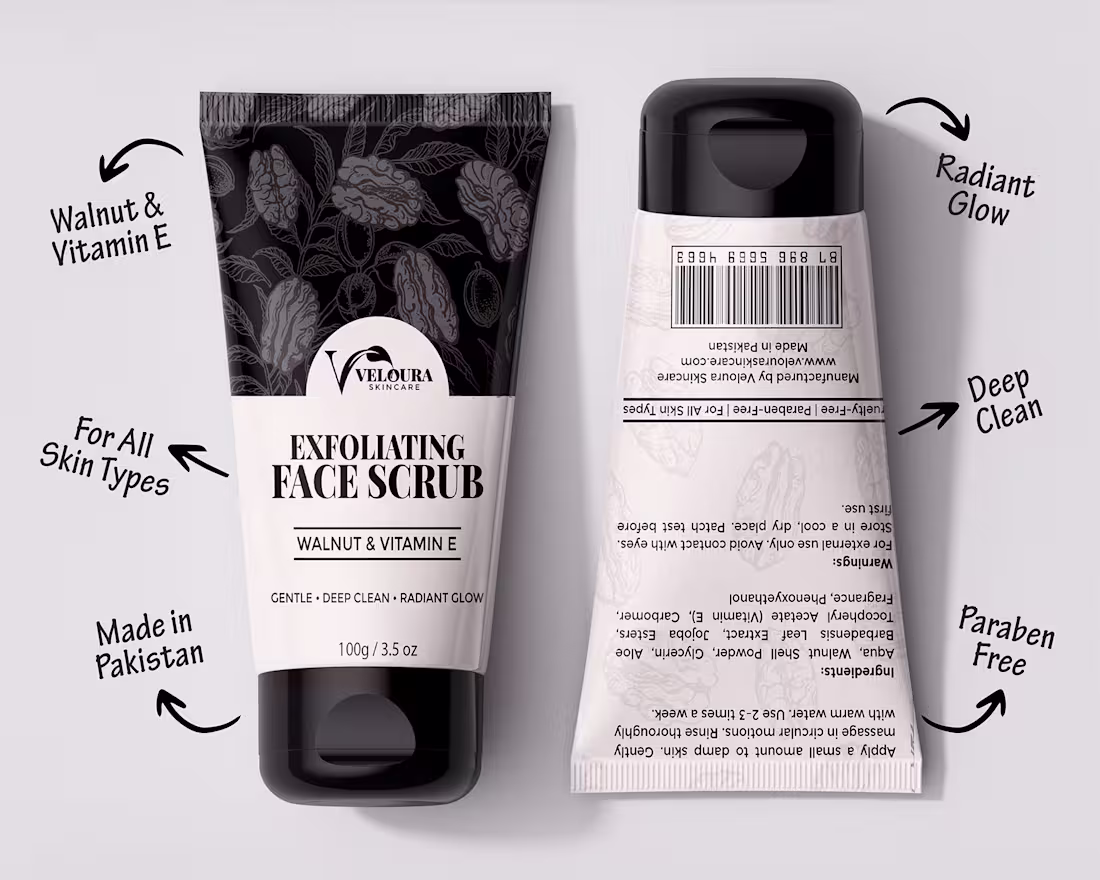
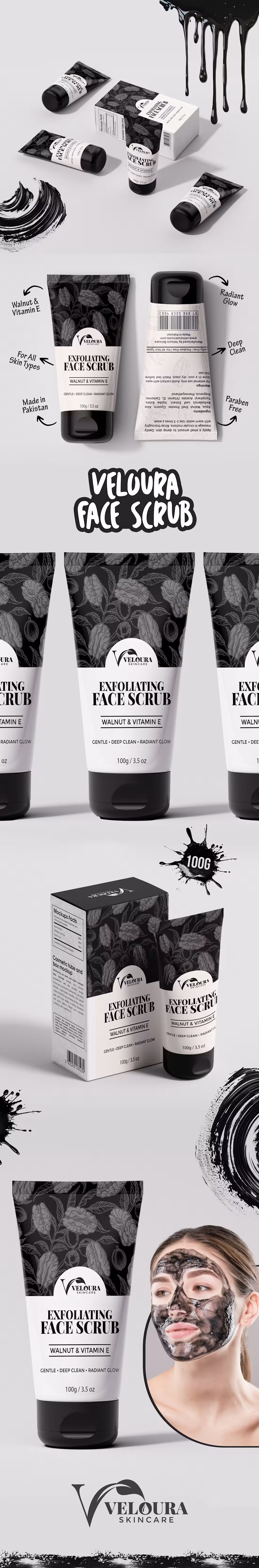
Packaging design is more than just making a product look good, it's about creating an experience before the customer even opens it.
Recently, I designed this packaging and tube label for Veloura Skincare's Exfoliating Face Scrub (Walnut & Vitamin E). The goal was to create a premium skincare identity that feels elegant, trustworthy, and visually distinctive while reflecting the product's natural ingredients.
Every detail, from the typography to the botanical pattern and packaging structure, was carefully crafted to communicate quality, care, and sophistication.
Design isn't just what people see.
It's what makes them stop, trust, and choose.
📌 Want to see the complete project, design process, and detailed mockups?
View the full case study on Behance: https://www.behance.net/mirmashhad
What do you think of this packaging direction?
Feedback is always welcome. 👇
1
32
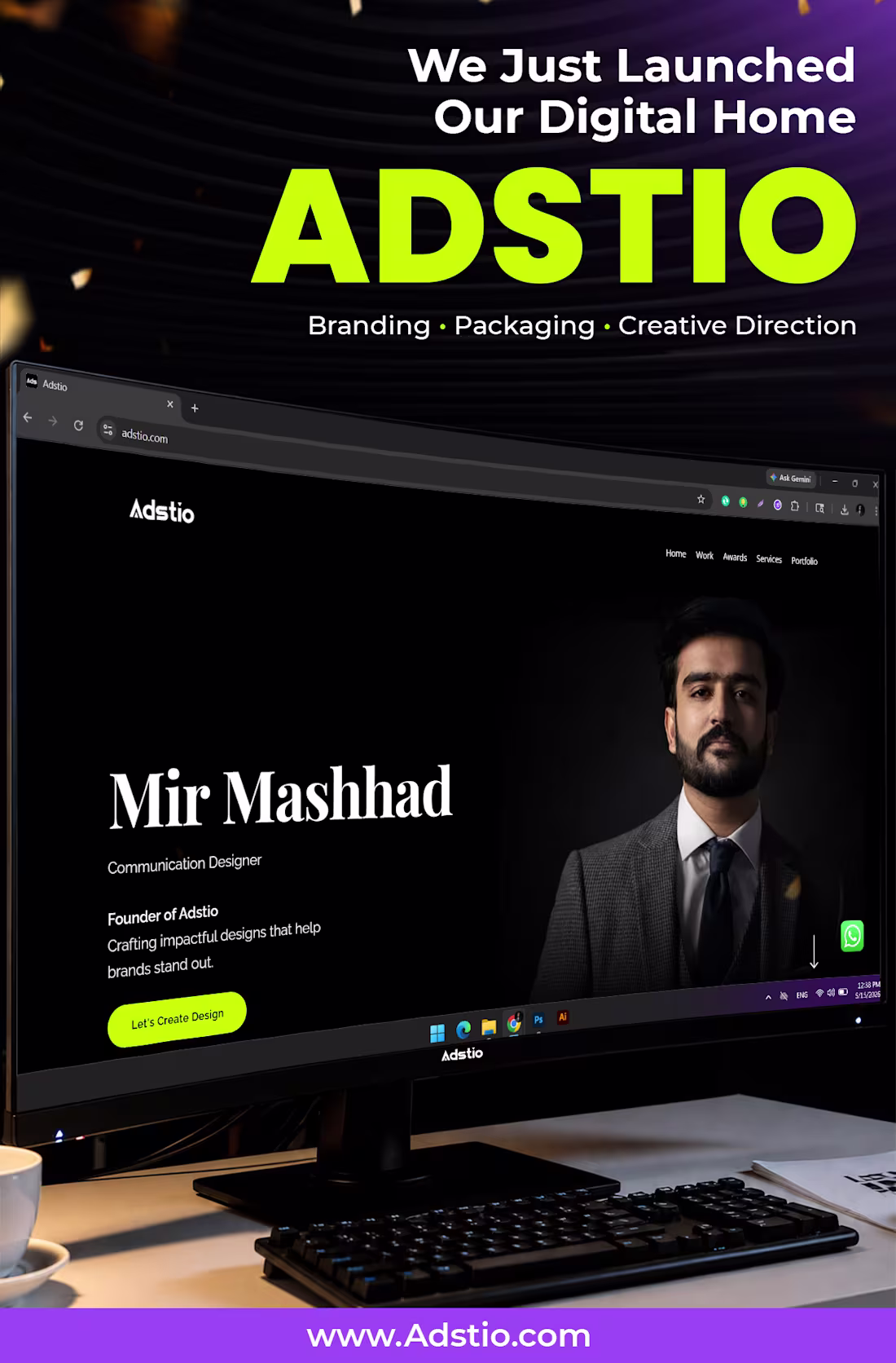
🚀 We just launched our Digital Home!
After countless late nights, bold ideas, and endless refinements, Adstio is officially live at www.adstio.com (http://www.adstio.com) ✨
We're not just a design agency. We craft identities that make brands impossible to ignore.
🎨 Branding
📦 Packaging
🎬 Creative Direction
If your brand deserves to stand out, let’s talk.
👉 www.adstio.com (http://www.adstio.com)
1
63
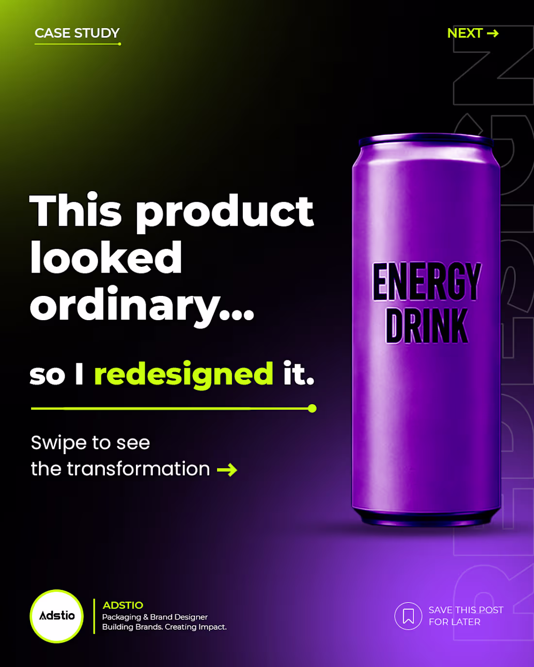
From basic to premium
that was the goal behind this packaging redesign.
The challenge wasn’t just creating a label.
It was building a product presence that instantly feels trustworthy, modern, and high-quality on the shelf.
Here’s what changed:
• Cleaner visual hierarchy
• Stronger brand identity
• Minimal yet functional layout
• Better typography and spacing
Small design decisions can completely change how a product is perceived.
Good packaging doesn’t just look good, it increases perceived value. 📦
2
43
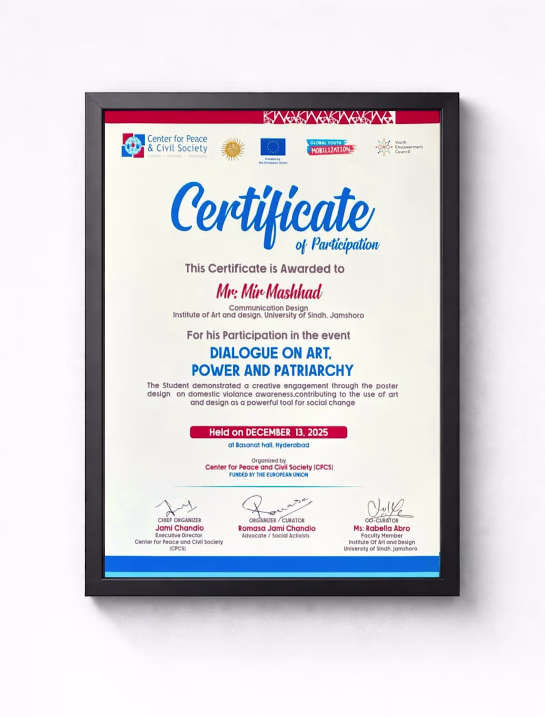
Honored to receive this Certificate of Participation from such impactful organizations including #CenterforPeaceAndCivilSociety (https://www.linkedin.com/search/results/all/?keywords=%23centerforpeaceandcivilsociety&origin=HASH_TAG_FROM_FEED) (CPCS), #GlobalYouthMobilization (https://www.linkedin.com/search/results/all/?keywords=%23globalyouthmobilization&origin=HASH_TAG_FROM_FEED), #YouthEmpowermentCouncil (https://www.linkedin.com/search/results/all/?keywords=%23youthempowermentcouncil&origin=HASH_TAG_FROM_FEED), and with support from the European Union
(https://www.linkedin.com/company/european-union/)Being part of the dialogue on Art, Power, and Patriarchy was a meaningful experience where design was not just about visuals, but about raising awareness and creating real social impact.
As a Communication Design student, this opportunity allowed me to explore how creativity can be used as a powerful tool for change, especially in addressing critical issues like domestic violence.
Grateful for the learning, exposure, and the chance to contribute.
1
28
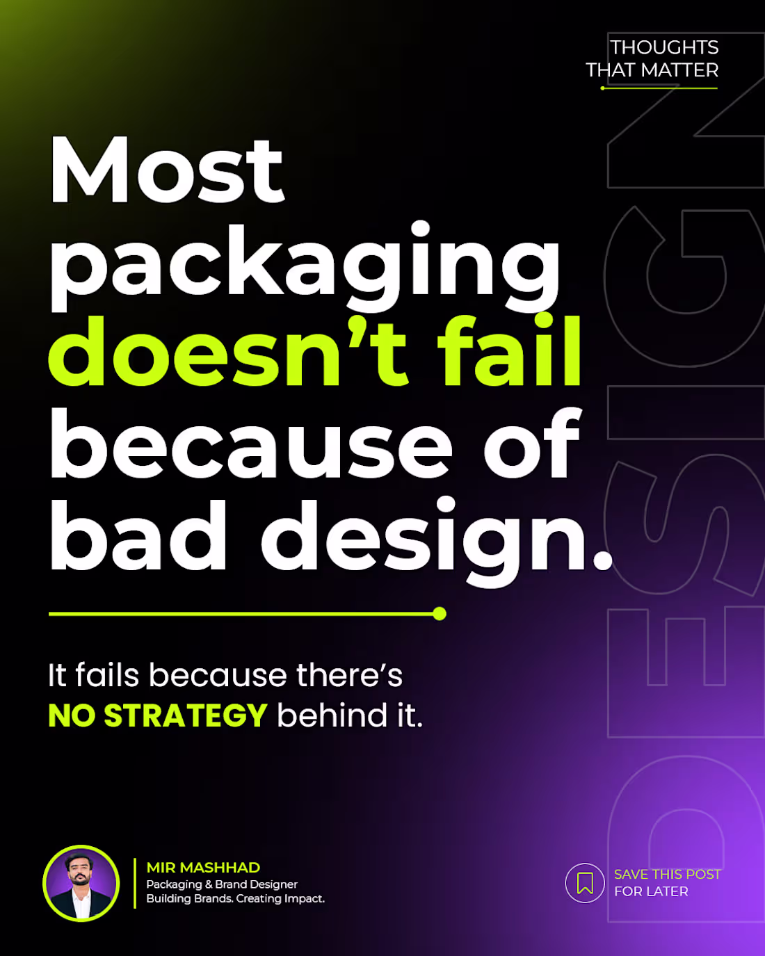
It fails because there’s NO STRATEGY behind it.
I’ve seen products with:
* Clean layouts
* Good colors
* Decent typography
Still not selling.
WHY?
Because packaging is not decoration.
It’s communication.
If your product doesn’t clearly show:
* What it is
* Who it’s for
* Why it’s better
People won’t buy it.
Good packaging doesn’t just look premium.
It makes people want to pick it.
What do you think matters more design or strategy?
1
34
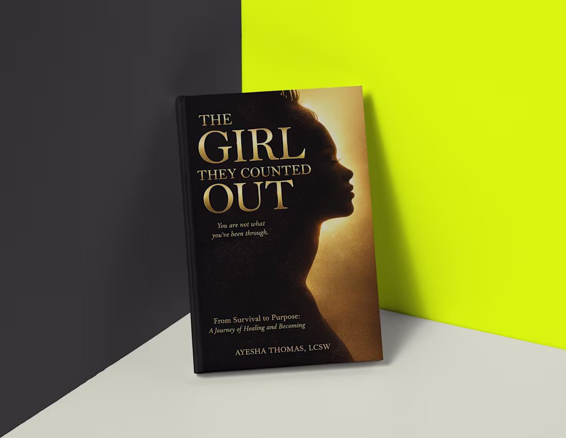
The Girl They Counted Out 📚
“Not every story starts with strength… some begin with survival.”
Designed this book cover to capture a journey most people don’t see the quiet transformation from pain to purpose.
The light vs shadow isn’t just aesthetic.
It represents the shift…
from being overlooked → to owning your voice.
Typography was kept bold and minimal
so the message hits instantly, even at a glance.
Because in today’s world,
A book cover has seconds to make someone feel something.
And if it does… it works.
What does this cover make you feel?
2
3
94
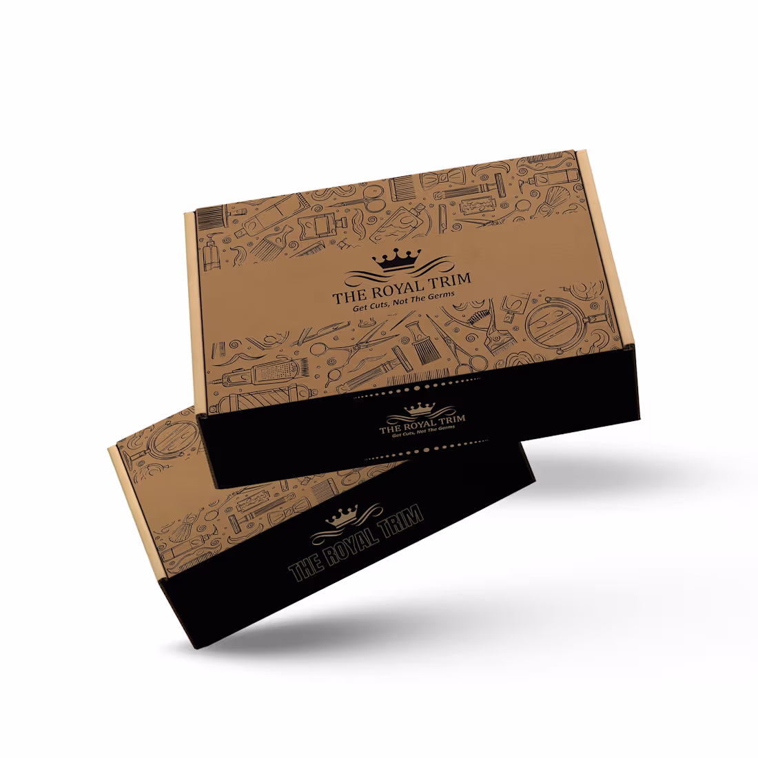
While designing the packaging for The Royal Trim, I wanted it to feel truly connected to the barbering world. Instead of using heavy typography, I created custom patterns inspired by barber tools to give the box a more unique and professional identity.🔥
The clean layout and bold color palette keep it minimal, while the patterns add character and make it stand out on the shelf. The goal was simple make the packaging feel as sharp and refined as the tools inside.🙌
Curious to know, would you pick this up just by looking at the box? 👀
2
3
93
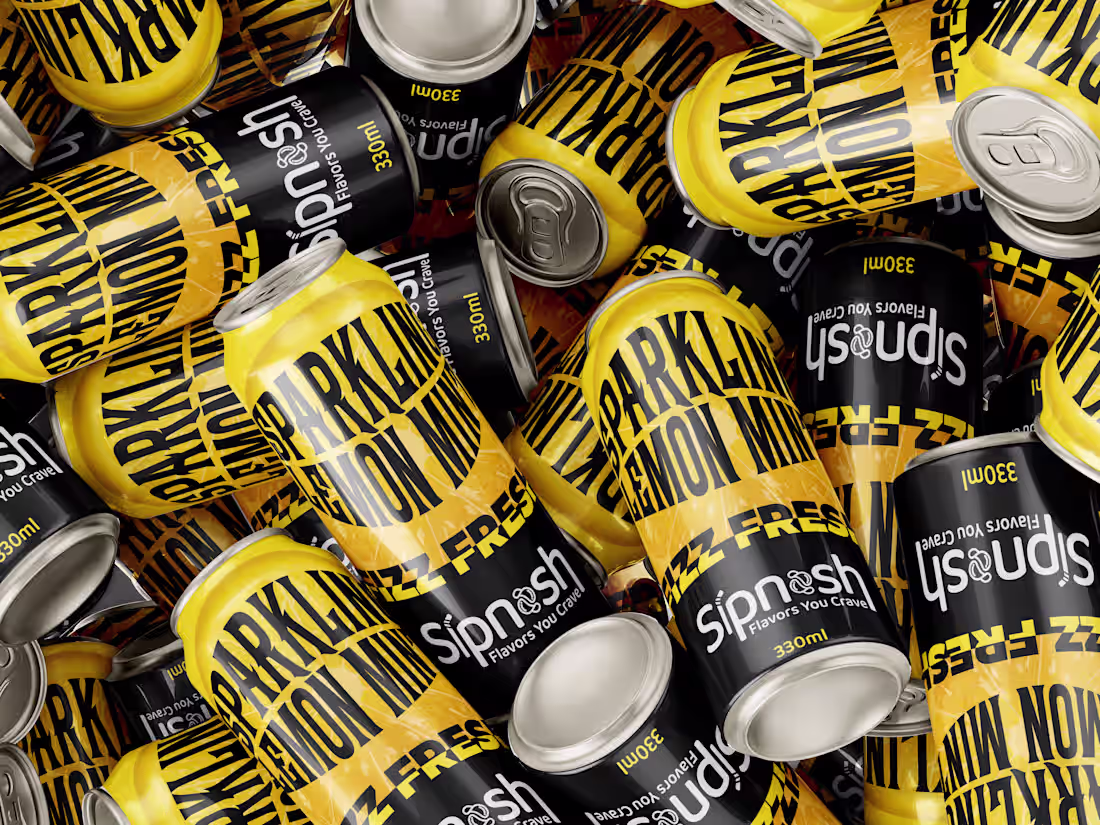
Sparkling Lemon Mint Can & Carrier Packaging Design
1
0
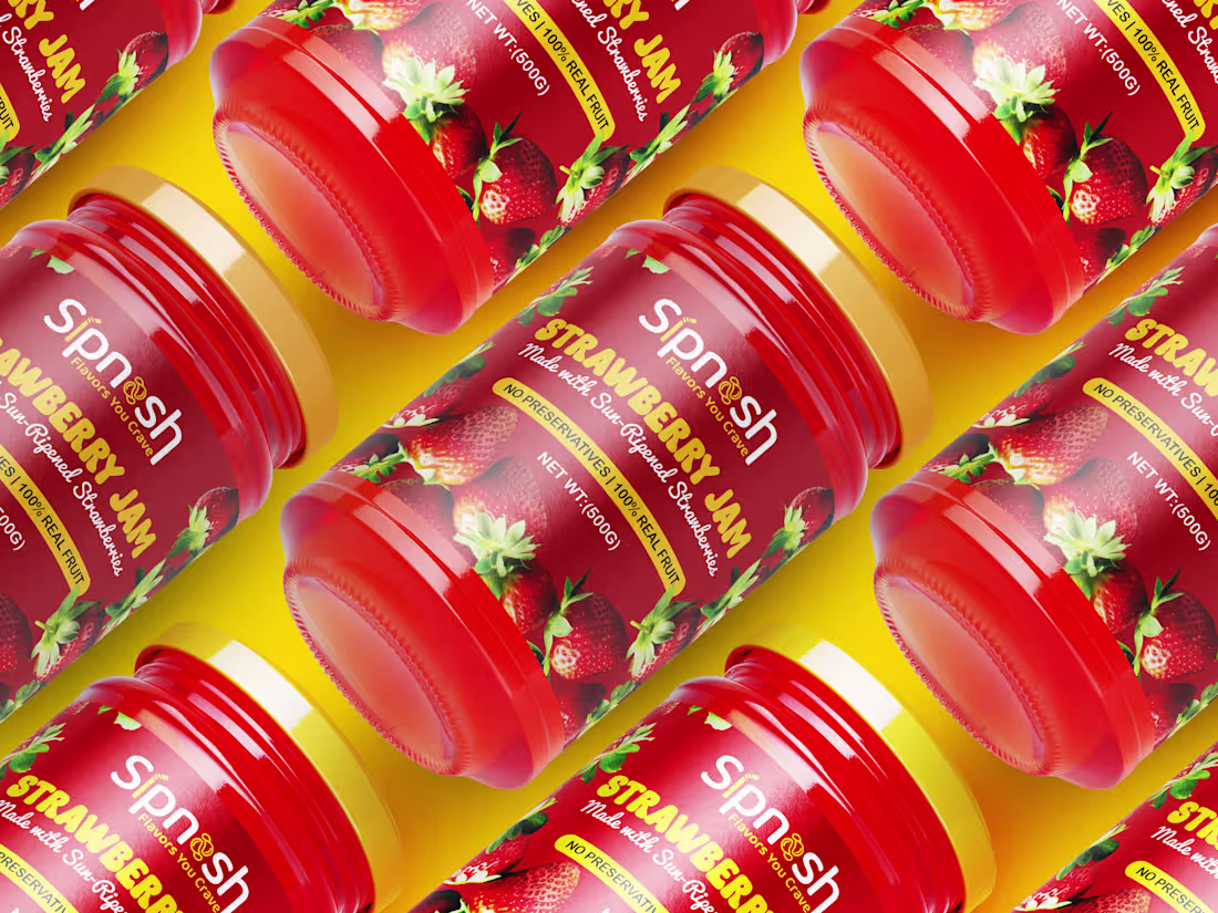
Strawberry Jam Label Design
1
0
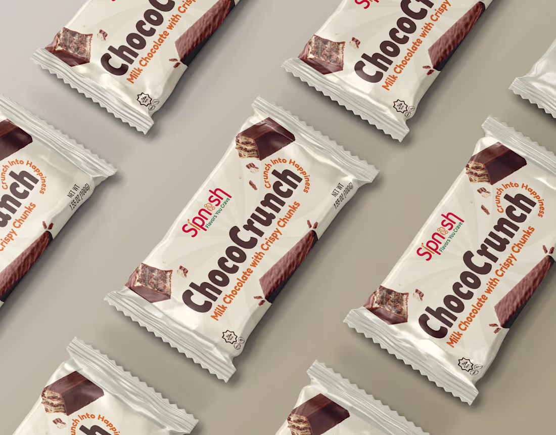
ChocoCrunch Milk Chocolate Packaging Design
1
1
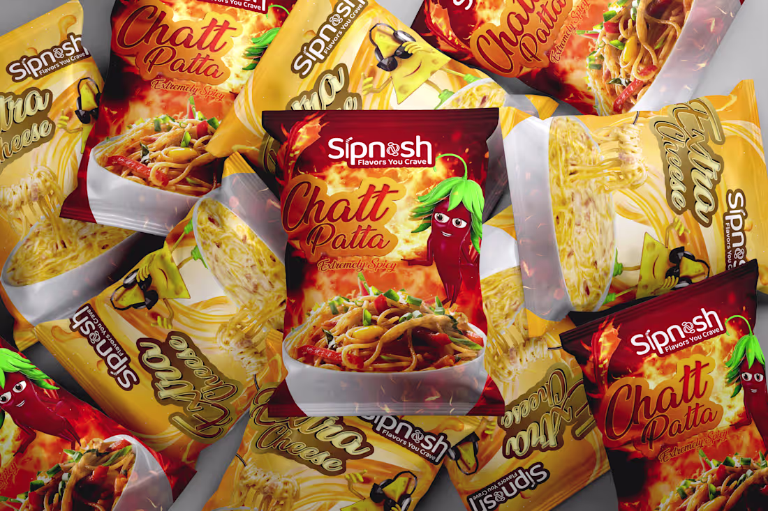
Chat Patta & Extra Cheese Maggi Packaging Design
1
0

Aloevera Herbal Soap Packaging Design
1
0
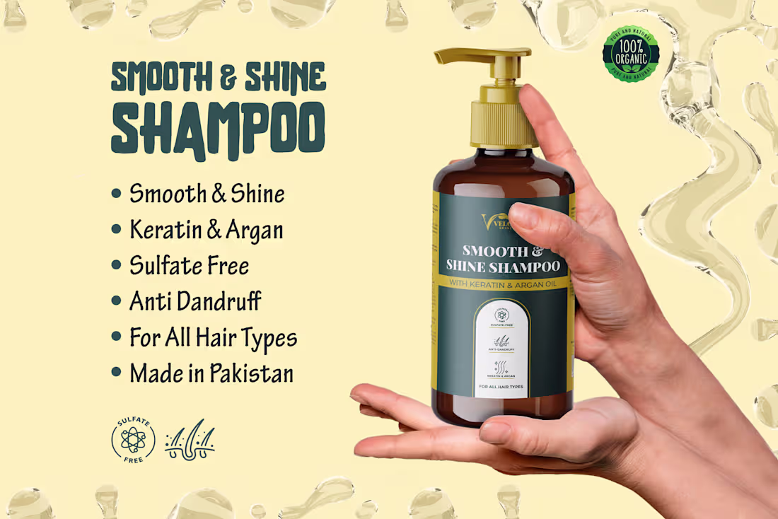
Smooth & Shine Shampoo Packaging Design
1
1
Exfoliating Face Scrub Packaging Design
1
2
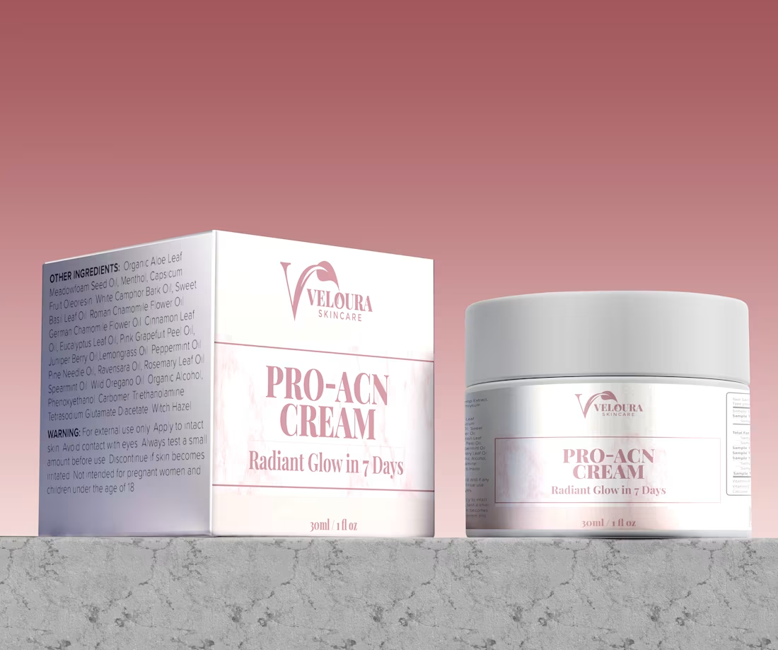
Pro Acne Cream Packaging Design
1
0
Spinash Butter Popcorn Packaging Design Concept
1
1
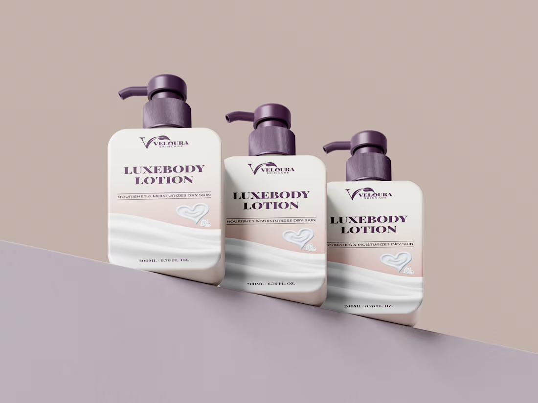
LuxeBody Lotion Packaging Design
1
2
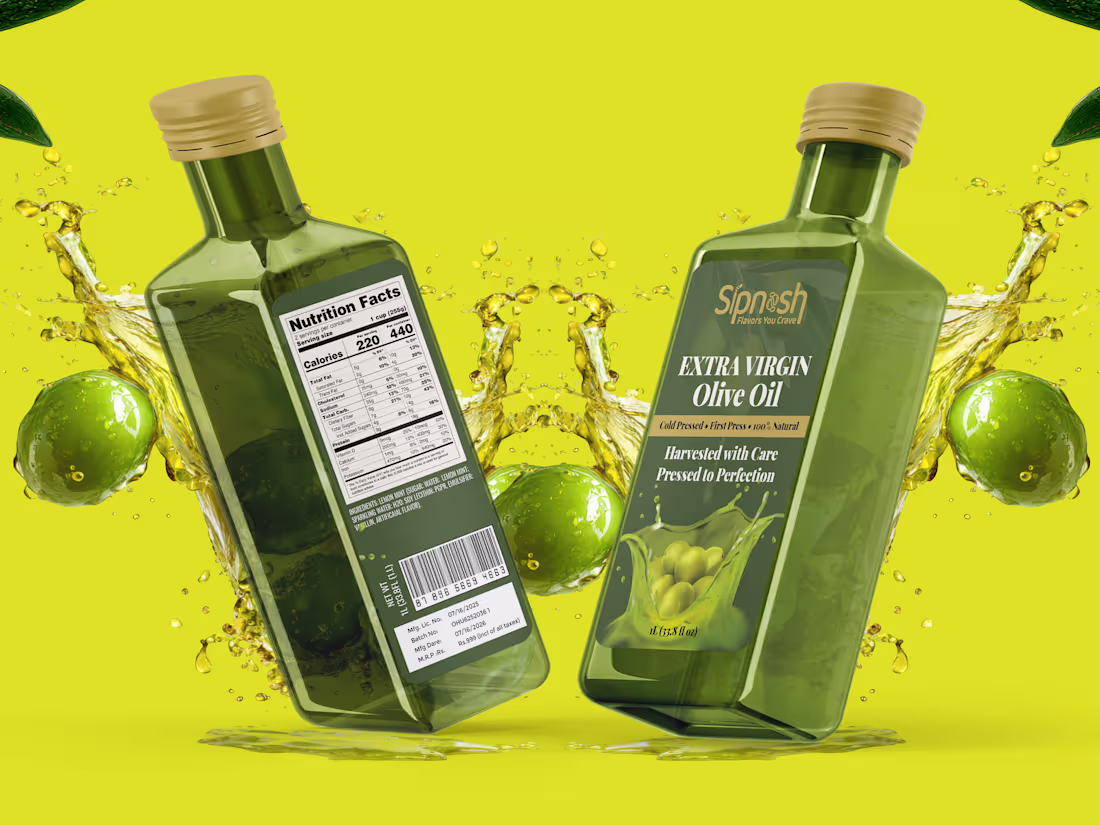
Olive Oil Bottle Label Design
1
1
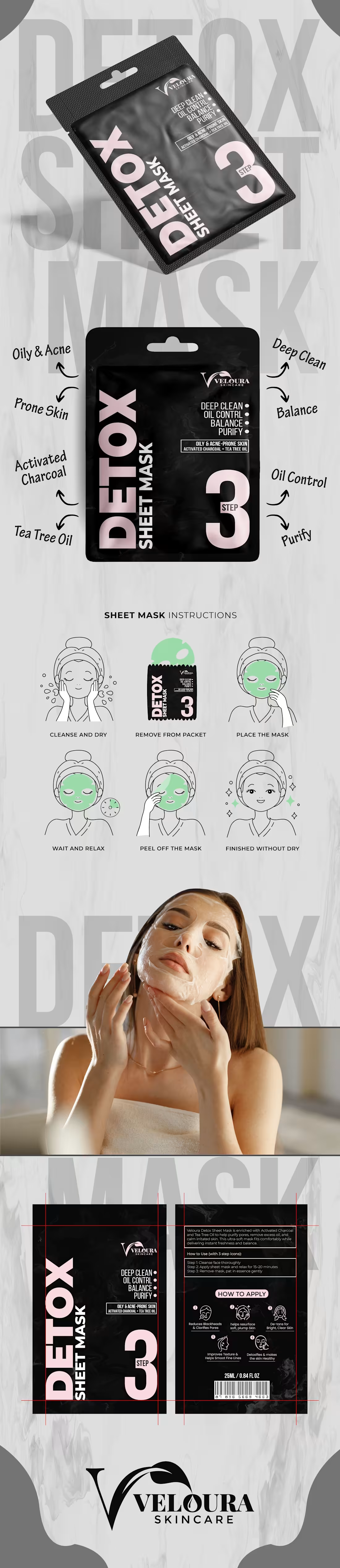
Detox Sheet Mask Packaging Design
1
2
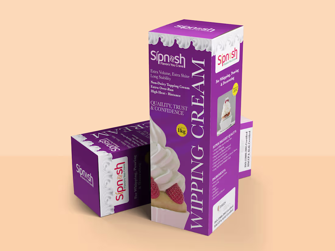
Wipping Cream Box Design
1
0
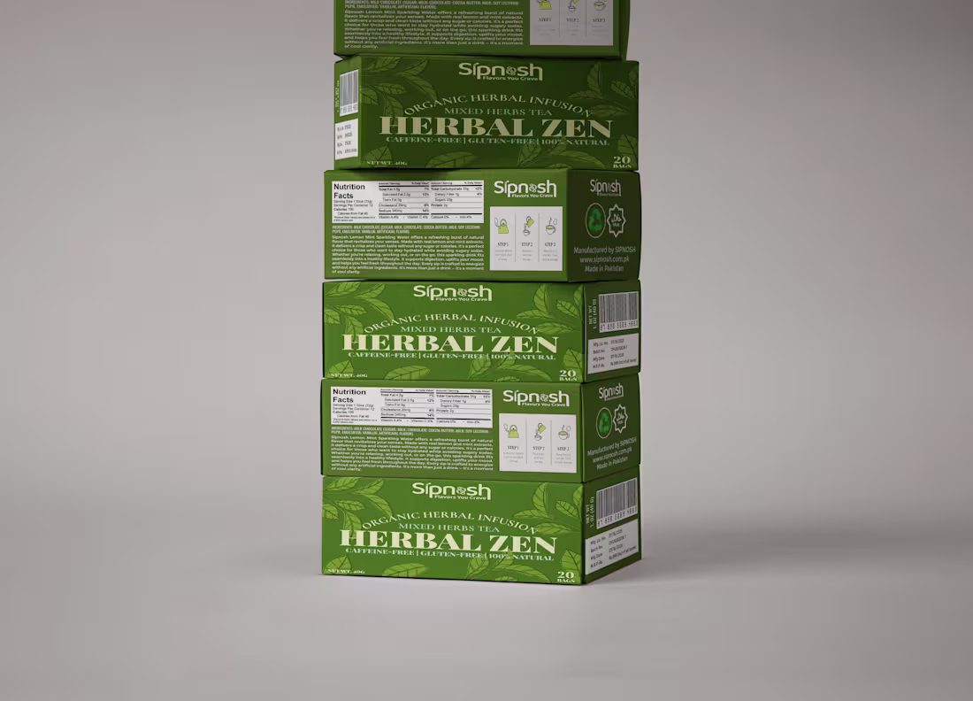
Herbal Zen Organic Herbal Tea Packaging Design
1
1
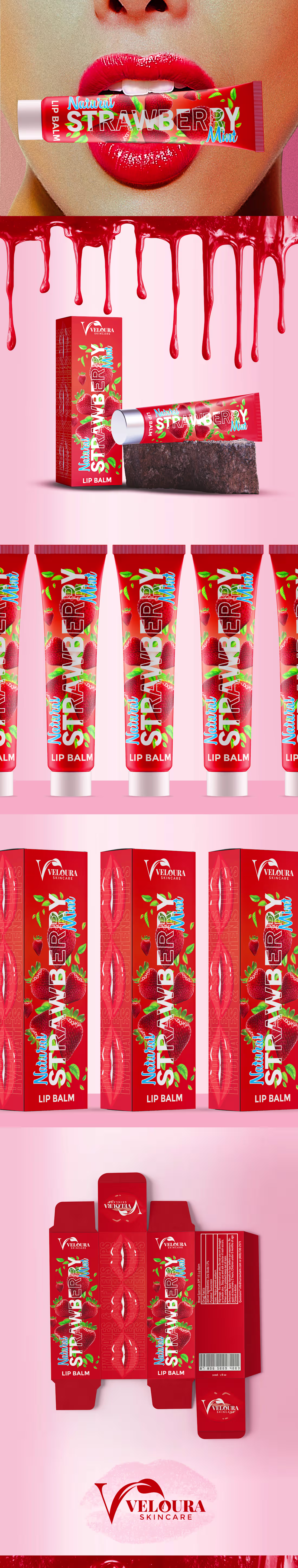
Strawberry Mint Lip Balm Packaging Design
1
2
Trango Enterprise LLC logo Design
1
0
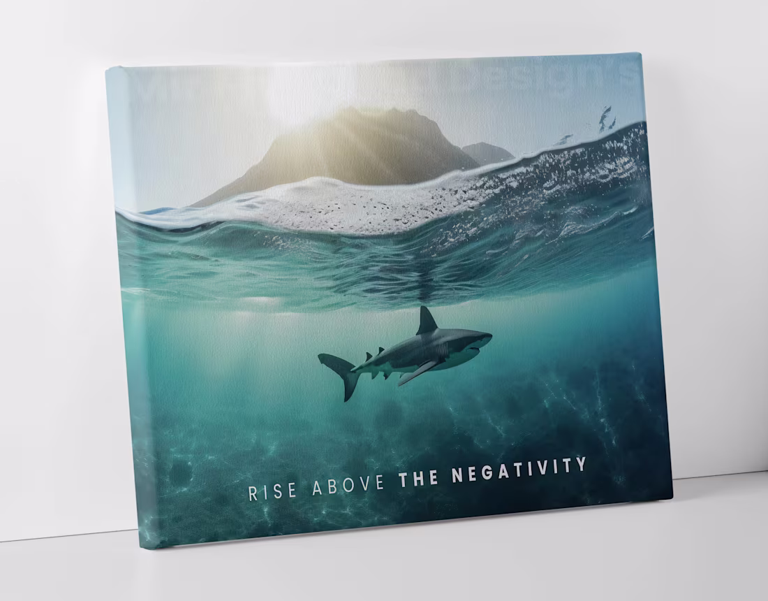
Rise Above The Negativity Wall Canvas Design
1
2
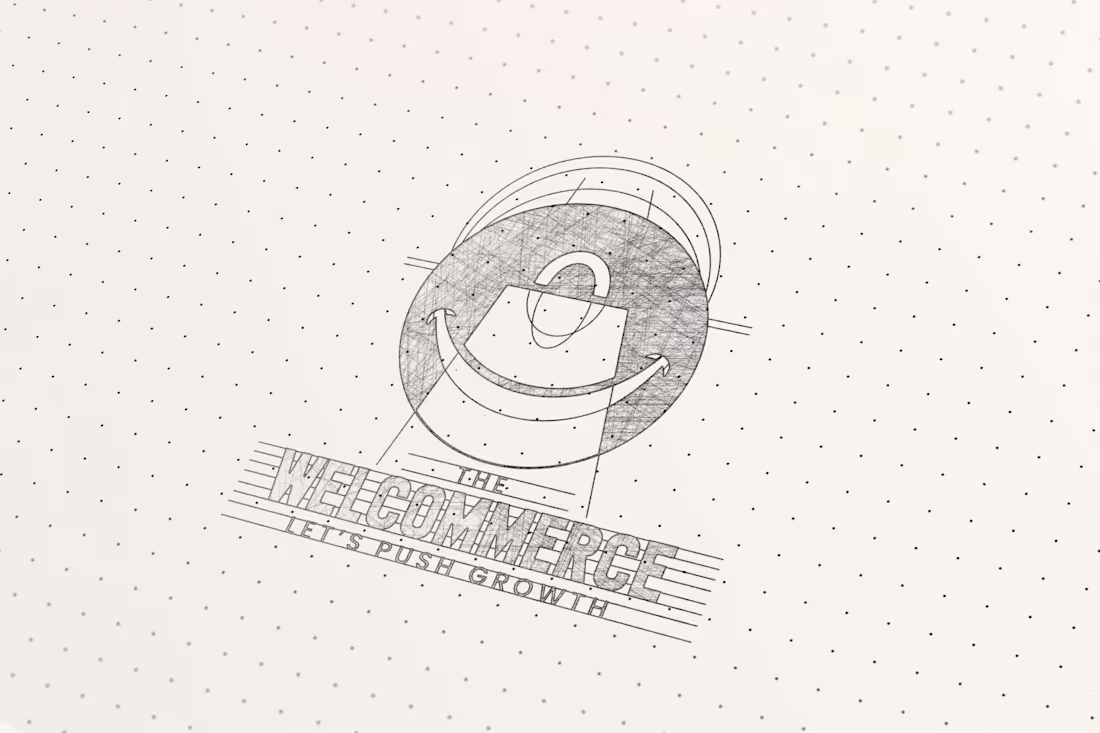
The Welcommerce Logo Design
1
1
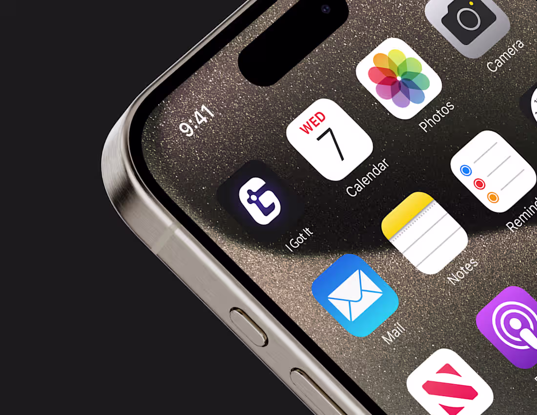
I Got It Logo & App Icon Design
1
1
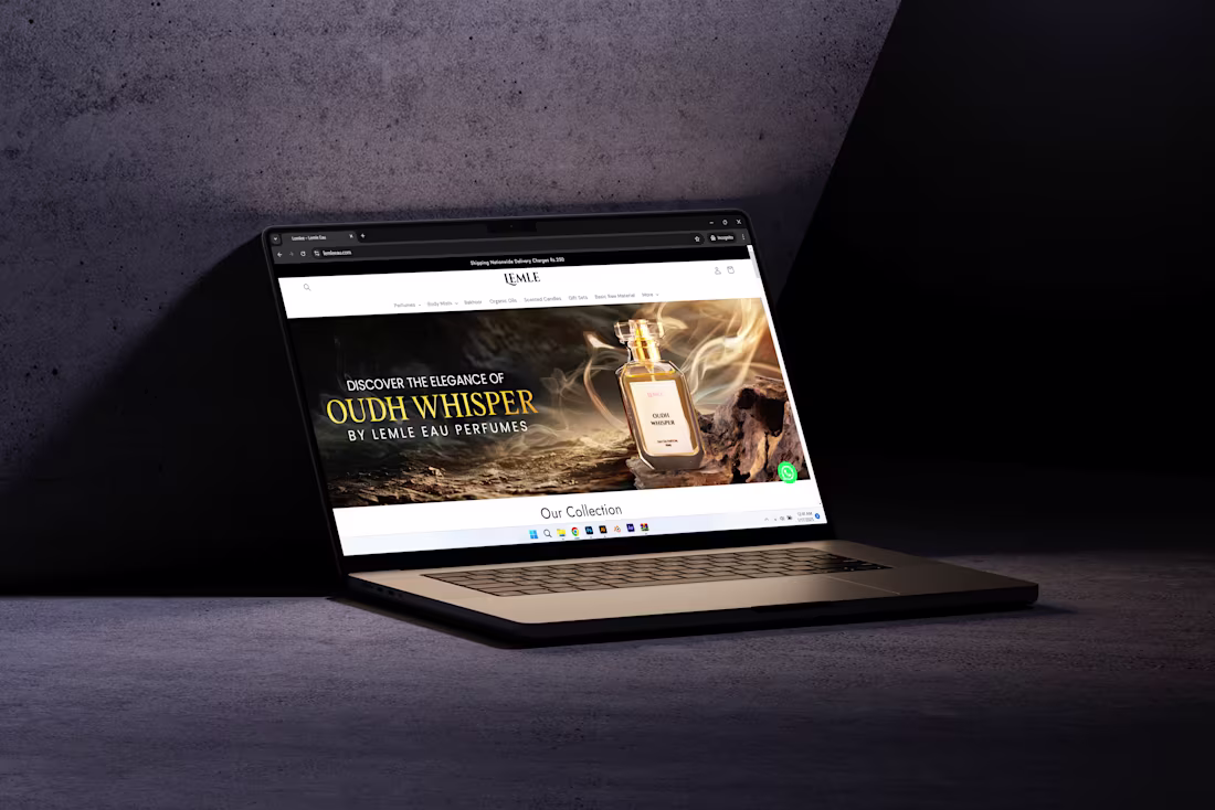
Website Cover Image Design
1
0