The network for creativity
Join 1.25M professional creatives like you
Connect with clients, get discovered, and run your business 100% commission-free
Creatives on Contra have earned over $150M and we are just getting started
Back to feedPost
Taste Test
Sometimes a website doesn’t need a full rebuild – just a clearer, more modern experience. We recently redesigned this homepage and simplified the layout, messaging, and structure. Curious which version you’d trust more at first glance: old or new?
29 voted
50%
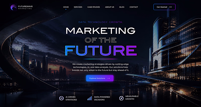
29 voted
50%
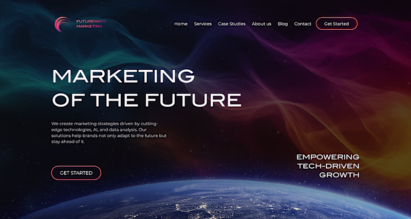
58 votes
Closed
The old one looks more clear and less sophisticated.
Your AI missspelled Services on the new navbar
New one has depth and the CTA is more emphasized 👍
I will go for the new one👍
Wow this is cool
Based on personal preference, I'll take the new one
both are looking really good
Nice work man
This is really cool but I prefer the old one
The new one looks awesome
Great work
The Old looks more mature
Excellent Work Brother
New! 🔥
Love the overall design direction 🔥
Voted New, the layout simplification does the most work here. The old version isn't bad, it just asks too much from the visitor too early. The new one earns attention before it asks for anything. That's the difference between a homepage that informs and one that converts.
The network for creativity
Join 1.25M professional creatives like you
Connect with clients, get discovered, and run your business 100% commission-free
Creatives on Contra have earned over $150M and we are just getting started
Related posts
I redesigned the website for this project, keeping its core elements while making it more modern and techy with dark mode by default, eye-catching floating animations, and improved color contrast.
Do you think the redesign I made in Figma is better? Or is the original version better?
19 voted
40%
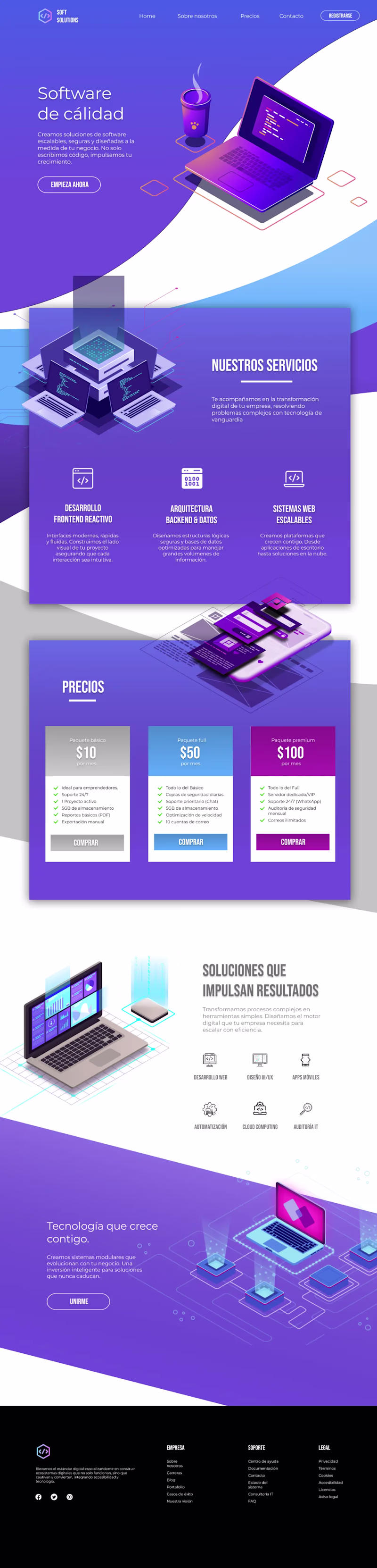
28 voted
60%
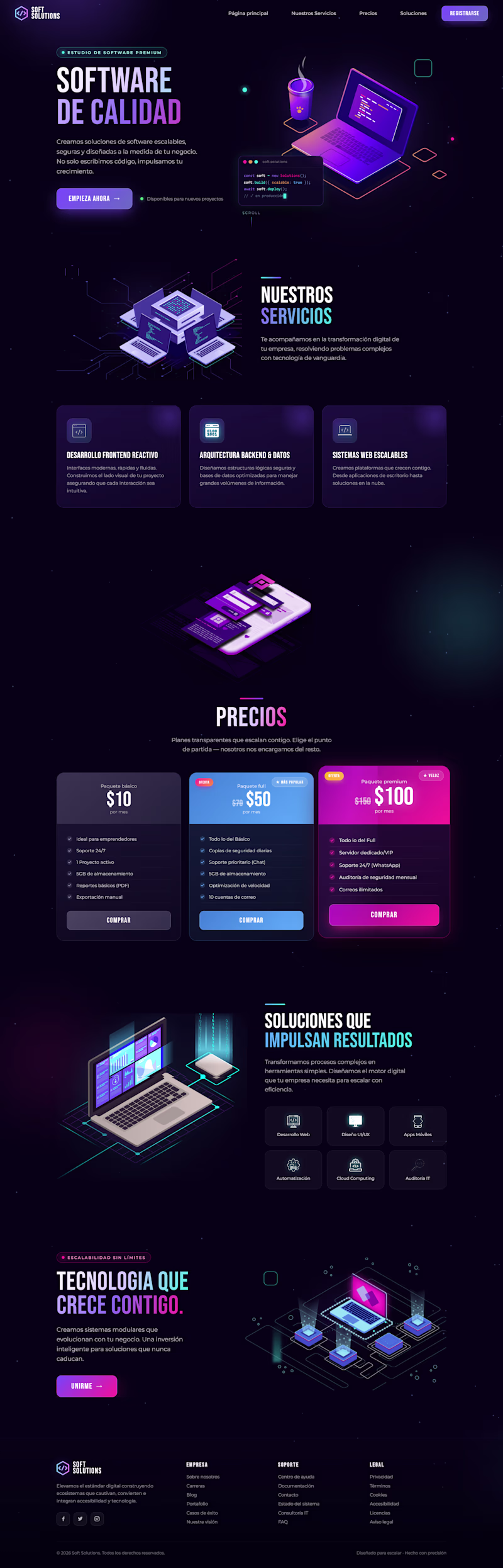
47 votes
Closed
Both of them looks nice but I can clearly see a big mistake on the footer the orig light page footer should be white or blue in color. @Grecia Valero that's why everyone's voted on the dark mode
Love this!
Trending
Claude
Claude has entered the design space. How are you using Claude Design?
Contra University
Learn from expert creatives how to earn more using next-gen AI tools.
creativeaiflow
Creative AI workflows are evolving. What tools do you use, and what are their strengths and weaknesses?
freelancerlife
Freelancer life is wins, pivots, and everything in between. What’s yours right now?
