The network for creativity
Join 1.25M professional creatives like you
Connect with clients, get discovered, and run your business 100% commission-free
Creatives on Contra have earned over $150M and we are just getting started
Back to feedPost

WARHOL // Website
Meet WARHOL — a bold portfolio website for a creative studio that doesn't do boring.We fused brutalist web design with an edgy grid layout, crisp typography, and slick animations that punch you right in the retina.
This modern website design was made for design collectives, fashion brands, and anyone tired of cookie-cutter templates.Packed with interactive UI elements, a responsive layout, and a ton of attitude — WARHOL turns scrolls into stares.
Ready to build a portfolio that actually says something? Let’s go.
Check it out and let us know if we nailed the vibe: CLICK ME
❖❖❖


The network for creativity
Join 1.25M professional creatives like you
Connect with clients, get discovered, and run your business 100% commission-free
Creatives on Contra have earned over $150M and we are just getting started
Challenges
View all


Related posts

Wellix two homepage directions. Which one would you pick?
Wellix is an AI tool that reads health records and explains them in plain language lab results, scans, and charts turned into something a person can actually understand without a medical background.
Same brand, same palette, same illustration just two different ways of arranging the hero.
Which one would you go with, A or B? Drop a comment I'd like to hear which one lands better for you.
60 voted
61%
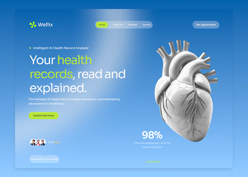
39 voted
39%
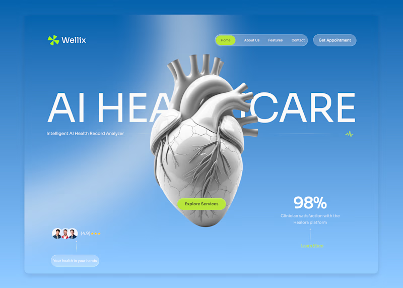
99 votes
Closed

Version. A does the job

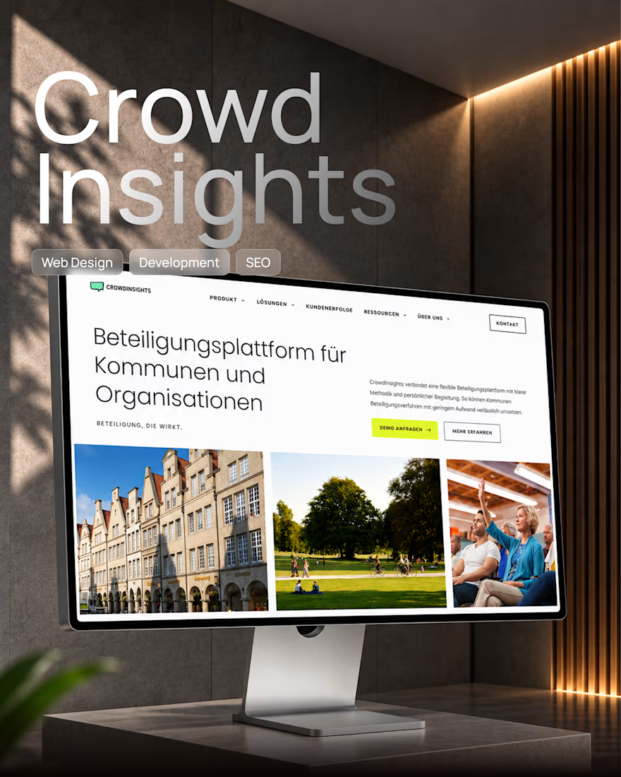
Framer Website Redesign for a Digital Participation SaaS Platform 🚀
A complete redesign and Framer development project focused on turning a complex software offering into a clear, modern, and scalable digital experience.
We created a new visual direction aligned with the product UI, reusable components, responsive layouts, CMS-powered content, and a strong technical foundation for SEO, AEO, accessibility, and future growth.
The result is a website that not only looks like part of the product ecosystem, but is also much easier for the internal team to manage and scale.
Design → Framer Development → CMS → SEO/AEO → Performance
#Framer #WebDesign #SaaS #UIUX #WebDevelopment #SEO #AEO

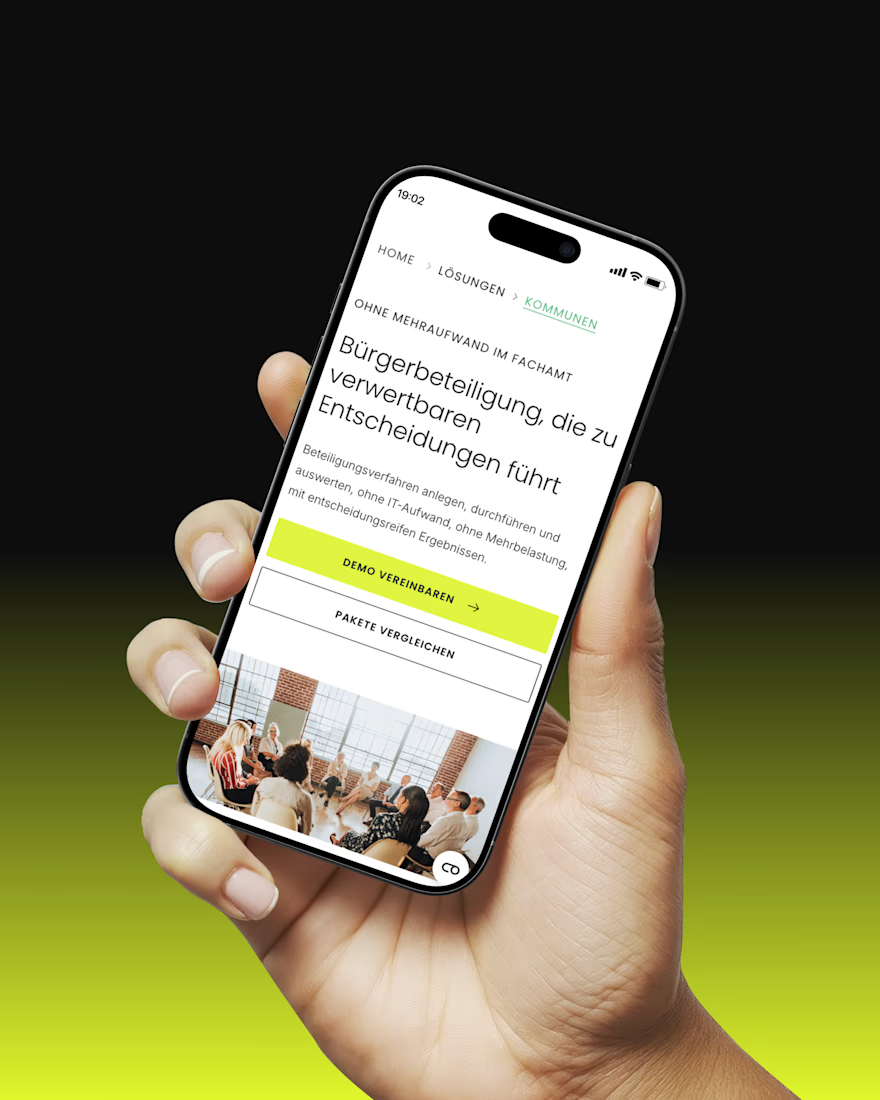
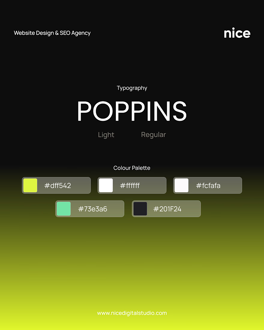
Never seen Poppins pop this well


Just posted mobile design for event platform 🎫 Share your feedback


Looks sharp


