
BL/S ®
Award-winning Digital Studio. Webflow Experts. 2x Webby.
New to Contra
BL/S is ready for their next project!
E-commerce grids are predictable. This one isn't.
Part three of Serotoninn focuses on the heart of the shop — the All Items and product pages. The challenge was making browsing feel as exciting as flipping through a high-end fashion magazine. No boring layouts, no compromise on visual energy. Pure joy at every scroll.
And then there's the 404 page. Because we believe every corner of a website deserves attention — even the dead ends. We turned a digital dead-end into a fun, stylized statement that feels as considered as the rest of the site.
Every single page. Every single detail. Built to feel alive.
5
39
Jason Bergh_Film Production // Case Study_Vol.1.0
Let’s be real: the world has enough boring, "safe" websites. When we sat down with the legendary Jason Bergh, we didn't just want to build a portfolio. We wanted to build a digital sanctuary for his incredible storytelling.
We’re talkin’ high-octane visuals, a UI that breathes, and enough soul to power a small city. It took a lot of late nights, a healthy amount of caffeine, and a mutual refusal to settle for "fine." The result? A home for Jason’s work that finally feels as cinematic as the films he creates.
Wait, there’s more! This is only Part 1 of our little takeover. Consider this the grand opening of the lobby—the red carpet is rolled out, the lights are dimmed, and the show is just beginning.
Go give it some love: 👉 jasonbergh.com (http://jasonbergh.com)
Stay tuned for Part 2, where we dive deeper into the guts of the design. We promise it’s worth the wait.🤘🏻
10
12
481
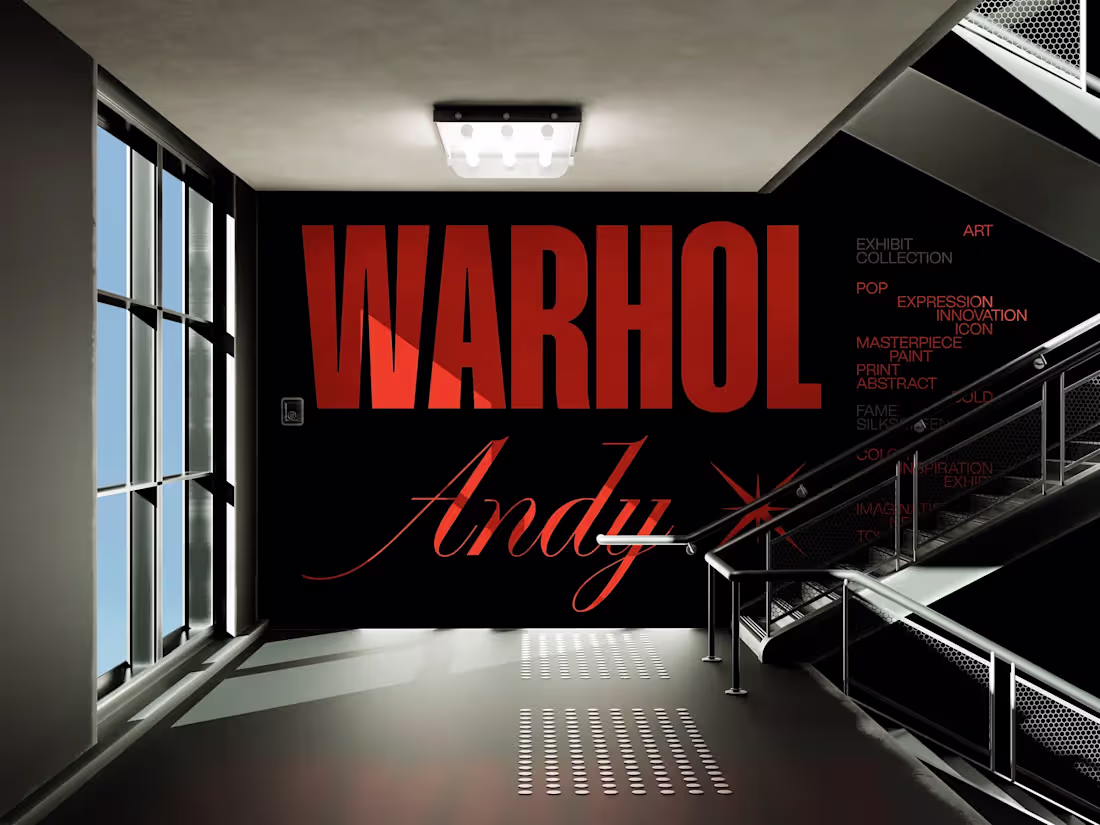
WARHOL // Website
Meet WARHOL — a bold portfolio website for a creative studio that doesn't do boring.We fused brutalist web design with an edgy grid layout, crisp typography, and slick animations that punch you right in the retina.
This modern website design was made for design collectives, fashion brands, and anyone tired of cookie-cutter templates.Packed with interactive UI elements, a responsive layout, and a ton of attitude — WARHOL turns scrolls into stares.
Ready to build a portfolio that actually says something? Let’s go.
Check it out and let us know if we nailed the vibe: CLICK ME (https://warhol-arts.webflow.io/)
❖❖❖
5
398
DICH™ Fashion
We wanted it loud. We made it louder. 🤘🏻
This is not just a website. It’s a digital middle finger to the beige and the boring.
We’ve started shaping the online home of DICH — a place where boldness lives, violet leads, and nothing fades into the background.
What you're seeing is just the tip of this beautifully unhinged iceberg. More pages, more madness, more DICHness dropping soon. 👾
Until then — Slam that link. Feel the vibe. Question everything.
Check out the live site → here ← (https://dich-fashion.webflow.io/) and feel the heat. 🫶🏻
1
8
424
An editorial concept built around an unlikely collision: raw, hyper-realistic nature and sharp, clean digital layout.
Floating mossy rocks, crisp circular lines, rich organic textures — all placed inside a structured, bold typographic system that keeps everything from tipping into chaos. The result is a digital storefront with personality and depth: alive, considered, and visually impossible to ignore.
No boring grids. Tons of texture. A whole lot of heart.
5
21
Vision is a web concept for a platform sitting at the intersection of urban planning and archaeological research — two fields that rarely get design this considered.
The interface blends futuristic and industrial visual elements into a system that feels both advanced and human. A precise color scheme, sharp typography, and a layout that communicates technological capability without losing accessibility. Modern enough to inspire confidence, intuitive enough to actually use.
A digital environment built for researchers, planners, and institutions that want their tools to match the ambition of their work.
1
11
Platform that makes booking a mobile home feel as exciting as the trip itself.
The dashboard combines clean, intuitive UI with interactive 3D models of each property — crafted entirely in-house — giving users a realistic and engaging way to explore their options before booking. The visual direction balances warmth and precision: approachable enough to inspire adventure, structured enough to make the process effortless.
Browse, explore, book. A rental experience designed for people who move.
1
17
A self-initiated research project built around two obsessions: grids and micro-animations.
This concept explores what happens when unconventional layout systems meet deliberate, witty interaction design in a fashion context. Every grid decision was pushed beyond the expected — asymmetric structures, layered compositions, and spatial tension that keeps the eye moving. Micro-animations were designed to reward attention, adding personality and depth without distracting from the content.
An ongoing exploration into how structure and motion can elevate a fashion UI from functional to unforgettable.
2
4
37
The internet doesn't need another predictable template. SEROTONINN needed a homepage that hits like a physical punch of aesthetic pleasure.
Months of work went into building this — bold typography, raw fashion energy, and a visual system designed for human emotion over generic best practices. Every detail of the main page was crafted to feel intentional: nothing safe, nothing templated, nothing compromised.
This is the crown jewel — part one of the full site, leading with the page that sets the tone for everything else.
Built for high-end vibes, designed to be felt, not just scrolled past.
4
79
A weekly creative experiment that turned into a full visual series.
Three editorial posters built around fashion eyewear — combining high-contrast photography, glitch overlays, HUD-inspired typography, and After Effects motion to create a look that sits between digital archive and fashion editorial. Each poster plays with grid fragmentation, duotone color, and layered type to give the series a cinematic, tech-native feel.
Designed to explore new tools, test visual directions, and have fun doing it.
1
20
A self-initiated concept exploring the future of personalized product design — where imagination is the only brief.
The idea is simple: type in a concept, and AI generates an original design for your product. T-shirts, hoodies, mugs, water bottles — anything. The interface is sleek and minimalist, keeping the focus entirely on the creation. No distractions, just the product and your idea taking shape in real time.
A 3D preview mode lets users visualize and tweak every detail before committing — bridging the gap between creative impulse and physical product.
Where creative flow meets AI-powered tech. Zero effort, all the fun.
1
18
The homepage set the tone. Part two goes deeper.
For the About page, we turned a standard section into a raw, high-fashion manifesto. Custom micro-animations — small, witty interaction details that reward curiosity and make the experience feel alive. The kind of details that make you stop mid-scroll and wonder how they did that.
Every interaction was crafted intentionally: nothing decorative, everything purposeful. Motion as a design language, not an afterthought.
5
35
Decide Protocol is a plug-and-play solution for AI and verification processes — and the website needed to feel as capable as the product behind it.
The design direction is dark, polished, and deliberately bold. Sharp geometric patterns, dynamic visuals, and a minimalist interface that communicates technological precision without sacrificing clarity. Every element was crafted to guide the user effortlessly while reinforcing a sense of cutting-edge capability at every scroll.
A website that doesn't just catch the eye — it earns trust.
2
28
Every element was designed to push boundaries — dynamic 3D animations crafted entirely in-house, a sleek ultra-modern interface, and a shopping journey where every interaction feels smooth, futuristic, and intentional. Visual immersion is the strategy, not the decoration.
This isn't a website with 3D bolted on. It's an experience where motion, design, and commerce are built as one.
For fashion brands ready to set a new standard online.
2
27
Kinki is a brand that doesn't do subtle — and the design wasn't going to either.
We developed a full visual identity and packaging system around Kinki's unapologetically bold and playful personality. Rich chocolate textures, vibrant color combinations, and cheeky details that reward a closer look. Every element was crafted to pull the consumer into Kinki's world — where indulgence and fun aren't just features, they're the whole point.
From brand identity to packaging, the system is cohesive, distinctive, and impossible to ignore on shelf.
🔗 See it live: trykinki.com (http://trykinki.com)
1
25
A self-initiated style exploration built around one question: how far can you push pink before it pushes back?
The concept fuses modern elegance with a daring visual twist — striking typography, fluid animations, and a vibrant color palette that radiates confidence without apology. Every element was designed to feel cohesive yet surprising, blending sleek minimalism with unexpected details that reward a second look.
Not a brand for a specific client — a study in what bold, fearless identity design can look like when there are no constraints.
1
4
66
Nite Riot®_Film Production // Case Study_Vol.1.0
When NITE RIOT approached us, they didn’t ask for “just a site.”
They wanted a digital riot—and we brought the noise.
No templates. No rules. Just raw rhythm, brutalist elegance, and transitions that hit like a drop at 3AM.
From seamless Difference Mode magic to horizontal scrolls that play like film reels, this baby moves.
Minimalism? Yeah—but with a wild side.
Every pixel was built to feel alive, loud, and unapologetically bold.
Proud to drop this one as a collab between me and my killer team at BL/S 💥Hit the link, dive in, and get ready to scroll like you’ve never scrolled before.
❖❖❖
🔗 https://www.nite-riot.com/
5
326
Most tech websites look like they were designed by a robot for another robot. This website was built to change that.
A landing page exploration for a B2B SaaS or AI brand — one that actually looks like it's building the future. Deep sci-fi purples, smooth orbital gradients, and typography clean enough to eat off. Every visual decision was made to inject emotion into a space that's usually defined by sterile grey boxes and stock photography.
The goal was simple: prove that complex technology can be communicated with beauty, not just clarity.
SaaS and AI companies are literally shaping what's next. Their design should feel like it.
13
212
A self-initiated concept exploring what a mobile marketplace could feel like when personality is treated as a feature.
We built the UI around a set of custom 3D illustrations — a juicy burger, a groovy lava lamp, a tropical island, a Tetris throwback — each designed to set a mood and make every section of the app feel worth exploring. The 3D objects aren't decoration; they're the visual language of the experience.
Beneath the creative chaos is a clean, seamless shopping flow — intuitive navigation, considered hierarchy, and interactions that feel alive.
A marketplace that makes you want to browse just for the vibe.
6
98
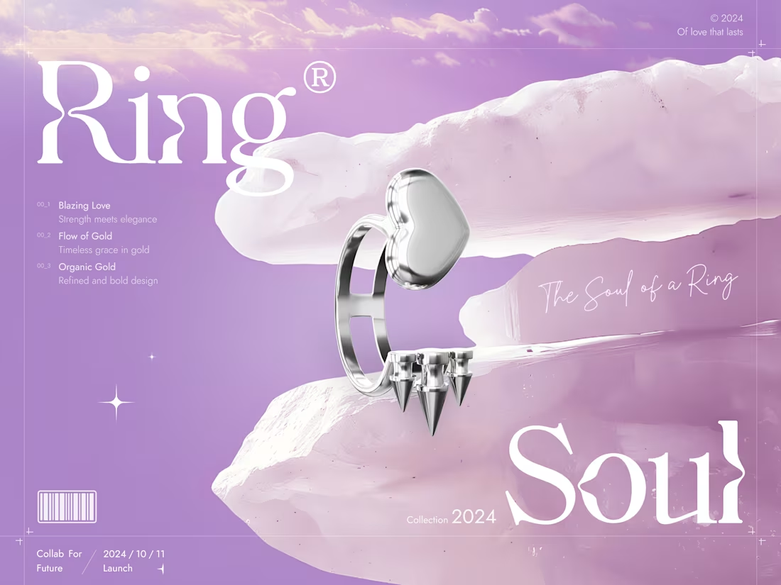
A self-initiated concept built around one idea: jewelry deserves a digital space as striking as the pieces themselves.
We designed and rendered a collection of rings entirely in 3D — handcrafted geometry, refined materials, and lighting that makes every curve and surface feel tangible. The website concept was built around this visual language: sleek layouts, cutting-edge visuals, and a narrative flow that guides the user through the collection like a gallery.
Bold enough to feel editorial. Sophisticated enough to feel luxury.
A digital space where fashion meets innovation — and neither compromises.
5
95
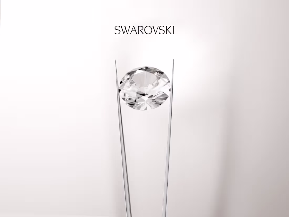
Some brands inspire you to create just for the craft of it. Swarovski is one of them.
A self-initiated, non-commercial 3D study built around Swarovski's iconic jewelry design. We brought their earrings into the 3D space to explore hyper-realistic material textures, dramatic lighting setups, and high-end compositional choices — treating it like a real campaign production from start to finish.
No brief, no client. Just a deep appreciation for world-class craftsmanship and a desire to push our 3D work further.
An unofficial creative homage in CGI.
5
82
Shihiko needed a website that matched the attitude of the brand — bold, stylish, and built to sell.
We designed a clean, modern UI with a sharp UX flow that makes the shopping journey effortless from first impression to checkout. Elevated typography, rich visuals, and smooth transitions create an experience that feels premium without slowing things down. Mobile-first by design, optimized for conversions by intention.
A fashion e-commerce website that looks as good as what it sells.
7
99
Boutique is a self-initiated mobile e-commerce concept built for fashion brands that want their app to feel as considered as their product.
The design prioritizes elegance and ease — clean UI, smooth navigation flows, and product pages crafted to make browsing feel like window shopping at its best. Every interaction is intentional: swipe-friendly, mobile-first, and optimized for conversion without sacrificing aesthetic.
A shopping experience that looks like couture and works like clockwork.
Built for fashion brands, online stores, and digital retailers who believe the app is part of the brand.
10
138
Bitenest is a self-initiated dashboard concept built for the crypto world — where complexity is the norm and clarity is the competitive advantage.
The design combines a clean, modern UI with slick data visualization components and intuitive navigation that makes even the heaviest data feel manageable. A fully responsive layout ensures the experience holds up across desktop, tablet, and mobile — without sacrificing function for form.
Sleek enough to feel premium, smart enough to actually work.
Built for crypto traders, blockchain platforms, and fintech startups that believe their dashboard should be as sharp as their strategy.
5
89
A clean, responsive website for a tech brand — minimal UI, crisp typography, subtle animations, and intuitive navigation built to convert.
Main text:
Blend needed a website that felt as sharp as the product behind it.
The design direction is clean and intentional — minimal layout, bold typography, and subtle animations that add life without distraction. Every section was built to guide the user naturally from first impression to action, with a responsive structure that performs across all devices.
Crisp, smooth, and built for a brand that wants to stand out without shouting.
4
73
Ec/Ho is a self-initiated mobile app concept built around the idea that good design can feel like a deep breath.
The interface is deliberately minimal — soft visual hierarchy, intuitive navigation, and a mobile-first layout that reduces friction at every step. Every interaction was designed to feel calm and intentional, supporting the kind of mindfulness experience users actually want to return to.
Not just a wellness app aesthetic — a considered UX system built to scale with the product.
For mental health platforms, meditation tools, and startups that believe calm is a feature, not an afterthought.
4
73
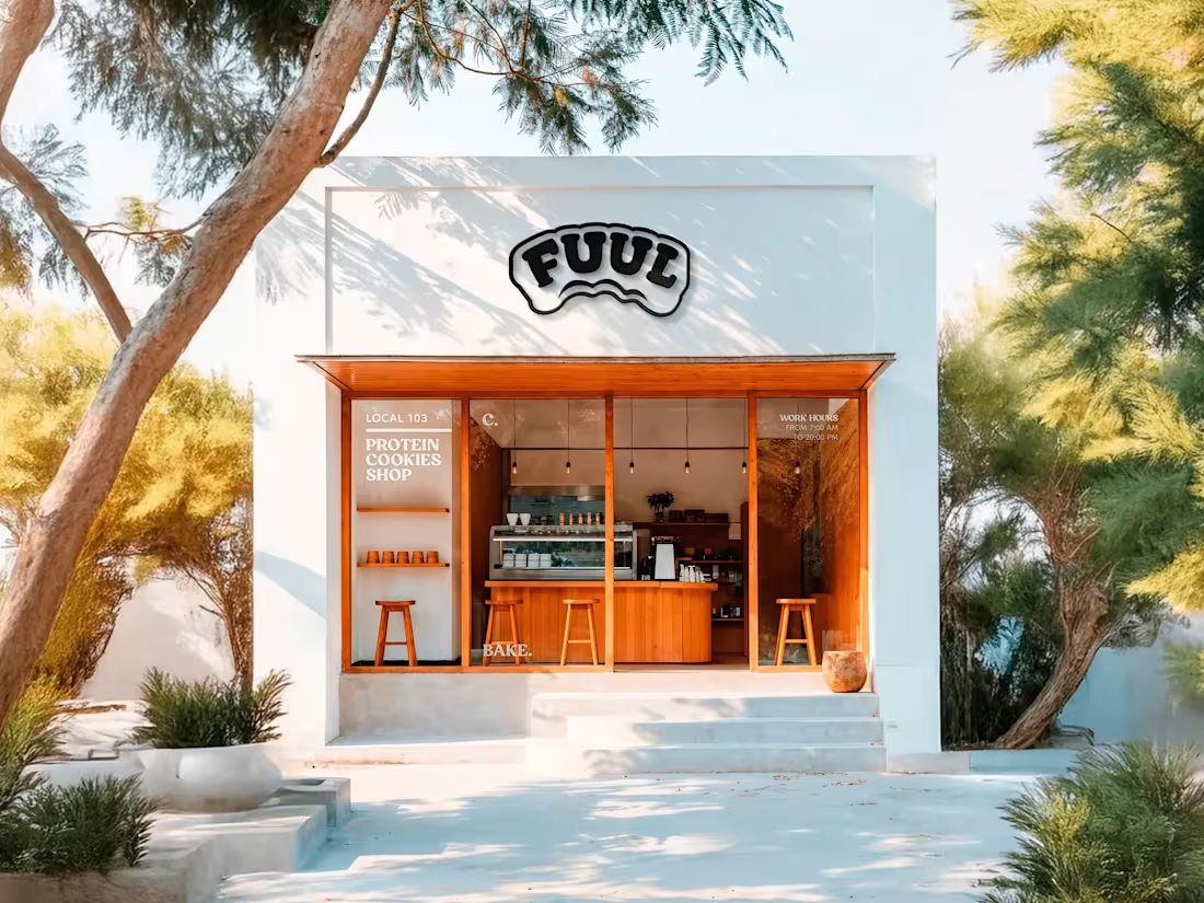
FUUL — Brand Identity & Logo Design
4
1
Crystal is a self-initiated website concept built around one idea: make technology feel refined.
Clean UI, smooth animations, and crisp typography form the foundation — a visual system that balances style and function without tipping into either extreme. Bold visuals and intuitive navigation guide the user through the experience effortlessly, while the responsive layout ensures nothing is lost on any device.
The design language is sharp, modern, and just polished enough to earn trust at first glance.
Built for tech startups, digital agencies, and brands that want their website to feel as considered as their product.
5
75
Sunborn is a self-initiated concept for a luxury hospitality brand that needed a digital presence as exclusive as the experience it sells.
The design combines a clean, modern UI with rich visual storytelling — bold imagery, smooth animations, and a fully responsive layout that performs on every screen. Intuitive navigation keeps the experience effortless, while the visual system communicates premium quality from the first scroll.
Warm, radiant, and built to convert. A website that feels like a destination before you've even booked.
4
72
Hello, people! 🍃
Let’s be honest, managing money can sometimes feel a bit overwhelming. That’s why we wanted to create a digital banking experience that feels calm, intuitive, and genuinely pleasant to use.
Inspired by the softness of nature, we combined organic textures with clean, modern glassmorphism.
The goal was simple: to design a friendly ecosystem where handling your finances feels less like a chore and more like a seamless part of your daily lifestyle.
8
16
270
Howdy, folks? 🔴
Welcome to Voyeur Verite—a digital space where we stop pretending and start presenting things as they truly are. When designing this website, our mission was simple: make it bold, make it clean, and make it impossible to look away.
We focused on a seamless user experience wrapped in a confident visual identity. Because why hide your best features when you can put them on display?
Take a scroll, click around, and let us know your thoughts.
👉 https://www.voyeurverite.com/
4
65
Crystal Part 2 brings the desktop experience to mobile — fully optimized, nothing compromised.
A self-initiated mobile UI/UX concept for a tech brand website, built around responsiveness and feel. Clean interface, intuitive navigation, and a visual hierarchy that translates seamlessly to smaller screens. Buttery transitions, crisp typography, and interactions designed to make every tap feel intentional.
Where Part 1 established the visual language, Part 2 proves it works everywhere.
3
64
UNIC is a self-initiated mobile app concept for a curated shop selling unique furniture and home decor — the kind of pieces you don't find everywhere.
The design prioritizes effortless browsing: clean layout, bold product visuals, and intuitive navigation flows that make discovery feel natural and addictive. Every screen was built with a mobile-first mindset — pixel-perfect detail, smooth interactions, and a visual hierarchy that lets the products speak.
Warm, modern, and considered. A shopping experience that feels as unique as what it sells.
5
74
Some product launches deserve a fan edit. This is ours.
A self-initiated 3D animation concept built around Maybelline's aesthetic — high-gloss product rendering, dynamic motion design, and a visual energy that matches the brand's signature boldness. Every frame was crafted to feel like a real campaign asset: scroll-stopping, desire-sparking, and unapologetically extra.
No brief, no client — just a deep appreciation for beauty brands that know how to show up.
An unofficial, unrequested tribute in CGI. May cause sudden shopping urges.
4
58
Spin Twin is a self-initiated concept for a brand that needed its website to feel as alive as its identity.
The design is built around energy and movement — kinetic scroll interactions, vivid color combinations, and smooth animations that turn browsing into an experience. Bold typography and custom visuals give the layout personality, while a clear underlying structure keeps everything from tipping into chaos.
Fun with intention. Playful with purpose.
Built for entertainment brands, creative studios, and anyone who believes a website should make people smile before it makes them click.
5
59
CTRL the Chaos is a self-initiated dashboard UI concept built around a simple tension: data is complex, but using it shouldn't be.
The design system leans into dark mode aesthetics — clean grids, deliberate typographic hierarchy, and a layout structure that guides the eye without overwhelming it. Data visualization components are built to communicate at a glance, reducing cognitive load while keeping the interface visually sharp.
Every decision — spacing, color, component structure — was made in service of clarity and control. Sleek enough to feel premium, structured enough to actually work.
Built for SaaS platforms, analytics tools, and productivity dashboards that refuse to choose between function and style.
4
56
DropX is a self-initiated concept for a SaaS landing page built around one goal: convert without compromising on craft.
The design combines bold hero sections with animated UI elements and sharp, confident typography. Every layout decision serves the conversion flow — capturing attention at the top, building trust through the middle, and driving action at the bottom.
Fast, premium, and alive. A visual system that communicates product quality before the user reads a single word.
Built for tech startups, product launches, and digital products that need a landing page as sharp as the product itself.
4
6
132
Hey hey! 👁
Honestly, we got so tired of those boring, robotic AI interfaces that look like they were made for spreadsheet lovers. So we decided to build an AI Assistant with an actual soul, a killer wardrobe, and... a very familiar face.
Yeah, about that — look closely at the avatars. Those aren't random stock photos or generic prompts. That is literally our team. We decided to digitize ourselves because, honestly, why hire models when you look this good?
Layout-wise, we smashed the usual boring structures and rebuilt everything into a clean, interactive Bento Grid. Everything moves, breathes, and
feels alive.
2
5
62
Hiya, friends! 🔴
We couldn't just leave Voyeur Verite on the desktop. True branding needs to live, breathe, and occasionally disrupt your daily commute.
Here is a closer look at the mobile version—smooth, responsive, and completely unfiltered—alongside some heavy-hitting city light mockups. No corporate fluff, just clean layouts doing what they do best: commanding attention.
Made with Webflow, GSAP & our love.
👉 https://www.voyeurverite.com/
4
56
Stanley is a self-initiated concept exploring what a modern outdoor gear website could feel like when branding and UX are given equal weight.
The design balances rawness with refinement — bold grid layouts and earthy tones that ground the experience, paired with an immersive scroll narrative that tells a story of adventure and functionality. Every section moves the user forward, from brand impression to product confidence to conversion.
Built for direct-to-consumer brands that want to feel premium without losing their edge. Grounded, purposeful, and hydrated.
4
55
Floya is a self-initiated mobile app concept built around one question: what does a wellness app feel like when it actually feels good to use?
The design direction is deliberately calm — soft UI components, a warm and restrained color palette, and interaction flows that reduce friction and invite consistency. Every screen was designed to support daily habits without adding cognitive load.
Mindfulness features, routine tracking, and personal growth tools — all wrapped in an interface that feels emotionally intelligent rather than clinical.
A concept for lifestyle apps and self-care platforms that want to connect with users on a human level.
4
57
BurnOut is a concept built around one idea: attitude at full volume.
A self-initiated exploration for a high-energy content platform — one that needed to feel raw, fast, and impossible to scroll past. The design combines punchy visual hierarchy with glitchy motion UI and a brand identity that doesn't ask for permission.
Bold typography, aggressive layouts, and a visual system wired for speed. Every element pushes against the grid just enough to feel alive without losing structure.
Built for media platforms, digital collectives, and creative brands that want their online presence to hit like a statement.
5
68
Cre8tera needed a website that could keep up with the ambition of the work it showcases.
The design leans into expressive, high-energy aesthetics: oversized typography that commands the screen, scroll-based animations that guide attention without slowing things down, and a layout system with enough personality to feel memorable — and enough structure to feel credible.
Every section is built to communicate creative confidence. Bold, smart, and slightly unhinged in all the right ways.
Built for a design studio that wanted their website to feel like a statement of intent — not just a portfolio.
4
58
Bola is a brand identity project for a lifestyle brand that takes its work seriously, but not itself.
The design direction centers around a modular logo system — soft curves, clean geometry, and identity elements flexible enough to work across digital, print, and merch. The visual language balances playfulness with strategic thinking: approachable enough to connect, distinctive enough to stick.
Color, typography, and mark were all built to scale — from a social media avatar to a hoodie to a storefront.
A self-initiated exploration in building brand identities that feel smart, fun, and ready for the real world.
5
61
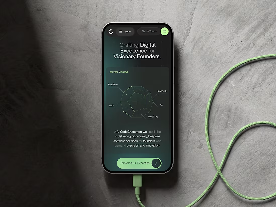
CodeCraftsmen Vol.2 - Part 2 // Website
5
6
Meet CodeCraftsmen. The tech bros you’ve been dreaming of.
Behind every mind-blowing website, there is an engineer who didn't sleep for three days. For us, that superhero is CodeCraftsmen — our absolute favorite development partner.
When they asked us to design their new digital home, we cheered so loud our neighbors called the cops. We wanted to create a website that feels as smooth, powerful, and flawless as the code they write every single day. Here is a sneak peek of what we cooked up!
Let us know what you think in the comments. Hugs and pixels!
4
59
Wohoo, friends! 🧠
Say hello to your new favorite screen interaction.
Dask Audio is an AI assistant crafted to rescue you from bad playlists and boring audio experiences. Our mission was to turn complex AI algorithms into a warm, immersive, and visually stunning journey.
Think glowing neon gradients, futuristic 3D audio shapes, and a dark mode that feels like a premium late-night concert.
We had an absolute blast designing this, and we hope you feel that energy radiating through the mockups!
3
72
Zerg is a website built for brands that don't do quiet.
The brief called for something kinetic and unapologetic — a digital experience that feels like controlled chaos. We combined brutalist layout structure with liquid scroll animations, bold typography, and a high-contrast color system to create a UI that commands attention from the first scroll.
Every interaction was designed to feel intentional: glitch aesthetics that reinforce the brand's tech identity, motion that guides rather than distracts, and a visual language that speaks directly to a tech-native audience.
Built for esports, digital products, and startups that want their website to feel like a system overload — in the best possible way.
5
63
Granola.gg (http://Granola.gg) needed a website that matched the energy of its audience: fast, loud, and impossible to ignore.
The design direction leaned fully into gaming culture — wild color combinations, chaotic grid layouts, and playful microcopy that entertains as much as it informs. Every scroll delivers something unexpected, and every interaction is designed to keep users engaged and moving forward.
Snackable animations, e-sports aesthetics, and a visual system built for digital-native audiences who move fast and have zero tolerance for boring.
The result is a scrollable dopamine hit that converts without losing its personality.
3
44
Immersive 3D Metaverse Sneaker Website
3
2
DODD // Website PRT.2
2
3
DODD // 3D PRT.3
2
2
A free pack of fully editable Figma templates — bold, clean layouts built for portfolios, case studies, decks, and experimental ideas.
2
48
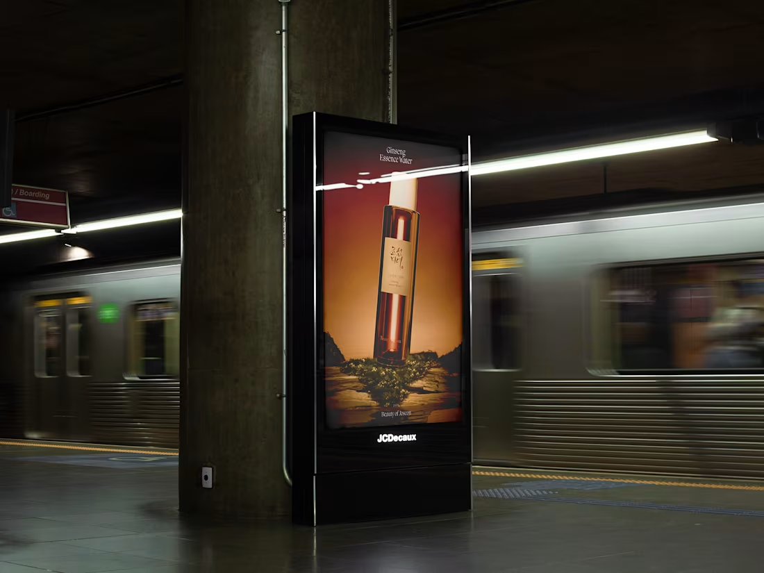
Beauty of Joseon 3D Promotional Tribute
2
3
An experimental 3D alphabet built around rock and glass — raw stone textures fused with polished reflections and light. Free to use and remix in Figma Community.
Main text:
The first volume of our experimental alphabet series. The concept was duality — rough and smooth, heavy and fragile, raw and refined.
Each letter combines stone textures with glass surfaces, layered with energy and light. The result sits somewhere between type design and material exploration — bold enough for a poster, striking enough for a case study or motion reel.
The full alphabet is fully editable and free to use or remix — available on Figma Community.
2
42
A digital tribute to Arne Jacobsen's Series Seven — an interactive configurator concept that lets you explore materials, finishes, and details of a design icon.
A self-initiated concept project built around one of the most recognizable chairs in design history — Arne Jacobsen's Series Seven.
The idea was simple: take a timeless icon and give it a digital space worthy of its legacy. The result is an interactive configurator that lets users explore warm wood finishes, chrome variations, and upholstery options — all wrapped in an interface that feels as considered as the chair itself.
The design direction leans into Danish precision: clean layouts, balanced typography, restrained color palette. Playful enough to invite exploration, polished enough to respect the source material.
A concept for anyone who believes that good design — whether a chair or a UI — should feel inevitable.
3
51
An experimental 3D alphabet built around Tuba and Strandline materials — glossy tubes, liquid curves, and flowing textures. Free to use and remix in Figma Community.
The second volume of our experimental alphabet series. Where Part 1 explored glass and rigidity, Part 2 is about rhythm, motion, and tactile playfulness.
Each letter is built using Tuba and Strandline material fusions — glossy surfaces, liquid curves, and flowing textures that sit somewhere between type design and 3D art. Bold enough for a poster, strange enough for a motion reel.
The full alphabet is fully editable and free to use or remix — available on Figma Community.
🔗 Search "Frmt: Alphabet [Tubes & Wires]" in Figma Community to grab it.
3
52
Honestly? We couldn’t just show you the ring once and call it a day. We’re so incredibly proud of this piece of metal that we spent hours just staring at it, playing with it, and seeing how it looks in every light possible.
So, we made a tiny movie about it.
This video is a little trip through our favorite visual experiments. It’s got different vibes, different textures, and a whole lot of soul. We poured our hearts into making this thing real, and this showreel is just us celebrating that.
4
4
144
Source One Parts Center delivers real OEM truck parts fast. The brand lives in a world of diesel, logistics, and heavy machinery — and needed a digital presence that matched that energy without losing clarity.
The design direction: confident, structured, and built to last. Clean layouts that communicate trust and speed. A visual language that feels at home in the industry — without looking outdated.
The challenge was balancing the rawness of the trucking world with a polished, professional interface that converts. Every decision — typography, hierarchy, color — was made to reinforce one thing: these people know their parts, and they deliver.
2
56