The network for creativity
Join 1.25M professional creatives like you
Connect with clients, get discovered, and run your business 100% commission-free
Creatives on Contra have earned over $150M and we are just getting started
Back to feedPost
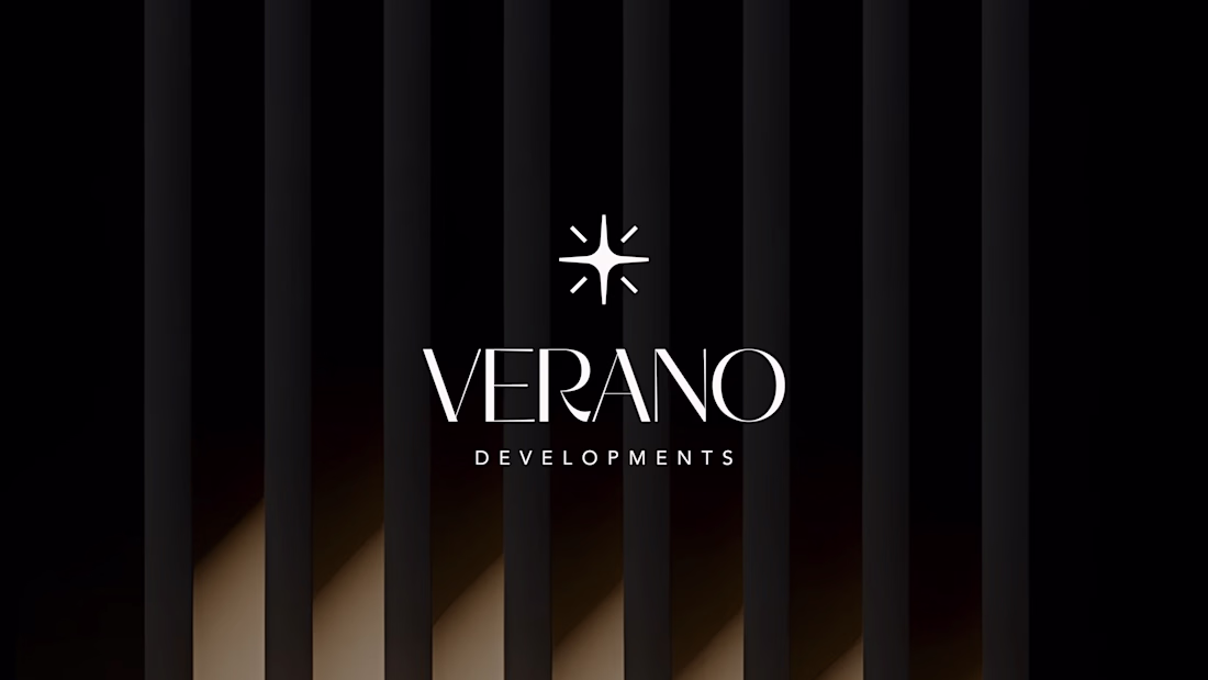
Verano Developments
Brand Identity & Visual System for a Boutique Luxury Real Estate Developer
Overview
Verano Developments is a new real estate developer entering Dubai’s competitive property market, launching its first residential project in Jumeirah Village Circle (JVC).
The objective was to create a premium, design-led brand identity that appeals to both investors and end-users seeking refined living experiences.
The Challenge
Dubai’s real estate market is saturated with developers positioning themselves as “luxury.”
The key challenge was:
How to differentiate Verano without relying on overused luxury clichés
How to establish credibility as a new entrant
How to communicate design sophistication with clarity and restraint
The Approach
The brand was built around the idea of quiet luxury and architectural precision.
Instead of loud visuals or decorative elements, the focus was on:
Strong typographic presence
Minimal and controlled visual language
A balance between emotional appeal and investment credibility
This ensured the brand speaks to both aspirational buyers and rational investors.
Brand Strategy
Positioning
A boutique developer crafting design-led residences for individuals who value quality, space, and timeless aesthetics.
Target Audience
Investors seeking long-term value
Design-aware professionals and expats in Dubai
Buyers who prefer understated sophistication over flashy luxury
Brand Personality
Refined
Architectural
Sophisticated
Warm
Intentional
Visual Identity
Logo Design
The identity is built around a refined wordmark, removing unnecessary symbols to reflect confidence and clarity.
The typography-led approach ensures the brand feels:
Premium
Timeless
Architecturally grounded
Typography
Primary: Minerva Modern (Serif)
Used to convey elegance and editorial luxury
Secondary: Avenir (Sans-serif)
Used for clarity, readability, and modern balance
This pairing creates a system where emotion meets function.
Color Palette
A soft, neutral palette inspired by architecture and natural materials:
Sand Beige
Warm White
Charcoal
Muted Gold (accent)
The palette avoids typical black-and-gold clichés, instead expressing modern luxury through restraint.
Imagery & Visual Language
The visual direction focuses on:
Natural light
Clean architectural forms
Material textures (stone, wood, glass)
Minimal human presence
This reinforces a sense of space, calm, and considered living.
Tone of Voice
The brand communicates with quiet confidence.
Instead of exaggerated claims, the messaging is:
Calm
Measured
Descriptive
Intentional
Example:
“Designed for those who value space, light, and quiet sophistication.”
Applications
To demonstrate real-world usability, the identity was applied across:
Social media creatives
Stationery (business cards, letterheads)
Outdoor branding concepts
Each application maintains consistency through spacing, typography, and tone.
Outcome
The final identity positions Verano Developments as a credible and differentiated player within Dubai’s upscale real estate market.
By focusing on clarity, structure, and restraint, the brand stands apart from typical luxury competitors and aligns with a more design-conscious audience.
Reflection
This project demonstrates my approach to branding:
not just creating visuals, but building systems that communicate value, trust, and positioning.
Let’s Work Together
If you’re building a brand that needs clarity, structure, and a strong visual presence, feel free to reach out.
🔗 Portfolio: https://Mouzambranding.framer.ai
🔗 Case Studies: https://Mouzam.framer.wiki
The network for creativity
Join 1.25M professional creatives like you
Connect with clients, get discovered, and run your business 100% commission-free
Creatives on Contra have earned over $150M and we are just getting started
Related posts
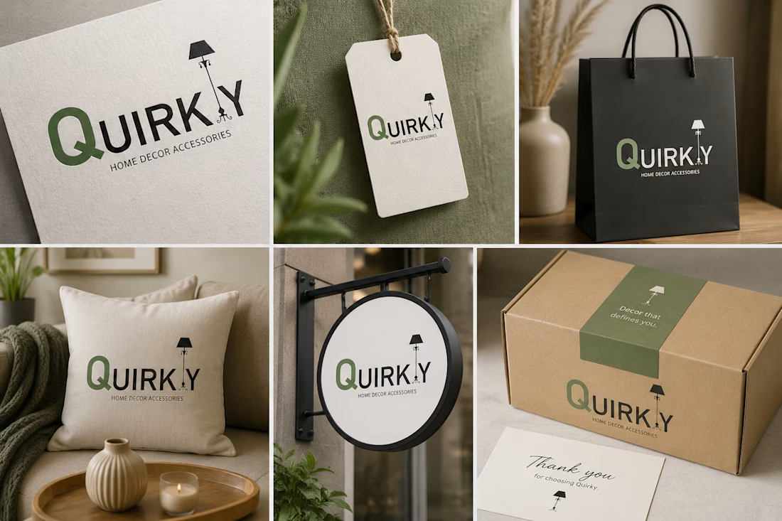
Logo Design for a Home Décor Accessories Brand
Designed a distinctive and modern logo identity for QUIRKLY, a brand associated with home décor accessories. The concept was created to reflect creativity, elegance, and a unique sense of style—qualities that resonate with contemporary interior aesthetics.
The logo balances visual appeal with brand functionality, ensuring versatility across packaging, social media, product labels, and promotional materials. Every element was carefully considered to establish a memorable brand presence while communicating sophistication, personality, and trust.
Logo Design | Brand Design
Wow! this is amazing
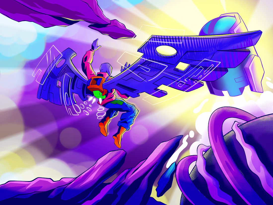
Illustration has always been about emotion. The best concept art never makes you think about the technique; it makes you feel the altitude before you know what you're looking at.
Escape Velocity is a 𝗵𝗶𝗴𝗵-𝗲𝗻𝗲𝗿𝗴𝘆 𝘀𝗰𝗶-𝗳𝗶 𝗮𝗰𝘁𝗶𝗼𝗻 𝗶𝗹𝗹𝘂𝘀𝘁𝗿𝗮𝘁𝗶𝗼𝗻 built for game studios, creative agencies, and brand campaigns that need visuals with real narrative weight. A jetpack rider launches between fractured purple canyon peaks, small against the scale of the world but undeniably the protagonist. Above them, a brutalist interceptor vessel hovers against a blinding solar burst. The scene doesn't explain itself. It pulls you in.
Warm neon accents cut through a cold violet atmosphere. A glowing green jetpack core. Halftone textures on the canyon rock nodding to classic comic art. Circuit-trace neon lines across the mechanical wings suggest the ship is alive, signaling back. Every color and composition decision was made to create one feeling: arrival, not escape.
𝗧𝗵𝗲 𝗽𝗿𝗼𝗯𝗹𝗲𝗺
Generic stock art that could belong to any brand. AI-generated scenes with no intentional composition. Concept art that shows technique but kills the story. Visuals that look impressive in isolation but fall apart at campaign scale.
𝗪𝗵𝗮𝘁 𝘁𝗵𝗶𝘀 𝗱𝗲𝗹𝗶𝘃𝗲𝗿𝘀
Narrative-first composition: every element placed to tell a story, not just fill a canvas
A bold neon palette with violet, coral-pink, burn orange, and solar burst yellow built for high contrast across any format
Original character design with costume detail, colour logic, and silhouette clarity at any scale
Mechanical vehicle and environment design brutalist ship geometry, halftone terrain, and atmospheric depth layered together
Circuit-trace neon detailing and comic-adjacent halftone shading for a style that is immediately distinctive
Delivered print-ready high resolution, layered source file included, ready for game key art, editorial, or brand use
𝗧𝗵𝗲 𝗿𝗲𝘀𝘂𝗹𝘁
An illustration experience that matches the ambition and energy of the projects it represents. Cinematic. Intentional. Built to make people stop scrolling and start feeling something.
Designing a game, campaign, editorial feature, or creative brand project that needs concept art with this level of visual depth? 𝗟𝗲𝘁'𝘀 𝗯𝘂𝗶𝗹𝗱 𝗶𝘁 𝘁𝗼𝗴𝗲𝘁𝗵𝗲𝗿.
wow
Tomorrow I’ll finally be sharing a new case study for a large award-winning influencer marketing agency based in the US 👀
Definitely one of those projects where I managed to combine a strong visual direction with a very user-oriented experience without sacrificing either side.
I worked on the project as a design lead — building the overall design concept, shaping the final visual direction, and designing both the desktop and mobile experience from start to finish.
A lot of cool details, interactions, and decisions went into this one, and honestly the client’s reaction to the final design result made the whole process even more satisfying.
Full case study drops tomorrow :)
Nice Job!
Trending
Claude
Claude has entered the design space. How are you using Claude Design?
Contra University
Learn from expert creatives how to earn more using next-gen AI tools.
creativeaiflow
Creative AI workflows are evolving. What tools do you use, and what are their strengths and weaknesses?
portfolioreview
The best portfolios tell a story, not just show a grid. Share yours for feedback.
freelancerlife
Freelancer life is wins, pivots, and everything in between. What’s yours right now?