
Adebimpe ABEIYA
Social Media Manager growing brands with strategy & content
- 5.0
- Rating
- 6
- Followers



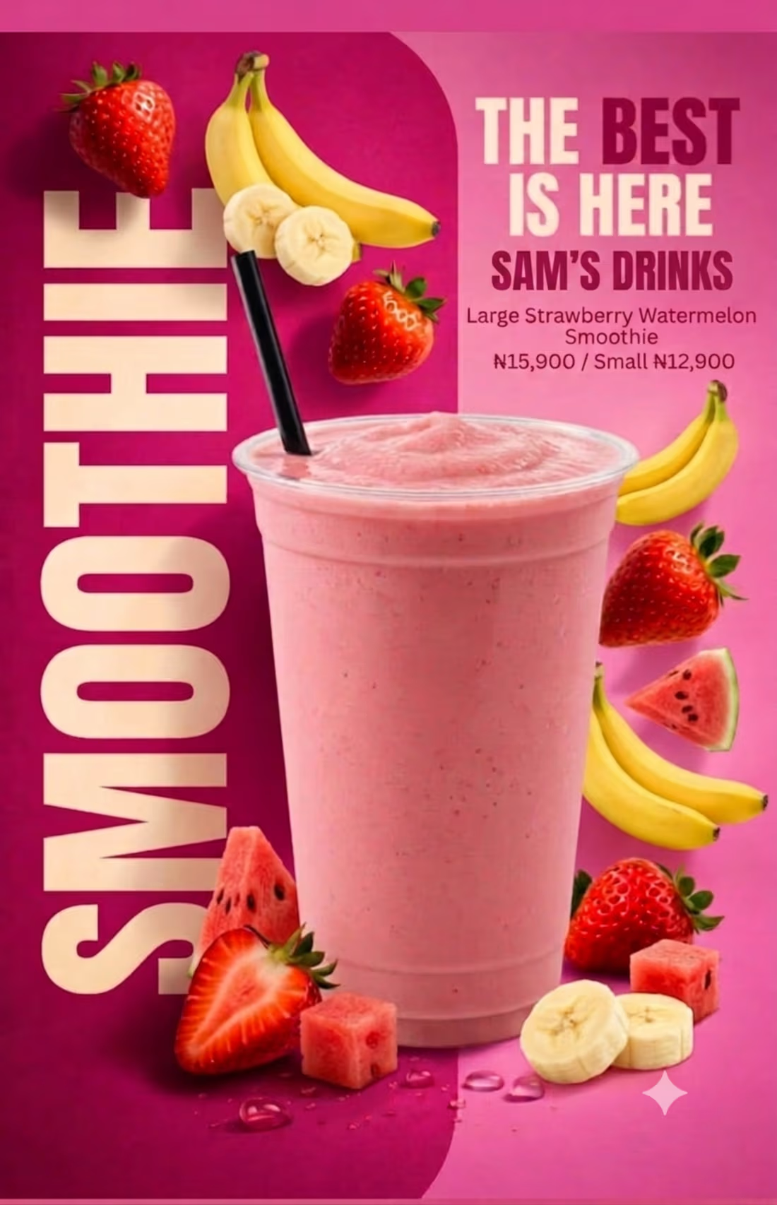
Designing the social media post for Sam's Drinks was a process focused on appetite appeal and strong, clean branding. Here is how I built it from the scratch:
First, I established the foundation with a high-contrast, double-tone background. I used a rich, deep magenta on the left to add sophisticated depth and a bright, vibrant pink on the right to make the post pop in a busy feed. This creates an energetic and appetizing atmosphere.
Second, I positioned the main subject, a generous, frosted smoothie cup filled with a blended pink smoothie, right in the center. I topped it off with a black straw to ground the color palette.
Third, to tell the ingredient story at a single glance, I layered the core fruits dynamically. I clustered ripe bananas and a halved strawberry on the magenta panel to the left, and mirrored them with floating bananas, strawberries, and a watermelon wedge on the bright pink right panel. This creates a balanced, falling-into-place motion. At the base of the cup, I scattered diced fruit and a large strawberry half for immediate texture and fresh detail.
Finally, I integrated the copy. On the deep magenta panel, I placed the word "SMOOTHIE" in massive, cream-colored, vertical sans-serif letters, making the post instantly scannable and iconic. For the details, I created a clean block in the upper right, using strong typography for "THE BEST IS HERE" and "SAM'S DRINKS" to establish the brand immediately, followed by the specific item name and pricing. I finished the entire piece with a clean, vector sparkle at the bottom right for a last bit of visual polish.
1
51
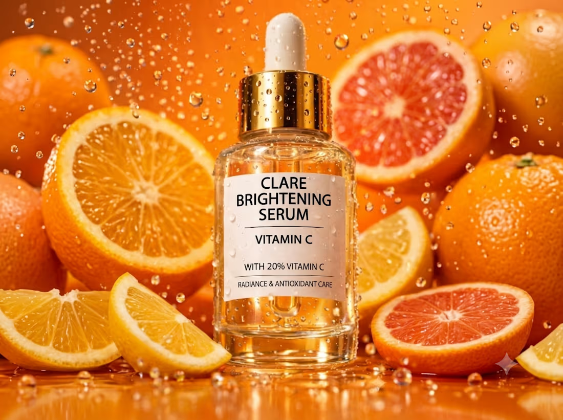
CLARE Brightening Serum Editorial Campaign
1
3
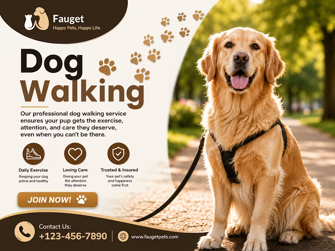
Design Description
This dog walking promotional flyer was designed using a clean and modern pet-care theme that combines professionalism with warmth. The layout features a high-quality image of a friendly Golden Retriever to instantly create trust and emotional connection with pet owners. A soft cream background paired with brown and gold accents reflects reliability, comfort, and premium service quality.
The design uses bold typography to highlight the main service, while paw-print graphics add a playful touch that reinforces the pet-care niche. Key service benefits are presented with simple icons for easy readability, and a prominent call-to-action button encourages potential clients to take immediate action. The curved shapes and balanced composition guide the viewer's attention naturally from the headline to the contact information, creating an engaging and conversion-focused marketing piece.
1
3
140
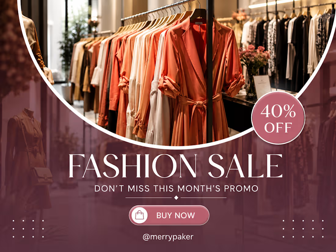
I designed this fashion brand campaign with a stylish and modern aesthetic to create a bold and luxurious shopping experience. The warm lighting, elegant typography, and premium store visuals were carefully combined to make the design visually attractive while highlighting the excitement of the sales promotion.
The campaign focuses on promoting fashionable and high-quality clothing pieces that help customers express confidence and personal style. The design emphasizes the importance of fashion as a form of self-expression while encouraging customers to engage with the brand through a clean, eye-catching, and professional visual presentation.
1
2
139