CLARE Brightening Serum Editorial Campaign

Adebimpe ABEIYA

CLARE BRIGHTENING SERUM Editorial Launch Campaign
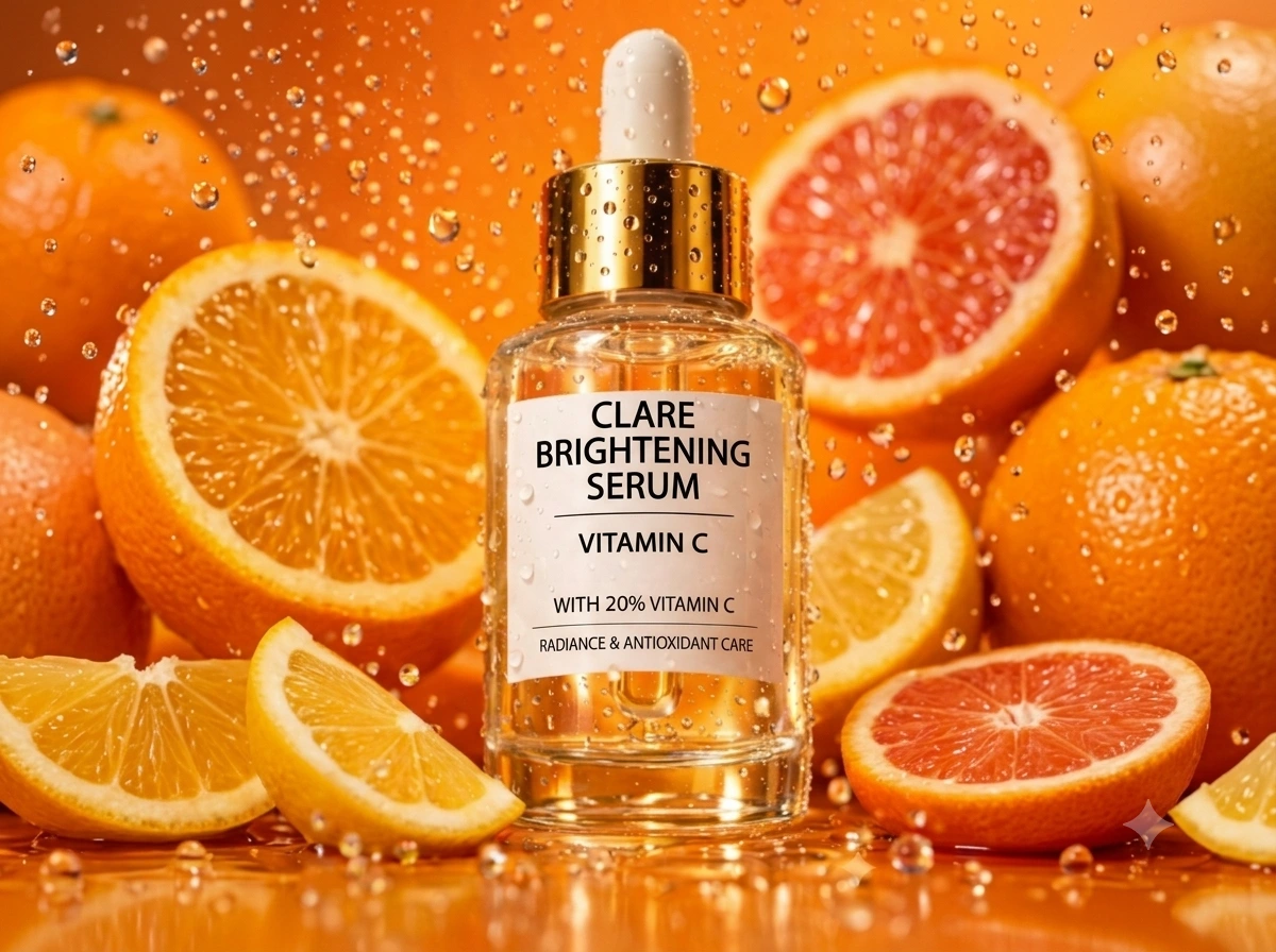
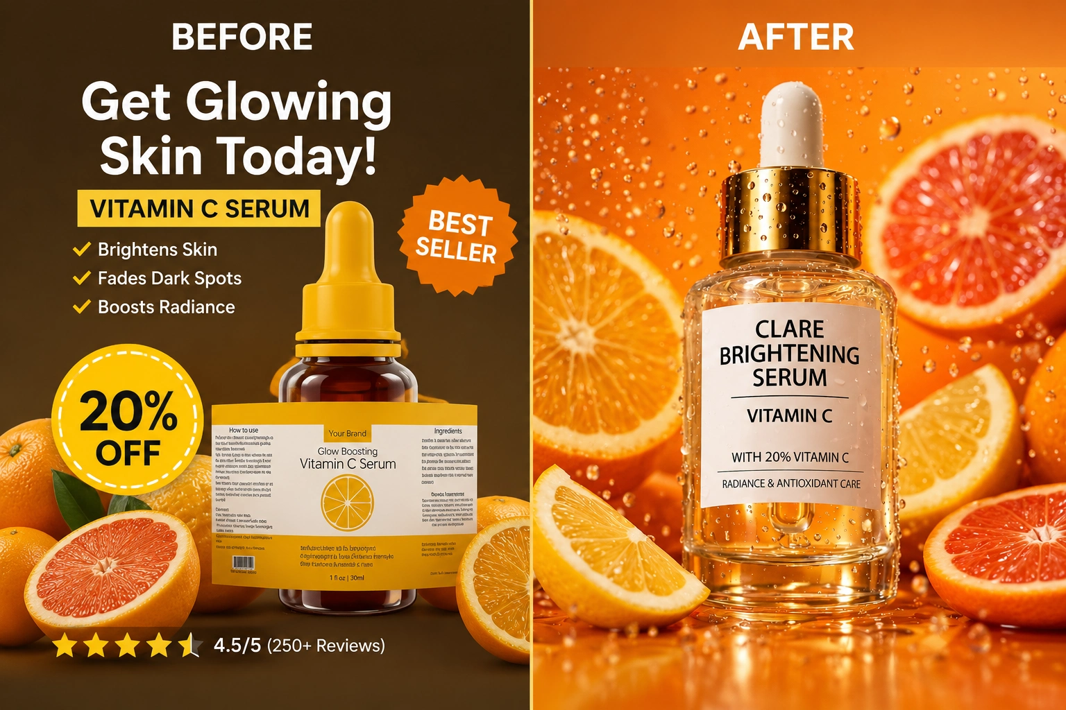
This project demonstrates a strategic visual transformation for CLARE BRIGHTENING SERUM, moving from an over-templated, cluttered social media ad layout to a high-end, premium digital campaign asset. By removing low-fidelity graphic elements, platform interface clutter, and sales badges, the design pivot successfully elevates the brand's identity to target high-intent, luxury beauty consumers.
The final asset leverages an intentional "High-Friction Minimalism" framework. It relies on crisp macro textures, dynamic lighting, and authoritative, capitalized brand typography to act as a natural scroll-stopper within the first 1.5 seconds, proving that a campaign can achieve high performance while maintaining an immaculate, editorial aesthetic.
Brightening vitamin c serum
The Problem Encountered
Balancing Aesthetic Appeal with High Conversion Performance
During the initial design phase, the primary challenge was overcoming the "pretty but passive" trap. While stripping away the generic neon badges, star ratings, and cluttered interface text instantly elevated the brand's visual prestige, early layout drafts became too minimalist. By removing all the typical sales elements, the asset began to look like a passive editorial print ad rather than a high-performance digital marketing asset designed to stop a fast scroll and drive direct action.
The core conflict was clear: How do you maintain a premium, high-end luxury aesthetic without losing the urgent, high-disruption marketing framework needed to convert digital buyers within seconds?
The Proffered Solution: Implementing "High-Friction Minimalism"
To solve this, the strategy shifted from basic template decoration to an intentional framework called High-Friction Minimalism. Instead of relying on cheap graphic stickers to grab attention, the layout was re-engineered to use the raw imagery and bold typography as the actual conversion drivers:
Sensory Disruption as the Hook: The background water droplets and crisp, dynamic citrus elements were enhanced to create immediate visual chaos and sensory impact in the first 1.5 seconds of a scroll, replacing the need for loud "Limited Offer" badges.
Strategic Typographic Hierarchy: The clinical components,"CLARE" in commanding capital letters and the bold "WITH 20% VITAMIN C", were treated as core design elements. This established instant brand authority and communicated product efficacy immediately, proving that clinical transparency can look incredibly premium.
The Clean Slate Framework: By replacing low-fidelity interface buttons with an immaculate, open-breathing layout, the product itself became the hero. This structural clarity naturally guides the viewer's eye straight to the value proposition, increasing engagement quality without relying on generic e-commerce clutter.
Like this project
Posted Jul 14, 2026
Elevated CLARE SERUM's ad to a premium campaign, balancing aesthetic with performance.
Likes
1
Views
3