The network for creativity
Join 1.25M professional creatives like you
Connect with clients, get discovered, and run your business 100% commission-free
Creatives on Contra have earned over $150M and we are just getting started
Back to feedPost

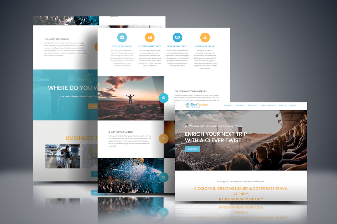
Wix Web Design || Travel Website || Wix SEO Wix || Wix Expert


The network for creativity
Join 1.25M professional creatives like you
Connect with clients, get discovered, and run your business 100% commission-free
Creatives on Contra have earned over $150M and we are just getting started











Related posts


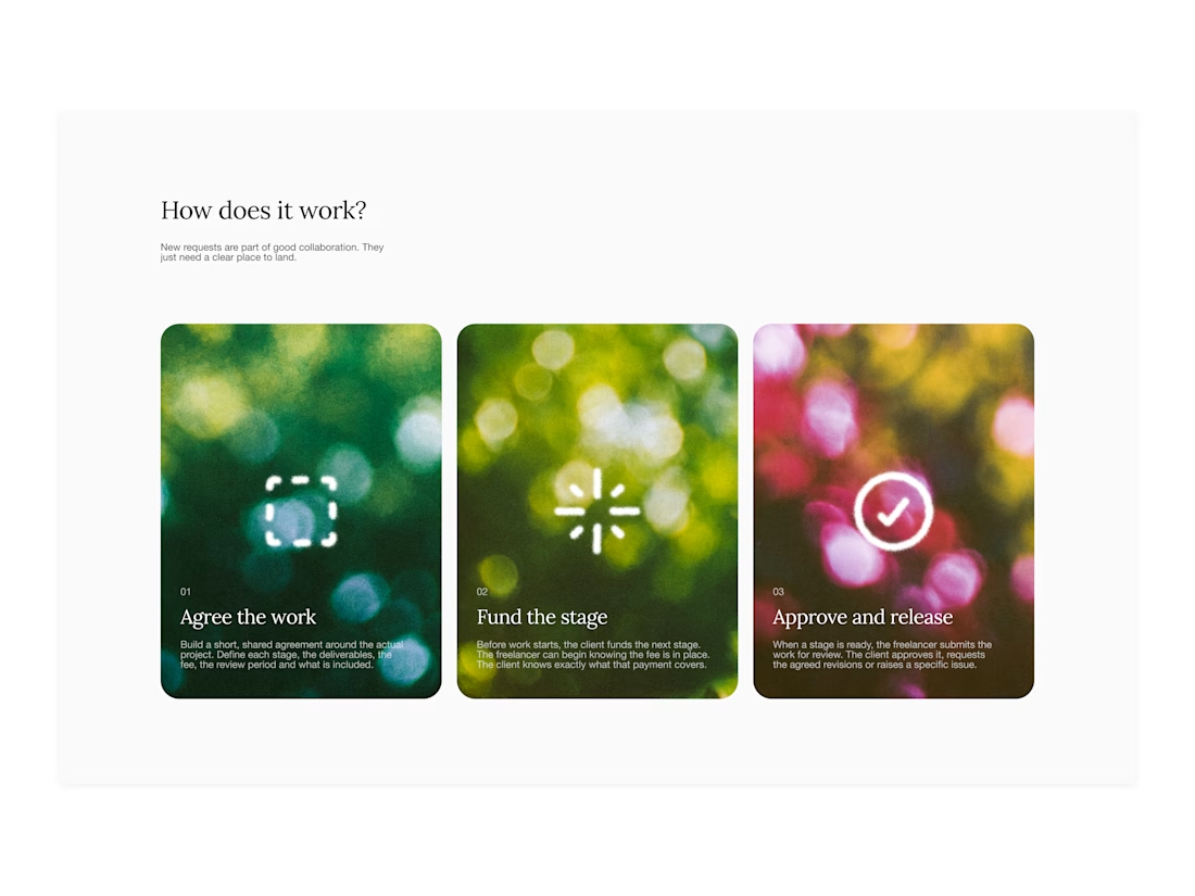

Your web sections always have such strong art direction. Great to see the brand carried right into the layout.


A little excerpt from the brand guidelines for a recent project

The APS mark built from the four small symbols reads like a map legend, which suits a psychology service. Nice that the guidelines page shows it on the dark teal, most would have played it safe on white.

Amazing 🔥🔥🔥

When does a hand-drawn logo make sense for a brand?
In this case, a Barcelona-based creative studio founded by a team with decades of combined experience approached me wanting a hand-drawn identity that would feel unexpected for a team like them, a way to signal creativity and...