The network for creativity
Join 1.25M professional creatives like you
Connect with clients, get discovered, and run your business 100% commission-free
Creatives on Contra have earned over $150M and we are just getting started
Back to feedPost
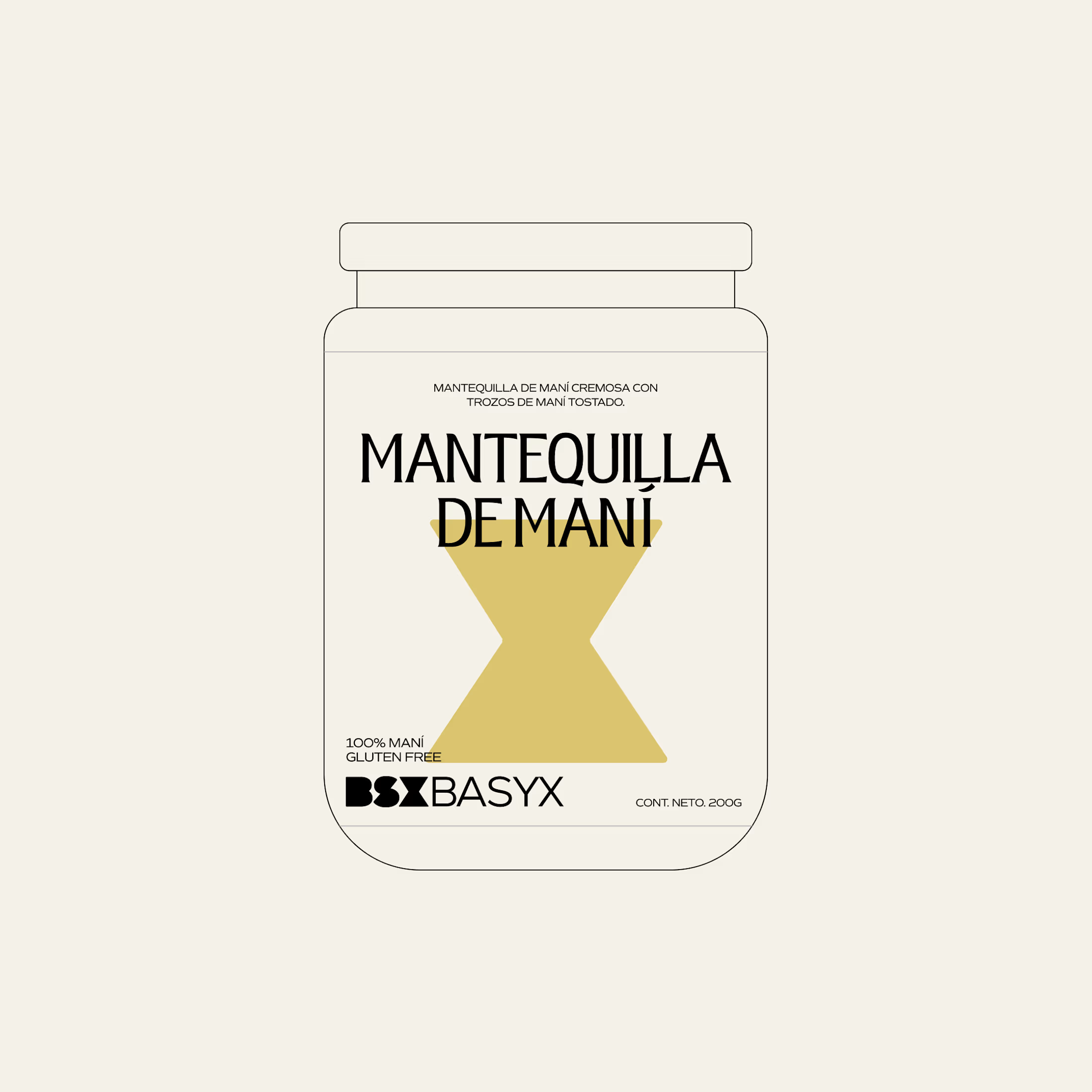
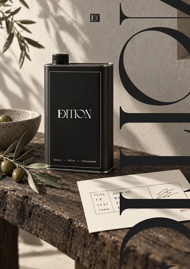
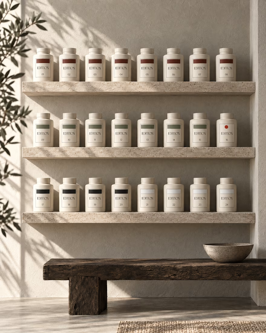
Minimalist wellness packaging design
This is a packaging concept I designed for a wellness brand, using minimalism as the core design strategy.
In the wellness space, packaging needs to feel calm, trustworthy, and premium. A minimalist approach helps reduce visual noise and lets the product’s purpose come through clearly.
Design focus
• Clean typographic hierarchy
• Soft, nature-inspired color palette
• Generous white space for balance
• Subtle graphic elements instead of heavy visuals
• Clear, benefit-led messaging
The goal was to create packaging that feels intentional, refined, and easy to trust at first glance.
#packagingdesign #branddesign #minimalbranding #wellnessdesign #productpackaging #visualidentity #creativedirection


let me know your thoughts
The network for creativity
Join 1.25M professional creatives like you
Connect with clients, get discovered, and run your business 100% commission-free
Creatives on Contra have earned over $150M and we are just getting started


Related posts

Minimal packaging is not less work. It’s MORE decisions 🤍
On a recent project, I spent a whole day on one thing: the spacing between two phrases in a label. Nobody will ever notice it. But everyone will feel it.
When there is nothing else on the label, every small adjustment has to carry the brand.
Do you also lose hours on details no client will ever mention? 😅
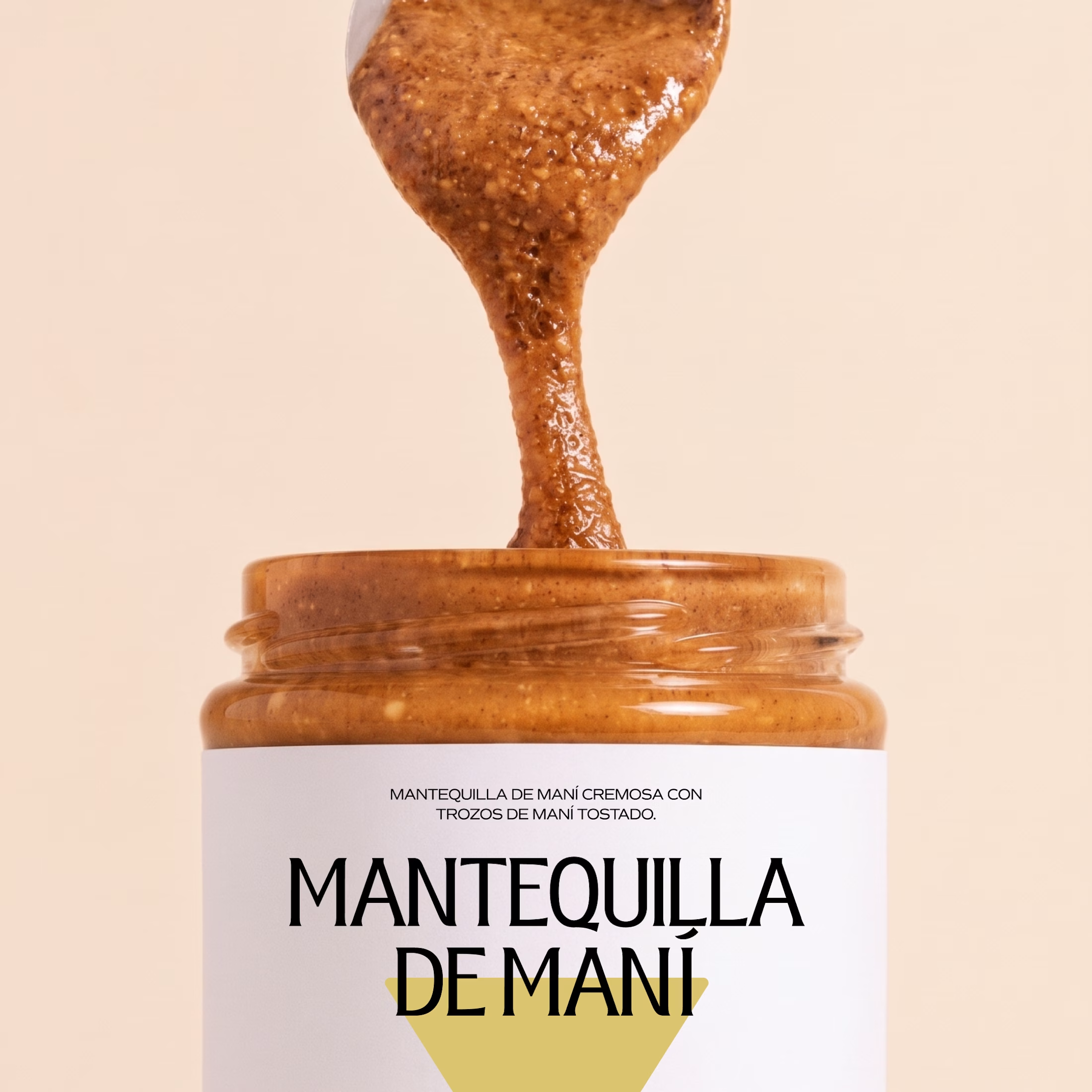

So true. A whole day on the spacing between two phrases sounds about right, and it's exactly why good packaging just feels right.

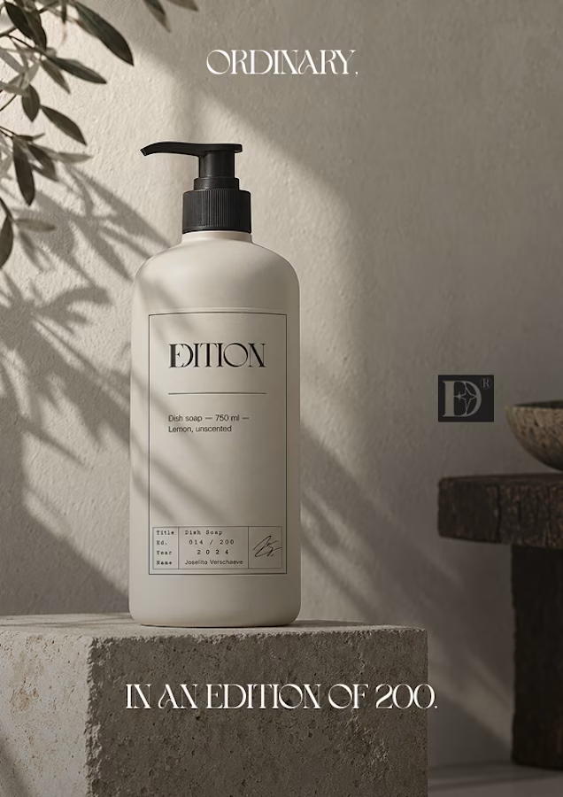
Ever signed for a pack of pasta? Soon you will.
EDITION is a brand where nothing is decorative and everything is numbered.
Case study landing very soon.

I felt inspired seeing this 🔥

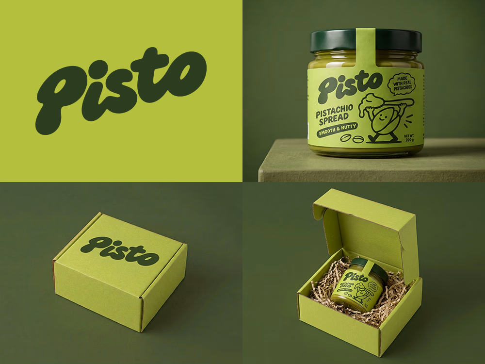
Can AI create a professional-looking logo?
I tried to create a logo concept for a pistachio spread brand using Recraft Logo Maker.
After answering a few questions about the brand and going through several variations, I finally landed on a logo that felt right and captured the fun,...