
BBR CREATIVES
BBR Creatives | Packaging Design Studio for Modern Brands
Ready for work
BBR is ready for their next project!
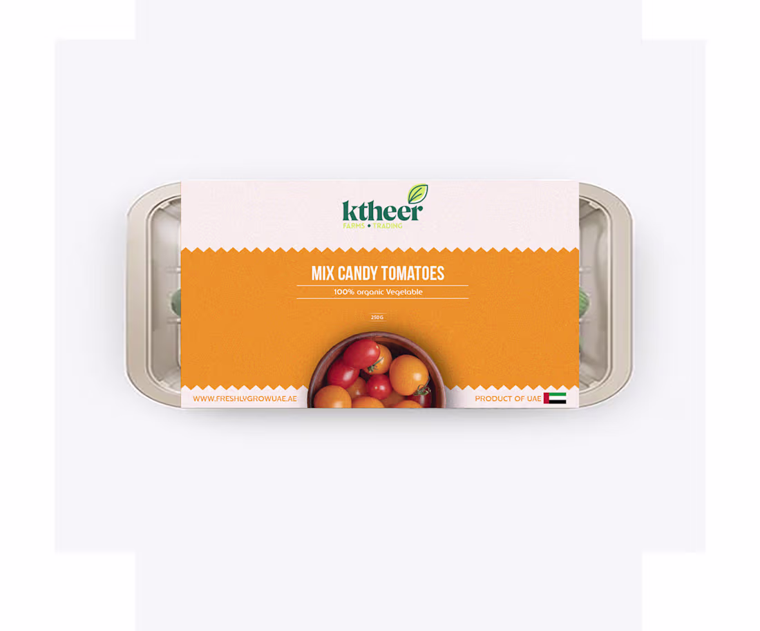
ktheer Farms | Organic Packaging Series
Fresh work for ktheer Farms! 🍅
The goal was to make organic produce look as vibrant and modern as it feels. I went with a bold color-blocking system and a "zig-zag" edge to give it a slightly tactile, paper-bag vibe.
Simple, clean, and ready for the shelf. 🌿
0
53
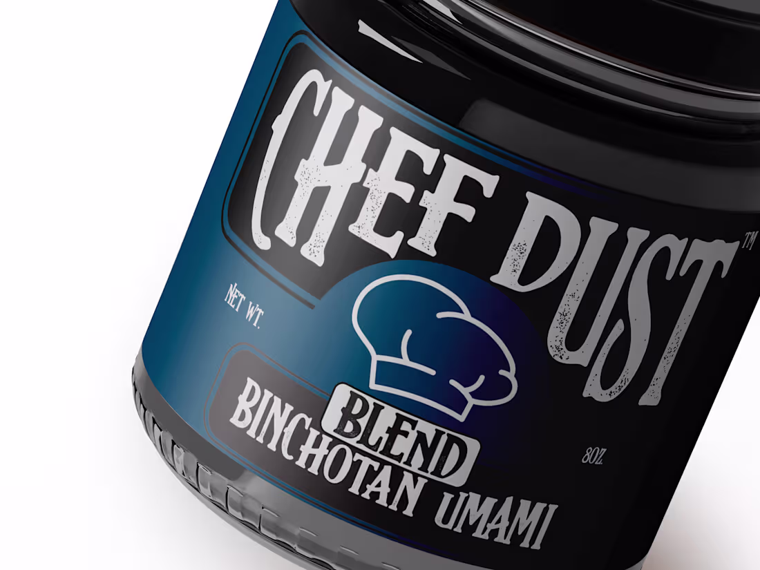
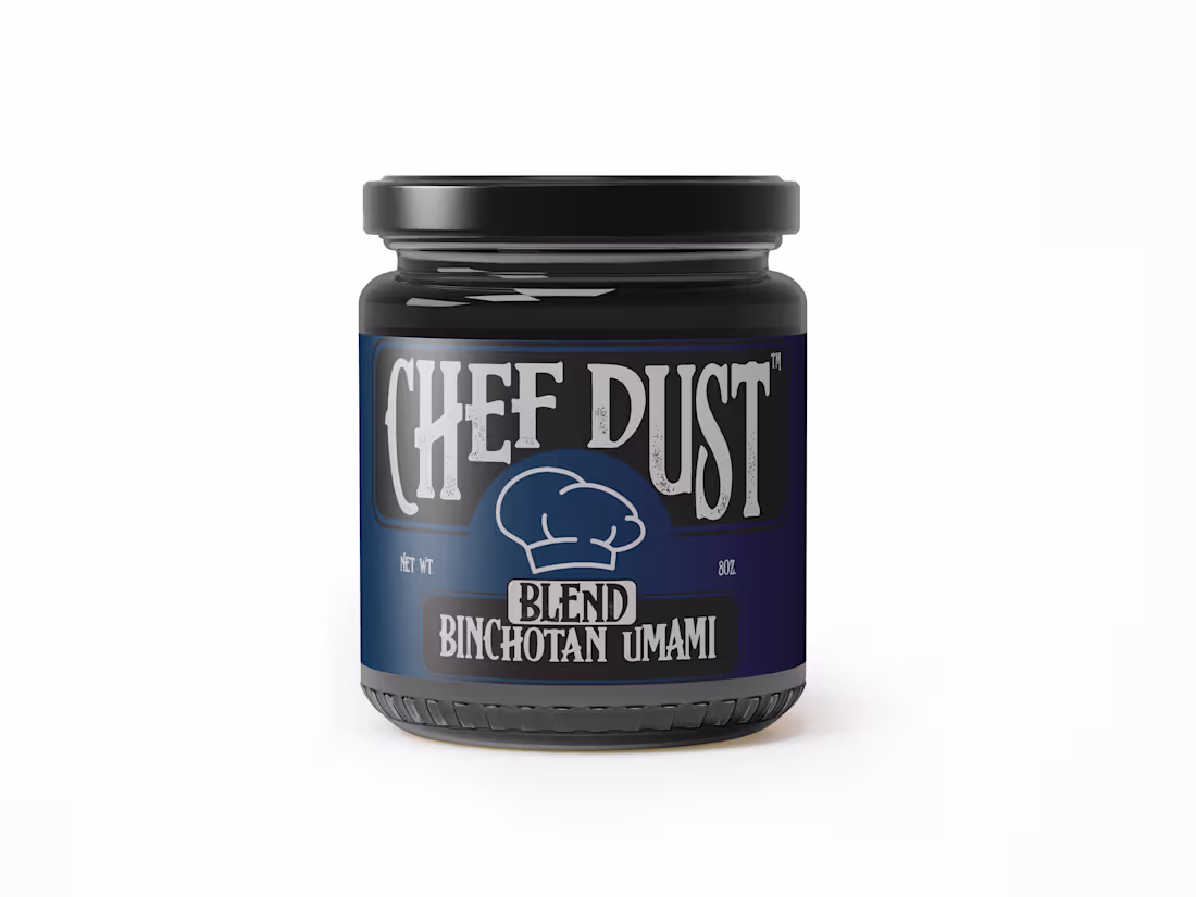
Stop designing for the shelf. Start designing for the soul.
Most food packaging is designed to blend into a "category." Green for organic, red for spicy, yellow for salty.
For the Binchotan Umami Blend, I threw the category rules out. We used a "Workwear" aesthetic heavy textures and a bold, stamped feel to mirror the intensity of the charcoal inside. If the packaging looks like it could survive a 1,200°C grill, that’s because the flavor does too.
Good design shouldn't just sit there. It should challenge you to use it.
0
45
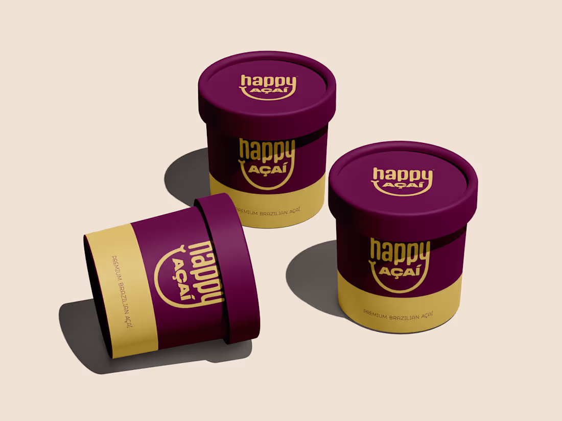
Happy Açaí packaging designed to feel premium, bold, and joyful without trying too hard. Deep berry tones paired with warm gold to reflect the richness of Brazilian açaí, with a clean layout that works from shelf to social.
Simple. Confident. Easy to recognize.
Would love to hear what you think.
2
1
67
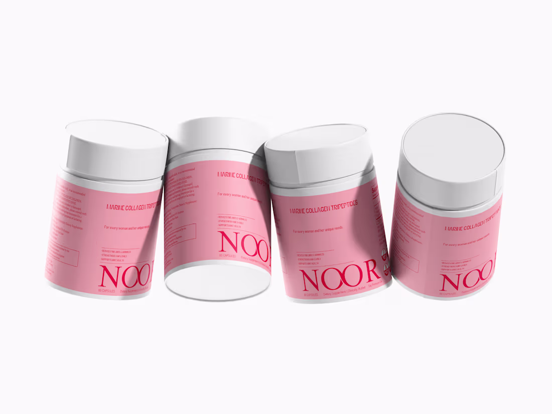
Premium packaging design for a Marine Collagen supplement brand. Clean structure, minimal aesthetic, and a high-end feel for strong shelf presence.
0
40
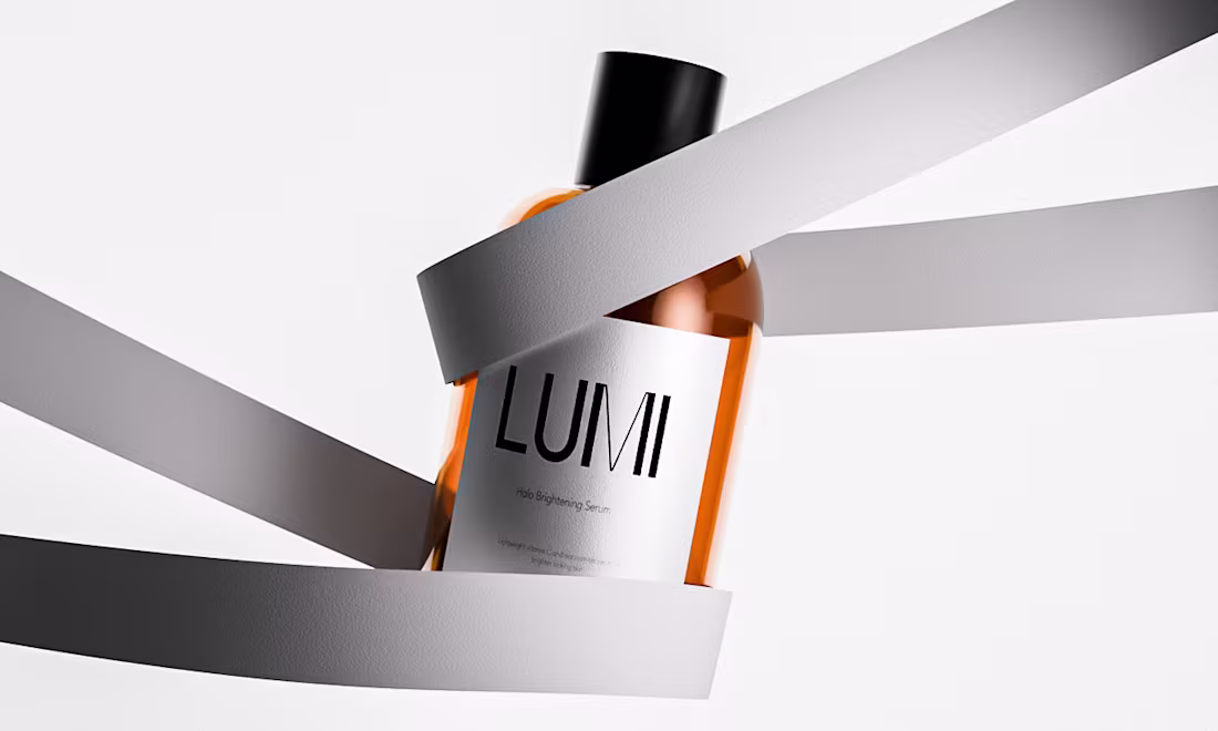
Clean design that builds trust. This brightening serum concept balances luxury and simplicity exactly how modern beauty brands stand out. If you’re looking to elevate your product’s look, let’s create something refined together.
0
45
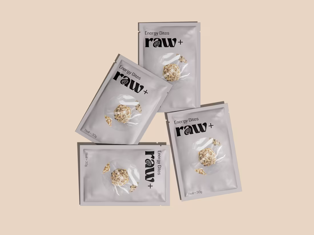
Energy Bites Packaging
Minimal, bold, and modern designed to make healthy snacks look just as good as they taste.
Crafted to highlight the natural ingredients with a transparent window and balanced typography.
Packaging Design | Product Branding | Mockup Presentation
#PackagingDesign #FoodBranding #MinimalDesign #ContraDesigner
0
43
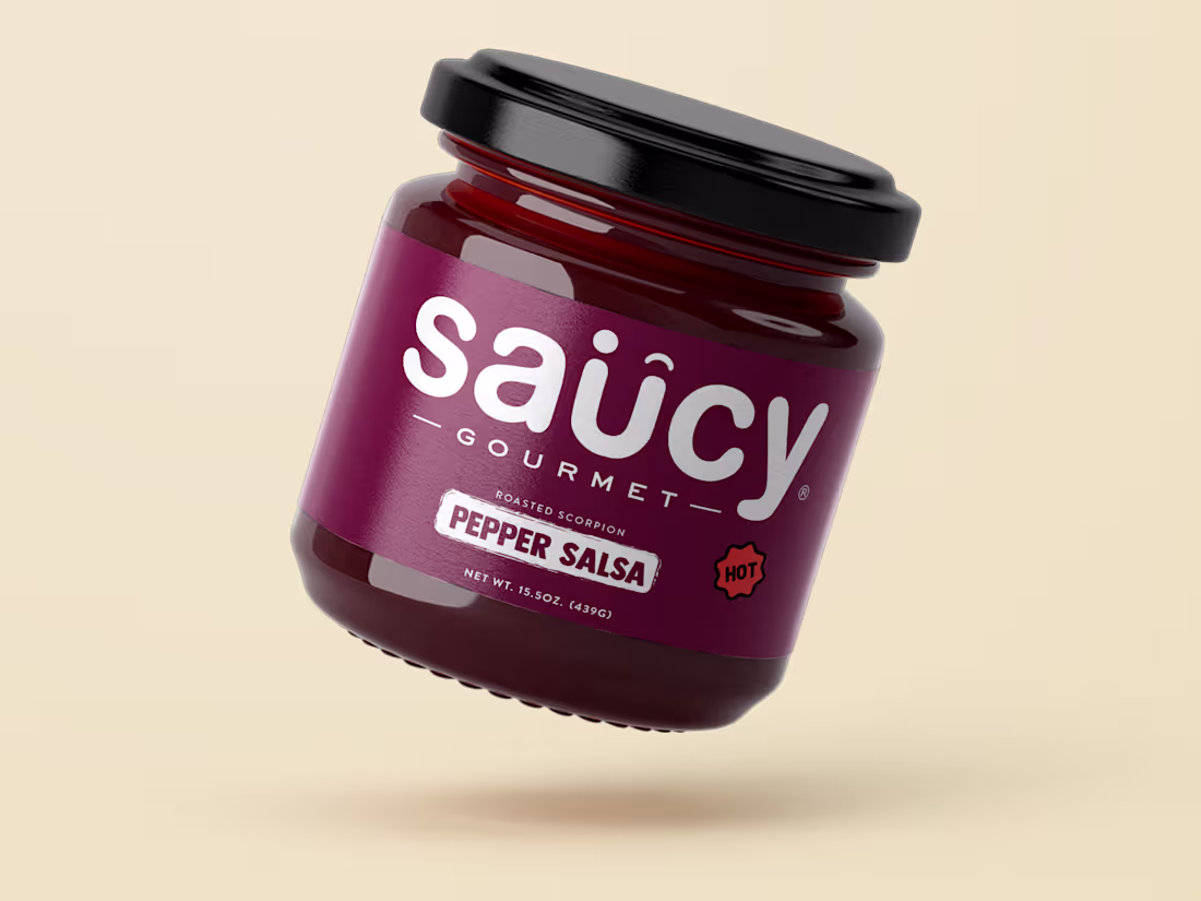
Saucy Gourmet Pepper Salsa Packaging
A bold and minimal label design for a premium salsa brand. The deep maroon tone and clean typography highlight the brand’s fiery personality while keeping it modern and shelf-ready.
Crafted to make your product feel premium and unforgettable.
#PackagingDesign #LabelDesign #BrandIdentity #FoodPackaging
0
48
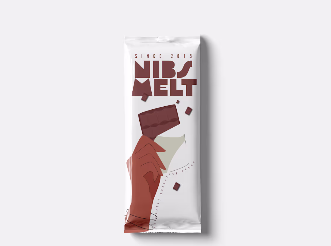
Beyond the Wrapper: Crafting a Brand Story for Nibs Melt Chocolate.
We believe packaging is the first bite. For Nibs Melt, we designed an identity that’s both modern and nostalgic, focusing on rich, warm tones and a hand-drawn illustration that captures the joy of breaking off a piece of chocolate.
The result? A stand-out look that translates beautifully across different flavor profiles (demonstrated here on white and red/pink backgrounds). We handle everything from concept to print-ready files.
Looking for packaging that elevates your product and captivates customers? Let's collaborate.
#PackagingDesign #BrandIdentity #FoodPackaging #ChocolatePackaging #ProductDesign
0
41
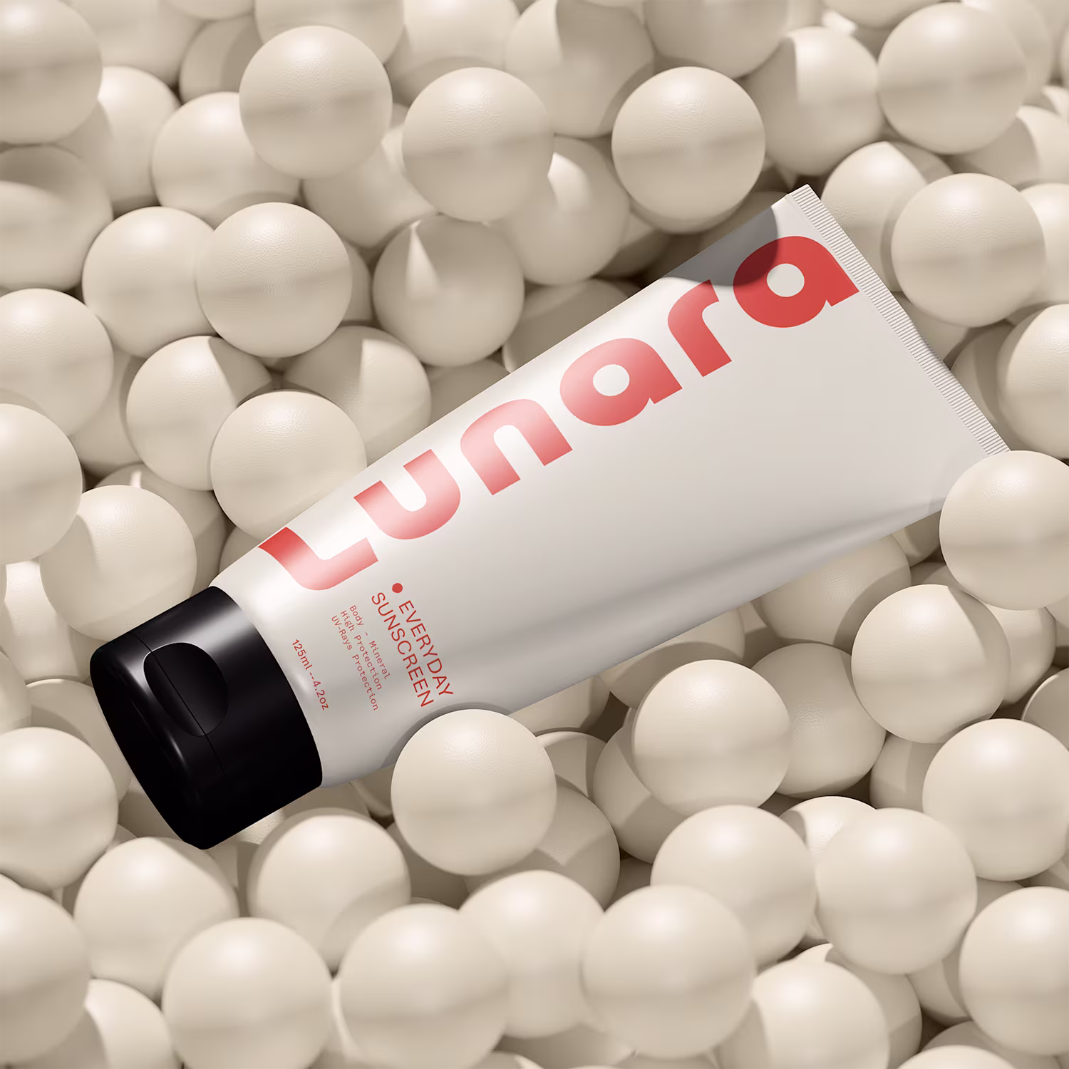
Good design doesn’t just show what’s inside it makes you want it.
1
61
Minimal design. Maximum impact.
1
54
Packaging that feels as fresh as the product inside.
1
48
Designs Built to Stand Out!
1
45