
BBR CREATIVES
BBR Creatives | Packaging Design Studio for Modern Brands


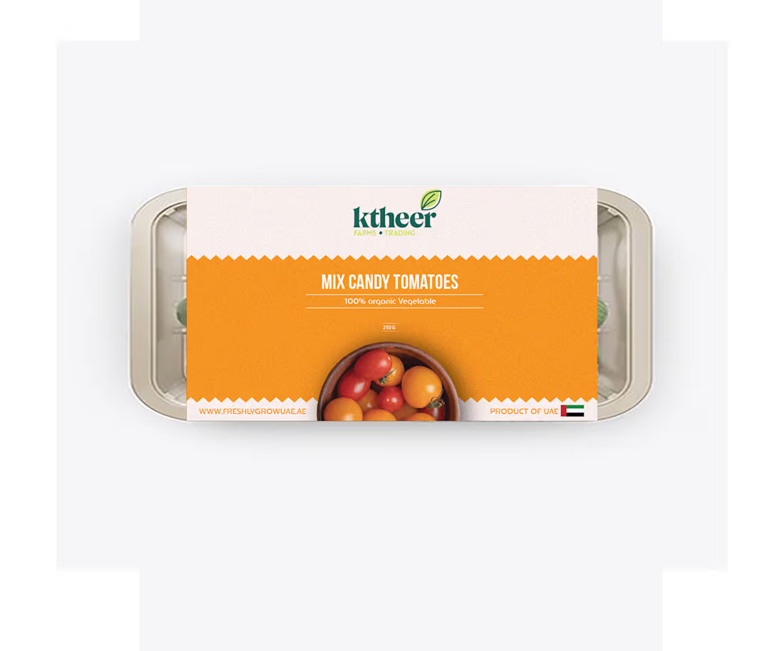
ktheer Farms | Organic Packaging Series
Fresh work for ktheer Farms! 🍅
The goal was to make organic produce look as vibrant and modern as it feels. I went with a bold color-blocking system and a "zig-zag" edge to give it a slightly tactile, paper-bag vibe.
Simple, clean, and ready for the shelf. 🌿
0
77
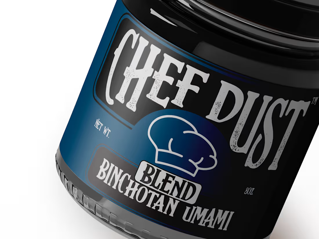
Stop designing for the shelf. Start designing for the soul.
Most food packaging is designed to blend into a "category." Green for organic, red for spicy, yellow for salty.
For the Binchotan Umami Blend, I threw the category rules out. We used a "Workwear" aesthetic heavy textures and a bold, stamped feel to mirror the intensity of the charcoal inside. If the packaging looks like it could survive a 1,200°C grill, that’s because the flavor does too.
Good design shouldn't just sit there. It should challenge you to use it.
0
65
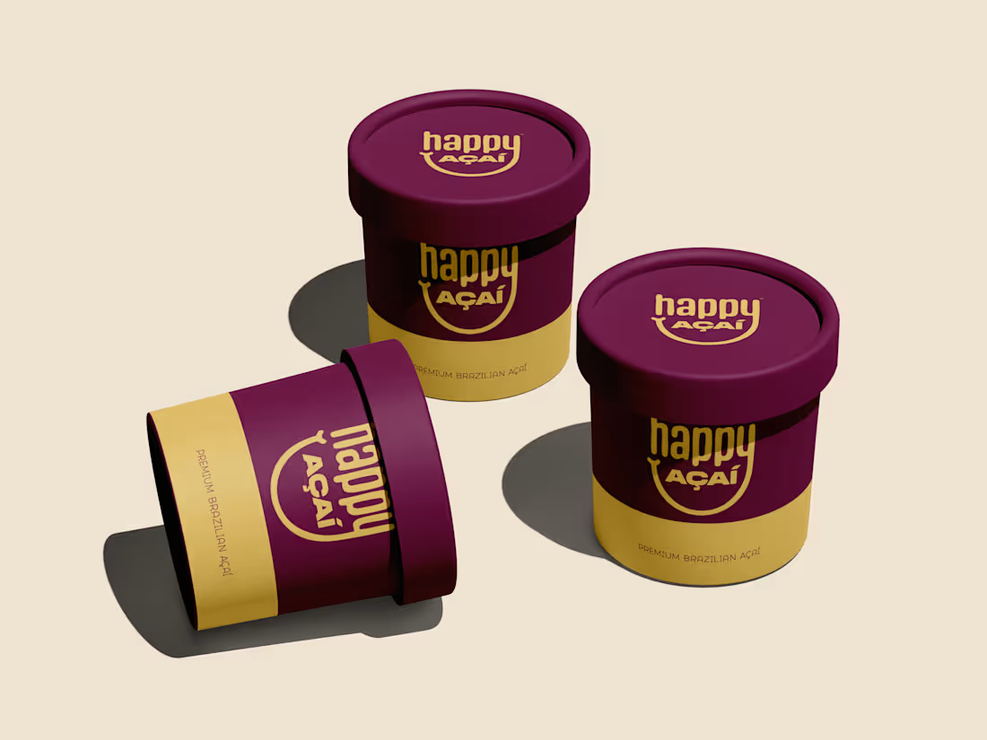
Happy Açaí packaging designed to feel premium, bold, and joyful without trying too hard. Deep berry tones paired with warm gold to reflect the richness of Brazilian açaí, with a clean layout that works from shelf to social.
Simple. Confident. Easy to recognize.
Would love to hear what you think.
2
1
104
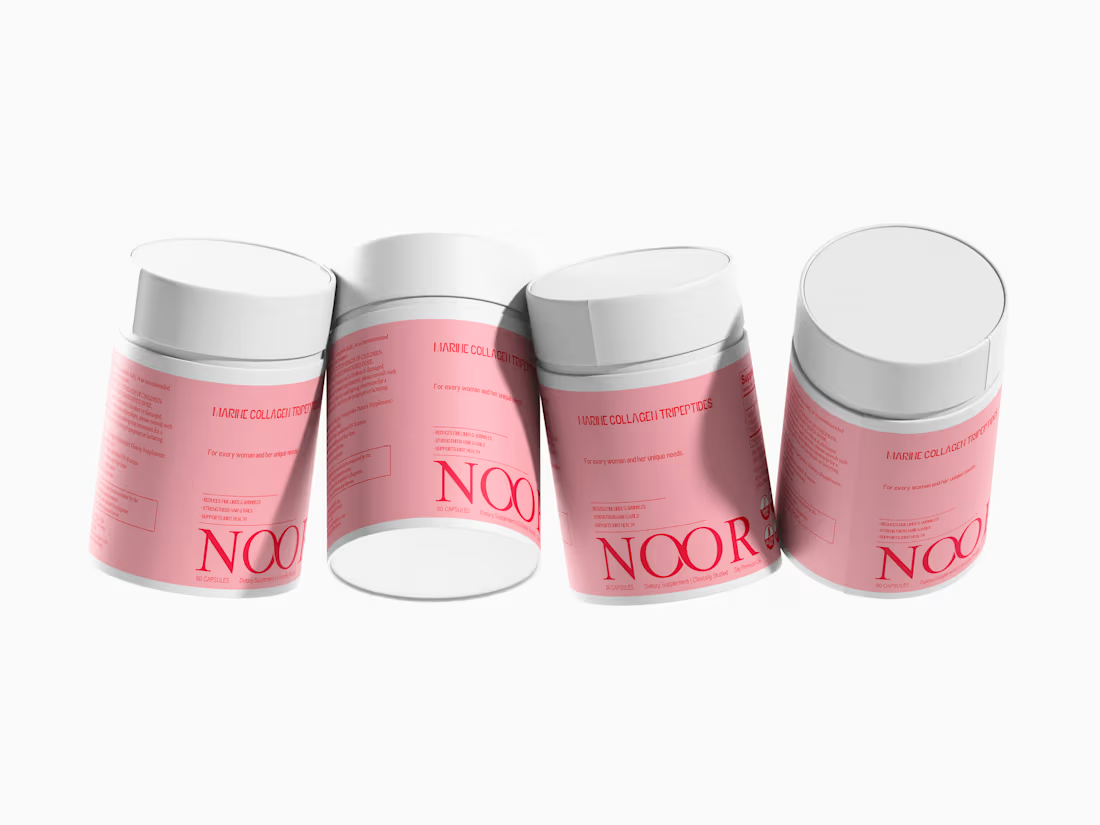
Premium packaging design for a Marine Collagen supplement brand. Clean structure, minimal aesthetic, and a high-end feel for strong shelf presence.
0
65