
Stop designing for the shelf. Start designing for the soul.
Most food packaging is designed to blend into a "category." Green for organic, red for spicy, yellow for salty.
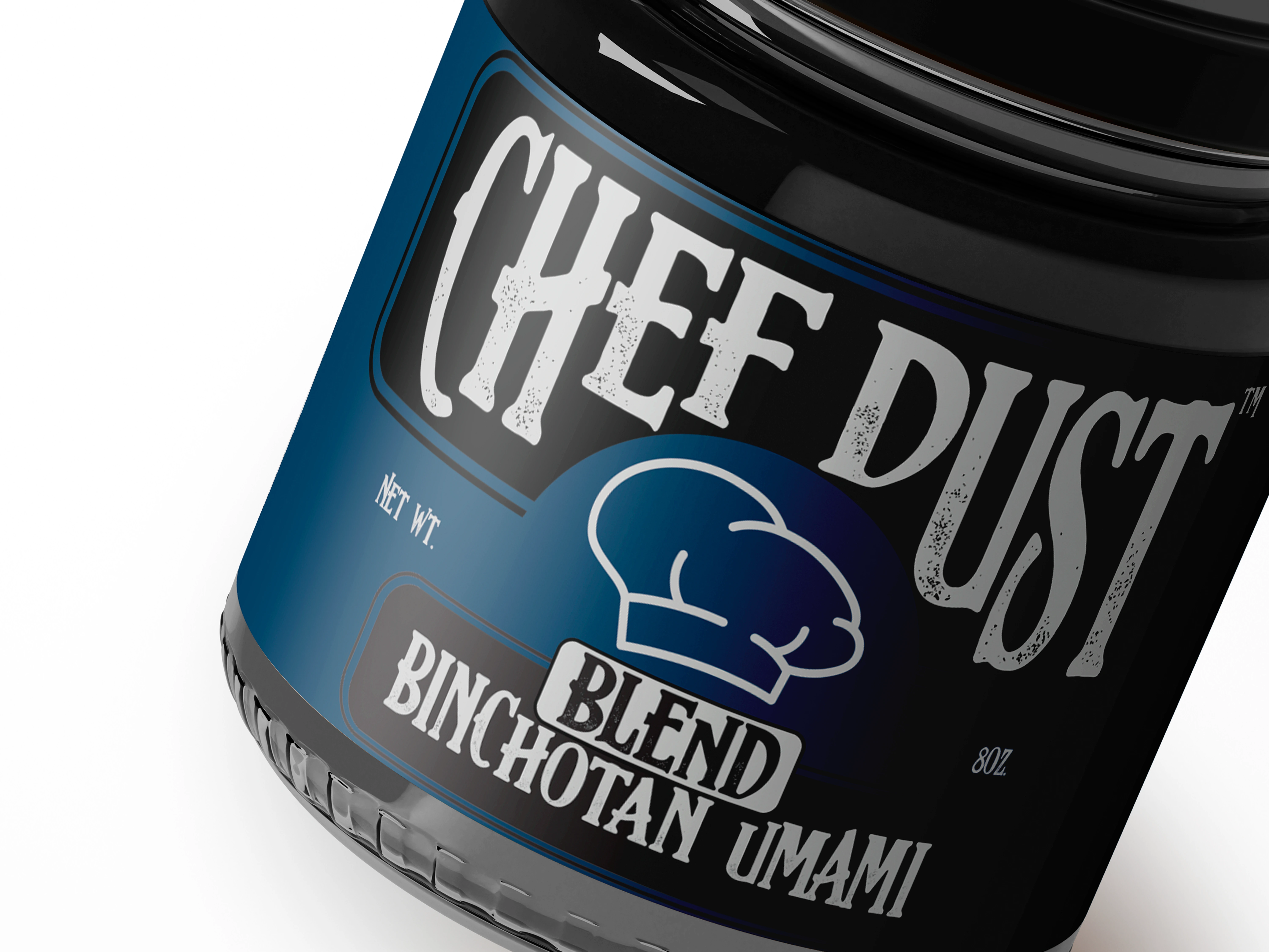
For the Binchotan Umami Blend, I threw the category rules out. We used a "Workwear" aesthetic heavy textures and a bold, stamped feel to mirror the intensity of the charcoal inside. If the packaging looks like it could survive a 1,200°C grill, that’s because the flavor does too.
Good design shouldn't just sit there. It should challenge you to use it.
0 likes · 2 views · Dec 30, 2025
Stop designing for the shelf. Start designing for the soul. Most food packaging is designed to blend into a "category." Green for organic, red for spicy, yel...

