The network for creativity
Join 1.25M professional creatives like you
Connect with clients, get discovered, and run your business 100% commission-free
Creatives on Contra have earned over $150M and we are just getting started
Back to feedPost

Every pixel in this composition has a reason.
This is a marketing visual I built. A lot of people might see the final image and assume it's one generated output. It's not. It's manually created with layers, each one placed and blended with a specific visual hierarchy in mind.
➜ The rocket sits on its own layer with independent glow and shadow controls
➜ The cityscape is a separate depth plane with its own color grading
➜ The smoke interaction between the two is hand-masked
➜ The background gradient is tuned to push the focal point exactly where the eye needs to land first
➜ And the blue ring, signature element that defines the brand
None of this is random. You are deciding what the viewer sees first, second, and third.
AI can generate a rocket over a city in 30 seconds.
What it can't do is tell you why the rocket needs to sit 15% above of center, or why the smoke opacity drops at exactly that rate.
That thinking is the craft.
Brand DesignAdobe Creative CloudmarketingassetsVisual DesignSocial Content DesignAdobe IllustratorAdobe Photoshop


The network for creativity
Join 1.25M professional creatives like you
Connect with clients, get discovered, and run your business 100% commission-free
Creatives on Contra have earned over $150M and we are just getting started
Related posts

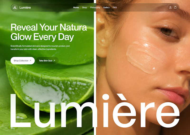
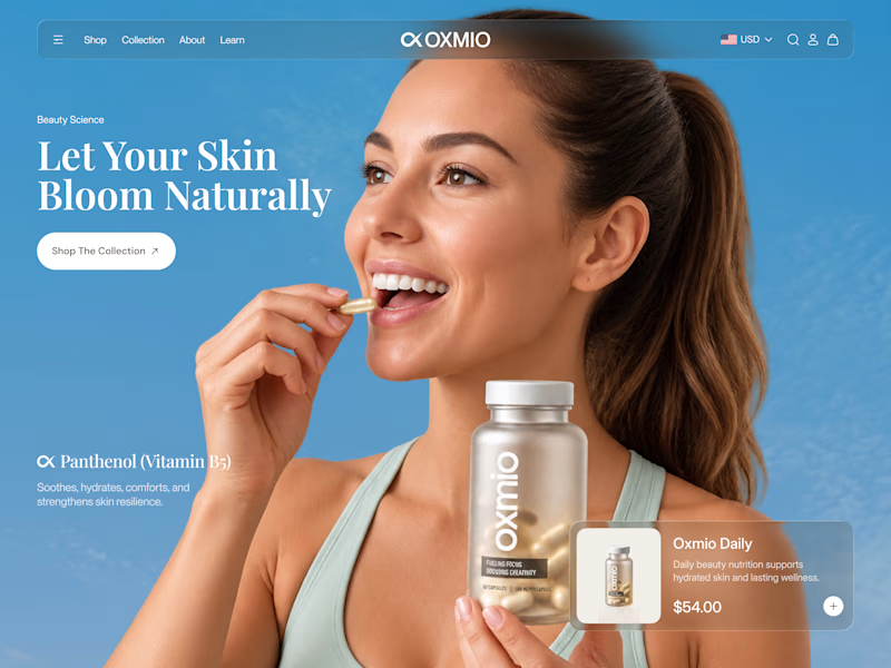
Your design has 3 seconds to earn attention. Which skincare brand wins?
A leads with confidence, energy, and aspiration. B builds trust through nature, freshness, and simplicity.
Great design doesn’t just look good. It makes people feel the brand before they read a word.
A or B? Which would make you stop scrolling?


30 voted
52%
28 voted
48%
58 votes
Closed


B without questions


A little throwback to one of our favorite collaborations with Lion Pose! 🧡
We worked with the founders to bring their vision to life through core brand identity, logo, and packaging design, creating a bold, playful visual language that feels fresh in the skincare space.
So lovely to see Lion Pose grow from its early days to the shelves of Sephora, with our packaging work recognized at the 2024 Dieline Awards!


Nice work


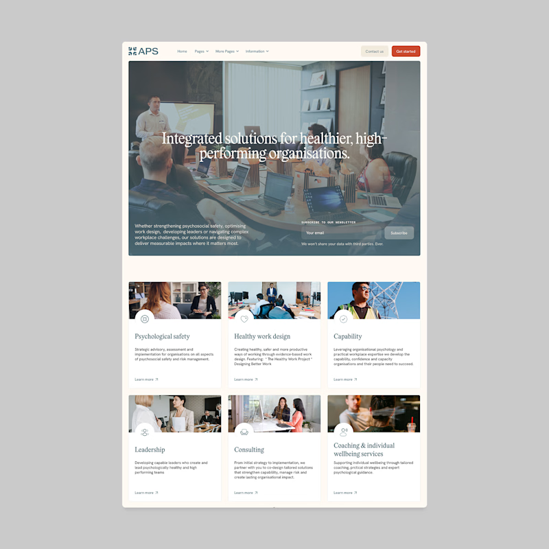
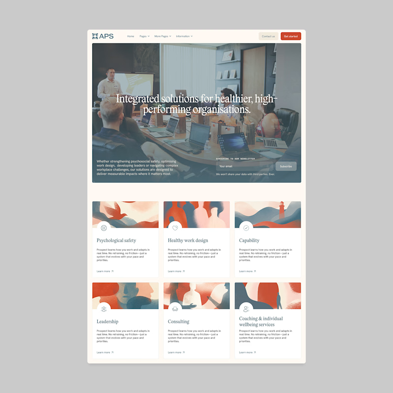
Designers, which direction would you go with: photography or illustration?
83 voted
69%
37 voted
31%
120 votes
Closed

I'll prefer photos, specially talking about organizations in your page, human faces and real scenarios can have a better effect in this case.


