The network for creativity
Join 1.25M professional creatives like you
Connect with clients, get discovered, and run your business 100% commission-free
Creatives on Contra have earned over $150M and we are just getting started
Back to feedPost
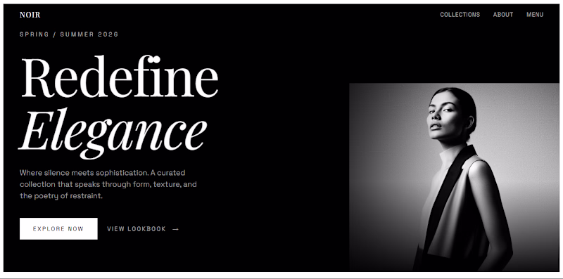
Taste Test
Designed two variations of a hero UI for a client.
would love your take - A or B?
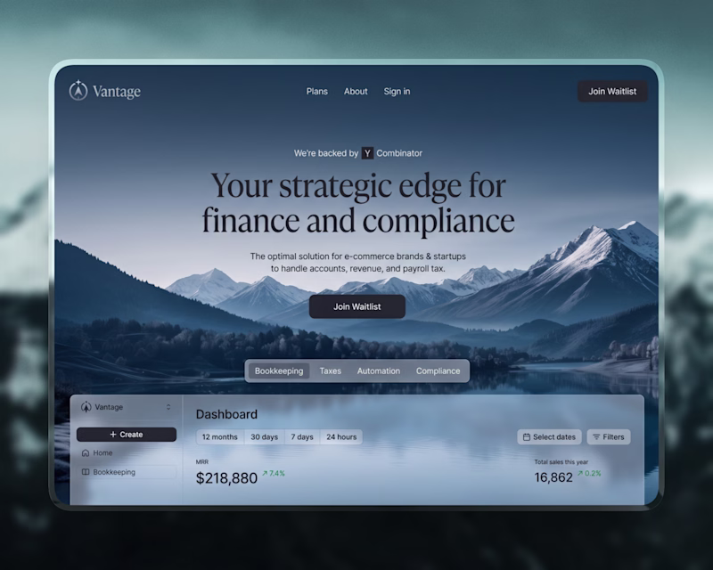
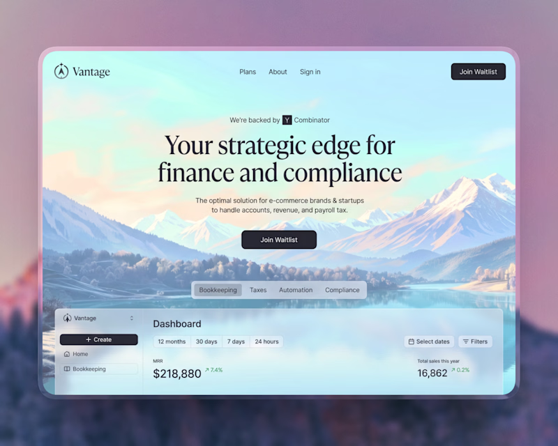
69 votes
Ends in 8h
looks awesome
Thanks @Amrina Khan
the background looks parfect
If someone wanted to reach this level, what would you say makes the biggest difference in your process?
Thanks, Honestly, just a few rounds of iteration, cut the fluff and keep it clear.
Nice
Thank you @Mominor Rahman
Low contrast on option A the top line of the heading is not so visible. Option B for me.
Yeahh, I agree.. A’s top line is a bit hard to see on smaller screen. I’d go with B too.
Nice work
Thanks @Koushik sarkar
amazing visuals
Thanks @Sohan Talukdar
B looks clean to me
Thank you @Aqsa Qamar
Nice work!
Thank you @Madob Acharjya
Option B. I don't think the text has enough contrast with the background for A. If not it'll be a better contender
Yeahh, I agree with you @Valerie Izuagbe on smaller mockups the contrast feels a little worse and harder to read. On a desktop it actually looks fine, but "B" still feels like the safer choice.
I am liking the option A
Thank you @Mohd Sohail
Amazing!
Thanks @Dhaval Bhimani
Clean work—both feel premium and well-executed.
I’d go with Option B. The lighter gradient adds more depth and contrast, making the content easier to scan while keeping it visually engaging. It also feels more modern and approachable compared to the heavier tone in A.
Really appreciate that,, glad it came through. Agree on B, the lighter gradient definitely makes it easier to scan while keeping the feel intact.
I liked B more because it has better contrast and also looks better for dark text & elements in general!
Yeahh, same here, Variant "B" handles contrast much better, especially with text and elements.
Option A feels stronger.
The contrast makes the content more readable and the overall layout feels more focused.
Option B looks nice, but it loses a bit of clarity.
Thank you @Mian Muhammad Umer Parvaiz
Colours can boost emotions, so option B is better
The network for creativity
Join 1.25M professional creatives like you
Connect with clients, get discovered, and run your business 100% commission-free
Creatives on Contra have earned over $150M and we are just getting started
Related posts
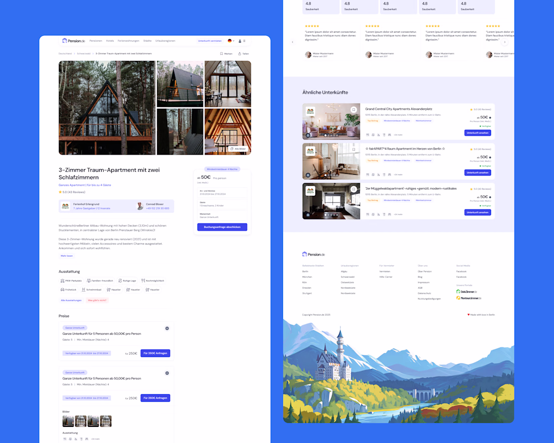
A better look at the booking screen / listing detail for Pension!
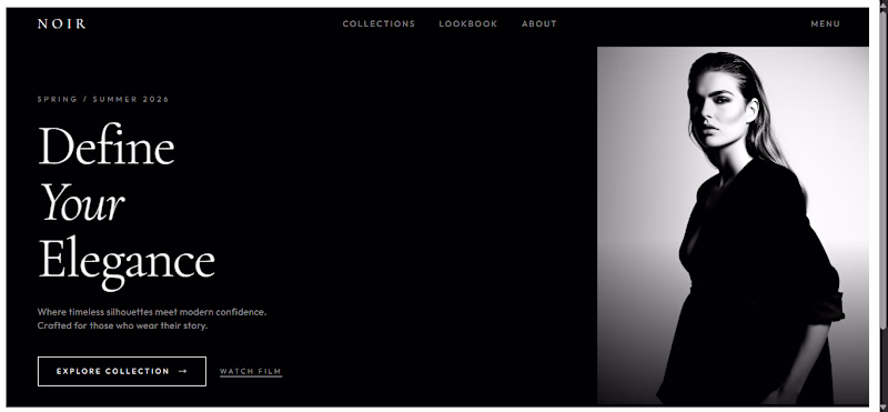
ARTIZO™ needed a digital presence as bold as their vision. The goal: design a landing page prototype that felt alive, not just another portfolio, but a statement.
Built in Figma, the concept leans into high contrast black and electric green, pairing oversized typography with layered 3D elements and fluid card compositions. Every section was crafted to guide the eye while keeping the energy raw and expressive.
From the hero's typographic clash to the gallery's dynamic grid, the design speaks before you read a word. Clean. Confident. Unmistakably creative.
This wasn't about filling a template, it was about building a visual identity that commands attention and makes every scroll feel intentional.
Designed in Figma → Transferred to Framer · UI/UX · Brand Direction
Excellent UI & elements!
Trending
Runway
AI video generation is exploding. What are you dreaming up in Runway?
Contra University
Learn from expert creatives how to earn more using next-gen AI tools.
creativeaiflow
Creative AI workflows are evolving. What tools do you use, and what are their strengths and weaknesses?
portfolioreview
The best portfolios tell a story, not just show a grid. Share yours for feedback.
freelancerlife
Freelancer life is wins, pivots, and everything in between. What’s yours right now?