The network for creativity
Join 1.25M professional creatives like you
Connect with clients, get discovered, and run your business 100% commission-free
Creatives on Contra have earned over $150M and we are just getting started
Back to feedPost

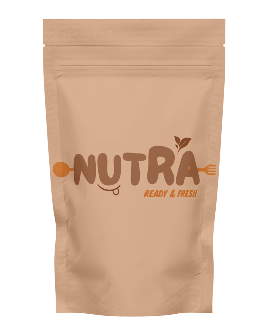
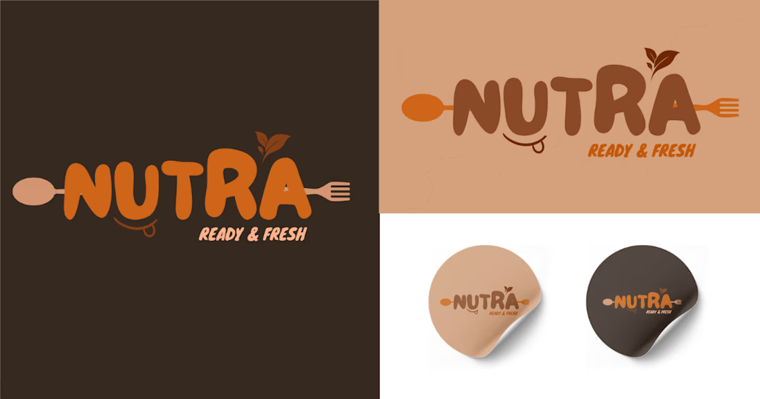
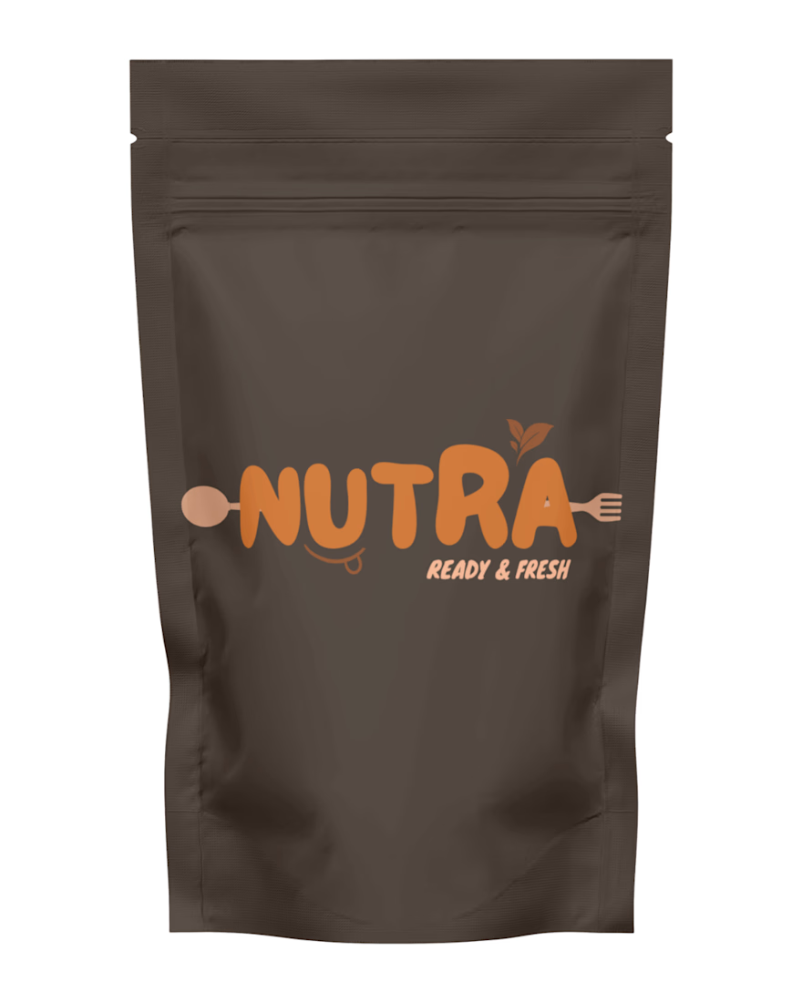
Logo Concept 01: A bold and modern logo concept for Nutra, combining custom typography with spoon and fork elements to reflect food and freshness.
Logo Concept 02: A clean and versatile variation using warm earthy tones and a subtle leaf element to create a natural and memorable brand identity.

The network for creativity
Join 1.25M professional creatives like you
Connect with clients, get discovered, and run your business 100% commission-free
Creatives on Contra have earned over $150M and we are just getting started





Related posts

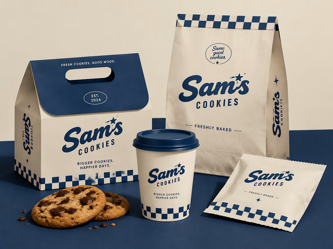
Turning a simple cookie into a memorable brand experience.
A packaging concept created to combine strategy, nostalgia, and a timeless American feel.
#BrandIdentity #PackagingDesign #FoodBranding #CreativeDirection

Beautiful design 😍

Meriot personal portfolio Website Homepage showcase
A portfolio website designed to turn personal expertise into a strong digital presence.
The goal was to create a website that communicates experience, personality, expertise, and credibility within the first few seconds.
I focused on:
Clear positioning and personal branding
Strong visual hierarchy
Editorial-style typography
Project-focused storytelling
UX/Product Design service presentation
Testimonials and social proof
Clear CTA for potential clients
Responsive, conversion-focused layouts
The visual direction combines minimal typography, bold imagery, dark/light sections, and subtle interactions to give the portfolio a distinctive personality without making it difficult to navigate.


Top notch execution



Took me a second to see the fold in the mark and now I can't unsee it, perfect for a dual-screen phone store. Was the slash always part of it or did it start as two plain stacked bars?