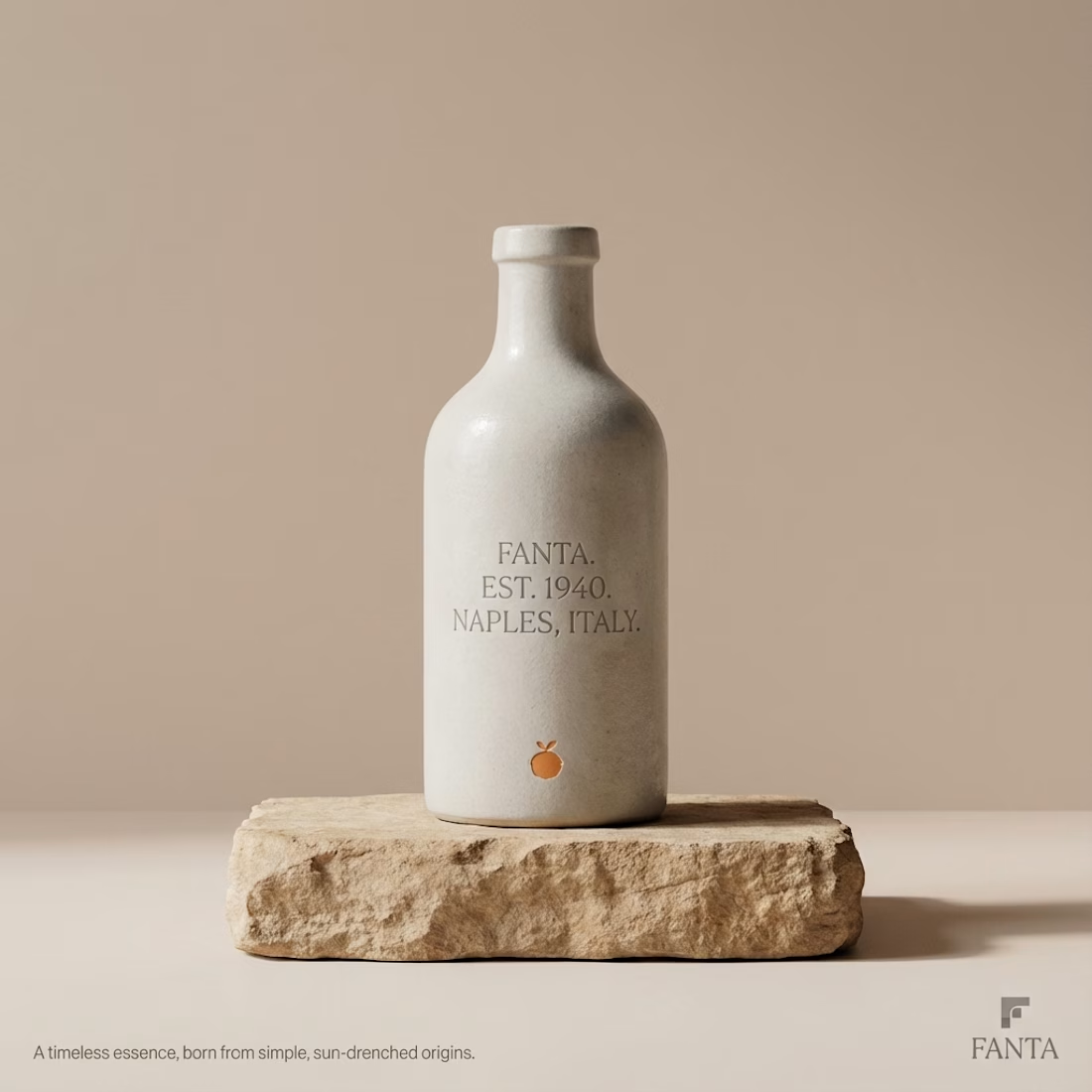
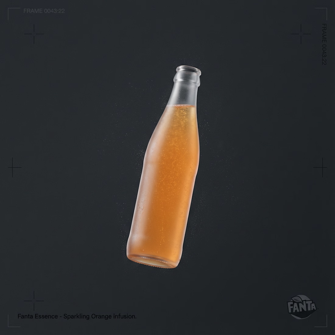
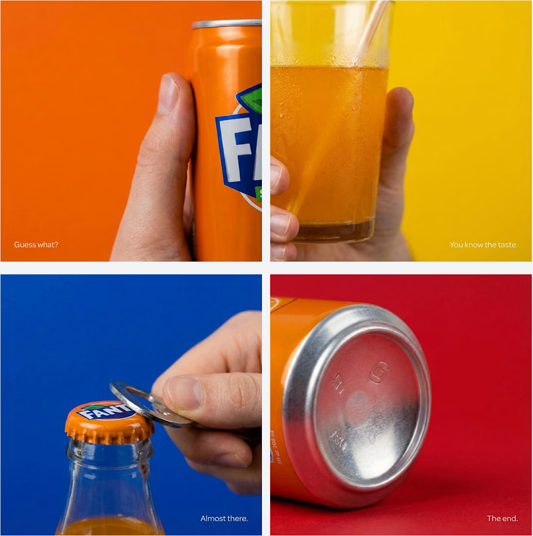
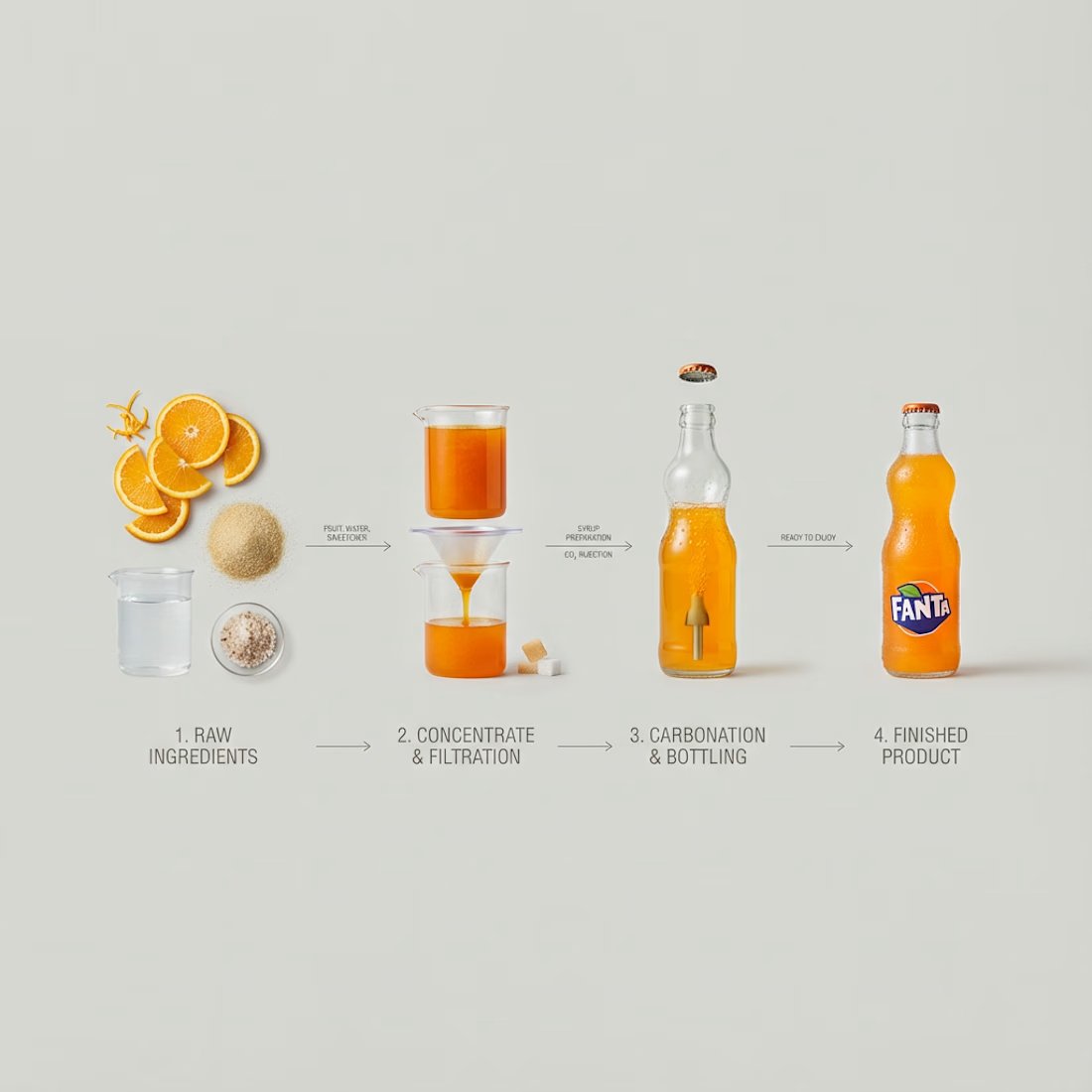
Creating brand & marketing images for Fanta using lovart.ai (https://lovart.ai) (concept). Using ...Creating brand & marketing images for Fanta using lovart.ai (https://lovart.ai) (concept). Using ...
The network for creativity
Join 1.25M professional creatives like you
Connect with clients, get discovered, and run your business 100% commission-free
Creatives on Contra have earned over $150M and we are just getting started
Creating brand & marketing images for Fanta using lovart.ai (concept).
Using highly detailed and crafted prompts fed into Nano Banana Pro and Lovart's features such as web search and edit text.
This level of visual quality comes down to how detailed your prompt is.
What if a space brand didn’t just look futuristic — but felt like it was already living in the future?
For XPACE, the goal was to build a visual identity that could turn the idea of space exploration into a complete and immersive brand experience.
The identity combines a bold typographic system, a high-contrast visual language, and electric blue accents against deep black to create a futuristic presence that feels precise, technological, and unmistakably XPACE.
But the identity didn’t stop at the logo.
The system was extended across digital interfaces, web design, favicon and UI icons, access cards, board passes, and branded applications — creating a consistent experience across every touchpoint.
Every detail was designed to make XPACE feel less like a brand inspired by the future, and more like a brand built for it.
XPACE — Visual Identity System.
Looking to build a visual identity that goes beyond a logo?
Let’s create something with a world of its own.
The identity system feels cohesive because the typography, electric blue accents, and image language all push in the same direction. Extending that logic into interfaces and packaging is what makes XPACE feel like a real world, not just a futuristic logo.
B has more life to it, that wing gradient gives it some motion the flat mark in A doesn't have. Are you pricing these as one-off logo packs or is there a bigger identity system behind them?
Can we talk about how weird it feels to actually like using AI in branding now, after spending a year being suspicious of it?
For me it stopped being "generate a logo" and started being more like a sparring partner... it throws rough, unexpected shapes at me and I spend my energy deciding what's worth keeping and shaping it into something that actually feels like the client.
Turns out the job didn't disappear. It just moved further upstream... into judgment, not execution.
Love the shift from generation to judgment here—the sparring-partner framing makes the designer’s role feel much more intentional. The real craft is in editing those rough shapes into a visual system that still carries the client’s voice.