The network for creativity
Join 1.25M professional creatives like you
Connect with clients, get discovered, and run your business 100% commission-free
Creatives on Contra have earned over $150M and we are just getting started
Back to feedPost

Packaging is more than just a container. (AI GENERATED BRAND VISUALS)
It’s the first impression, the brand’s voice, and a key player in customer experience. I had the time to work on another passion project, got to design the product label and packaging for " Chimy Daddies ", ensuring it stands out while reflecting the brand’s personality.
Every detail, from typography to color choice, was carefully crafted to create a satisfying identity that captures attention and builds trust. It’s always exciting to see how design +AI can transform a product’s appeal
SeaArt AIProduct DesignAI ArtPackaging DesignAdvertisement DesignGraphic DesignVisual DesignAdobe PhotoshopChatGPT


The network for creativity
Join 1.25M professional creatives like you
Connect with clients, get discovered, and run your business 100% commission-free
Creatives on Contra have earned over $150M and we are just getting started



Related posts

A fashion storefront needs to show the outfit and make its individual pieces easy to find.
For FORM, I paired a warm, editorial lookbook with clearly grouped product names, prices, and size choices.
Cream surfaces, charcoal typography, and consistent product cards connect the homepage with the desktop and mobile screen concepts.
One useful design principle from this project: give campaign imagery and shopping details their own readable zones. The collection can have a strong visual presence while the next product decision stays clear.
Explore the complete design case study:
https://contra.com/p/rNPRqooQ-form-fashion-e-commerce-website-design
When exploring a clothing collection, what helps you most: a styled outfit or an individual product grid?

Adorable


Great!!

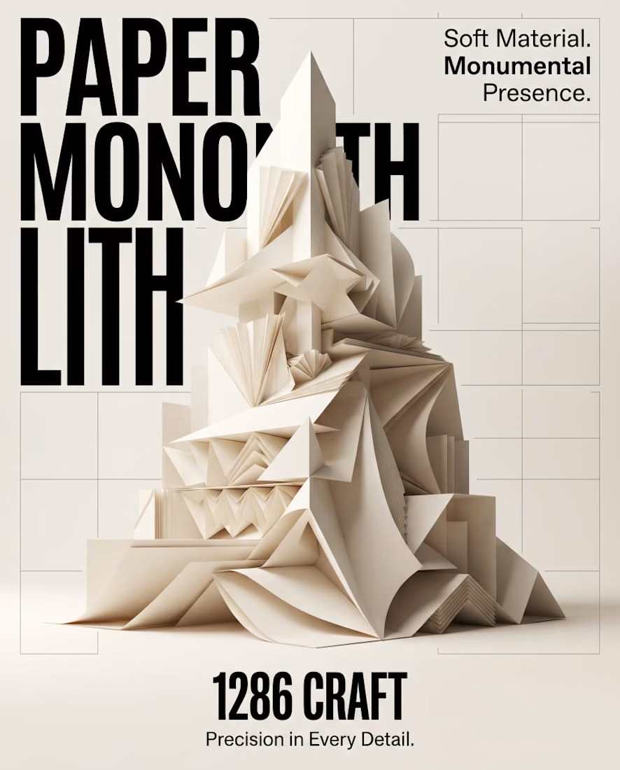
PAPER MONOLITH — Where Paper Becomes Architecture
An exploration of experimental graphic design, sculptural form, and architectural minimalism.
PAPER MONOLITH transforms the delicate nature of paper into a monumental visual statement. Inspired by origami geometry and contemporary architecture, this concept combines intricate folded structures, sophisticated typography, and refined editorial composition.
Created for 1286 CRAFT, the project explores the contrast between softness and strength through ivory-toned sculptural forms, realistic CGI aesthetics, precise geometric detailing, and a minimalist Swiss-inspired design approach.
The accompanying cinematic motion design brings the composition to life through subtle unfolding movements, atmospheric lighting, and elegant visual storytelling.
Creative Direction: Experimental Graphic Design, 3D Art Direction, Editorial Typography, Conceptual Design, Architectural Visualization, AI-Assisted Visual Design, and Cinematic Motion Design.
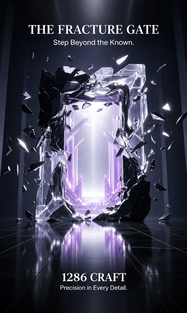
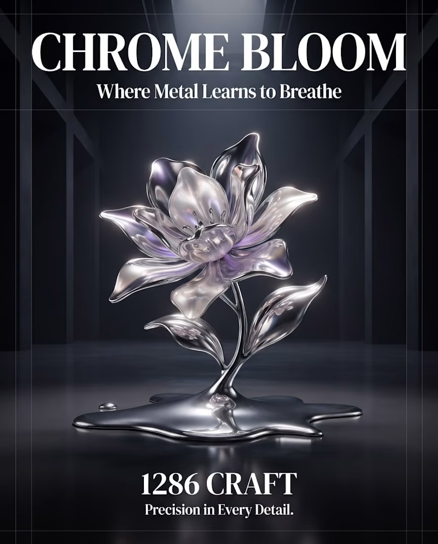
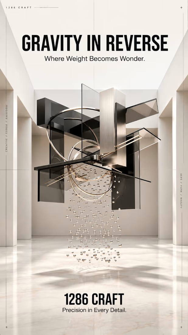
1286 CRAFT — Precision in Every Detail.
#1286CRAFT #GraphicDesign #ExperimentalDesign #EditorialDesign #Typography #3DArt #ArtDirection #MotionDesign #VisualIdentity #CreativePortfolio



Amazing work