The network for creativity
Join 1.25M professional creatives like you
Connect with clients, get discovered, and run your business 100% commission-free
Creatives on Contra have earned over $150M and we are just getting started
Back to feedPost
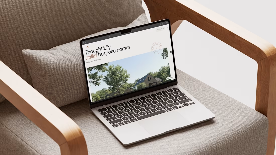
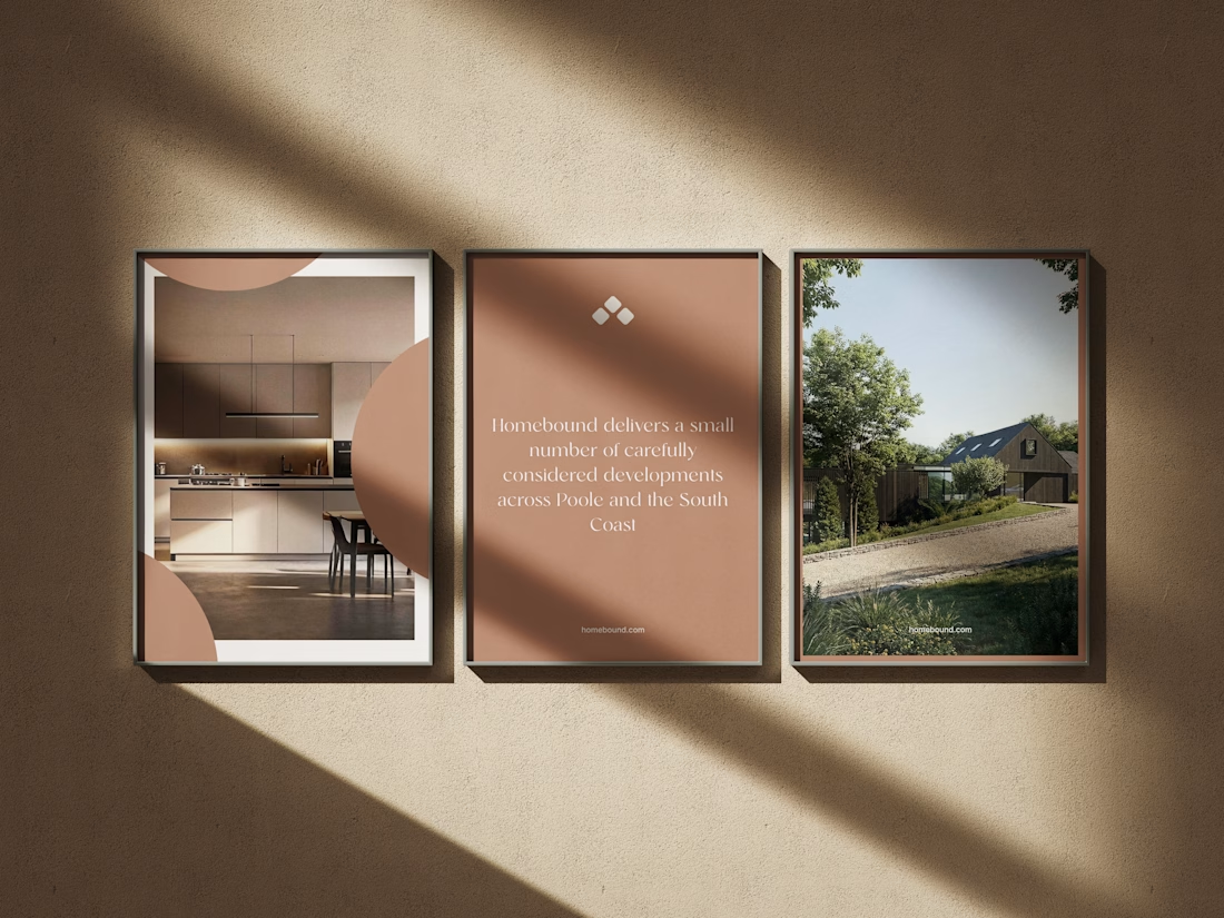
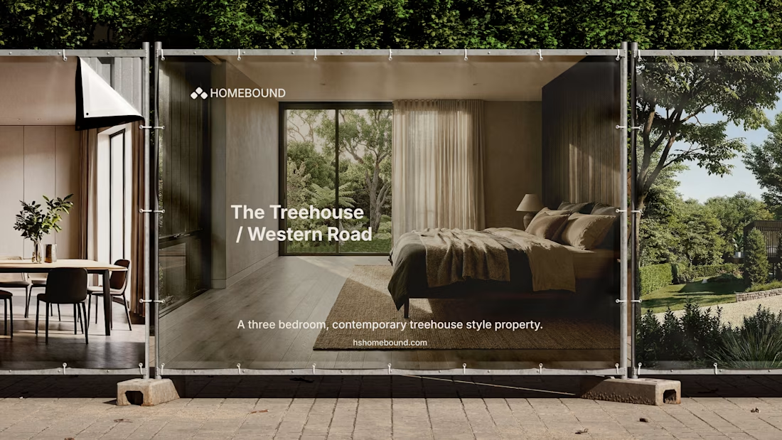
Really enjoyed working on Homebound, a property brand built around making the experience of discovering a home feel a little more considered.
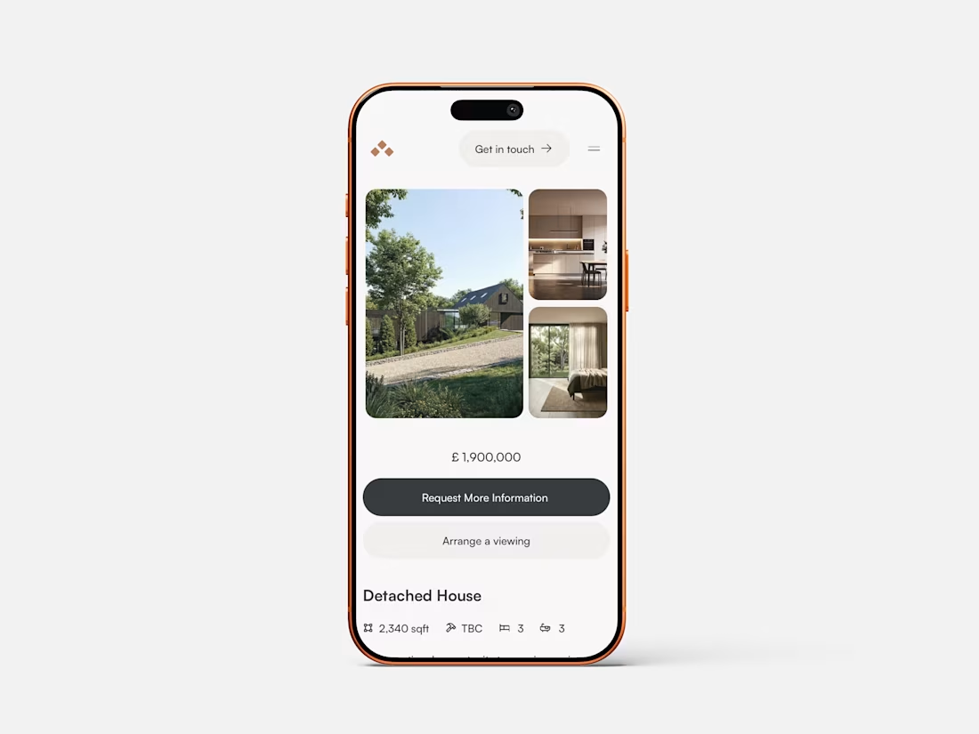
The brief was to create something that felt premium, calm and editorial, while still making the important stuff easy to find.
Photography does a lot of the heavy lifting here, so the design is intentionally restrained — giving the homes room to breathe rather than throwing information at you.
From the property experience through to mobile, everything was designed to feel simple, intuitive and genuinely enjoyable to use.
A really nice one to work on.
#WebDesign #Branding #Property #WebDesignInspiration #Framer #FramerDesigner




so calm

Thank you!

Thank you very much!
The network for creativity
Join 1.25M professional creatives like you
Connect with clients, get discovered, and run your business 100% commission-free
Creatives on Contra have earned over $150M and we are just getting started




Related posts

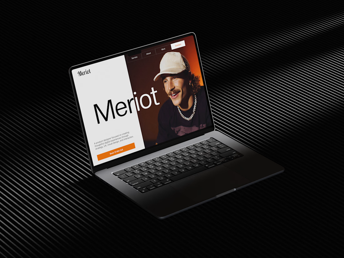
Meriot Netherlands-based product designer portfolio
I explored a portfolio website for Meriot, a product designer based in the Netherlands who wanted a digital presence that felt more personal, editorial, and design-focused.
The challenge was to avoid the typical portfolio formula and create something that communicates personality within the first few seconds.
The direction
→ Bold editorial typography
→ Strong personal photography
→ Minimal black-and-white foundation
→ Warm orange accent for CTAs
→ Simple, structured navigation
→ Clear positioning as a product designer
→ A portfolio experience that feels like a personal brand
The idea was to make the website feel confident without being complicated.
Rather than leading with a long introduction, the hero immediately communicates who Meriot is, what he does, and where the visitor should go next.


Nice design broooo

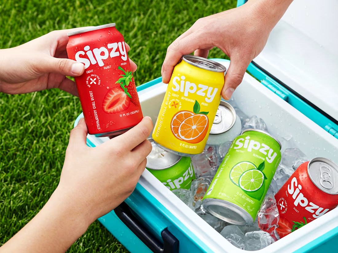
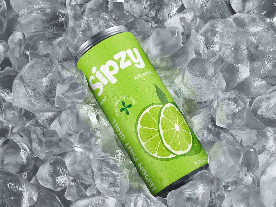
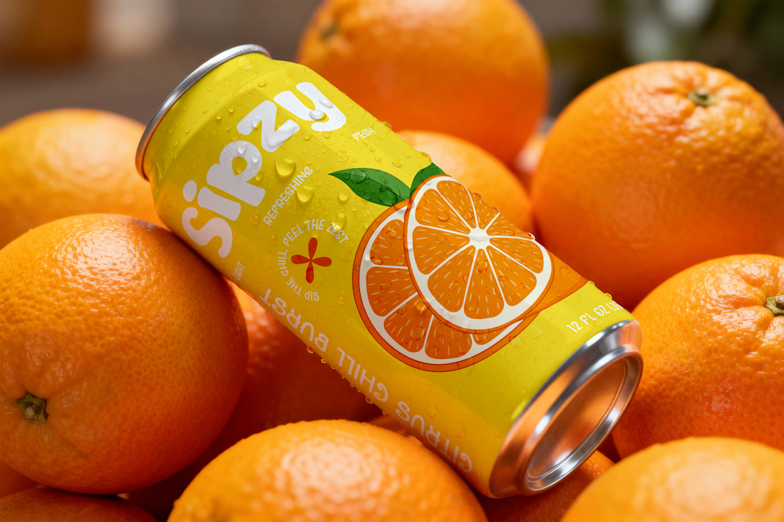
Sipzy – Fresh Fruit Juice Can Design

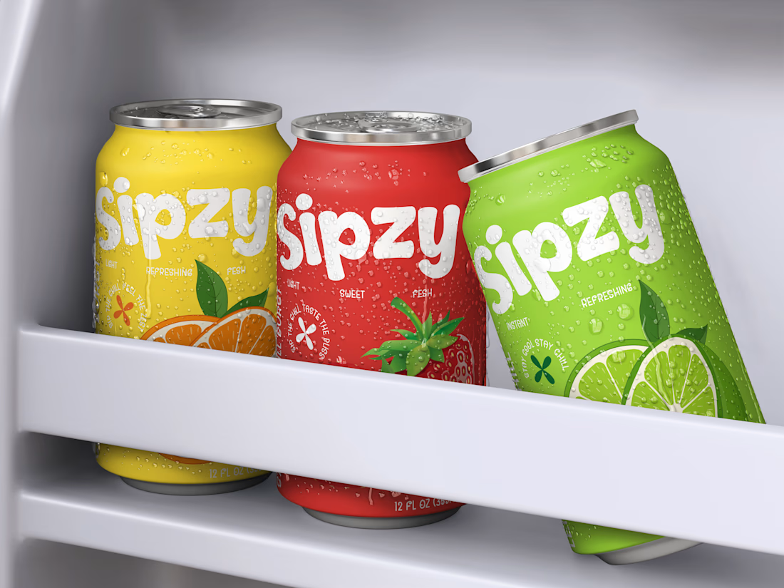

Love the visuals!

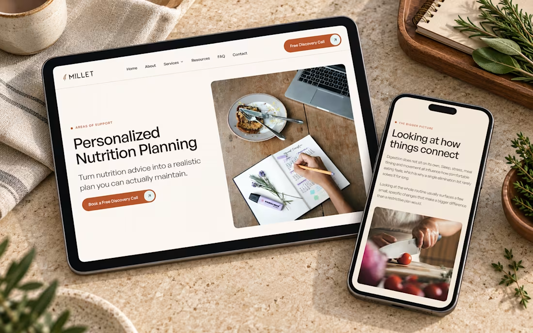
I just published a new @Framer template for nutritionists and health coaches.
Most wellness sites are either clinical and cold or sage green with leaf illustrations. I went warmer. Cream, wheat, terracotta, print magazine spacing.
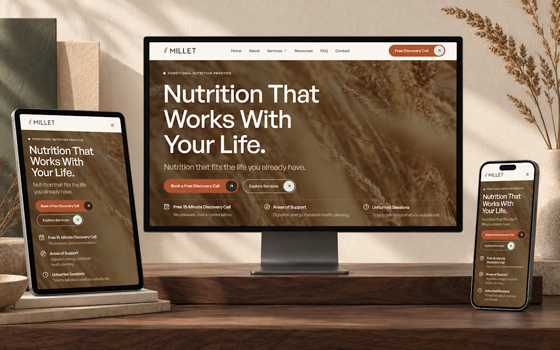
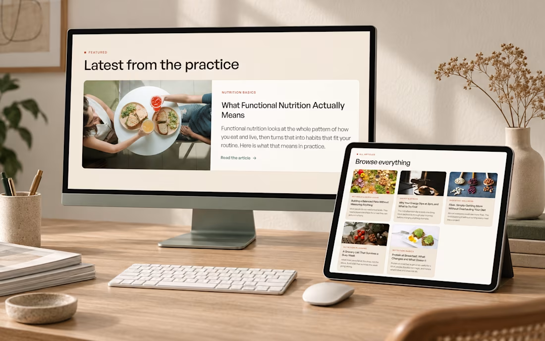
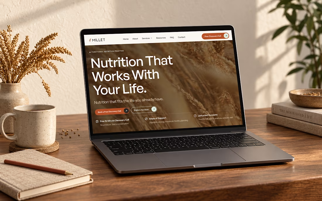

Looks Clean and Clear.