
Lewis Steadman
Web + Brand designer for ambitious brands.
- 5.0
- Rating
- 5
- Followers


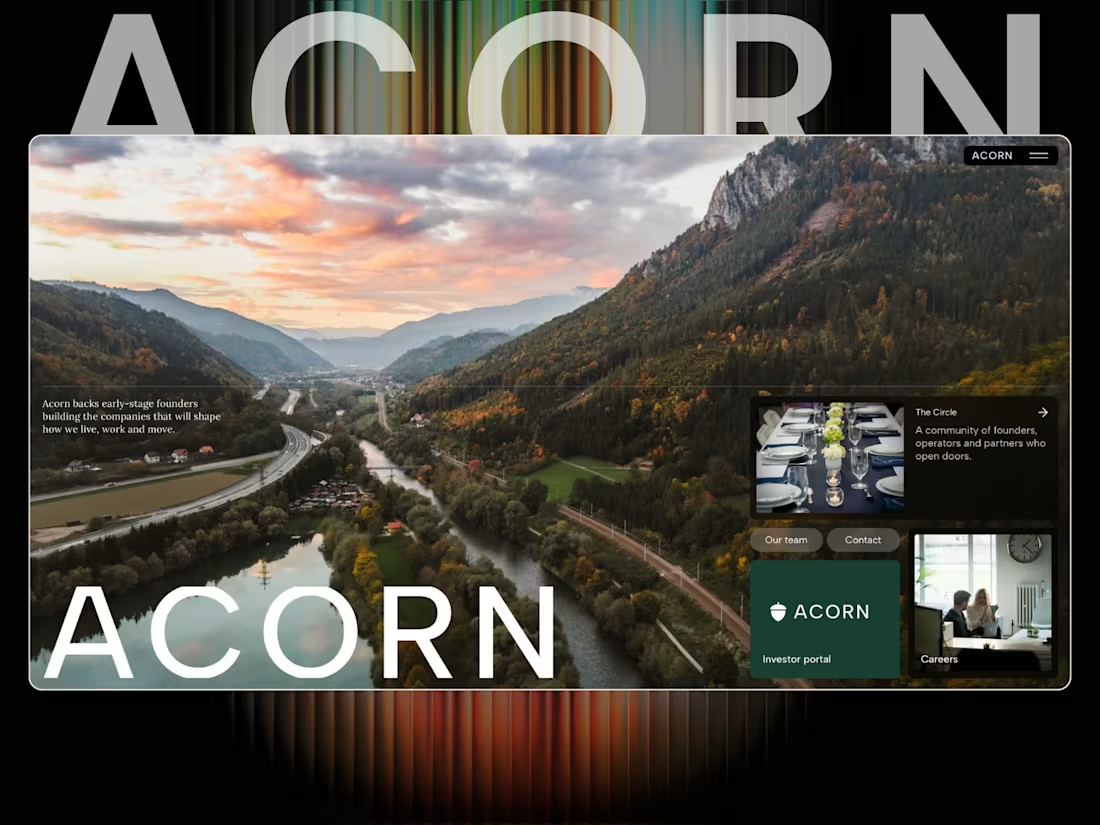
Acorn — a new VC website concept 🌱
Been working on Acorn, a Framer site for a modern venture capital firm.
I wanted this one to feel less like a traditional finance website and more like a serious technology brand — editorial, confident and very focused on the people and companies behind the numbers.
The site is built around three core areas:
Invest. Build. Scale.
With sections covering the investment thesis, criteria, portfolio, locations, team, fund metrics and dedicated journeys for founders and investors.
A big part of the challenge was making a lot of information feel simple without making it feel empty.
Built in Framer.
Acorn — backing founders early, and staying for the long run. 🌱
#Framer #FramerDesigner #WebDesign #VentureCapital #VC #StartupDesign #Investment #WebDesignInspiration
0
57

A playful pizza brand built around bold illustration, personality and a slightly irreverent attitude. The identity combines a hand-drawn mascot with chunky custom lettering, creating something that feels nostalgic, fun and instantly recognisable.
The concept extends across packaging, drinks, takeaway, interiors and print, using a simple colour system and expressive typography to make the brand feel like more than just another pizza joint.
A full visual identity concept for a pizza brand with plenty of character. 🍕
1
3
134
Really proud of this one.
I’ve put a lot of time into Helm, obsessing over the small details, interactions, spacing and overall feel until it felt right.
View here: https://helm.framer.media
It’s a complete SaaS website built in Framer, with product pages, pricing, customers, docs, changelog, status and everything in between.
Probably one of my favourite templates I’ve built so far.
Would genuinely love your feedback on this one, what works, what doesn’t, and what you’d change.
Built in Framer. 🤍
2
182
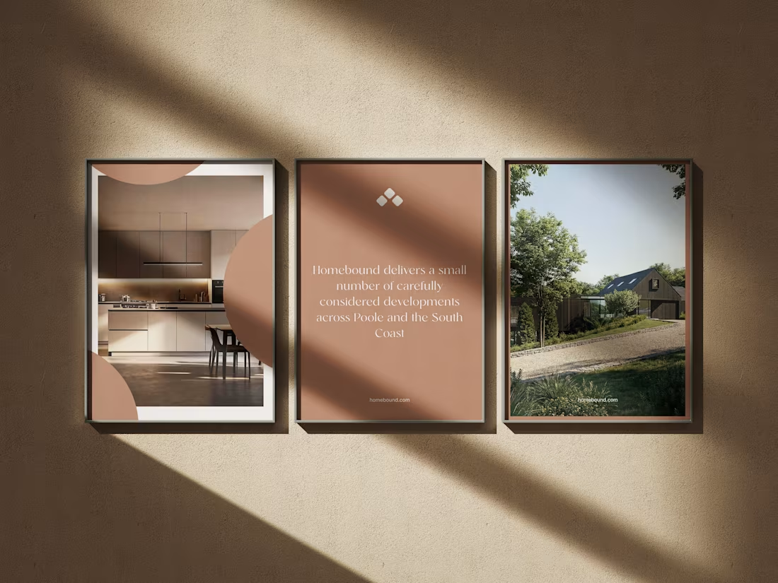
Really enjoyed working on Homebound, a property brand built around making the experience of discovering a home feel a little more considered.
The brief was to create something that felt premium, calm and editorial, while still making the important stuff easy to find.
Photography does a lot of the heavy lifting here, so the design is intentionally restrained — giving the homes room to breathe rather than throwing information at you.
From the property experience through to mobile, everything was designed to feel simple, intuitive and genuinely enjoyable to use.
A really nice one to work on.
#WebDesign #Branding #Property #WebDesignInspiration #Framer #FramerDesigner
4
14
406