The network for creativity
Join 1.25M professional creatives like you
Connect with clients, get discovered, and run your business 100% commission-free
Creatives on Contra have earned over $150M and we are just getting started
Back to feedPost
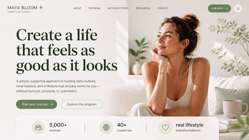
Taste Test
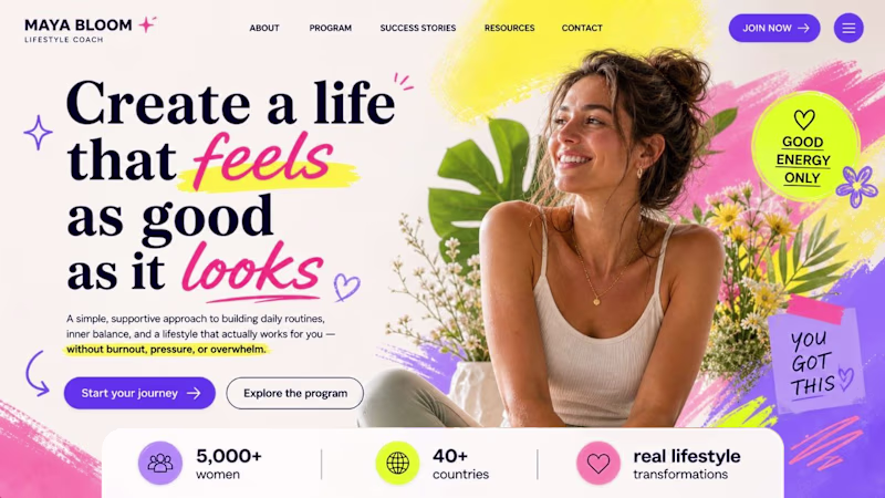
Both 🙌
Calm +++
Though choice to make but I'd go for calm over dopamine it does well to retain
They both look good! One is for a clean look, and one is for a little fun and funky vibe.
I'm quite confused, cause both looks good, but Dopamine one, is like showing the end result that your life will be that colorful
Dopamine all day!
Wow this looks stunning
Both could work for very different audiences. For me, dopamine is just a more inviting, colorful layout that draws my eye in.
They both work well. It comes down to the goal of the design. But if we're talking about aesthetics, I def like dopamine, I love me some pop up colors.
Calm ☺️
I prefer calm
that dopamine hit design is everything!
Depends on the Goal From The hero section, what audince we targeting
For me Calm Feels better Cause i love designs that visually simlpe and give eyes more Comfort
this was a tough call, but i ended up going with dopamine. i think the different font you used for 'feels' really pulled at a string psychologically & truly does lead the viewer to FEEL that you're introducing something that'll bring that pop of vibrancy into their life.
Dopamine just feels different
I will take calm
Being a UX designer and lover I'd go with Dopamine, but I'd A/B test both options since users are not designers.
Both work well in their own way, for different brand identities and demographics. Since the copy mentions that this coaching helps with inner-balance and making life feel less overwhelming, I'd say the calmer less stimulating design is a better fit tonally.
This hits the core of conversion psychology! The dopamine version works brilliantly for action-oriented audiences who need that energy boost to commit, while calm appeals to overwhelmed users seeking sanctuary. The genius is in your typography choice - that playful "feels" font...
Both look great.
The one on the right is just too overwhelming
I will go for the calm one it look like the 2nd one has a lot going there
It totally depends on the audience and what you are selling! The one on the left is overdone, but fun and vibrant for a more youthful audience. The one on the right is for a wellness-centered client who wants peace and calm.
Both look amazing!
Depends on the personality of the creator for me.
Based on the copy and the smile of the creator , "Calm" feels more authentic. I'd pay.
But If she was bubbly and high energy then i'd feel her brand aesthetics is more aligned with her offerings in...
I like the calm version better. I think that the dopamine version feels more childish and it's hard to take it serious. the calm version is less busy, more clear to read and it feels aspirational.
I like the “Calm” version because it really fits the vibe and the purpose. This is just my personal opinion; I’m sorry if I’m wrong.
dopamine
The network for creativity
Join 1.25M professional creatives like you
Connect with clients, get discovered, and run your business 100% commission-free
Creatives on Contra have earned over $150M and we are just getting started
Related posts
I'd go for the 2nd one
Super happy to share my entry for the Figma Makeathon 😊
Connected Earth.
Language separates us. Sound connects us.
https://www.connected.earth
Connected Earth started with a simple observation: despite being more connected than ever, many of us feel increasingly disconnected from each other, our surroundings, and the places we live.
Most platforms ask us to compete for attention. More followers. More likes. More visibility. More noise. I wanted to explore the opposite.
Connected Earth is a living archive of sounds contributed by people around the world. A quiet place where someone can capture a moment from their corner of the planet and share it with someone they’ve never met.
The sound of rain in Scotland.
A train arriving in Tokyo.
Waves breaking in Australia.
Bikes whizzing past in park in Amsterdam.
Children playing on a street somewhere you’ll probably never visit.
None of these moments need translating. They’re immediately human.
Every recording becomes part of a growing global collection that can be explored individually or experienced through Earth Radio, a continuously evolving stream shaped entirely by community contributions. The more people contribute, the richer and more diverse the experience becomes.
Alongside the archive, Connected Earth includes Ambient Radio for creating evolving soundscapes from community recordings where sounds are stretched, overlayed, reversed, and can have user effects applied. We also have Resonance Tables for discovering related sounds and places, and Resonance Chains that allow recordings to be connected (chained) together into journeys spanning countries, cultures, and time zones. Together they transform individual moments into something larger than a collection of uploads.
Rather than likes, Connected Earth uses Resonations. Small acknowledgements that a sound resonated with someone else. No user account, No follower counts. No popularity contests. No pressure to perform. Just people sharing moments.
For those looking for calm, Ambient Mode transforms community recordings into evolving soundscapes that can be used for focus, reflection, relaxation, or simply feeling connected to somewhere else in the world.
The result is less of a social network and more of a shared listening experience.
The project was designed and built using Figma’s evolving ecosystem, including Figma Agents (Conversation & Moods), Make, AI-assisted (ChatGPT > validation) workflows, and iterative prototyping. What began as a conversation with design tools quickly became an exploration of how technology might help us feel a little more connected to one another.
Connected Earth is fully desktop and mobile compatible, allowing people to contribute, discover, listen, and explore wherever they happen to be.
In a world increasingly driven by content, Connected Earth is an experiment in presence. A reminder that while we may speak different languages, we often experience the same rain, the same wind, the same birdsong, and the same quiet.
And perhaps that matters more than we think.
Love the idea, Lee! Being focused on what matters most, the small details of life. No pressure, no engagement, no likes... Just seeing the awesome world that we have from our chairs
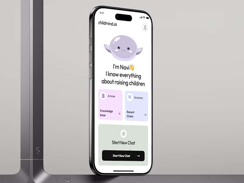
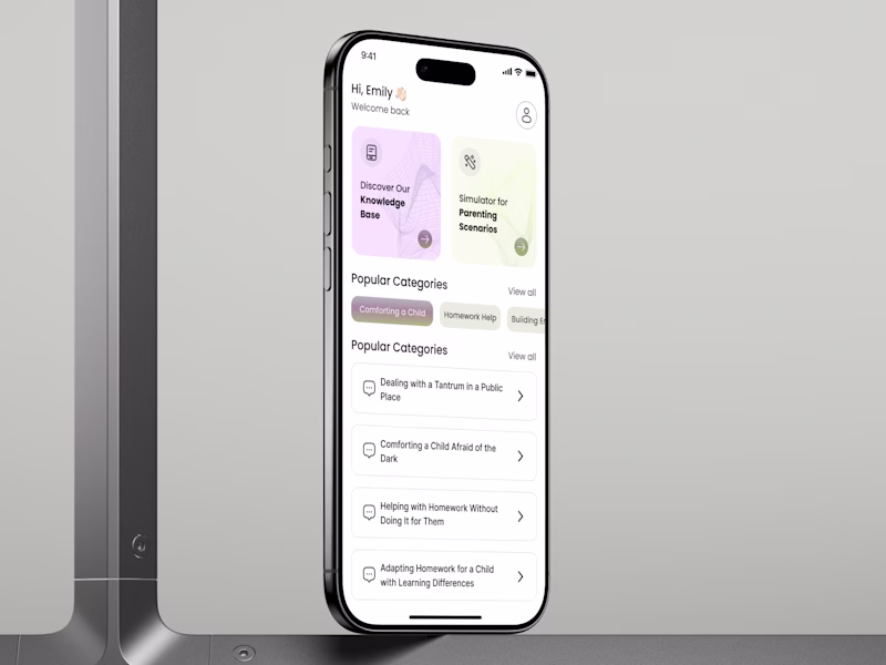
AI PARENTING MOBILE APP: MASCOT OR NO MASCOT? 👀
Same app. 2 UX directions.
A - 🧸
B - 🤖
This is not about which screen is cuter.
For a parenting app, UX works when the user is tired, stressed, or guilty
So the real question is:
Which UX would a parent open again tomorrow?
Navi is not just a cute character.
It can become a retention mechanic.
Not through badges, points, or FAKE gamification.
But through emotional memory.
A parent may forget features.
But they remember how the product made them feel in a hard moment.
2nd optionis cleaner, faster, and more direct.
Strong for utility.
But easier to become another generic AI app.
UX impact:
+43% potential daily retention 📈
+27% user engagement ⚡️
up to 40% faster discovery 🔍
VOTE BELOW: WHICH UX HAS A STRONGER REASON TO RETURN? 👇
42 voted
70%
18 voted
30%
60 votes
Closed
Clean AI Layout
Trending
Claude
Claude has entered the design space. How are you using Claude Design?
Contra University
Learn from expert creatives how to earn more using next-gen AI tools.
MagicPath
The canvas is infinite, and exploration is becoming the workflow. How are you using MagicPath?
creativeaiflow
Creative AI workflows are evolving. What tools do you use, and what are their strengths and weaknesses?
freelancerlife
Freelancer life is wins, pivots, and everything in between. What’s yours right now?