
Smart Secured Systems — Unofficial Brand Concept
3S Egypt has been around since 2006. 200+ experts, 500+ projects, clients like the Central Bank of Egypt, EgyptAir, the Ministry of Interior, and the Suez Canal Authority. One of Egypt's most serious tech and security companies.
The brand never matched that weight.
So I redesigned it — without being asked.
The old identity: a dated circular emblem, flat corporate blue, "Since 2006" stamped on top. Safe. Forgettable. Could be any company.
The new direction: an isometric 3D S-mark with structural depth and a grain texture — built to feel like infrastructure. Like something that protects things. Two modes: raw black for brand presence, clean blue on white for product and digital.
Nothing is final. I haven't pitched it to the owner yet. This is a concept I believe in and I'm putting it out there.
What would you change? What would you push further? Drop it below — I'm genuinely taking notes.
0
21
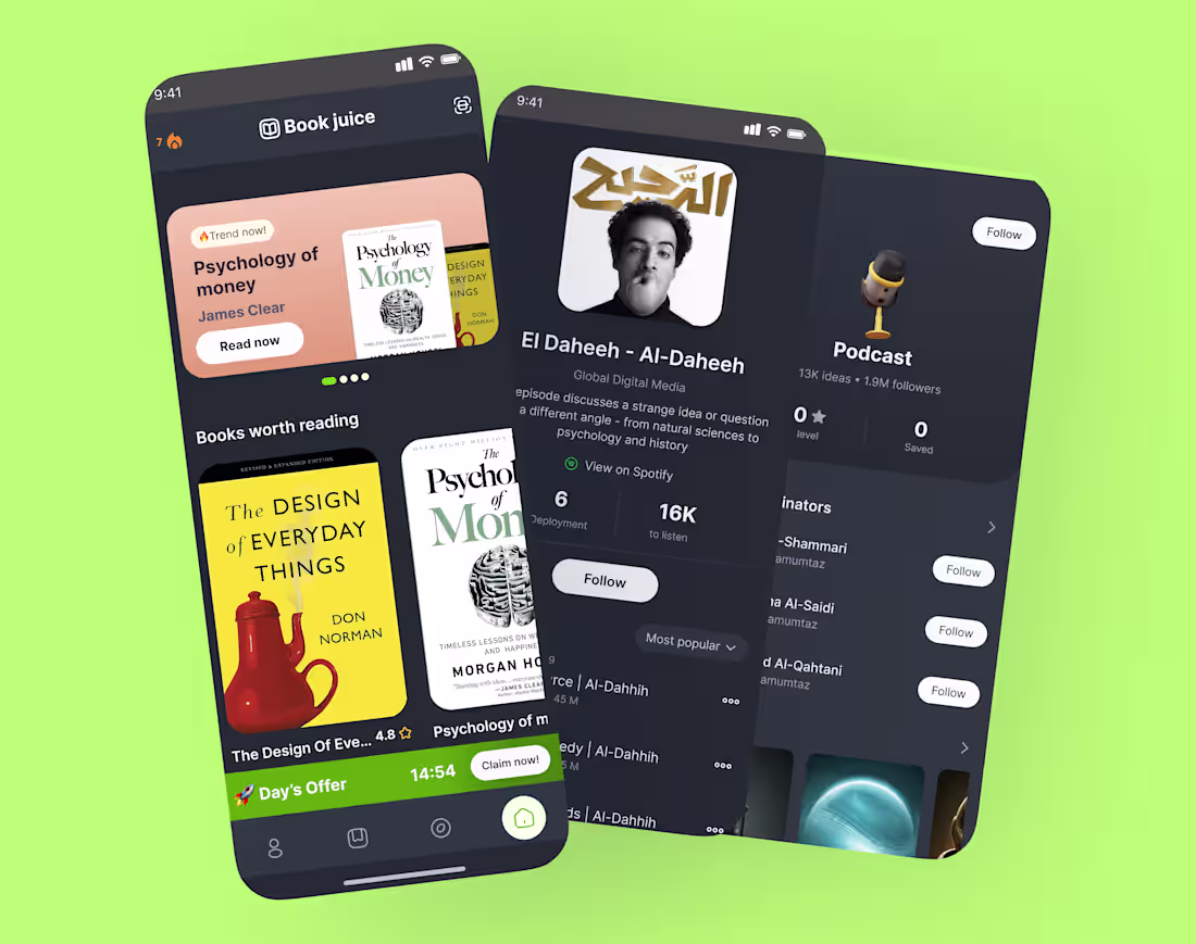
📚 Designing Book Juice — a reading app that actually makes you want to read.
Dark UI + warm book covers = a combo I couldn't stop tweaking.
Here's what drove my design decisions:
→ Dark theme to reduce eye strain for long reading sessions
→ Featured hero card to spotlight trending titles (not bury them)
→ Podcast + book integration — because some people learn by listening
→ A streak + daily offer mechanic to make coming back feel rewarding, not guilt-tripping
The hardest part? Making a grid of book covers look cohesive without looking like a library database.
What's one thing you'd want in your perfect reading app? Drop it below 👇
I'm actively iterating and would love real feedback.
💬 If you've built a reading habit — what made it stick? An app, a ritual, a format?
2
3
74
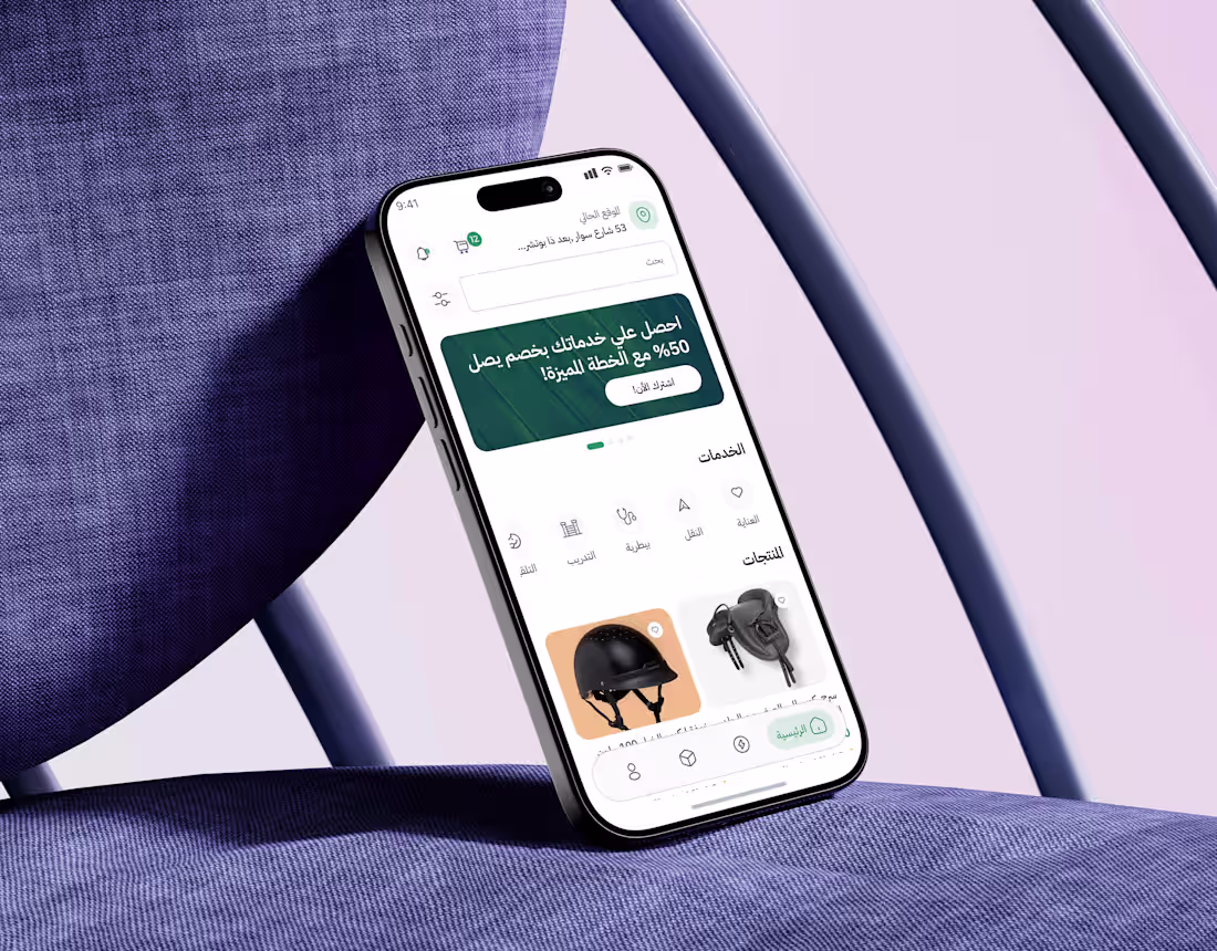
FILLO Horses Essentials App Case Study
0
2
Wecare – Company Management Dashboard
0
2
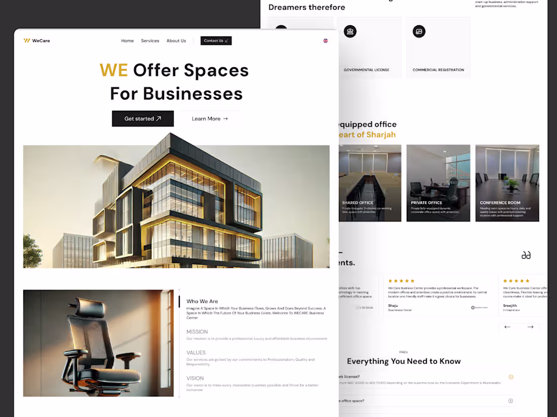
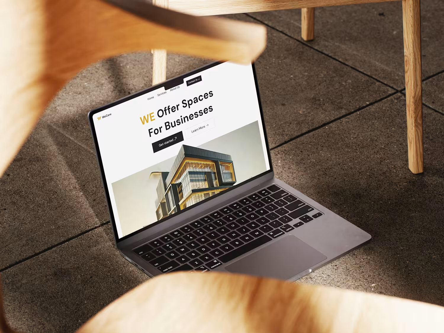
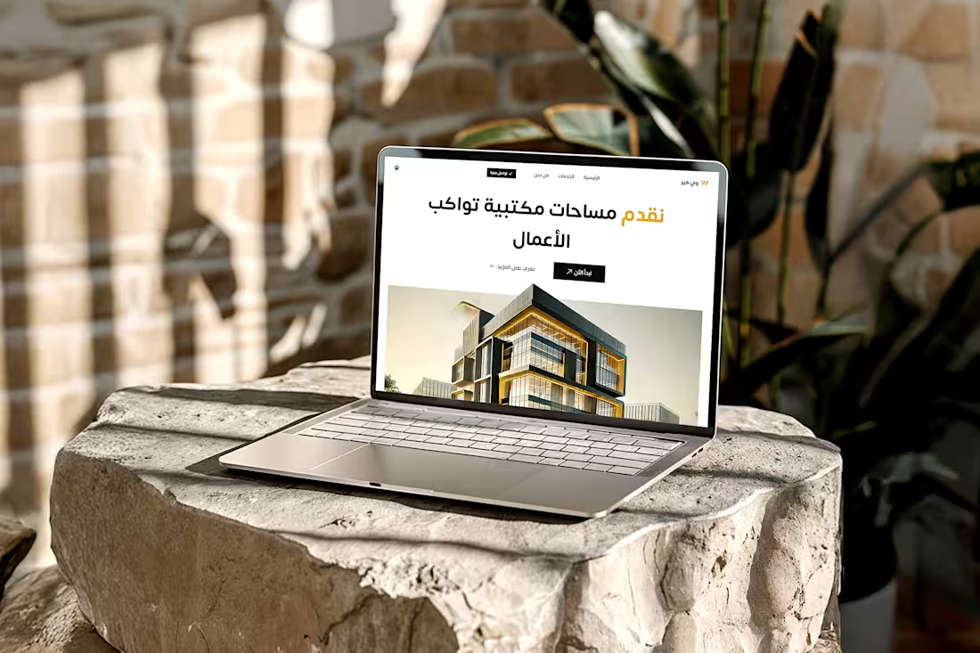
Wecare Landing Page
0
0
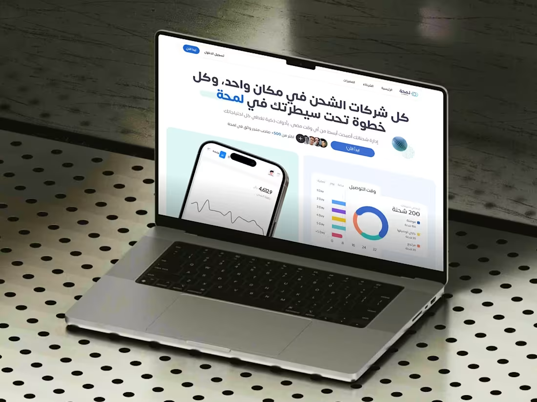
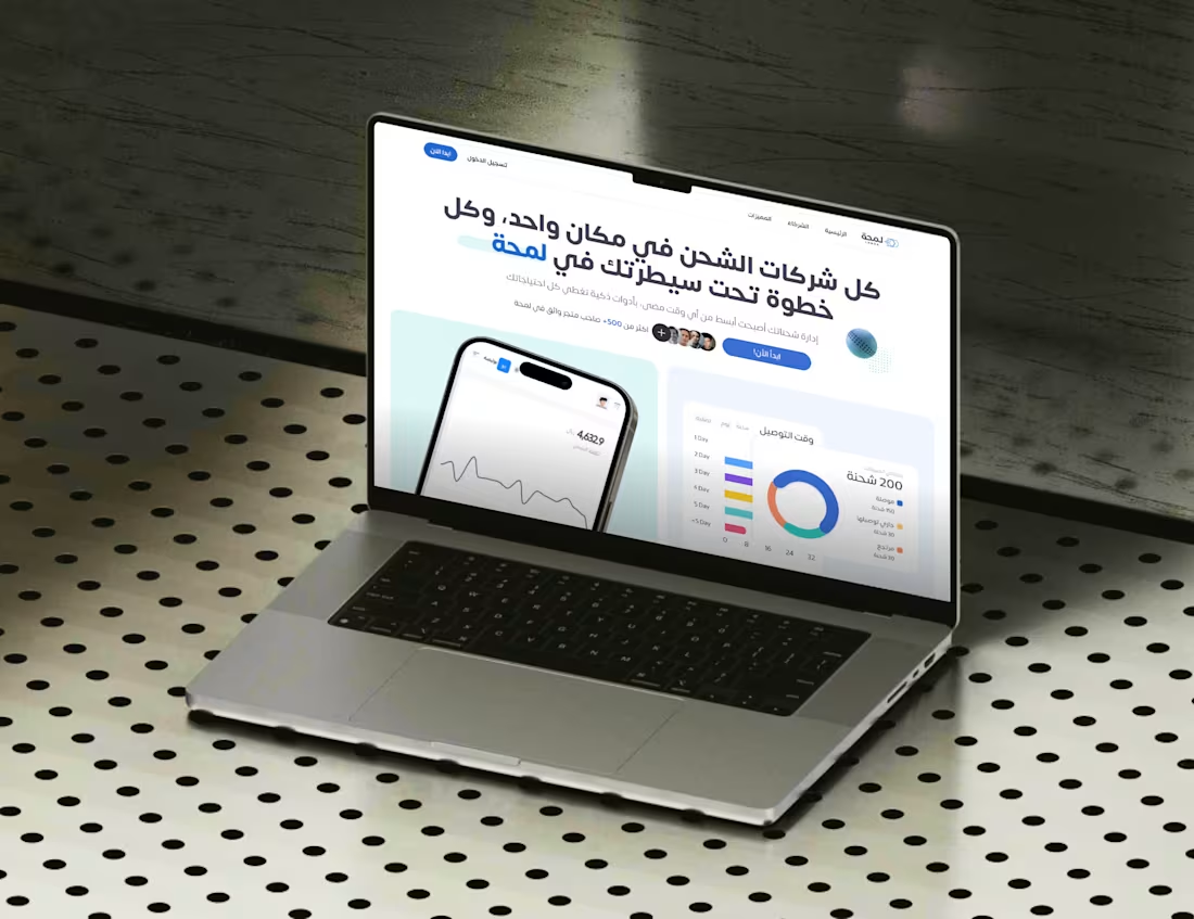
Lamha Shipping Platform Development
0
2
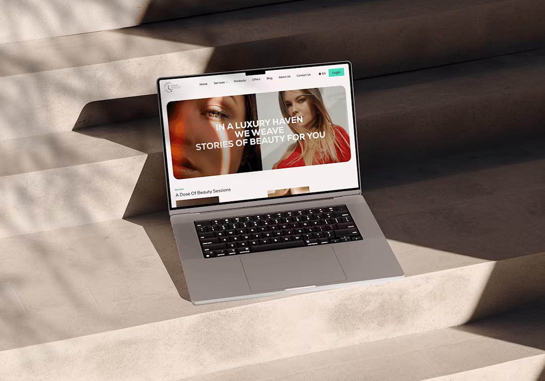
L'Elite Salon & Spa Website
0
6
Wecare Landing Page
0
3
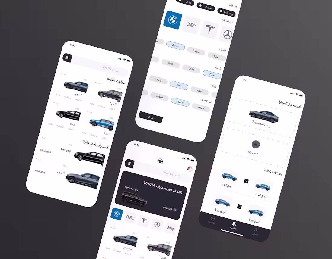
Car Safety app UX/Ui
0
3
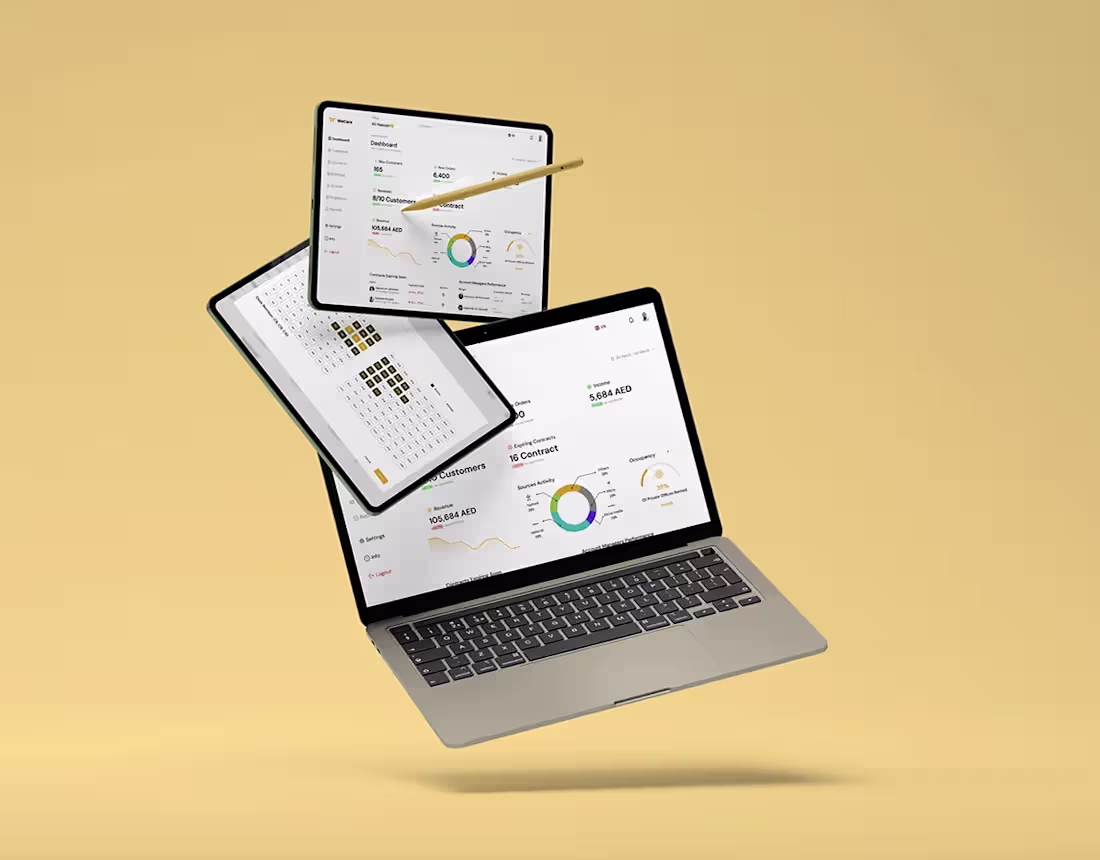
Wecare – Company Management Dashboard
0
6
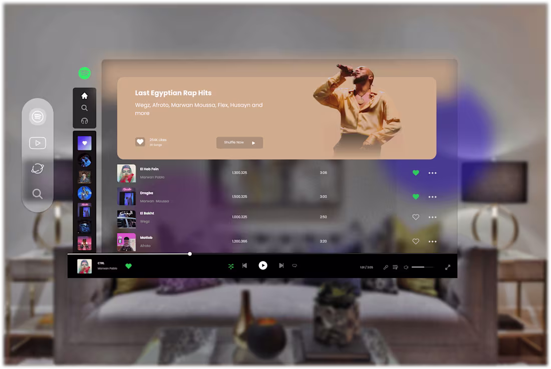
Spotify Visual Ui
0
4
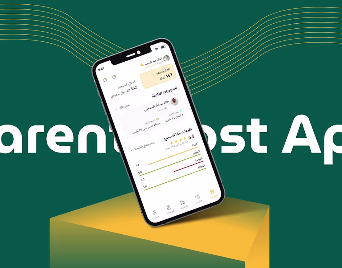
Darent UX/Ui Case Study
0
4
Lamha – Minimalist Luxury Web Experience
0
5
FILLO Horses Essentials App Case Study
0
3
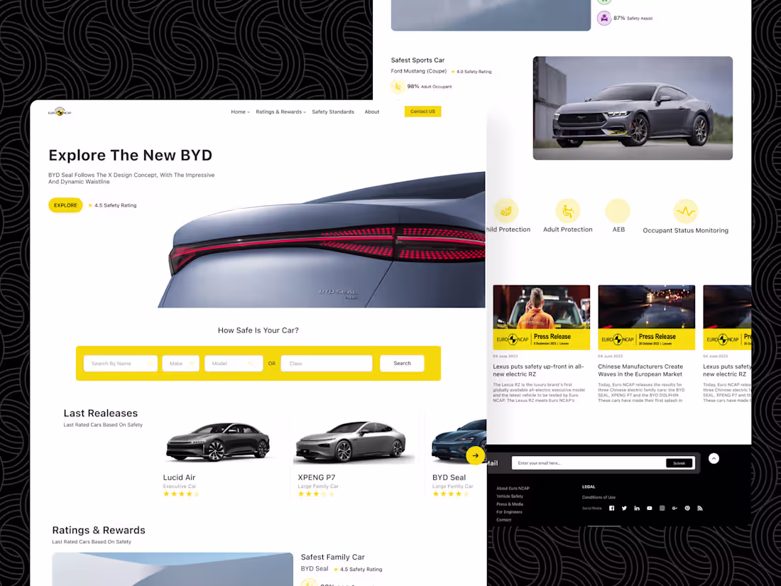
Euro NCAP Landing Page
0
4