The network for creativity
Join 1.25M professional creatives like you
Connect with clients, get discovered, and run your business 100% commission-free
Creatives on Contra have earned over $150M and we are just getting started
Back to feedPost
Taste Test

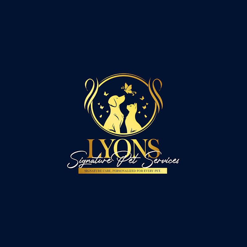
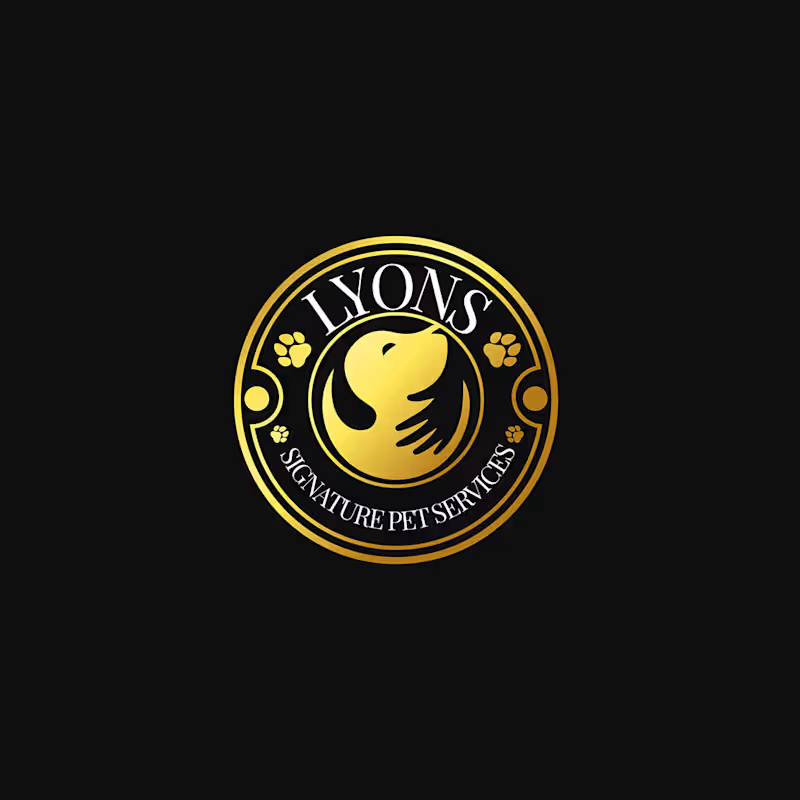
Two logo directions, one final choice. Which LYONS concept stands out to you? 🦁✨ Left or Right?
1 voted
100%
0 voted
0%
1 vote
Closed


I’m drawn to the first direction—the compact badge reads clearly at a glance, while the ring and small type give it a strong emblem feel. The second has more personality, but the first feels more versatile across sizes.


The bold and modern option stands out. The lion mark feels strong and clear.
The network for creativity
Join 1.25M professional creatives like you
Connect with clients, get discovered, and run your business 100% commission-free
Creatives on Contra have earned over $150M and we are just getting started











Related posts

Hey everyone! 👋
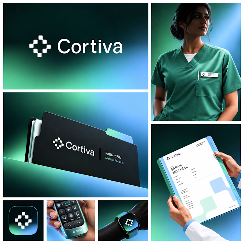
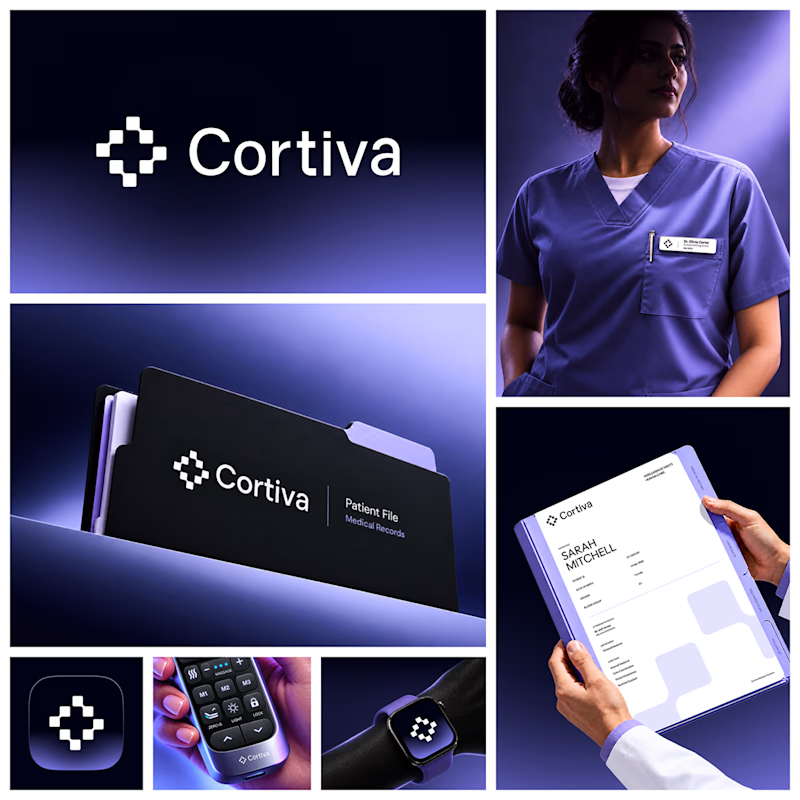
Working on Cortiva, an AI-first hospital branding project.
I've already finalized the color direction, but I thought it would be fun to explore two different moods.
Option 01💚 or Option 02? 💜
Both have their own personality, and I'm curious to see which one you prefer!
Let's see which one wins! 👀
5 voted
33%
10 voted
67%
15 votes
Closed

Both directions are strong, but I'm leaning towards Option 01. The green feels instantly like "care" and trust, which is perfect for a hospital. Option 02 looks more techy and premium. Curious, which mood are you aiming for - clinical and calm, or friendly and modern?


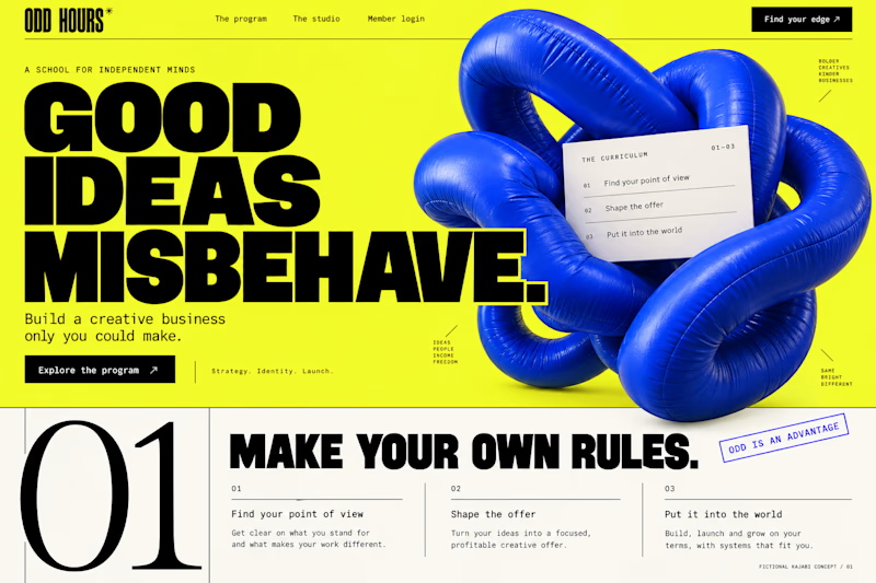
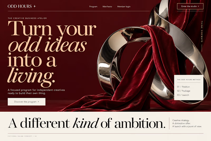
Which Kajabi direction would stop your scroll?
Meet ODD HOURS, a creative-business academy concept.
A / Acid Play: electric yellow, oversized type and a sculptural blue knot.
B / Velvet Rebellion: oxblood, chrome and velvet with fashion-editorial typography.
Two original AI-generated concepts. Same offer. Completely different energy.
Which one pulls you in, and why?

15 voted
65%
8 voted
35%
23 votes
Closed

It's only Acid Play it's unbelievable 🔥🔥🔥🔥
Great job Kraig🎉🎉

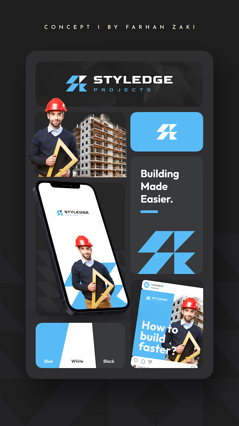
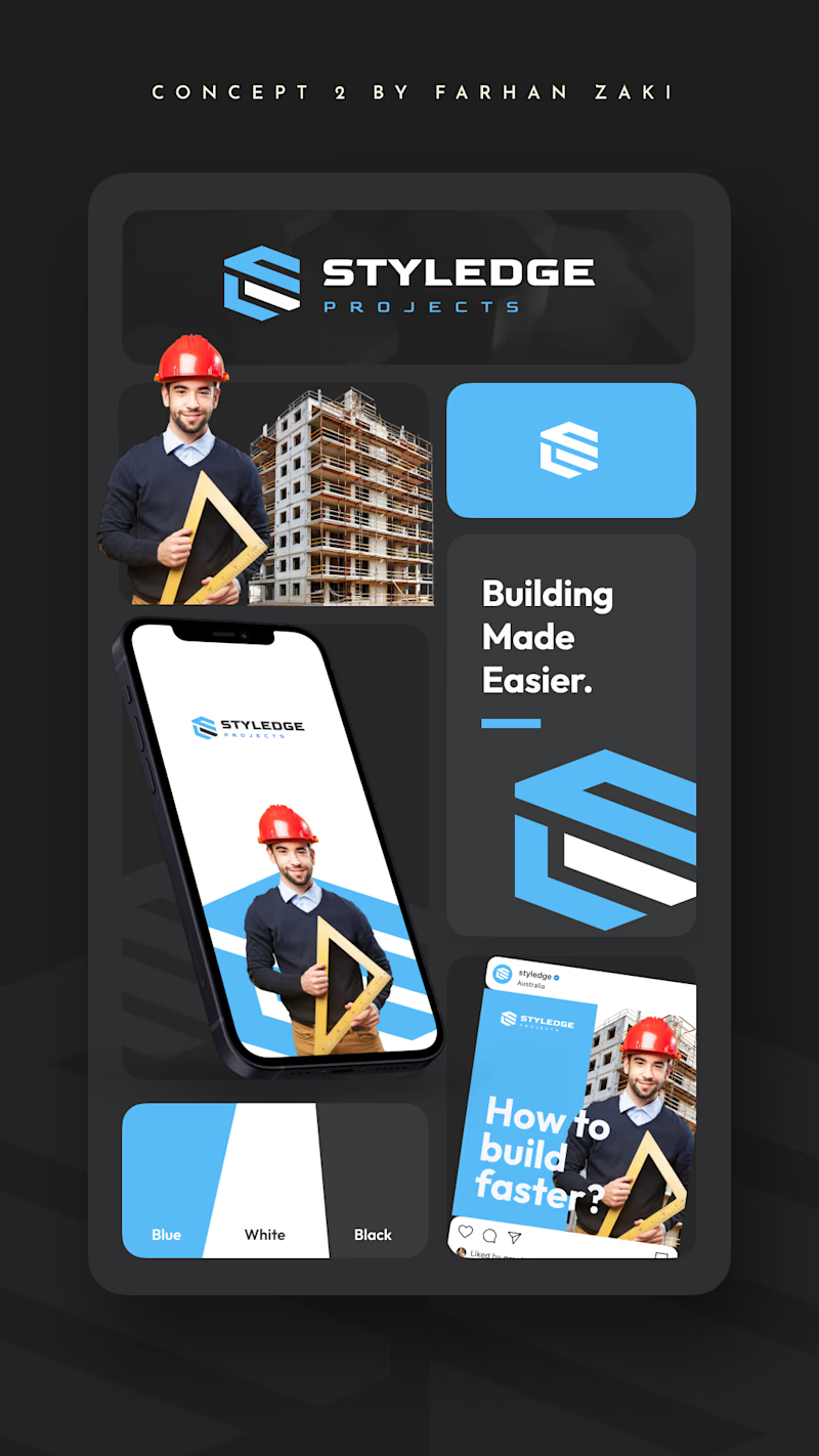
If you are the logo designer, which one do you choose for a building company in 2026? And whats your reason?
0 voted
0%
2 voted
100%
2 votes
Closed
Concept 2 logo is better in it's design and details ❤️❤️
Great job Farhan🎉🎉🎉