The network for creativity
Join 1.25M professional creatives like you
Connect with clients, get discovered, and run your business 100% commission-free
Creatives on Contra have earned over $150M and we are just getting started
Back to feedPost

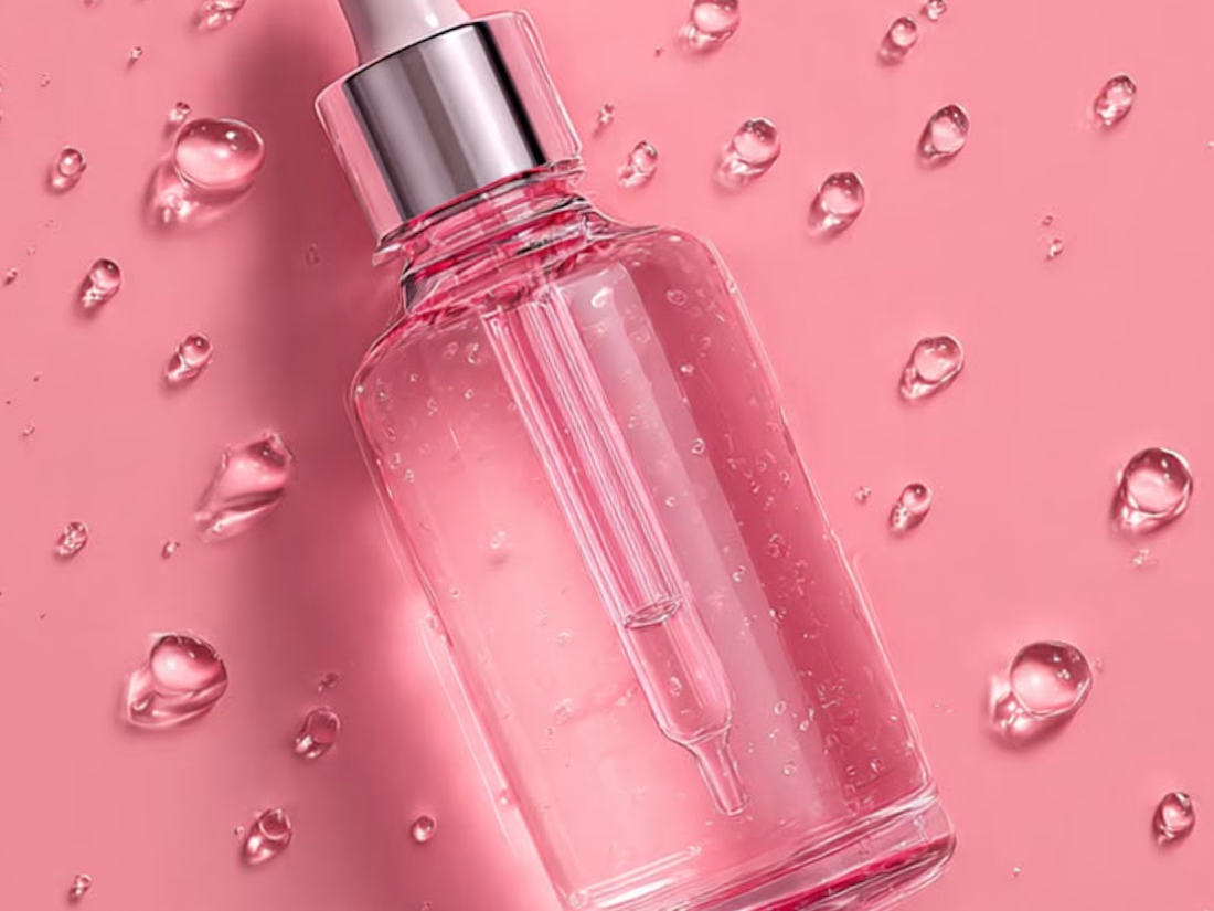
This visually striking skincare design brings together creative static elements and high-quality product photography to create a polished and premium brand presentation.


The network for creativity
Join 1.25M professional creatives like you
Connect with clients, get discovered, and run your business 100% commission-free
Creatives on Contra have earned over $150M and we are just getting started





Related posts

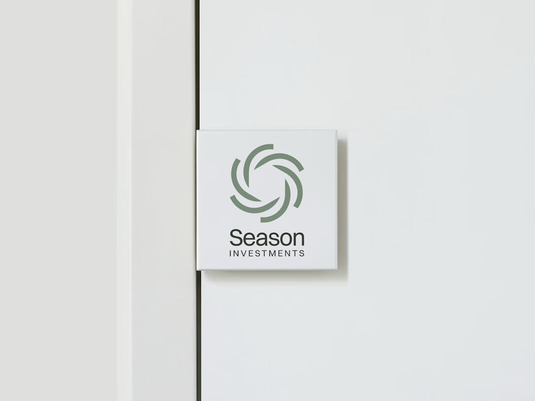
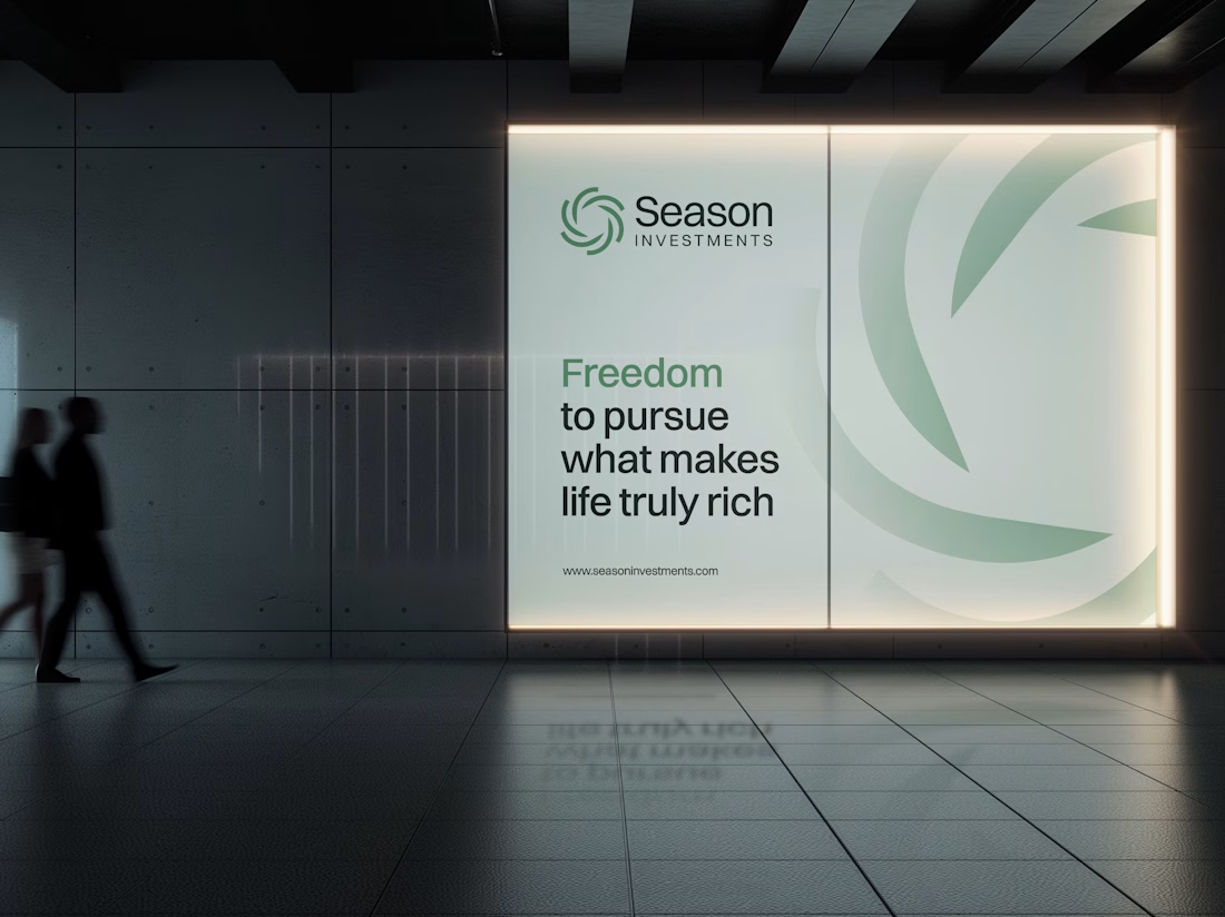
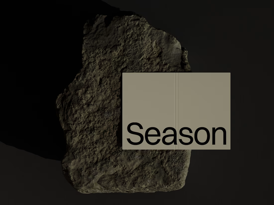
The Rebranding Challenge - Season Investments
One of the key challenges was deciding what to change and what was worth preserving.
Rather than starting from scratch, the new identity retains a visual connection to Season Investments’ heritage, but reframes it for a more contemporary and flexible brand system.
A major improvement was creating a symbol that can work independently from the wordmark. This gives the brand a stronger presence across investment platforms, digital interfaces, profile images, and other compact applications where the previous identity was difficult to use.
The result is a more adaptable system that moves the brand forward without losing its familiarity.



Love how adaptable this feels across compact digital spaces. Really well done. Any plans to post the original before version for comparison?

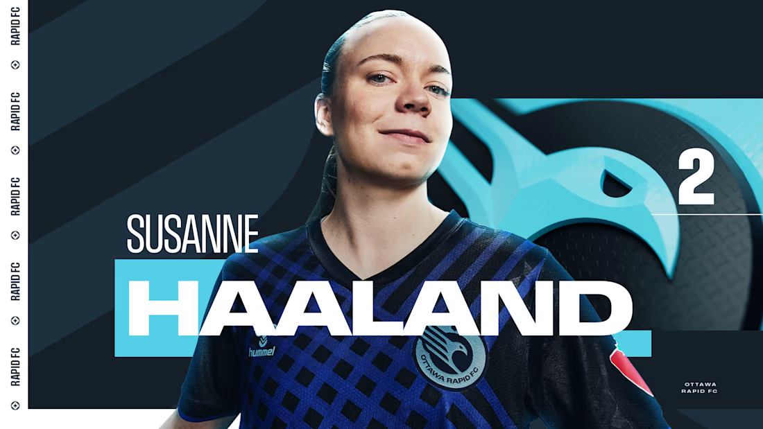
Sharing a project I'm really proud of: the 2025 broadcast design for the Northern Super League, Canada's new professional women's soccer league.
What made this one special is that the league had no visual history on TV. Every graphic viewers saw in that first season had to be created from zero, for a league that was introducing itself to the country.
The goal was a broadcast identity that feels as ambitious as the league itself: bold enough to stand out on screen, clear enough to follow at a glance, and flexible enough to carry six different clubs inside one consistent system.
The biggest lesson for me: when you design for a league that's just being born, you're not only packaging matches. You're helping define how people will remember its first season.
I'd love to hear from anyone working in sports or broadcast design: how do you approach building a visual system for a league that's launching from scratch?


Great Work demands great efforts

Mosaic: Curated Web Design Gallery
Mosaic is an internal Huehaus project: a gallery that features one standout website a day. We built it because we spend a lot of time looking for good references and wanted a place that only showed work we'd actually recommend. Every site is picked by hand.
The site is built in Framer. The layout is a simple grid that stays out of the way, with filters for 18 categories like Agency, Bold Type, Editorial, Minimal, and Dark Mode, so you can get from browsing to a specific reference quickly.
Outcome: Mosaic is live and updated daily. It gives designers a reliable place to find references and gives Huehaus a presence in the design community, while showing what we can build in Framer. It's one of the original 128 sites featured in Framer Gallery.


Amazing work!