The network for creativity
Join 1.25M professional creatives like you
Connect with clients, get discovered, and run your business 100% commission-free
Creatives on Contra have earned over $150M and we are just getting started
Back to feedPost

New brand exploration for an AI-powered organizational intelligence platform that connects your team's knowledge, conversations, decisions, and actions.
How does it look?


creative
The network for creativity
Join 1.25M professional creatives like you
Connect with clients, get discovered, and run your business 100% commission-free
Creatives on Contra have earned over $150M and we are just getting started











Related posts


Three weeks into building the Pasted website, after the design was approved, an 11-page document arrived with a whole new vision.
It was beautiful work, and it described a different project at the agreed price.
I asked them to decide: keep the approved scope, or pause and price the new idea separately. On day six, they chose the original. We shipped two weeks later.


Offering to price the new vision as its own phase also lets the client see what the idea costs without it feeling like a no. Was a change-order process already written into your contract, or did you build that path on the spot?

Which creative direction better communicates a Tech-Forward AI Brand Identity for anvio.online ?
25 voted
44%
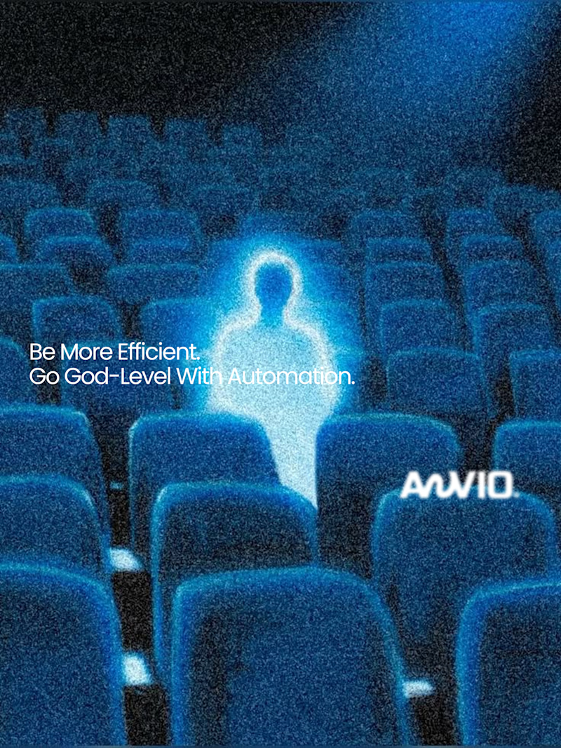
32 voted
56%
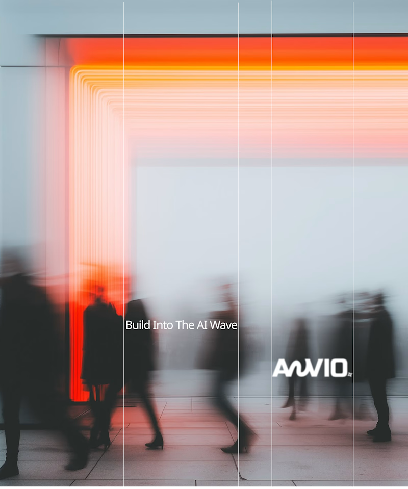
57 votes
Closed

Fast vibrant energy gets my vote. The warm glow feels more human, which is nice for an AI brand.


Mastering Claude + Figma MCP has been a process, but it’s already made iterating on brand assets significantly faster

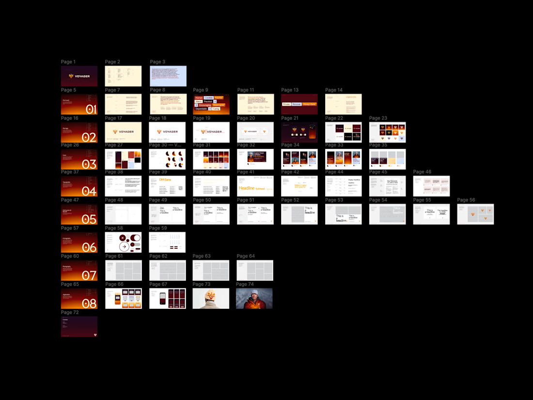
Same here, once it clicks the iteration speed is wild. Would be cool to see how you set up your workflow.