The network for creativity
Join 1.25M professional creatives like you
Connect with clients, get discovered, and run your business 100% commission-free
Creatives on Contra have earned over $150M and we are just getting started
Back to feedPost
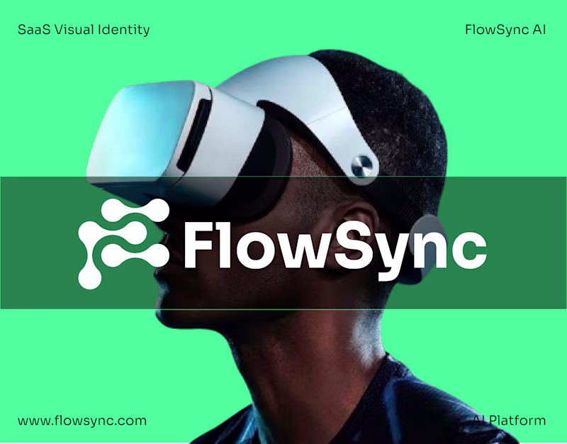
Taste Test
AI vs Human Design 👀
I created the logo on the bottom . The logo on the top was generated by AI.
Both aim to represent the same SaaS brand: FlowSync.
I'm curious about your perspective: 👉 Which logo would you trust more as a customer? 👉 Which one feels more memorable? 👉 If you were launching a SaaS startup, which would you choose and why?
33 voted
83%
7 voted
17%
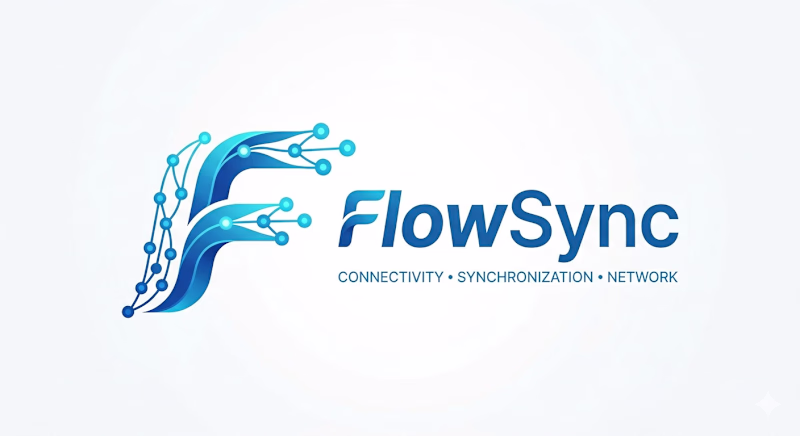
40 votes
Closed
Love the one Designed by Human, it is so creative!
Thank you
The Human design is okay. But i think it would have been better if the logo was moving. Like an animation or something that draws attention in the background. The difference would be top noch
Thank you for your valuable feedback. I completely agree with your perspective, and I'll continue working on improving it.
Human wins
It's clearly seen that "Designed by human" is better
Thank you
AI so bad
Yes
Am going for the Designed by human
Right decision. Thank you.
Definitely, the one "Designer by Human." It's creative, and the color scheme is really cool and modern.
Thank you
The network for creativity
Join 1.25M professional creatives like you
Connect with clients, get discovered, and run your business 100% commission-free
Creatives on Contra have earned over $150M and we are just getting started
Related posts
Built a financial SaaS brand that looks like it was designed by a meteorologist who never lost a board meeting.
No dashboards. No icon libraries. No "clean and modern."
Just pressure.
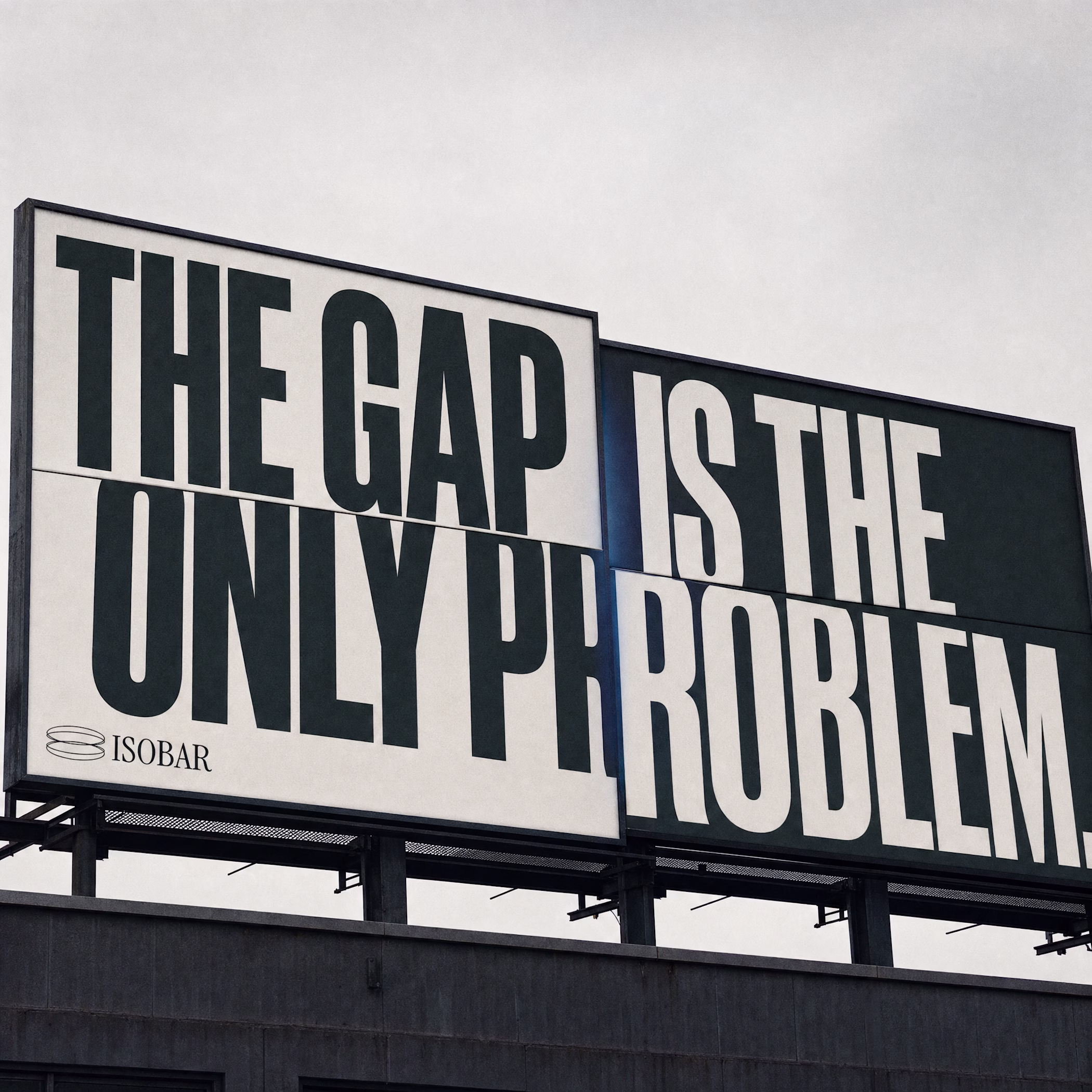
Incredible
I’m currently working on a visual identity for a tattoo studio. I’ll show you a small part of this project.
It was important to convey femininity and character. The studio creates fine-line tattoos that look clean and reflect each client’s personal story. The mirror effect in the logo represents exactly this idea of reflecting stories through tattoos. The lines in the typography reference fine-line tattoo work, and their interconnection represents the close bond between the tattoo artist and the client. This reflects the core philosophy of the brand.
I’d be curious to hear your thoughts on the result. 😊
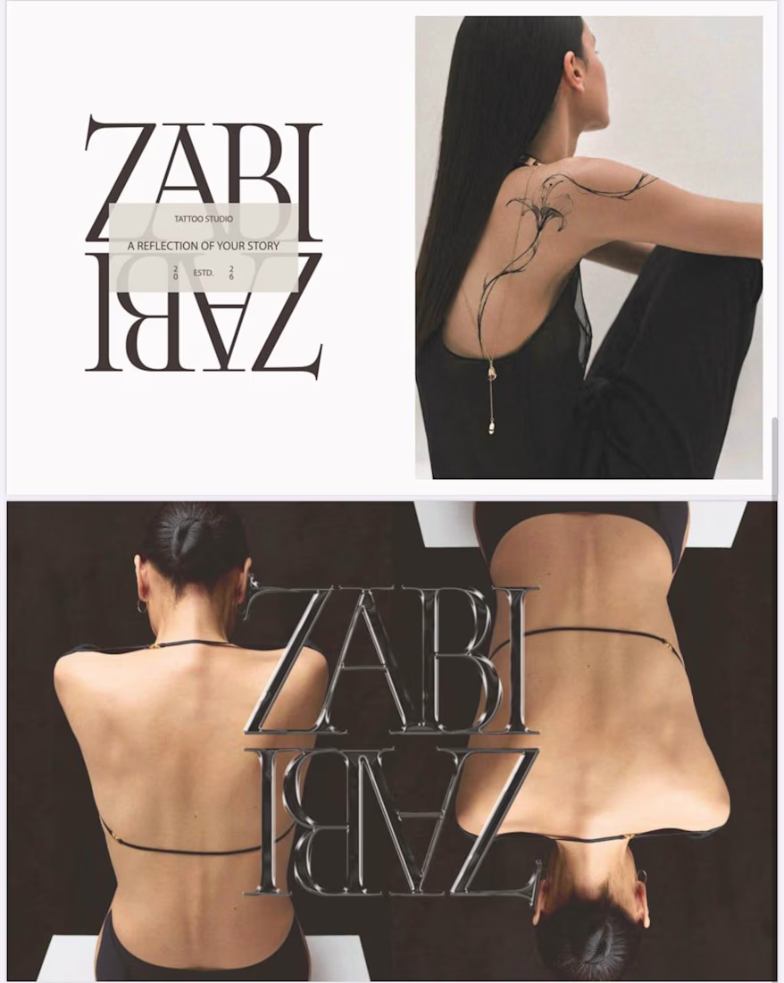
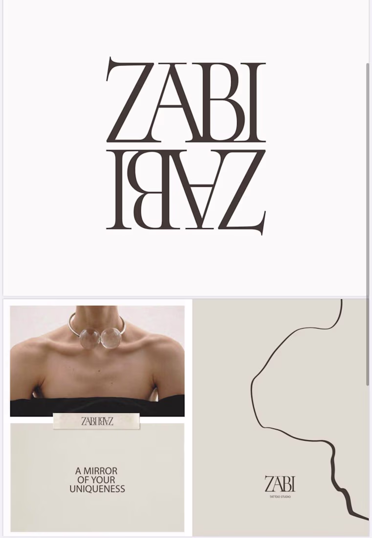
As a woman, I really appreciate how femininity is expressed here — not as decoration, but as character. Beautiful work.😍
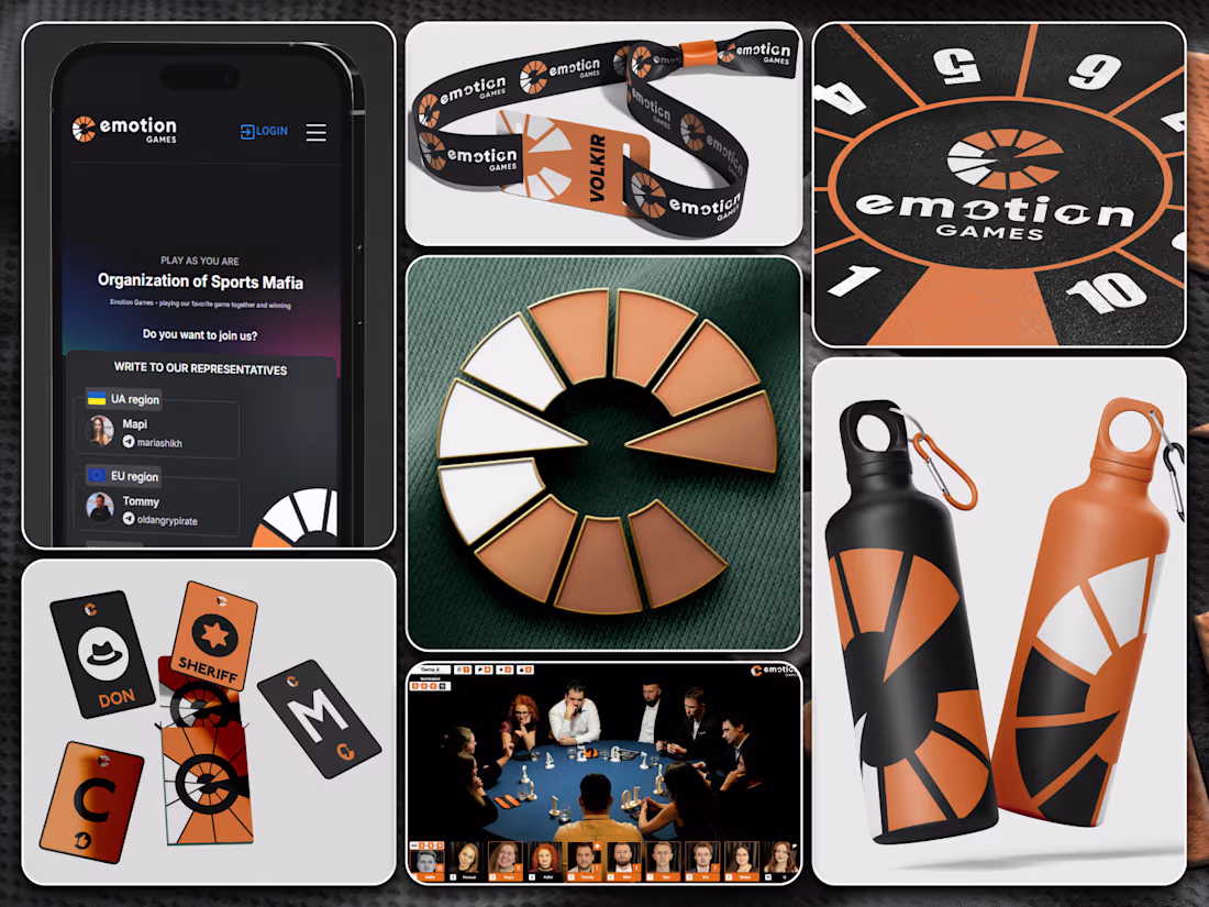
🃏 Have you ever played Mafia?
Did you know it's also played professionally – with rankings, federations, and tournaments all over the world?
"Mafia" – a team psychological, turn-based, role-playing game with a detective plot, simulating the struggle of an informed organized minority against an unorganized majority.
Some time ago, I developed the identity for one of the Mafia game federations.
The logo was built around the symbolism of the game itself:
🔴 10 players seated at a round table
🔴 two teams divided by color – black (the Mafia) and red (the citizens)
🔴 the key roles: the Don leading the "black" team and the Sheriff leading the "red"
The goal was to capture the whole essence of the game in one clean mark – conveying both the drama of the confrontation and the clear structure around the table.
So which side are you on — the Mafia or the citizens? 👀
I love Mafia, although I've only played it three times in my life 😄 So I'm more of a spectator than a player)))
I really like the logo concept. It's very creative, and I love the deeper meaning behind it!
Trending
Claude
Claude has entered the design space. How are you using Claude Design?
Contra University
Learn from expert creatives how to earn more using next-gen AI tools.
MagicPath
The canvas is infinite, and exploration is becoming the workflow. How are you using MagicPath?
creativeaiflow
Creative AI workflows are evolving. What tools do you use, and what are their strengths and weaknesses?
freelancerlife
Freelancer life is wins, pivots, and everything in between. What’s yours right now?