The network for creativity
Join 1.25M professional creatives like you
Connect with clients, get discovered, and run your business 100% commission-free
Creatives on Contra have earned over $150M and we are just getting started
Back to feedPost
Taste Test
Creative brains, help me settle this 👀
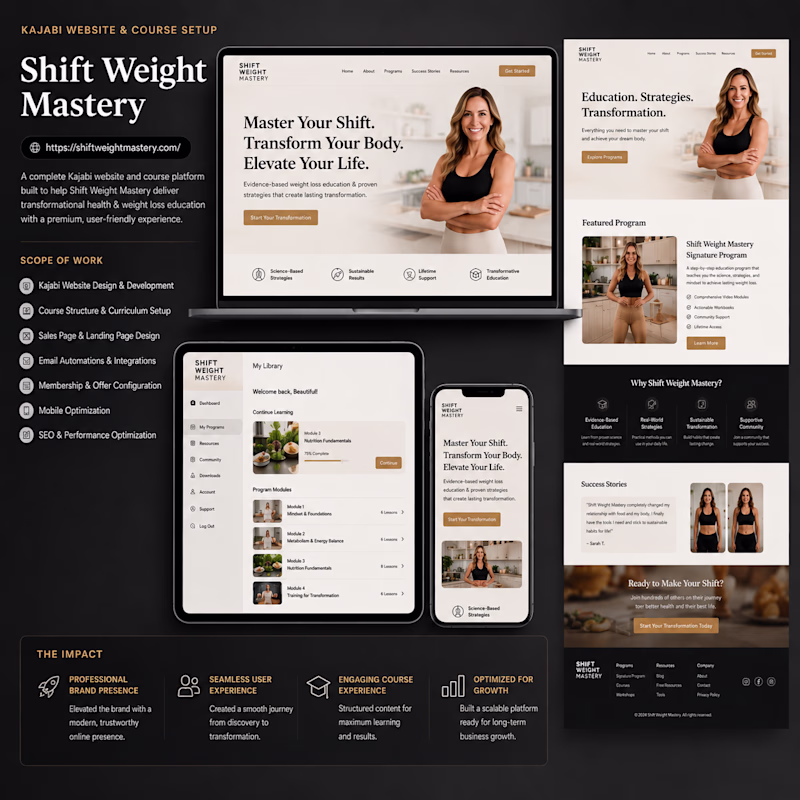
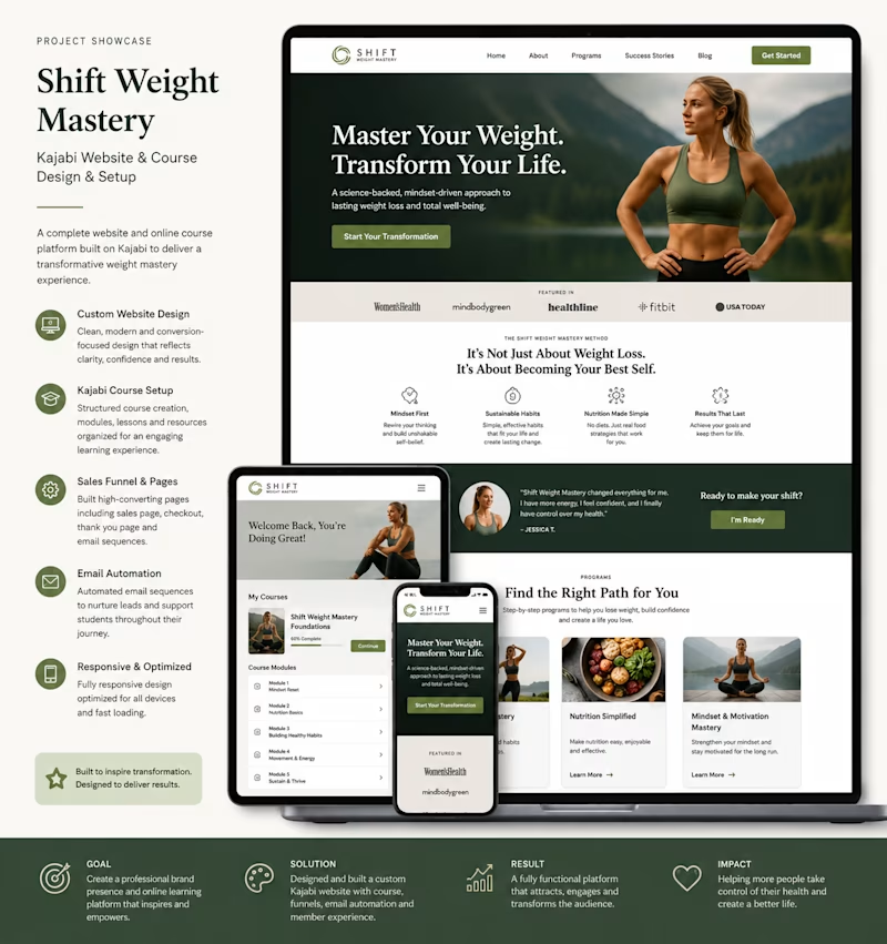
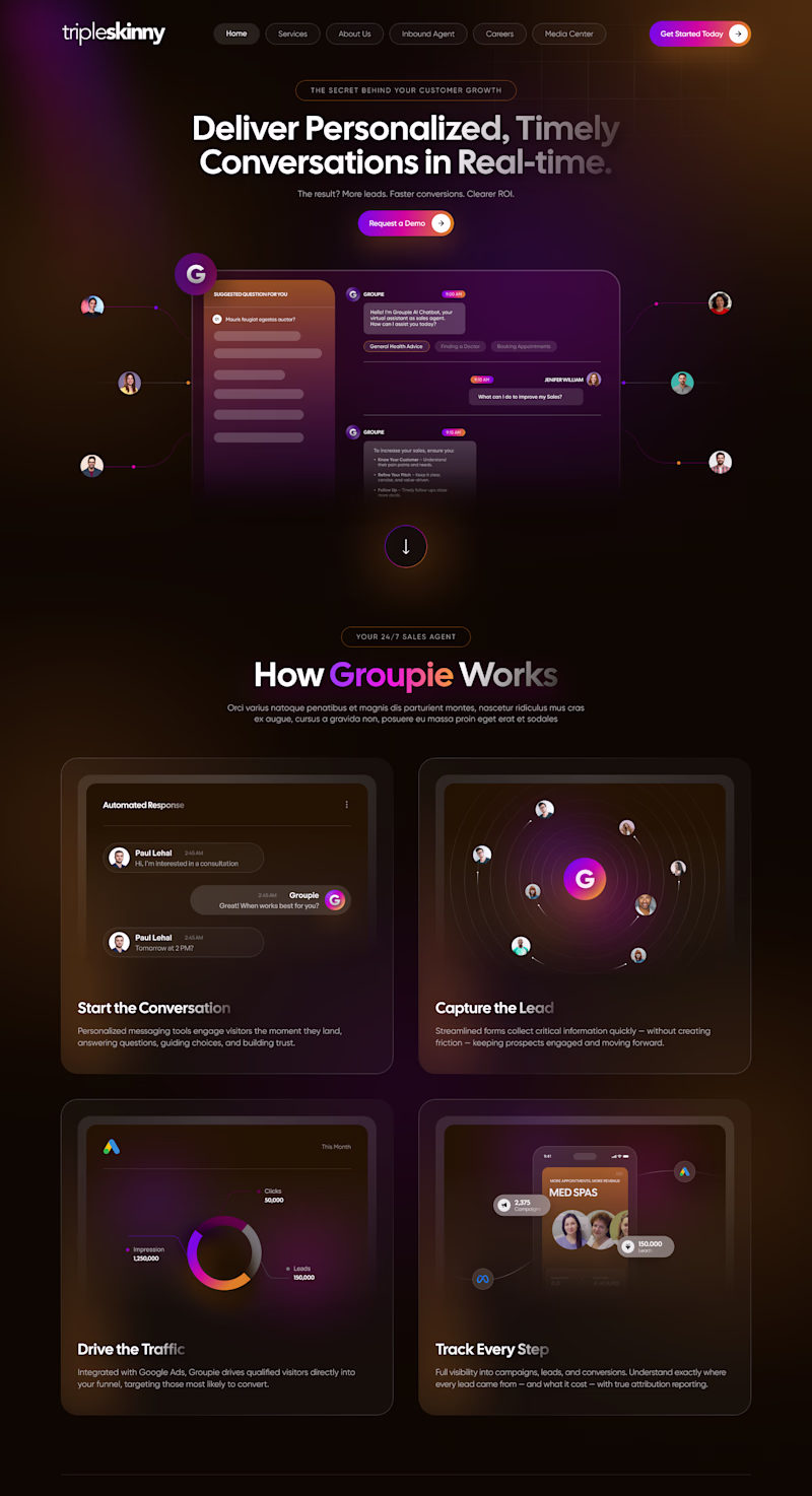
Which redesign direction hits harder for the redesign of a weight loss website I am working on?
⚡ Option A — Bold & Cinematic
🧼 Option B — Clean & Premium
Which will guarantee more conversions?
9 voted
30%
21 voted
70%
30 votes
Closed
Honestly, both directions look strong visually, but for a weight loss brand, conversions usually come more from trust, clarity, and emotional confidence than pure cinematic styling.
I like Option A best, its clean, the CTA Buttons stand out, and I'm a sucker for softer tones over brighter white ones
I admire your POV
Option B is more clearer and sleek.
Thank you
Will go for the clean and premium own which is the option B
I am also inclined in this direction
Thanks
You're welcome!
I choose Option B
I love it also
Option B
Thanks for your input.
I think I have a clear direction now
You’re welcome
i think i will go with second option the colour pallete looks clean and trustworthyand the photo selction and layout also looks so good so yeah 🙌
Thanks for this Ibrahim!
I prefer Option B to A
Thanks for making this easier
Am seriously going for option A
I would go for option B. Why? Since it's a weight loss website, green fits it perfectly. That color do not just draw better attention than the other but because green communicates health, food and nature. And weight loss is a good thing to the health. So green is better
Amazing insight
Option B
Amazing
Option B is more better
The network for creativity
Join 1.25M professional creatives like you
Connect with clients, get discovered, and run your business 100% commission-free
Creatives on Contra have earned over $150M and we are just getting started
Related posts
I was in a creative rut last year 🫠
Burnt out from work and feeling exhausted to create for myself.
I even did daily posting challenges to get myself to build the habit of posting again. From the outside, that probably looked like consistency. But internally, I still felt disconnected from my creativity and I couldn't figure out why.
And whenever I stopped posting, I would tell myself I was just too busy.
👉 Client work
👉 Strategy
👉 Editing
👉 Filming
👉 Admin
..Basically everything.
But I’m realizing “busy” became the easiest excuse because it sounded responsible. It made avoidance feel professional.
I started The Artist’s Way this month, and I’m already noticing small shifts and quiet little realizations I had been too distracted to hear.
One of them is this: Sometimes creativity needs more honesty. It needs the space to breathe before we can stop them from external voices (and yes, even the overthinking we do to ourselves). Posting consistently is one thing, but feeling connected to what you’re making is another.
Amazing!
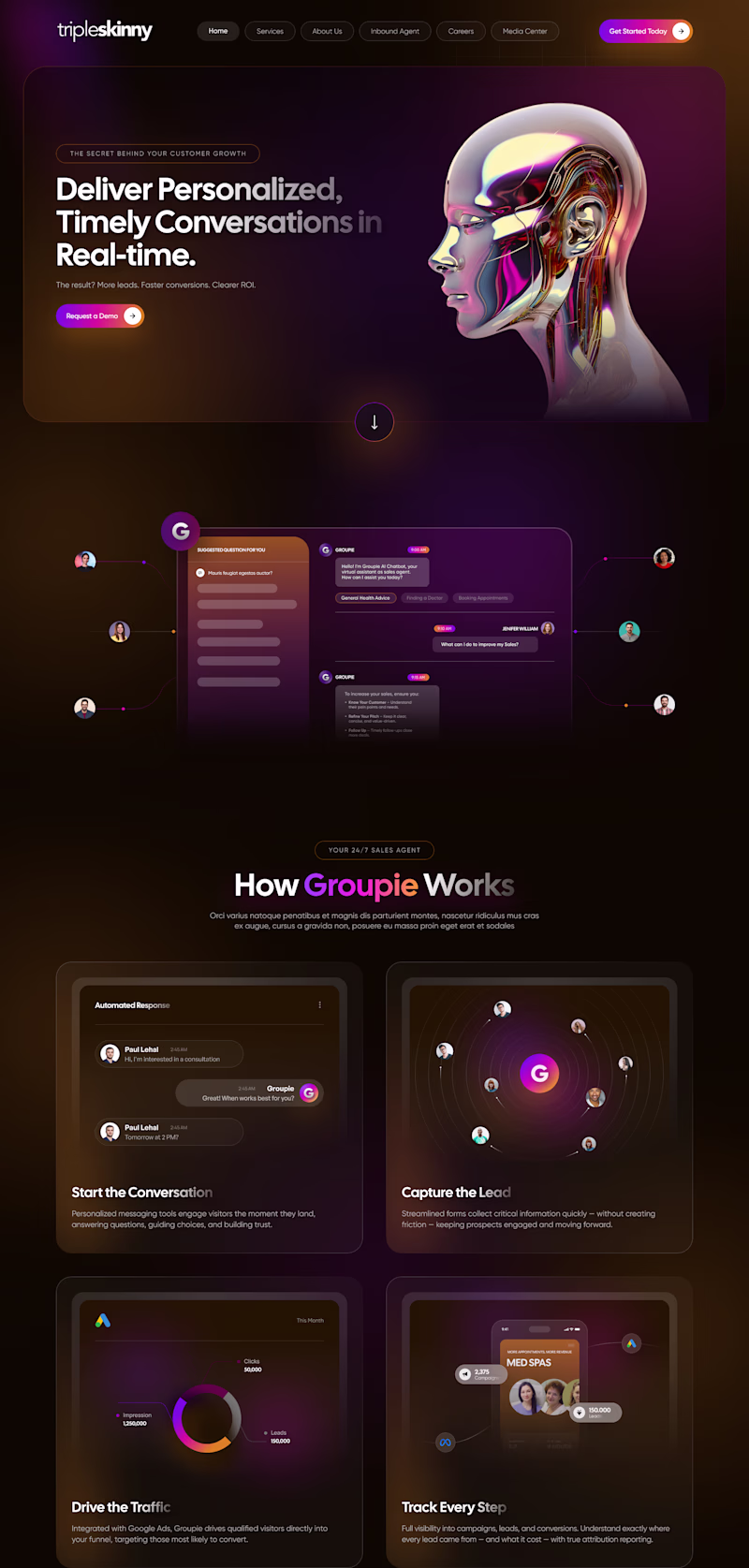
🎨 Design Poll: Which direction would you choose? 👀
I explored two hero concepts for the same AI marketing landing page, each with a different approach to grabbing attention and guiding users.
✨ Option A puts storytelling first with a bold 3D visual to create an immersive first impression.
🚀 Option B leads with the product experience, helping users instantly understand the value and functionality.
Both are designed for the same audience, but they create two completely different experiences.
👇 If you were the client, which one would you launch?
💜 Option A: Storytelling First
🧡 Option B: Product First
Drop your vote and tell me what influenced your decision🎯, conversions, 🎨 aesthetics, 🧠 UX, or 📈 clarity. I'd love to hear your perspective!
19 voted
79%
5 voted
21%
24 votes
Closed
Nice design
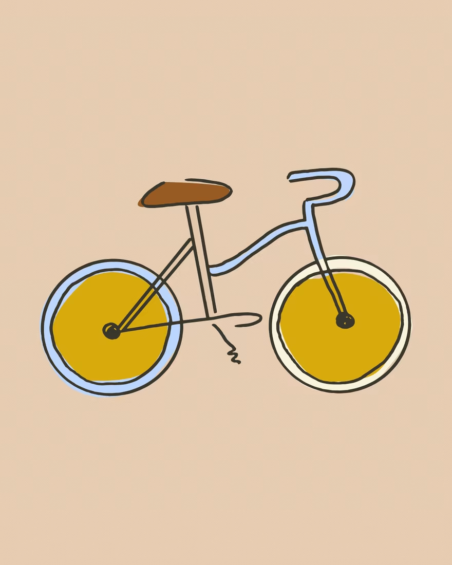
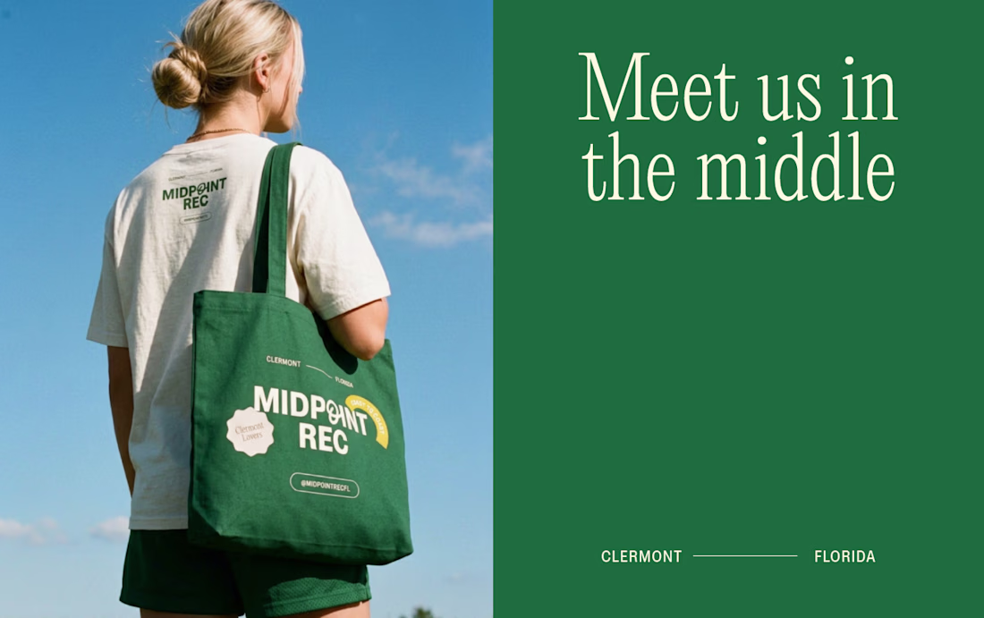
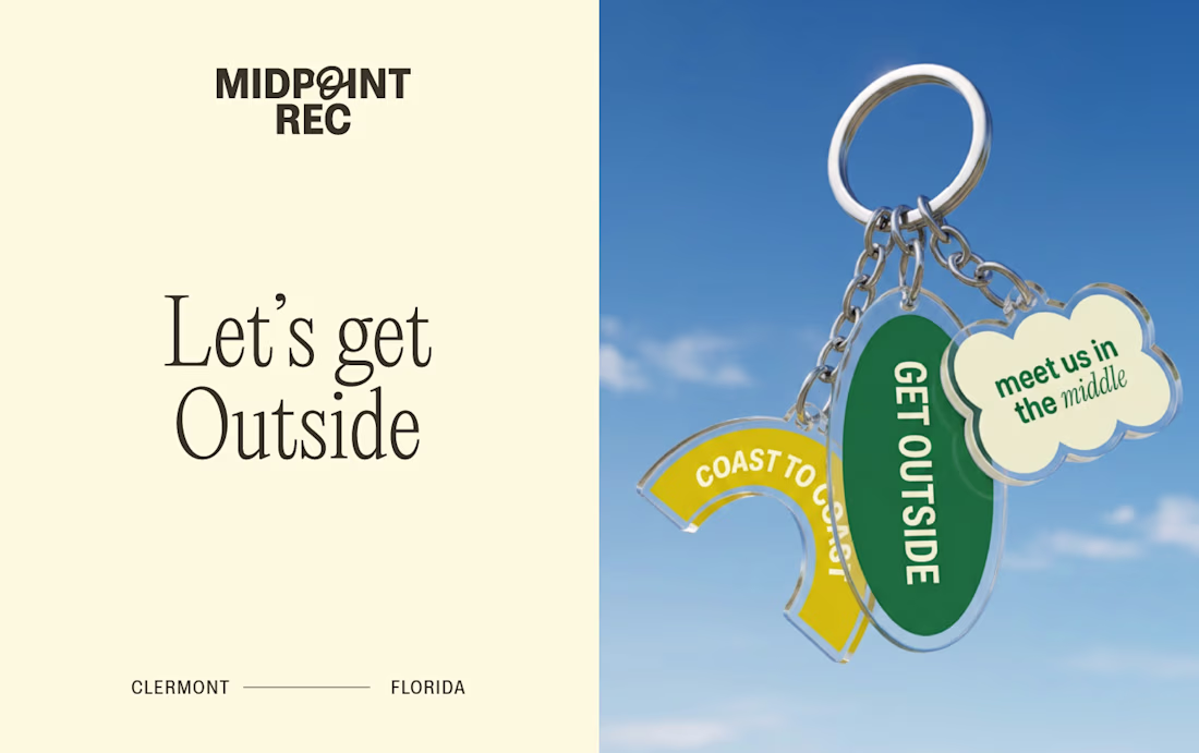
One of my favorite summer projects to date.
This was actually one of my first projects Contra featured on their homepage, which still makes me smile when I think about it.
Midpoint Rec needed an identity that felt relaxed, chic and a little playful. I built a set of illustrations that landed somewhere between doodle and chic. Been wanting to do something in this same spirit again soon.
Anyone else remember the first time Contra featured your work? 🤩
Full project.
Amazing!
Trending
Claude
Claude has entered the design space. How are you using Claude Design?
Contra University
Learn from expert creatives how to earn more using next-gen AI tools.
MagicPath
The canvas is infinite, and exploration is becoming the workflow. How are you using MagicPath?
creativeaiflow
Creative AI workflows are evolving. What tools do you use, and what are their strengths and weaknesses?
freelancerlife
Freelancer life is wins, pivots, and everything in between. What’s yours right now?