The network for creativity
Join 1.25M professional creatives like you
Connect with clients, get discovered, and run your business 100% commission-free
Creatives on Contra have earned over $150M and we are just getting started
Back to feedPost
Taste Test
Creative brains, help me settle this 👀
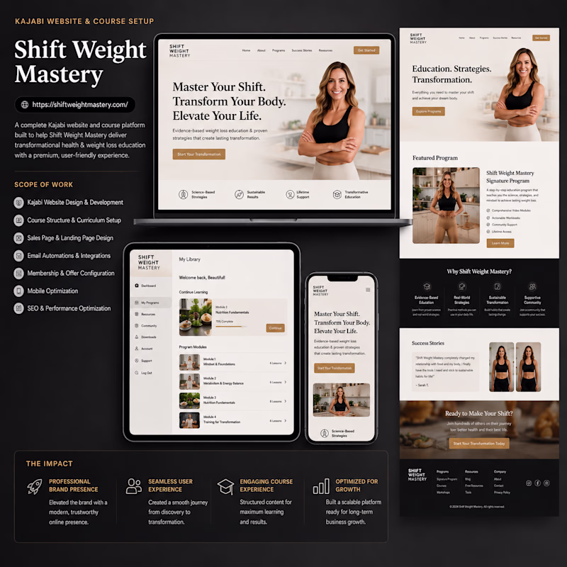
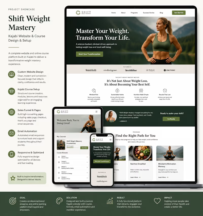
Which redesign direction hits harder for the redesign of a weight loss website I am working on?
⚡ Option A — Bold & Cinematic
🧼 Option B — Clean & Premium
Which will guarantee more conversions?
11 votes
Ends in 1d
Will go for the clean and premium own which is the option B
I like Option A best, its clean, the CTA Buttons stand out, and I'm a sucker for softer tones over brighter white ones
Option B is more clearer and sleek.
I choose Option B
The network for creativity
Join 1.25M professional creatives like you
Connect with clients, get discovered, and run your business 100% commission-free
Creatives on Contra have earned over $150M and we are just getting started
Related posts
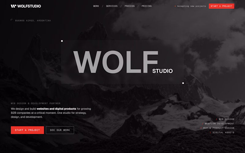
dark one, has more contrast
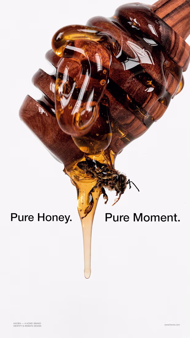
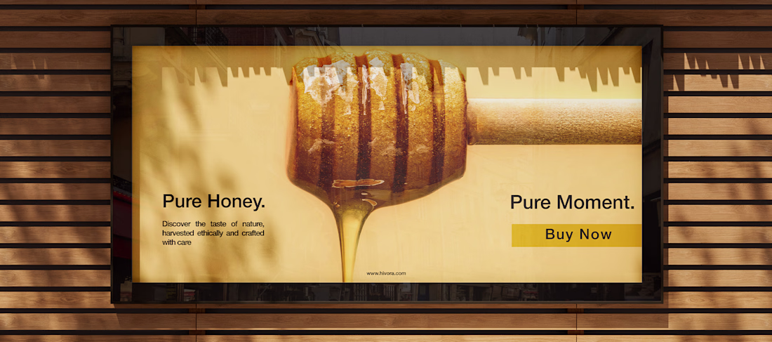
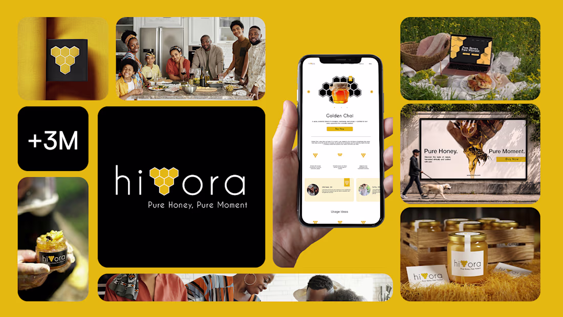
Most honey brands look the same. Generic labels, outdated design, no story worth telling.
Hivora was built to be different — a premium honey brand that transforms a daily ritual into an extraordinary moment. From a bold visual identity to a full e-commerce experience, every design decision was made with one goal: to make people feel something before they even taste it.
Pure Honey. Pure Moment. Pure Design.
Such a fun design!

beautiful color combo
Trending
Claude
Claude has entered the design space. How are you using Claude Design?
Contra University
Learn from expert creatives how to earn more using next-gen AI tools.
creativeaiflow
Creative AI workflows are evolving. What tools do you use, and what are their strengths and weaknesses?
portfolioreview
The best portfolios tell a story, not just show a grid. Share yours for feedback.
freelancerlife
Freelancer life is wins, pivots, and everything in between. What’s yours right now?