The network for creativity
Join 1.25M professional creatives like you
Connect with clients, get discovered, and run your business 100% commission-free
Creatives on Contra have earned over $150M and we are just getting started
Back to feedPost

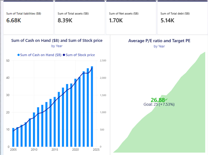
📊 𝗚𝗼𝗼𝗱 𝗱𝗮𝘁𝗮 𝗮𝗻𝗮𝗹𝘆𝘀𝗶𝘀 𝗶𝘀 𝗺𝗼𝗿𝗲 𝘁𝗵𝗮𝗻 𝗷𝘂𝘀𝘁 𝗯𝘂𝗶𝗹𝗱𝗶𝗻𝗴 𝗮 𝗱𝗮𝘀𝗵𝗯𝗼𝗮𝗿𝗱.
A clean dashboard can show you 𝘄𝗵𝗮𝘁 is happening but the real value comes from understanding 𝘄𝗵𝘆 𝗶𝘁’𝘀 𝗵𝗮𝗽𝗽𝗲𝗻𝗶𝗻𝗴 𝗮𝗻𝗱 𝘄𝗵𝗮𝘁 𝘁𝗵𝗲 𝗱𝗮𝘁𝗮 𝗶𝘀 𝘁𝗲𝗹𝗹𝗶𝗻𝗴 𝘆𝗼𝘂.
While working on different projects, I’ve been focusing more on:
🔹 Finding meaningful patterns
🔹 Asking the right business questions
🔹 Turning raw data into clear insights
🔹 Building dashboards that are actually useful
For me, the goal is simple: 𝗺𝗮𝗸𝗲 𝗱𝗮𝘁𝗮 𝗲𝗮𝘀𝗶𝗲𝗿 𝘁𝗼 𝘂𝗻𝗱𝗲𝗿𝘀𝘁𝗮𝗻𝗱 𝗮𝗻𝗱 𝗲𝗮𝘀𝗶𝗲𝗿 𝘁𝗼 𝗮𝗰𝘁 𝗼𝗻.🚀
💬 𝗪𝗵𝗮𝘁 𝗱𝗼 𝘆𝗼𝘂 𝘁𝗵𝗶𝗻𝗸 𝗺𝗮𝗸𝗲𝘀 𝗮 𝗱𝗮𝘀𝗵𝗯𝗼𝗮𝗿𝗱 𝘁𝗿𝘂𝗹𝘆 𝘂𝘀𝗲𝗳𝘂𝗹?
The network for creativity
Join 1.25M professional creatives like you
Connect with clients, get discovered, and run your business 100% commission-free
Creatives on Contra have earned over $150M and we are just getting started




Related posts

Everyone thinks a data dashboard should look complicated.
I think that is exactly why most of them fail.
I just finished Helios, a tool that tracks solar energy assets in real time. Dozens of sites, live output, verification records, a wall of numbers. The kind of screen people drown in.
Most designers would make it feel technical. More lines, more glow, more charts. I did the opposite. Every number had to answer one question in half a second, is this good or is this a problem. If it could not, it lost its place.
Because design is not decoration, it is closer to math. It is deciding what to remove until only the truth is left.
Complexity was never the enemy. Confusion is.
Get that right, and people trust you before you have said a word.
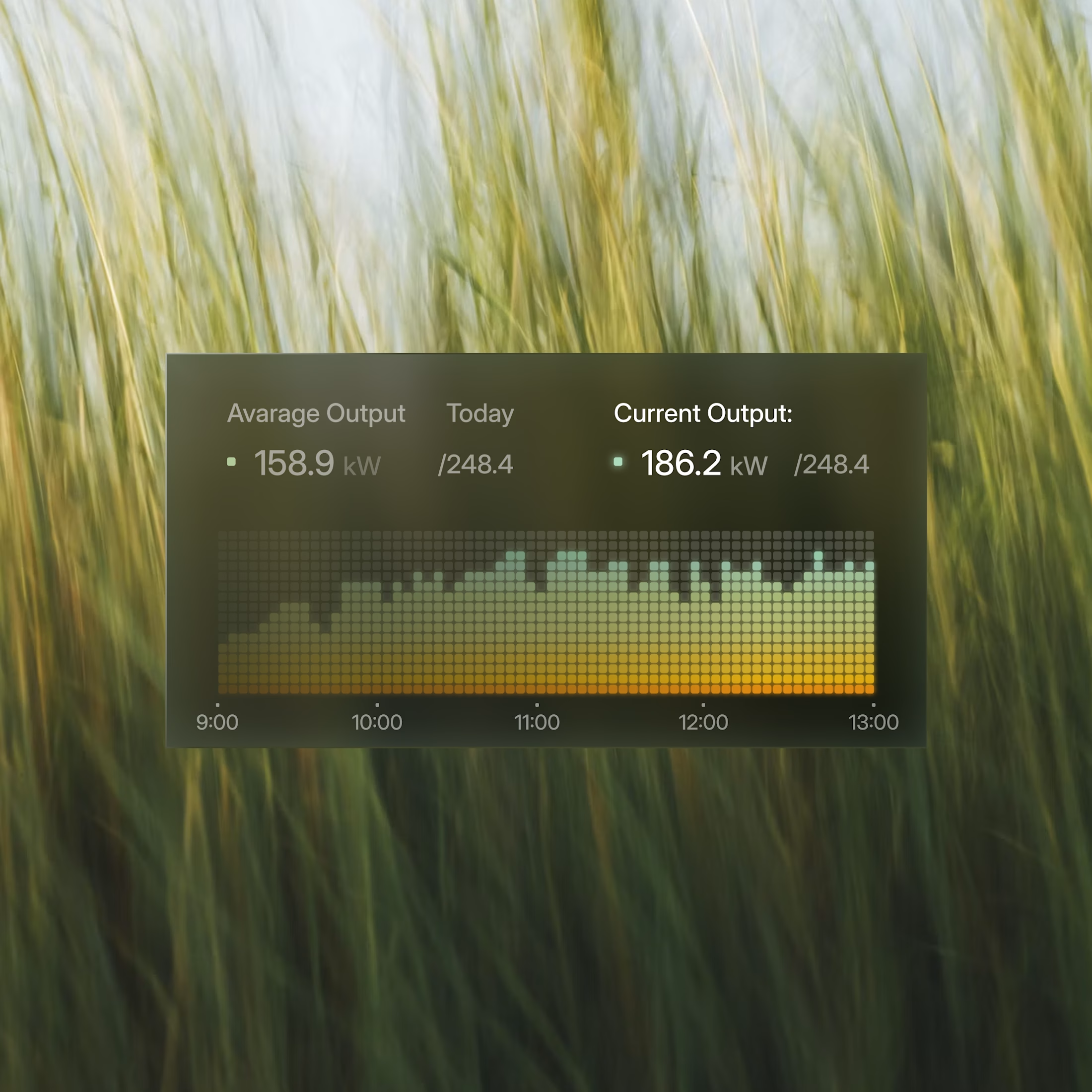
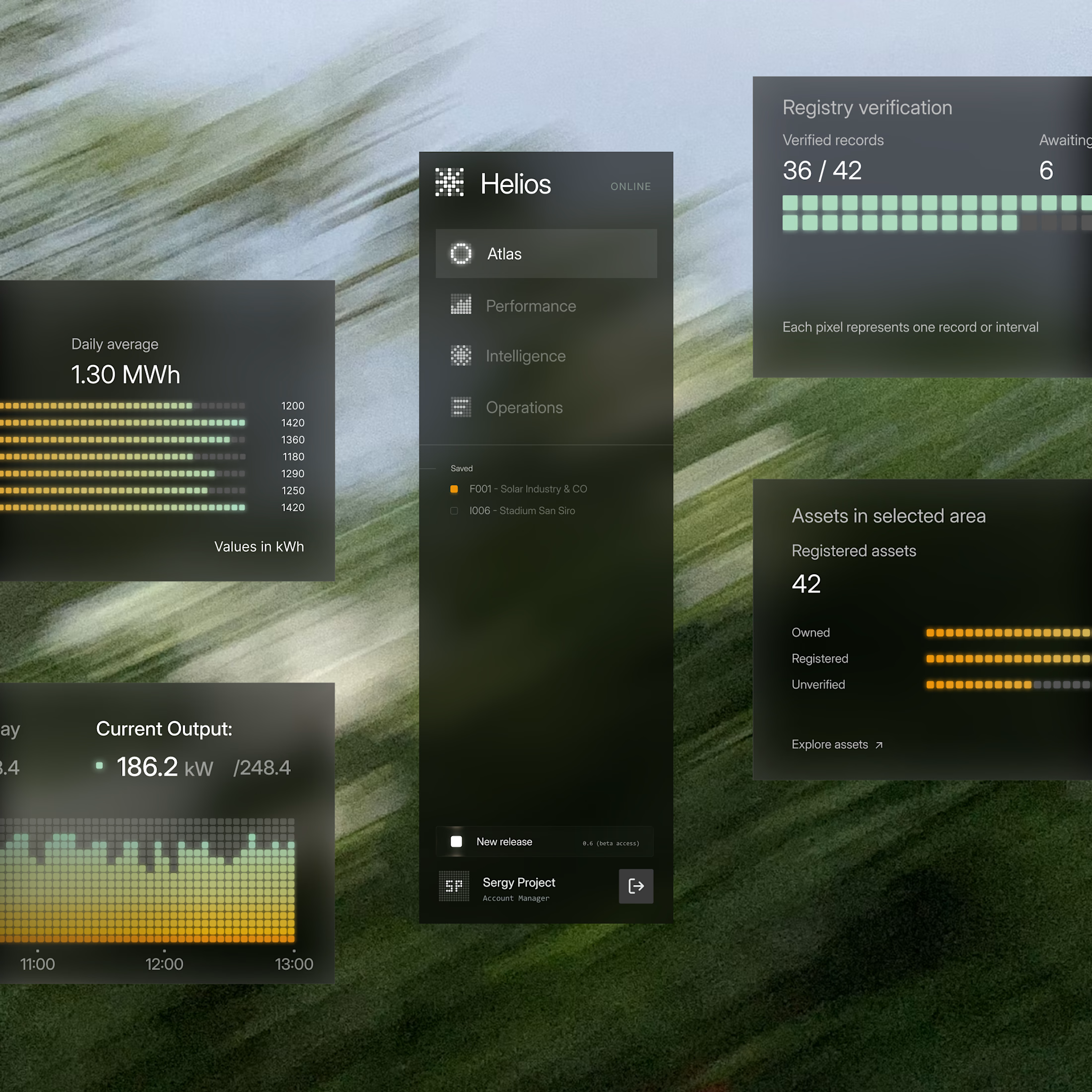

These components are perfectly executed, and the background is perfect for them.

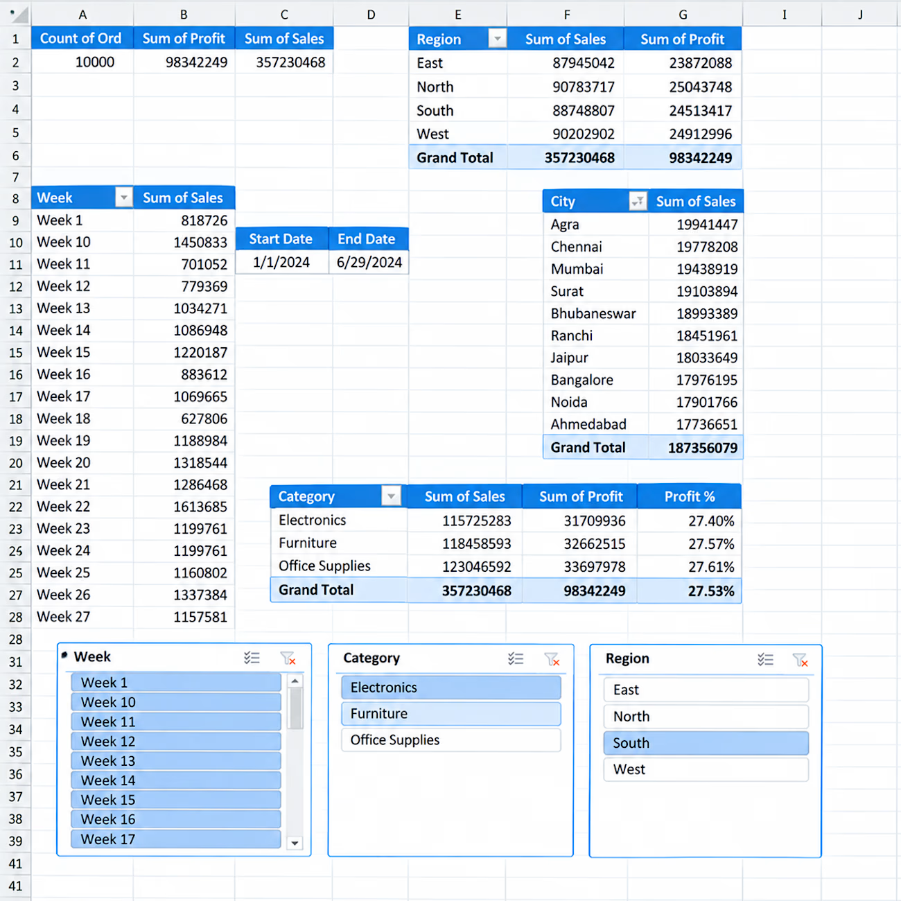
📊 Interactive Sales Analytics Dashboard in Excel
I created an interactive Excel dashboard to analyze sales performance across different business dimensions.
Key Insights & Features:
• Total Orders, Sales & Profit KPIs
• Sales & Profit by Region
• Sales by City
• Category-wise Sales, Profit & Profit %
• Weekly Sales Analysis
• Interactive Slicers for Week, Category & Region
• Start Date & End Date tracking
• PivotTable-based analysis
This dashboard is designed to turn raw sales data into clear and actionable business insights using Excel.


Hello.
I guess we're in the same page about data analysis and visualization
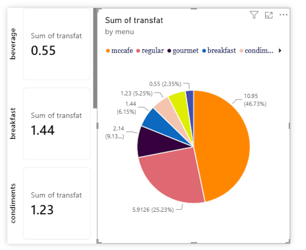

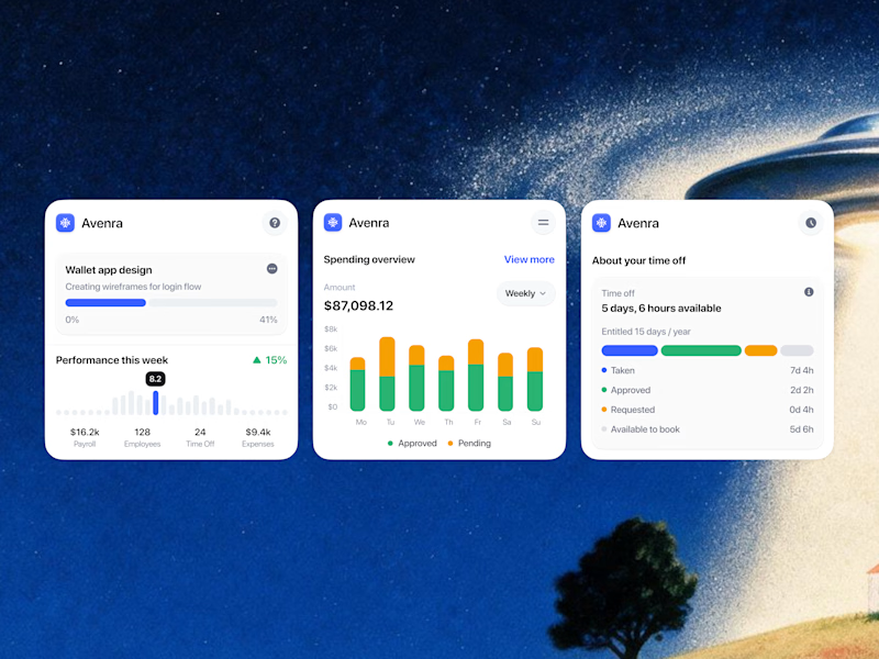
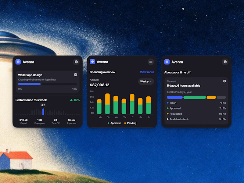
Which style wins for you? 🤔
We’re testing out two theme directions for Avenra’s dashboard component cards; featuring real-time spending breakdowns, project progress metrics, and time-off tracking.
Curious to hear your thoughts! 💬

8 voted
42%
11 voted
58%
19 votes
Closed