The network for creativity
Join 1.25M professional creatives like you
Connect with clients, get discovered, and run your business 100% commission-free
Creatives on Contra have earned over $150M and we are just getting started
Back to feedPost
Taste Test

Which style wins for you? 🤔
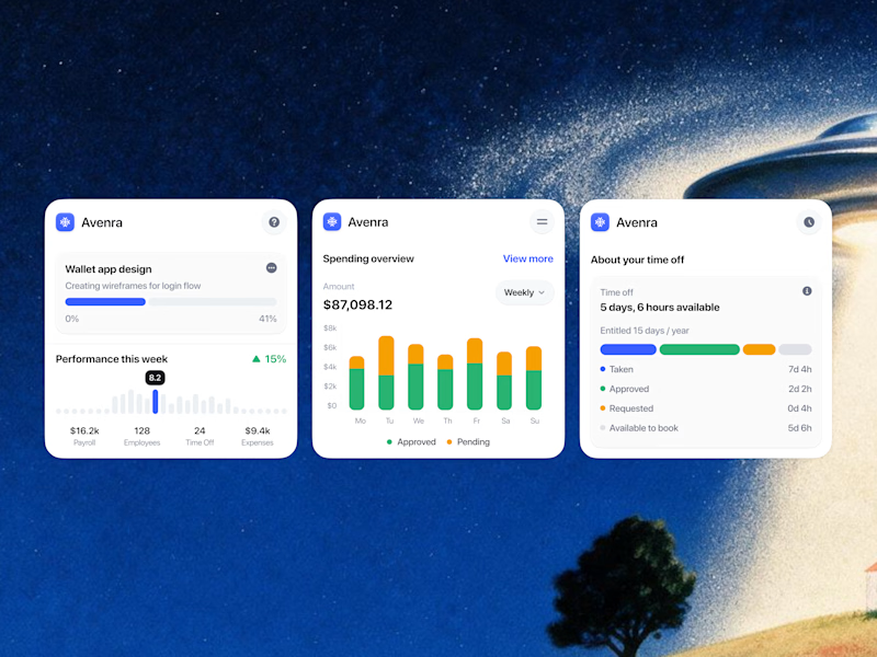
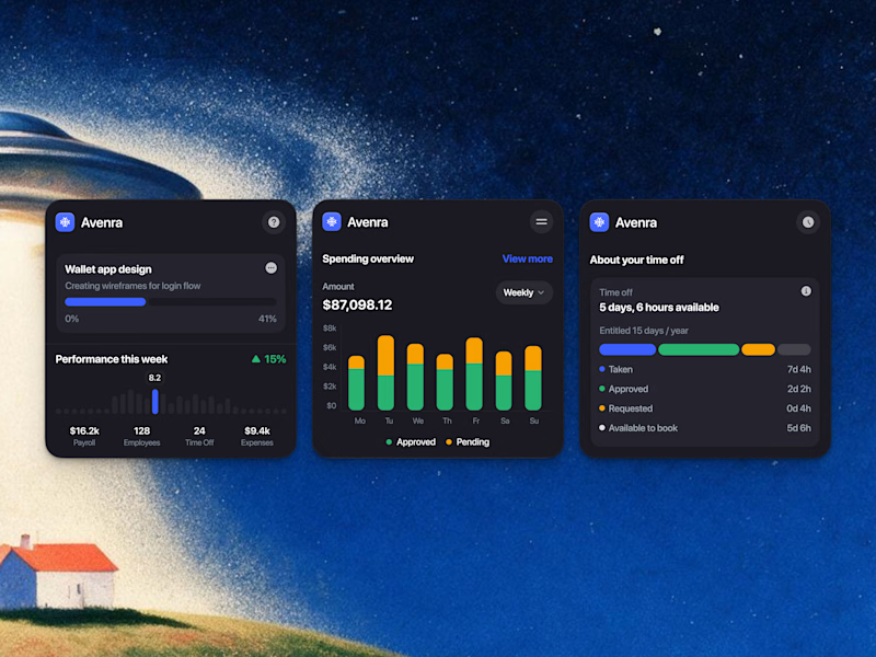
We’re testing out two theme directions for Avenra’s dashboard component cards; featuring real-time spending breakdowns, project progress metrics, and time-off tracking.
Curious to hear your thoughts! 💬
3 votes
Ends in 1d


hard to choose, but i love a light mode ver

Dark mode wins for me. The yellow data accents stand out more clearly, and the cards feel more focused at a glance.

Light mode looks much cleaner and clearer with the background. ✨ The dark mode feels a little less suited to it.
The network for creativity
Join 1.25M professional creatives like you
Connect with clients, get discovered, and run your business 100% commission-free
Creatives on Contra have earned over $150M and we are just getting started

Challenges
View all


Related posts

A or B? 😇👈
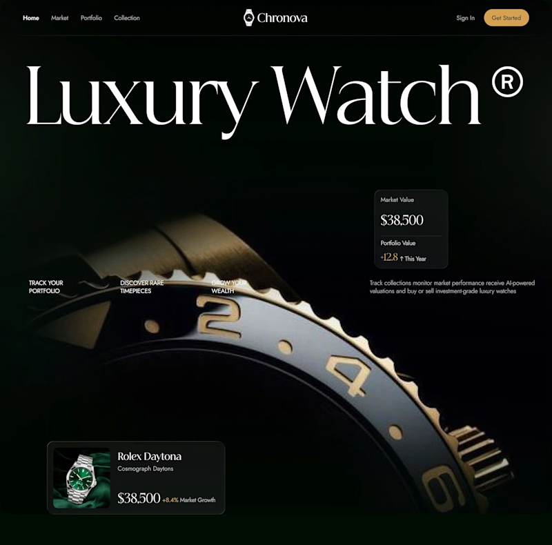
Which design delivers the better luxury feel and overall visual experience?


3 voted
17%
15 voted
83%

18 votes
Closed

Option B feels more luxurious to me—the watch gets a clearer hero moment and the warmer accent adds just enough energy against the dark field. The typography and product scale also make the comparison feel polished.


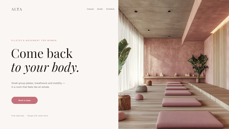
Where should the photo live - behind the words or beside them?
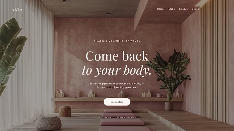
Same pilates studio, same headline.
01 - Photo as the background. Full-bleed atmosphere: the room wraps around the words. Immersive and cinematic, but the text only survives thanks to a darkening overlay laid over the image.
02 - Photo beside the text. A clean split: words on calm ground, the room in its own column. Everything readable at a glance, the trade is a little less drama.
One sells the feeling. The other sells the clarity. Which hero would make you book the class?

80 voted
75%
27 voted
25%
107 votes
Closed

1 nails it




The left one is much clearer and better to watch as a customer. Clean execution.